HR dashboard with Highcharts and Web Pivot Table component

Today we’re going to talk about analytics. To be more precise – HR analytics.
We’ll clarify why it is so important for small-, medium- and large-sized businesses and how you can implement a custom solution for HR data analysis simply using charts and a pivot table without investing a lot of developer resources?
You might be wondering: why does your company need to focus on it at all? – Fortunately, we have all the answers for you here.
First of all, it helps to evaluate the performance of the company’s departments and answer crucial questions regarding the work of employees.
Though often being underestimated, HR analytics also gives the power to transform how the HR department performs by testing the effectiveness of the implemented strategies.
In other words, provided that you use analytics to the fullest extent, you can improve employee performance, get a bird’s eye view of your business and make data-driven decisions relying on extracted insights rather than simple intuition.
Before the start, we suppose you’ve already managed to outline your business goals. The goals may vary from company to company but the foremost ones may include:
- recognizing trends in the current workforce.
- increasing employee retention rates, engagement, and performance.
- predicting voluntary and involuntary turnover.
Then, you need to identify metrics to track.
We took care of it and have prepared a kind of memo for you.
It’s fundamental metrics we’re going to analyze in this tutorial and corresponding types of visualization. (!But bear in mind that you can always calculate your own metrics with the help of tools we’ll mention below).
- Employee productivity (efficiency). This is the ratio of the employee output’s amount to time spent on a particular task or project.
- Turnover rate. Measures the number of employees leaving a company over time. With the multi-line chart, we can track a turnover rate in each department. This metric is often the center of the HR manager’s attention. The goal is to minimize this number.
- Revenue per employee. Measures the revenue per employee.
- Retention rate. This is the opposite of a turnover rate. Measures the percentage of employees remained at the end of a period. We can also measure it by the department.
- Employee engagement. Measures the level of the employee’s commitment. It is mostly affected by satisfaction and stress levels. We can use the line chart to track engagement for each person over months. Or within each department.
- Training costs per employee. Column chart.
- Overtime hours by departments and age groups. Best to analyze with a column chart.
- The number of part-time employees in the company.
- Hires to the goal. Total hires required to achieve the specified recruitment goal within a fixed time.
- Absenteeism (absence rate). Measures the percentage of total working time when employees are absent from work. You want it to be as low as possible.
- Ranges of salaries by departments.
And finally, demographics-related metrics:
- Employees’ countries of origin. We can display the top countries in a pie chart.
- Gender ratio. The ratio between the number of females and males in the company. Pie chart works here best since there are only two categories to depict.
- Age groups. Column chart.
Now, check all your data that you’ve already collected from various sources and start building your HR analytics solution.
We suggest the most popular way to communicate all the data through an interactive dashboard. You can easily implement this approach by combining WebDataRocks Pivot with Highcharts.
Both libraries work together like a charm and soon you’ll make sure of it. Let’s go-ahead to the dashboard’s creating!
Step 1: Add Highcharts dependencies
We’ll be adding all scripts into the <head> section of the web page to ensure they are run before the rest of the page is loaded.
To access Highcharts, include these scripts:
<script src="https://code.highcharts.com/highcharts.js"></script>
<script src="https://code.highcharts.com/highcharts-more.js"></script>
Let’s also add the export module to allow end-users to download charts as PDF, JPG, PNG, or SVG images:
<script src="http://code.highcharts.com/modules/exporting.js"></script>
If you want to enable exporting without an internet connection, you can add this script instead:
<script src="http://code.highcharts.com/modules/offline-exporting.js"></script>
Add containers where the charts will be rendered:
<div id="piechart-container"></div>
...
<div id="barchart-container"></div>
Create as many containers as there will be charts on the dashboard.
Step 2: Add WebDataRocks Pivot
It’s time to configure a reporting tool in your project.
Include WebDataRocks scripts and styles:
<link href="https://cdn.webdatarocks.com/latest/webdatarocks.min.css" rel="stylesheet">
<script src="https://cdn.webdatarocks.com/latest/webdatarocks.toolbar.min.js"></script>
<script src="https://cdn.webdatarocks.com/latest/webdatarocks.js"></script>
To apply the dark theme, add the corresponding styles:
<link rel="stylesheet" type="text/css" href="https://cdn.webdatarocks.com/latest/theme/dark/webdatarocks.min.css" />
Create the container for the pivot table:
<div id="pivot-container"></div>
Step 3: Initialize the pivot table on the page
var pivot = new WebDataRocks({
    container: "#pivot-container",
    toolbar: true,
    report: {
        dataSource: {
            data: getData()
        }
    }
});
To load data into the component, define and set a function that returns the JSON data:
function getData() {
    return [
        {
            "id": 1,
            "Full Name": "Sallyanne Tryhorn",
            "Job Title": "Software Consultant",
            "Country": "Sweden",
            "Gender": "F",
            "Employee Engagement": 0.8,
            "Part-time": "No",
            "Revenue per employee": 889,
            "Hours Spent for Project": 66,
            "University": "Kalmar University College",
            "Currency": "SEK",
            "Department": "Business Development",
            "LinkedIn Skill": "Brand Management",
            "Month Salary": 1229,
            "Overtime Hours": 12,
            "Employment start date": "9/26/2015",
            "Age Group": "<21"
        }
    ]
}
Don’t forget to specify data types for JSON!
Step 4: Create a report
Now that your pivot contains the data, it's time to analyze it.
To provide your end-users with a meaningful report, set a slice that describes which hierarchies have to be placed to the rows, columns, and measures.
As well as a report, this object has a JSON structure:
"slice": {
    "rows": [{
        "uniqueName": "Department"
    }],
    "columns": [{
        "uniqueName": "Measures"
    }],
    "measures": [{
        "uniqueName": "Total Overtime Hours",
        "formula": "sum(\"Overtime Hours\") ",
        "caption": "Total Overtime Hours"
    }],
    "sorting": {
        "column": {
            "type": "desc",
            "tuple": [],
            "measure": "Total Overtime Hours"
        }
    }
}
This slice helps to get an understanding of the overtime hours by departments.
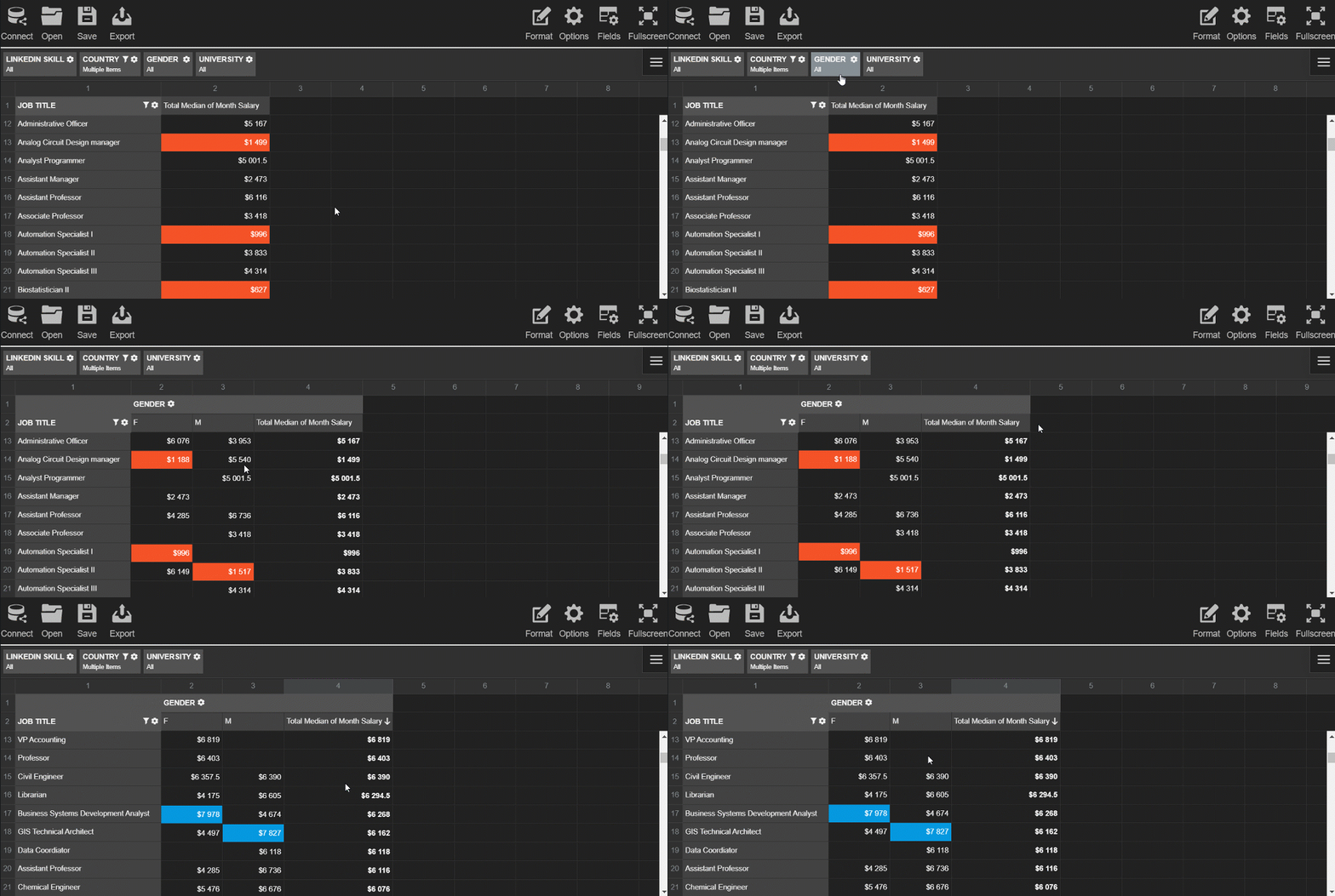
Try exploring the data interactively - drag and drop the hierarchies on the grid and save the resulting report.
Step 5: Pass the data to the charts
Before creating the charts and filling them with the data, we need to process the data to the appropriate formats.
Each chart requires a different data structure. To save your time, add the WebDataRocks connector for Highcharts to get access to the ready-to-use methods that handle data processing:
<script src="https://cdn.webdatarocks.com/latest/webdatarocks.highcharts.js"></script>
Next, we need to write code that performs the following scenario for each chart type:
- Gets the data from the pivot table component. On this step, you can specify which subset of the data you want to visualize.
- Processes this data with the help of the connector's methods.
- Creates the chart and sends the data to it.
- Each time the report on the grid is updated, the renewed data has to be resent to the chart.
To know whether the pivot table is ready to provide the data, we should use an event handler for reportcomplete.
Here's a simple example of the handler you can attach to the event:
reportcomplete: function() {
    pivot.off("reportcomplete");
    createPieChart();
    createBarChart();
}
To keep the blog post concise, I prefer not to include all the code here - you can find all the details of charts creating in the CodePen demo. You can also see there how to apply a dark theme for Highcharts.
Step 6: Enjoy the resulting dashboard
See how the dashboard looks like as a result:

This dashboard is completely ready to be an efficient instrument for HR analytics. Your end-users can interact both with a pivot table and charts, change reports on the fly and look at the data from multiple angles.
Coupled together, the pivot table and charts complement each other and make your data speak.
Hopefully, the presented approach will help you to get insights from the data, showcase your data story to the colleagues and improve the business performance in the long run.
People often ask: how data analytics and data science differ from each other? For many, it may be hard to differentiate these two disciplines. And today we’ll try shedding the light upon their principal distinctions.
To my mind, it’s not quite right to oppose these disciplines with each other. Instead, it’s more beneficial to consider them as parts of a single whole.
Data Science
Data science is an umbrella term that embraces data mining, data analytics, machine learning, and other disciplines. Its primary goal is to extract insights from massive collections of raw unstructured, semi-structured and structured data sets.
A significant difference between Data Science and Data Analytics lies in their goals and tactics. For example, a data scientist is more concerned with finding the right questions to ask while a data analyst intends to obtain the right answers based on the existing questions to the data.
Also, these disciplines are different in scopes. While data science produces broader insights on the subject and identifies inherent trends in the data, data analytics aims at focusing on more concrete / narrower goals.
Skills to become a proficient data scientist
Hard skills
A skilled data scientist has to know how to collect data sets from diverse sources, preprocess it by cleaning and transforming disordered data, extract required features and implement machine learning techniques to gain insights into the data.
Equally important is to know how to perform predictive analytics, sentiment analysis and integrate analytics with enterprise-scale systems.
Tools and languages
Along with ML techniques, a data scientist has to know Python, R, Scala, or/and SAS/STAT well, have a strong background in maths, probability, and statistics.
Since the data that data scientists work with is most often stored in relational databases, SQL expertise is a critical skill that can’t be underestimated. You need to know how to write basic and complex, nested queries to get the precise data you need.
Understanding how to work with unstructured data is especially valuable – in most cases, you’ll work with messy data. The ability to work with NoSQL databases (MongoDB, etc) is also highly appreciated.
Soft skills
A qualified data scientist should possess not only exceptional technical skills but also outstanding communication, problem-solving, and prioritization skills. Another key skill is a clear understanding of the data from a business point of view.
Given the above, data scientists are proficient data analysts with solid programming skills.
To be a good data scientist, you must be an excellent data analyst. But the opposite is not always true.
Skills to become a proficient data analyst
A data analyst has to be skilled at descriptive statistics, visualizing data, and reporting insights gained from the data.
Like data scientists, data analysts have to be proficient at statistics, working with databases, and looking at the data from multiple angles.
Hard skills
Must-have skills for data analysts are:
- Knowledge of R and Python
- Experience with Tableau, Power BI
- Ability to prepare the data for analysis
- Solid maths and statistics foundation
- The ability to create visualizations with Python/JavaScript libraries (e.g., pivot tables, charting libraries) is a plus.
Soft skills
A skilled data analyst has to expertly communicate their findings to a wide audience of decision-makers by using various data visualization and reporting methods. Data analysts have to constantly cooperate with other team members, be good at problem solving and research.
No less important is to be attentive to the smallest details and be able to present complex concepts in a simple language.
To summarize, data science and data analytics have a lot in common, yet, they have differences that can be nonobvious at first sight. Today we’ve covered the major aspects that differentiate these two powerful disciplines and outlined must-have skills for data scientists and data analysts.
Have you read?

What is React
React is a front-end library created and maintained by Facebook.
The central idea behind React is that everything can be built with reusable components which have own lifecycle.
Among companies that choose React as a front-end technology, you can find Netflix, Dropbox, Coursera, IMDb, Khan Academy, New York Times and a lot of other notable organizations.
If you asked us what are the main features that make React great for the development of user interfaces, we’d outline these:
- Quick process of writing components with JSX.
- Virtual DOM & the diffing algorithm that ensure effective updates of the DOM tree, leading to higher app’s performance. This aspect is critical for building large-scale applications with real-time data.
- Stability of code due to the downward data flow.
- SEO–friendliness.
- Ability to build mobile apps for iOS and Android platforms with React Native.
- Shorter learning curve comparing to Angular. As soon as you are comfortable with the concepts of components and their lifecycle, you can proceed to create user interfaces.
Another advantage of React is its rich ecosystem that’s backed by the strong community of developers across the globe. Thanks to them, all possible tools are available to you: IDEs, extensions for code editors, plugins for web browser, boilerplates, libraries, etc. And these are what we’re going to dedicate this blog post to.
Regardless of your level of expertise, you can greatly benefit from tools that speed up web development. To simplify your searching, we’ve picked the most useful tools that will help you to build a successful project.
Let’s take a closer look at them.
CodeSandBox
CodeSandBox is on the top of our list. And not by chance – it’s one of the most progressive online IDEs we know. The companies that use CodeSandBox are GitLab, Atlassian, Shopify.
With the available toolkit, you can create any type of web project that uses React, Angular, Vue, Vanilla JS, Preact, Reason, Svelte, CxJS, Unibit, Dojo as client templates and Next.js, Nuxt.js, Gatsby, Ember, Apollo, Nest, Node.js as server templates. If you don’t want to be limited to provided templates, you can create your custom ones.
The finished sandboxes can be deployed to Zeit or Netlify.
The IDE smoothly integrates with GitHub: you can import your repository as a sandbox which will stay in sync with the original repo.
You can even create commits and open pull requests from a forked sandbox. It’s also possible to create a new GitHub repository based on the existing sandbox.
Another cool feature is that React DevTools are integrated directly inside CodeSandBox.
The feature we’d like to highlight is the capability to embed the project anywhere, even on Medium. This is what makes it perfect for sharing projects.
Lastly, the IDE is almost entirely open-source – you can contribute to its development.
Rekit Studio
You shouldn’t miss this stand-alone IDE as well. Rekit Studio offers a lot of features which make building scalable web applications with React, Redux, and React Router easier: code generation, dependency diagraming, building, unit tests, navigating code in a meaningful manner. It also facilitates refactoring, which is especially important for large-scale apps.
With the project explorer, you can quickly navigate between project elements.
To understand your code better, you can always review your project visually – Rekit generates diagrams that display dependencies between features, modules, and actions. This functionality increases the visibility of your work and simplifies refactoring.
Read about it in more details on freeCodeCamp.
React Studio
Whether you prefer using a design- or code-first approach for building projects, you are going to like React Studio.
It provides the functionality that makes easier to control all the top-level aspects of your application’s design, assemble the components into an application and keep your code clean. As soon as you’re satisfied with your project, you can publish it right to the web. All these features bolster rapid development.
It should be noted that the IDE is especially suitable for designers. Completely from scratch, they can create a web application via the drag-and-drop gesture and test it even before the real-world data is available.
Other features for designers include built-in drawing tools for Illustrator, Photoshop, and Sketch.
Discover more about new features of React Studio on Hackernoon.
React boilerplate
React boilerplate is a real find for developers who want to enhance their performance. It automates everything – creating of components, routers, containers, selectors right from the CLI.
The built React applications are offline-first, meaning that they remain accessible to the users even without a network connection.
When editing code, you can see changes to the CSS and JS in an instant, without the need to update the page.
Other features for development involve state management, support of the most up-to-date JavaScript features, composable CSS.
You are free to contribute to this evolving project on GitHub.
Create React App
Create React App is an official start-kit for React created by Facebook. It considerably reduces time spent on configuring projects. With one simple command, you can create a project with its live development server, compiled React, JSX, ES6, CSS files. For testing, ESLint is used.
Keeping the library up-to-date is effortless as well – once a new version of Create React App is rolled out, you can update it with a single command.
React DevTools for Chrome
React DevTools for Chrome is a handy extension for making the development process more manageable. As well as ‘Create React App’, it’s created and maintained by Facebook.
With the Component tab, you can thoroughly inspect the components, edit their properties and states.
With the Profiler feature, you can track performance information.
By the way, you can select one of the 18 predefined themes to change its Look & Feel. Or even create your custom styling.
React DevTools for Firefox
React DevTools for Firefox is another add-on that offers alike functionality for inspecting a React tree right in Firefox.
Closing words
All the listed React developer tools are meant to make your development process more efficient and fast. We truly hope they will.
More to learn
If you are getting started with React, you’ll find useful this amazing overview.
If you prefer a visual approach, check out the React for designers guide.

Importance of analytics
Employees often spend hours trying to compose meaningful reports with inconvenient tools, creating a big drain on efficiency in the team.
To prevent this from happening, you can provide them with ready-to-use data dashboard libraries equipped with interactive features and intelligible visualizations.
As a developer, you can build such a dashboard right in your app with the help JavaScript libraries.
The advantage of this approach is that it makes development flexible – you can control all the aspects of a dashboard (both visual and functional) and customize it whenever required.
Where to start
Firstly, understand your problem and objectives.
Since the core purpose of any dashboard library is to communicate actionable information at a glance, you need to figure out the far-reaching goals of analysis and define metrics or KPIs to measure in a specific department.
Secondly, define the dashboard’s structure. The data dashboard can consist of many elements of varying complexity: charts, tables, maps, graphs, networks, diagrams, word clouds, timelines, widgets, etc.
Key characteristics of a full-featured dashboard library are the ease of customization and displaying trends in data.
Keeping this in mind, we’ve decided to provide you with an overview of popular JavaScript data visualization libraries which charts can be used as a dashboard’s components. We’ll also focus on “a pivot table + charts” combination and show how to build a dashboard with WebDataRocks Pivot and any of the listed charting libraries.
But firstly, a few words about WebDataRocks.
What is WebDataRocks

WebDataRocks is a lightweight JavaScript pivot table component that runs on any browser and integrates with any front-end and back-end technology. Its functionality is aimed primarily at creating tabular reports in a fast-paced and efficient manner.
The coolest thing is that you can integrate this component as a part of an embedded business intelligence solution.
Its core features are:
- Aggregation functions.
- Slicing & dicing data via the drag-and-drop.
- Calculated values feature for tracking custom metrics.
- Filtering based on members and values.
- Report filters that can be applied to the entire report.
- Highlighting cells via conditional formatting.
- Number formatting.
- Built-in exporting of reports to PDF, HTML, Excel.
- The drill-through feature that helps to know which records stand behind the aggregated values.
And a lot more!
All these reporting features are at hand via the UI and make WebDataRocks Pivot so essential for data analysis.
The pivot table has a smooth learning curve. To explore more features, please refer to our UI Guide. If you prefer the code-first approach, you are welcome to dive deeper into the API reference.
Integrations
Available tutorials on integrations will walk you through using a pivot in React, Angular, AngularJS, and jQuery projects.
Another shiny feature is that you can use a pivot control with any charting library of your choice.
Charts
We are excited to present our top of charting libraries that you can use with WebDataRocks. ?

With over 8K stars on GitHub, the Highcharts library holds the leading positions among free and commercial charting solutions on the market. It’s widely used across diverse industries: from computer software and IT to higher education and financial services. It’s also favored by such top companies as Facebook, Microsoft, StackOverflow, MasterCard, and others.
You can run it either on top of jQuery or on top of its framework.
It’s easy to get started – simply install packages via CDN, npm, Bower or locally.
Data
You can load data from a CSV file, HTML tables or Google Sheets. You can even visualize the real-time data from a server.
Chart types
The Highcharts library provides a whole family of charts: Highstock, Highmaps, Highcharts Gantt.
Among the basic charts there are gauges, area, areaspline, bar, column, error bar, box plot, funnel, heat maps, line, pie, polar range, waterfall, scatter, spline charts, treemaps, and more.
Integration options
Supports TypeScript, React, Django integrations.
Documentation
The documentation is divided into topics that contain logically linked tutorials. You can quickly get used to all primary concepts and move to create more sophisticated charts.
A particular point of interest is the Use cases section. Here you can check real examples of industry-specific usage.
Customization
There are a lot of aspects you can configure through options:
- Customize the design of charts by changing colors, gradients, axes, titles, predefined styles and even create your theme.
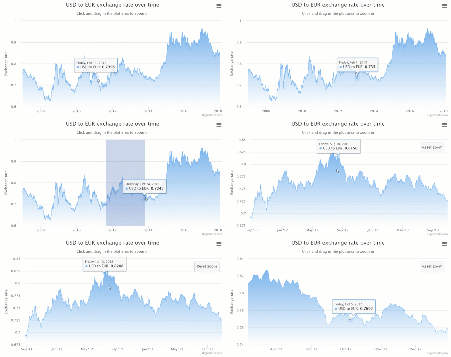
- Add the drill-down, zooming features, tooltips, bubble legends, scrollbars.
- Make charts responsive.
It’s also possible to extend Highcharts functionality by writing custom plugins.
General impression
Highcharts stand out from the rest thanks to a wide variety of responsive charts for all purposes and the ease of usage – the code is incredibly developer-friendly.
If you want to communicate your data effectively, this library is a perfect choice.
Dashboards with Highcharts and WebDataRocks:

FusionCharts is one of the most widely used charting libraries written in JavaScript.
It offers three types of installation: via CDN, npm or locally.
Chart types
Once you start working with FusionCharts, a broad spectrum of charts is at your disposal: maps, columns, bar, line, area, pie, donut, stacked, bubble, scatter charts, heat maps, Gantt, Pareto, box and whisker, bullet charts, gauges, and more.
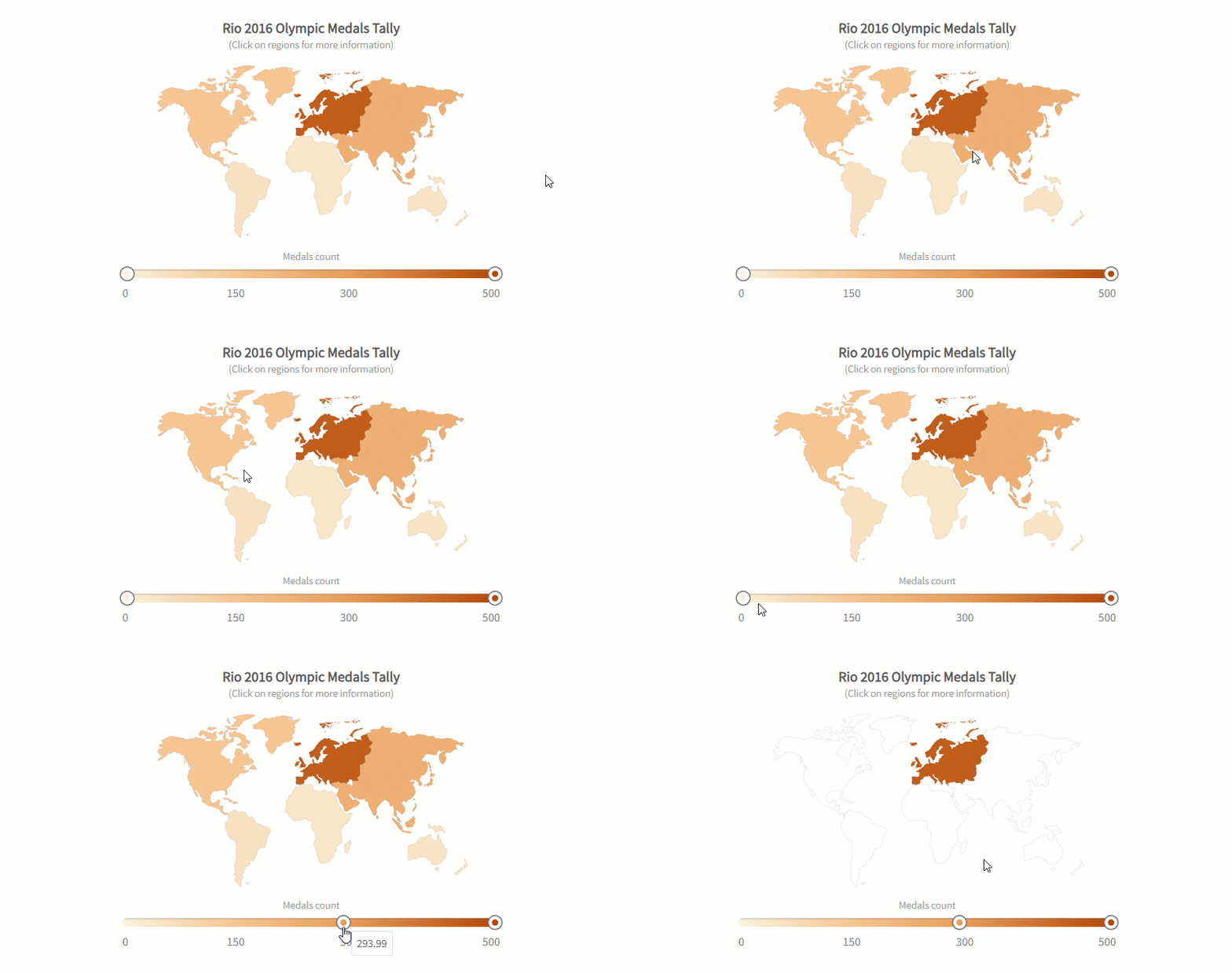
All charts are categorized by purposes and accompanied by the code you can play with.
Most of the charts are available in 3D versions. There are also their real-time charts which means you can stream real-time data through charts. Another benefit is that there are a lot of charts for time-series analysis.
Integration options
It integrates easily with such front-end technologies as React, Angular, jQuery, Vue, Ember, AngularJS, and React Native. Plus, it works well with apps that are written in Java, PHP, Ruby on Rails, Django, ASP.NET.
If you want to integrate FusionCharts with Highcharts – it’s not a problem as well.
Customization options
Personalize charts by changing colors, titles, labels, add tooltips, animations, and exporting options, apply themes. Using API events, you can build custom scenarios around the component.
You can even add a special extension to make charts more accessible to any end-user and great looking on any screen and device.
Documentation
The documentation is user-friendly – it walks you through the basics to advanced custom charts creating. What is more, you can take a look at how to build each chart using various frameworks.
If you want to develop your storytelling skills and learn how to communicate information, we strongly recommend delving into the Data stories section where you can find many industry-oriented demos.
General impression
Regardless of your level of expertise, it takes a brief time to figure out how charts work and configure them. This is all thanks to a rich gallery of examples.
Dashboards with FusionCharts and WebDataRocks:
- Sales analysis with the pivot table and charts
- Dashboard with the pivot table and charts: dark theme
- 3D bar chart and the pivot table

Google Charts is one of the most popular services for creating web-based data visualization. It’s created and maintained by Google.
You can install it by simply including JS scripts and loaders to your web page.
Data
The simplest way to use Google Charts is by setting JSON data in the chart’s configuration. Under the hood, it will be represented by DataTable and DataView classes.
Other options include connecting data from your database, importing data from Salesforce, Google Fusion Tables, or Google Sheets. As an advanced option, you can implement your data source protocol to fill the charts with data from custom data sources.
Also, you can embed charts right in spreadsheets.
Chart types
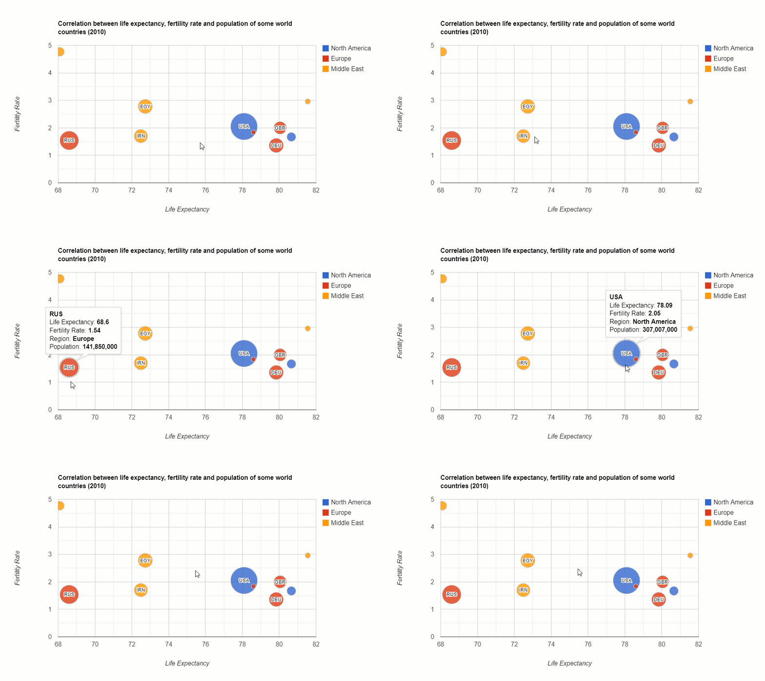
It offers pre-built visualizations that serve for diverse purposes: bar, column, combo, area line, geo, pie, donut, bubble, scatter charts, histograms, gauges, timelines, candlestick charts, word trees, and a lot more.
Integration options
There are no official integration guides with frameworks but you can find wrappers for Angular, React, Vue, and TypeScript definitions contributed by passionate developers.
Customization
You can customize the look and feel of every chart effortlessly by setting their options in the chart’s draw() method.
Change axes, formatters, lines, crosshairs, points, overlays, tooltips, animations, add toolbars – it’s all possible.
If you want to run certain scenarios upon the user’s actions or describe complex interactions between charts and widgets placed on the same web page, you can do it with events.
Chosen charts are available in material design which makes charts look modern in any app.

Do you want to be the first to test the grid with your data?
Documentation
The library’s functionality is well-documented and exemplary. The structure of the documentation is intuitive and consists of many tutorials. It guides you through all the important aspects of visualizing data: from installing the library to creating advanced web dashboards.
General impression
Charts are easy-to-use for both beginners and skilled developers.
Check out how to create a dashboard with WebDataRocks Pivot and Google Charts:
- Sales analytics
- WebDataRocks Pivot Table with Google Charts Map
- Marketing analytics with WebDataRocks and Google Charts
- WebDataRocks with Google Charts: Bubble Chart

AmCharts is a charting library that can brighten up any project with truly eye-catching visualizations. Among customers, there are Amazon, eBay, Microsoft, CISCO, Apple, PayPal and a lot of other outstanding companies.
The library runs on any platform and browser and can be used with mobile platforms.
You can include it via CDN, npm or install it right on your server. Note your browser must support SVG technology (which is true for all modern browsers).
To make it work perfectly on mobile devices, you can activate touch-specific UX features.
Chart types
A collection of charts contains pie, line, column, pyramid, polar, dumbbell, bubble, stacked column, Gantt charts, histograms and many more. It also comes with plenty of charts for visualizing time-series data. You can also visualize geographical data with maps.

With minimum lines of code and using an object-based approach, you can build any chart.
Integration options
You can use it with vanilla JavaScript, React, Angular2+ projects. It also integrates with Ember, RequireJS, Cordova / PhoneGap, webpack. You can use it as a plugin for WordPress.
The latest version is written in TypeScript, therefore, there are no problems in integrating with this language.
Customization
You can tailor colors, gradients, patterns, themes, zoom and localize charts. Besides, it’s possible to enable responsive settings of charts to make them look accurate on any device’s screen. The adapters can be used to override the default functionality.
Also, charts support right-to-left (RTL) languages such as Arabic, Aramaic, Hebrew, Farsi, and others.
To complement the existing functionality with new features, you can load extra plugins (e.g., Regression trend lines, Slice Grouper)
Documentation
We’d like to note that the product is well-documented and the documentation is nicely organized by logical sections. What is more, each demo contains the source code that helps to understand how to use charts with frameworks. You can simply copy-paste and create a chart.
General impression
All in all, this library is definitely worth your attention. Feel free to use it in your data visualization projects.
Check out how to create a dashboard with amCharts and WebDataRocks Pivot:

AnyChart is a JavaScript library that provides a collection of beautiful charts that run on any device and browser, including IE 6 and can be integrated with any app.
A lot of companies, startups, governmental and educational organizations all around the world choose AnyChart. Among the largest ones, there are Microsoft, Ford, Samsung, At&T, Nokia, Bosch, Oracle, McDonald’s, Citi, and others.
Chart types
There is a family of products that serve different purposes. You can use AnyStock to visualize financial data, AnyMap to display data in maps, AnyGantt to track performance inside the organization.
Other kinds of charts and maps you can try are area, bar, bar mekko, box, pie, Pareto, line, error, bubble, cherry, bullet, column charts, gauges, maps, candlestick and bullet charts, and many more. All of them are noteworthy.
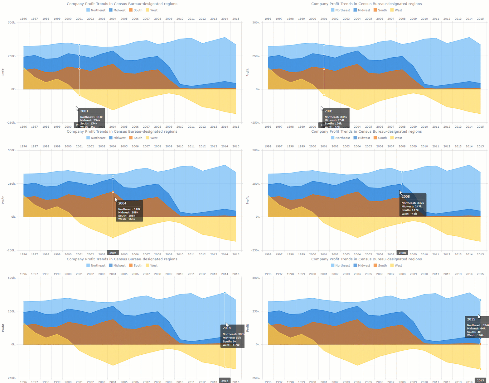
Besides, the list of charts is constantly updated.
Integration options
Works well with scripting languages (PHP, ASP, ColdFusion, Perl).
Integrations with Elasticsearch and Backbone are planned.
Customization
You can customize everything manually or by using scripts.
Documentation
The documentation allows walking through all general concepts of using charts effortlessly. It’s divided into sections: the General User’s Guide is a great place to start with, the API Reference with all properties and methods, the Playground – a sandbox for running charts, and Chartopedia for discovering all kinds of charts.
General impression
This lightweight charting library offers brisk visualizations that deserve to be a part of your data visualization project.
Dashboards with WebDataRocks and AnyChart:

ChartJS is a free and open-source JavaScript charting library.
Getting started is easy: you can install it via CDN, Bower, jsDelivr, or npm and create your first chart.
Data
To fill the chart with information, you should make sure that your data fits the structure required for a certain type of visualization. In most cases, it’s an array of numbers or objects.
Chart types
There are eight kinds of charts you can add to your project: bar, line, pie, radar, area, bubble, scatter and a polar area.
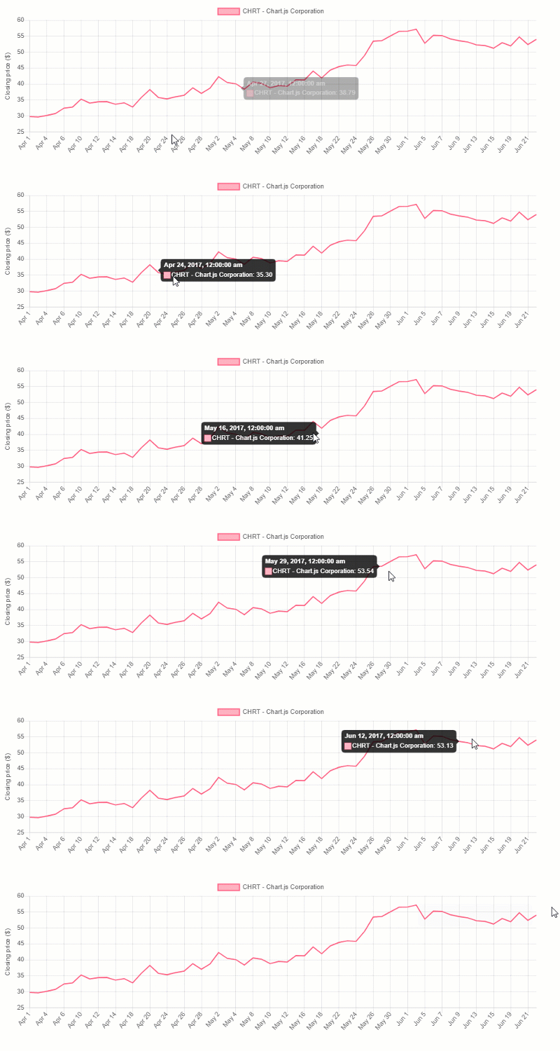
All charts are rendered in canvas elements that are supported in all modern browsers.
Customization
You can configure fonts, colors, texts, tooltips, scales, chart’s size, gradients, as well as add scriptable properties and transitions.
What is especially cool is the ability to configure animations. There are a lot of easing functions that modify the motion of charts.
Also, try using plugins – they represent an extra way to change the charts.
Integration options
You can use ChartJS with plain JS and various bundlers. There are also React, Meteor, Vue, Ember, Angular wrappers available.
We recommend trying extensions for ChartJS that extend the capabilities of the original charting library. The extensions are contributed by developers – you can support this trend and suggest your ideas of making charts better.
Documentation
The most important information is at your fingertips in the documentation which is short yet comprehensive.
General impression
ChartJS is lightweight and simple. The visualizations it has to offer are enough for basic data exploration. But if you need more diverse charts (e.g., for statistical analysis or visualizing geospatial data), it’s better to stick to other solutions presented on this article’s list.
See how to create a data dashboard with WebDataRocks Pivot and ChartJS:
Putting it all together
In this blog post, we’ve covered top JavaScript data visualization libraries and showed how these can be combined. We encourage you to take some time exploring the data in interactive dashboards. Hopefully, these will help to improve your data analysis and bring value to your business.
Extra: pivot table personalization
We believe customizing should be easy. Hence, we’ve prepared plenty of tutorials to make your pivot table component look and work uniquely:
- How to change the theme of the pivot table
- How to use conditional formatting in the pivot table
- How to customize the Toolbar of the pivot table
- How to create a custom theme for the pivot table
- How to localize the pivot table
How to become a better developer
Searching for ways to improve your programming skills? Try GitConnected – here you can find a rich collection of the most up-to-date coding tutorials.

Microsoft Excel is spreadsheet software that has been a standard on the market of reporting tools for many years. It’s designed to assist you in summarizing and analyzing data or keeping it in tabular format. Excel is also loved for its diversity of mathematical formulas for every situation. They come in handy when you need to solve a complex mathematical problem.
Excel is one of the most widely used reporting software in the business world. A lot of small and large companies use it for different data analysis purposes.
But before investing in licensed software, you can try other solutions that offer more flexibility and allow visualizing data right in your app.
Today we’ll research on the features of two tools for reporting – WebDataRocks and Excel and compare the ways they provide reporting experience.
We hope this article will help you to pick what is right for you.
Overview of features: Excel
Interface & learning curve
Excel strikes with the available functionality related to data visualization. But once you are taken to its workspace, it’s easy to get lost among the variety of tabs and bars. Figuring out the purposes of each one may be overwhelming for a newcomer. It often takes a lot of time before you learn how to navigate swiftly and efficiently. In general, the learning curve for adapting to Excel can be described as steep. You need to invest a lot of time to learn how to do reporting rather than extracting value from the data.
Scalability & performance
Performance is always a key consideration in any data analysis and reporting process.
Excel ensures fast data access and processing because of the way it manipulates memory. When you are working with spreadsheets, an entire file is loaded into RAM. On the one hand, this approach speeds up data access. On the other hand, the whole document has to be reloaded into RAM again once you make any small change to your current workbook.
Thus, working with spreadsheets that contain large amounts of data (~ 200k records) can be rather slow and not efficient.
Customizability
If you are willing to change some parts of the interface, you can personalize the Ribbon, Quick Access Toolbar, change the language, etc. In this sense, Excel is customizable enough.
Integrations
Excel works with almost every other product of Office 365. You can add spreadsheets to presentations or text reports.
But to move data between Excel and any third-party app, you need to use external services since there are no off-the-shelf integration options available.
Working online
Not only can you use Excel as a desktop app but also in the web browser. Pay attention to the fact that there are certain variations in the functionality of both versions. However, it’s not possible to embed Excel into a web application.
Teamwork
Shared workbooks had many limitations previously but now you can use Excel for collaborative work with the help of the `Co-authoring` feature. Provided that you have a cloud-based version of Excel (as part of an Office 365 subscription), your colleagues can have remote access to your spreadsheets and see updates nearly in real-time. Without this subscription, another way to send a report is via an e-mail or a portable storage media which leads to duplicating information and is a neither secure nor convenient way to share the data.
Excel as a data storage
Many companies use Excel as a database. Despite certain similarities between spreadsheets and databases, Excel lacks the capabilities of a database management system. Spreadsheets can’t meet the requirements on data integrity, consistency, security, ease of updating and retrieval of data. Moreover, as mentioned before, multiple users can’t access and update such a kind of database at the same time if they don’t have ‘Co-authoring’ feature enabled.
Considering all, it’s more convenient and reliable to keep your data in relational databases rather than store it in spreadsheets.
What about Pivot Tables?
Excel is primarily known for its pivot tables – the most indispensable tool when it comes to summarizing the data and getting insights from it.
But be aware that adding pivot tables may affect the performance – they double increase the workbook’s size because of the large caches they require.
Cost
Excel is not expensive for companies but can be costly for individual users.
Conclusion
Many people use Excel because it’s comfortable and they get used to it.
But why not break out of your comfort zone and move towards web-based solutions? Especially if you have exhausted the possibilities of Excel’s pivot tables.
It’s worth to note that using web pivot table components instead of Excel pivot tables implies going to a programmatic approach. The advantage of such an approach is that you can embed the component into any app, fully control the access to it and tailor pretty much every aspect of your reporting experience.
And this is where WebDataRocks comes into play.
WebDataRocks
WebDataRocks is a client-side pivot table component designed to provide data analysts with summarized data in the form of a tabular report. You can easily embed this tool in your web application and empower your end-users with reporting.
Let’s see what it has to offer.
Interface & learning curve
To make your learning curve less steep, we developed a highly intuitive interface that enables you to concentrate solely on the reporting purposes without being distracted by redundant functionality. All vital features are at hand, most of them are accessible via the Toolbar.
Customizability
You can customize WebDataRocks according to the style of a particular application, add or remove tabs to/from the Toolbar, and leave only the features which you need. You can easily switch between different layouts, apply predefined themes, add icons to the cells, and change everything through the UI or in code to make the component look natively in your app.
Additionally, you can bring to life your ideas about design and create a custom report theme.
Flexibility
The previously mentioned customization options are what make WebDataRocks a flexible reporting tool that ideally suits Agile practices. In particular, it adapts to such Agile principles as continual improvement and flexible response to changes.
Integrations
As a developer, you can experience the freedom of integration with popular frameworks such as React, Angular, AngularJS, Vue, and more.
To facilitate the integration process, you can make use of the available tutorials:
Besides, you can follow an API-first approach with a lot of API calls that make interacting with the tool easier and allow building your scenarios around the component.
Responsiveness
Works perfectly on all browsers and mobile platforms. Looks natively in any app.
Charts
In Excel, you are limited to use default charts and apply a set of defined styles to them. Of course, you can install some add-ons of 3rd-party charting libraries but it takes time to figure out how to use them in Excel’s workspace.
Here is how we solved this problem in WebDataRocks – you can integrate the pivot table component with any charting library you like. All you need to do is to pivot your data and pass it to any kind of chart. To make things easier, we prepared a series of tutorials on integration with the most popular charting libraries. If your favorite library is not on the list, you can make use of webdatarocks.getData() method to preprocess the data accordingly to the format the chart requires.
Ease of use and configuration
With little or no IT help, you can set up a powerful data visualization tool in no time. The Quick start guide will walk you through the basics of working with the component.
Teamwork
We know how teamwork matters: it provides the company with a diversity of thoughts and perspectives. After installing your instance of a pivot table tool, you can give role-based online access to analytics inside the application. Moreover, you can customize it to make a read-only mode of the pivot table.
Saving reports
We protect you from losing your working results.
Save the report in a JSON file and restore it anytime.
Sharing results
The exporting of reports is meant to be as fast as possible – WebDataRocks comes with exporting functionality bundled in which means there is no need to install custom plugins for exporting to PDF, HTML, and, of course, Excel. You can even send your report for printing. If you need to send the report to a server, it’s not a problem at all as well. To make that possible, you can customize exporting configurations with a few lines of code.
Data size
You can load up to the 1MB of data.
Cost
Free.
You can get WebDataRocks at no cost and save your money for other business investments.
Integration with Excel
To help you make the best of both Excel and WebDataRocks, we made a transition from Excel to WebDataRocks as smooth and simple as possible.
You can load your CSV data into the pivot table component and start pivoting your data in a new web-based interface.
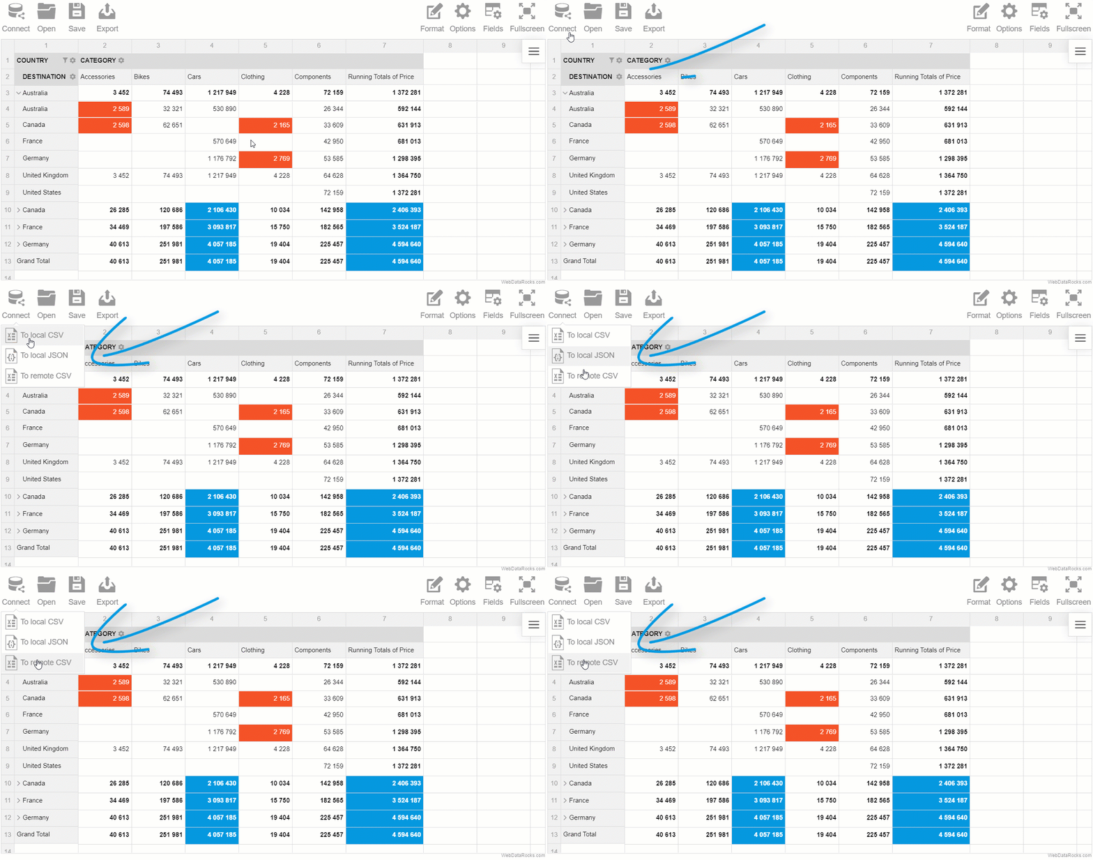
Besides, if you feel you miss the spreadsheets and want to see the raw data, you can always switch to the flat mode and view non-aggregated data in a row-by-row manner.
Putting it all together
Today we reviewed the capabilities of a desktop reporting software (Excel) and a web-based pivot component (WebDataRocks). While the former is a great example of a standalone application, the latter can be successfully used as an integrated component of a larger Business Intelligence platform.
The choice is yours.
Live demos
How to become a better developer
Searching for ways to improve your programming skills? Try GitConnected – here you can find a rich collection of the most up-to-date coding tutorials.

Collecting high-quality data is a fundamental prerequisite for starting any data analysis or machine learning project.
However, you may notice that looking for a really thought-provoking dataset can be a burdensome process and usually entails spending a lot of time. So as to save your precious time for deriving insights from the data, WebDataRocks team prepared a carefully selected list of free repositories with real-world data, ready to boost your project.
Let’s start exploring them!
Contents:
- Socrata OpenData
- Kaggle
- FiveThirtyEight
- UCI Machine Learning Repository
- ProPublica
- Yelp
- InsideAirbnb
- data.world
- Data Hub: Collections
- Quandl
- NASA datasets
- Wikipedia
- The World Bank
- Data.gov
- Pew Research Center
- Google Dataset Search
- Google Public Datasets
- AWS Public Datasets
- Academic Torrents
Socrata OpenData
One of the largest and most powerful search engines, which hosts thousands of datasets on the topic of finance, infrastructure, transportation, environment, economy, and public safety. What is more, all the datasets are categorized by use of machine learning algorithms, which makes this platform even more intriguing.
Try digging deeper to find here the most challenging datasets for your work.
Developers may find useful the fact that Socrata OpenData exposes the Discovery API which presents a mighty way for getting access to all the public data from the platform. Another great feature for developers is the fact that API calls return nested JSON objects which are easy to understand and parse.
On top of that, there are a lot of examples of data visualization and short tutorials which allow you to explore data interactively with charts. Here you can also find wrappers for accessing features of Socrata OpenData from various server-side languages.
If you want to become a contributor, read the Publisher guide to know how to upload your data.
Kaggle
Literally, Kaggle is the greatest data science platform and community which impresses with a diversity of datasets, competitions, examples of data science projects. Apart from educational purposes, it gives a chance to win financial rewards in competitions, hosted by the leading companies which yearn for understanding their data better.
But competitions are more about journeys to the data science realm rather than winning the first places. You should definitely bring all the available opportunities into play to master the skills required for your career as a data scientist.
It should be noted that this resource contains mainly cleaned data, especially if it’s a part of a competition’s kernel. Datasets can be searched by different tags.
To experience a competitive and challenging environment and test your strengths, you can try participating in the following open competitions:
Or build visualizations and ML models around these datasets:
FiveThirtyEight
Keen on data-driven articles and graphics created by writers of FiveThirtyEight blog? Have a peek into the data that is at the heart of visualizations. You can download the data from this online collection of data or the GitHub repository. Also, you can navigate right up to the journalistic article where it was used.
Most of the visualizations that you can find here are interactive. And we encourage you to create your own variant of the analysis and visualization.
UCI Machine Learning Repository
A comprehensive platform that hosts datasets for machine learning tasks for many years. This is a classic place to start your machine learning path which is supported by the National Science Foundation. Every dataset is well-described – you can check its default task, attribute types, data types, and other features. Many of the datasets are quite small but still great for educational projects.
ProPublica
This American nonprofit organization is recognized for noteworthy investigative journalism. But it’s also known for offering a versatile data repository that covers health, criminal justice, education, politics, business, transportation, and finance topics. Besides, it’s frequently updated.
The collection contains both paid and free datasets. Paid datasets, in turn, are available under academic, commercial, students and journalist licenses.
ProPublica also cares for the ways to access data by exposing five APIs which simplify retrieving data.
Yelp
Have been waiting for the opportunity to create your project but didn’t know how to start?
Then you can’t miss a perfect chance to improve your research and analysis skills on Yelp – one more platform that provides ready-to-use data and encourages both newcomers and skilled data scientists to solve problems.
Not only can you participate in the challenges but also win cash prizes.
After downloading and playing with the data, as the next step, you can submit your project by filling the application form. It can be presented in any format – a paper, video presentation, website, blog, etc – anything that confirms your using of the data.
Do not pass by this place – it’s not only for students. Feel free to participate in challenges and discover your hidden talents.
InsideAirbnb
A data service created and maintained by Airbnb company. It hosts a unique collection of the Airbnb’s data which is categorized by regions and countries. You can browse data for your particular city and explore insightful reports with creative visualizations. But we recommend getting the data and exploring it deeper with your favorite tools.
data.world
Being an open community for developers, data.world is a real treasure for everyone who is passionate about data analysis. More than 450 datasets for all tastes and purposes are freely available in the collection. Most of them are close to the modern world and, henceforth, require cleaning. Since cleaning data is an important stage of any data science project, here you are given an opportunity to practice these skills.
Datasets cover finance, crime, economy, education, census, education, environment, energy, sports, NASA, and a lot more topics.
Besides, you can even contribute your own data.
Signing up is a piece of cake – just use your GitHub account to register and get access to all the datasets.
Working with data is easy as well – you can write SQL queries through the site interface, use SDKs for Python or R or simply download the data file.
Data Hub: Collections
A rich data catalog containing datasets on various topics: economic, climate, education, logistics, healthcare, and more. On the dataset’s page, there are embedded visualizations built with Plotly, which give you a quick overview of data trends.
If you can’t find data you are looking for, you can even make a free request for it.
You will be impressed by a variety of means to integrate the dataset into the tool you are using. There are code snippets that show how to use data with R, Pandas, Python, JavaScript, cURL, and data-cli. Also, you can simply download CSV or JSON datasets.
Quandl
It positions itself as a not to be missed platform with financial and economic data that help power data-driven strategies. Here you can find free and pre-paid datasets. For data retrieval, Quandl provides a free-to-use API which acts as a single interface. Also, you can access data from Python, R, Ruby with the help of modules and packages. The Add-In for Excel is available as well.
NASA datasets
Enthusiastic about space-related projects?
Then this repository is a real find for you. It contains Astrophysics, Heliophysics, Solar System Exploration data, and Image Resources.
Wikipedia
Surprised to see Wikipedia on the list? Yes, you can use it not only for educational purposes. Wikipedia also offers ways of downloading and querying data. You can read more about them in this guide.
The World Bank
A huge repository which provides free access to global development data. You can search datasets by countries, regions and economic or demographic indicators.
With the help of online data visualization tools, you can explore data interactively using charts, tables, maps, build reports in no time, style them, share and embed. Datasets are available as CSV, XML and Excel files.
Data.gov
A repository of public datasets from US government agencies. The datasets related to climate, consumers, education, ecosystems, energy, finance, manufacturing, science are at your fingertips.
Datasets are available for public use but sometimes you have to agree to license agreements before downloading and using data.
Another great thing is that you can submit data stories to share with the world your ways of using data. There are also a lot of challenges you can participate in.
Pew Research Center
Pew Research Center is known for publishing survey reports and various kinds of analysis. Its researchers make datasets that lie at the core of reports available to the public. Many of datasets are provided as .sav files, therefore, you should know how to use SPSS or R. With them you can discover religious, political, social, journalistic and media trends.
Google Dataset Search
Dataset Search is a powerful search engine that exposes a convenient interface through which you can access millions of datasets from around the world. This relatively new product launched by Google has been already favored by scientists, data journalists, and students who need to find scientific, social, environmental, or government data. A huge plus is that the volumes of the data are growing fast.
After querying data, you’ll see the list of repositories, including academic ones, from which you can download it.
If you want to publish your data, follow these quality and technical guidelines which help understand how to describe uploaded datasets.
In general, Google Dataset Search copes well with the goal of making data more accessible to everyone.
But what if you want to practice analyzing big data?
Google Public Datasets
Visit the Cloud Public Datasets Program catalog to find large and amazing datasets. All of them are stored in BigQuery and can be accessed through the Cloud Public Datasets Program. Though you need to pay for the queries that you perform on the data, you can make use of the first 1 TB of free queries.
AWS Public Datasets
You can search datasets from the Amazon Web Services platform through the Registry of Open Data. Datasets are available in the public domain. Here you can also find a lot of fascinating usage cases which may inspire you for starting new scientific or enterprise projects. They cover details on using data by organizations, implementing recommended systems, predicting stock prices, etc.
Besides, you can make your personal contribution by sharing data on AWS.
To start working with data, simply download it or get access from the cloud with the help of EC2 or Hadoop.
Academic Torrents
A distributed system that contains more than 45 TB of data for research. Pay attention to license terms – most datasets are allowed to be used for non-commercial and educational purposes.
Here is the list of some popular datasets:
- ImageNet Large Scale Visual Recognition Challenge (V2017)
- VA: A Large-Scale Database for Aesthetic Visual Analysis
- Google Open Images
Final words
You are more than welcome to explore the above-mentioned collections of data. To get an even more complete list of amazing datasets, we recommend referring to this GitHub page.
We do hope you’ll find your perfect dataset for conducting data-driven researches and satisfying your intellectual curiosity about trends in certain areas of our diverse life.
Good luck with your data analysis and machine learning projects!
Tools for data visualization
To extract the value from your data, you can try visualizing it with WebDataRocks Pivot Table and a charting library of your choice. Here are the tutorials which will help you get started:
- WebDataRocks Pivot Table with Google Charts: How to use
- How to visualize data with Pivot Table and FusionCharts
- WebDataRocks integration with Highcharts
To advance your programming and analytical skills, we recommend searching for courses and tutorials on GitConnected.

In WebDataRocks, we care about your reporting experience and make every effort to deliver value to you on a daily basis.
In the light of the new release, we are delighted to introduce to you new awesome aggregation functions and report themes enhancements.
New aggregations
Starting from version 1.1.0, you can calculate the following measures right in the pivot table component:
- Running totals
- Median
- Sample standard deviation
- Population standard deviation
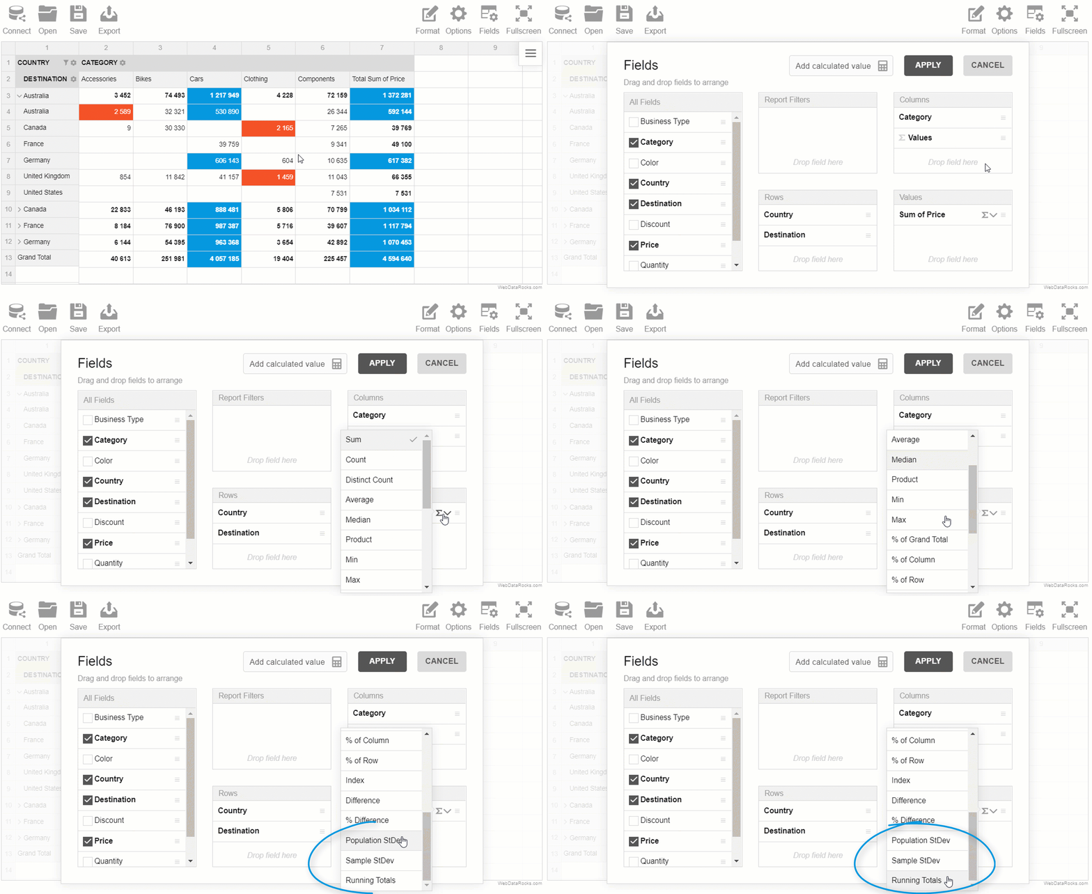
Let’s figure out why these aggregations may become handy for your reporting and data analysis.
As well as average, the median is extremely important in the statistical analysis since it represents the middle of a dataset. Unlike the mean (average), it’s less affected by outliers and skewed data.
The standard deviation is another important statistic (parameter) that helps to measure the spread of data distribution.
We implemented two versions of this aggregation – population and sample standard deviations.
One more aggregation you can benefit from is the running total aka cumulative sum. It’s simply a total which is changed every time a new value is added to the list of numbers. A nice thing about the running total is that you can check the total at any moment without having to sum the whole sequence every time.
Styles enhancement
The appearance of the reporting tool is no less important than its functionality.
Therefore, we made minor improvements to lightblue and teal report themes and fixed issues with colors so as to make your pivot table stand out from the rest.
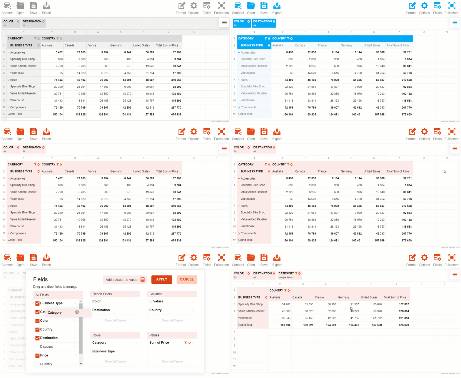
You can try all the themes in our demo.
Test new features now
Explore our demos to try new aggregations ?
Or install a new version of your favorite reporting tool via npm ✨
Thank you for entrusting your data analysis and reporting to WebDataRocks. We do our best to help you turn your raw data into rich and comprehensible reports.
There is much more to come.
Stay tuned to new updates!
Meet us on social media
Follow us on Twitter to keep track of the latest developments and tips & tricks on data visualization.
Subscribe to our CodePen profile to be the first to know about new mind-blowing demos.
What to read next?
- Learn about all aggregation functions in the Technical specifications section.
- Immerse into the purposes and features of a pivot table in our blog post.
- Need to improve your digital marketing strategy? And here the pivot table is ready to assist you.

To help your audience get insights from your report, the best practice is to place accents on the most important chunks of information in it. Highlighting data makes your report more efficient and easier to perceive.
Today we’ll show how to highlight trends in your data by substituting individual values with custom icons.
Our reporting goal is to identify successful and unsuccessful months in terms of revenue.
To see the results right away, you can scroll down to the CodePen demo at the end of the tutorial.
Let’s head over to practice!
Initialize Pivot Table
Following the steps from the Quick start guide, embed a pivot table component on the web page.
Now it’s time to fill the pivot table with the data.
Connect to your data source (CSV or JSON) by specifying a URL to the data file or defining a function which returns the data.
Here is how you can define the data provider:
function getData() {
    return [{
            "Country": "Spain",
            "Revenue": 33297,
            "Date": "2018-02-21T08:05:23.683Z"
        },
        {
            "Country": "France",
            "Revenue": 232333,
            "Date": "2018-02-21T08:05:23.683Z"
        },
        {
            "Country": "France",
            "Revenue": 66233,
            "Date": "2018-03-21T08:05:23.683Z"
        },
        {
            "Country": "Spain",
            "Revenue": 27356,
            "Date": "2018-03-02T18:57:56.640Z"
        }
    ]
}
Now tell the pivot table where to get the data by specifying the function in the dataSource attribute of report:
dataSource: {
    data: getData()
}
Specify a slice
Define which hierarchies you need to see on the grid. Put them to the rows and the columns. Choose fields for the measures and apply aggregation to them.
In our sample, we’ll put “Date.Month” to the rows, “Country” to the columns and “Revenue” to the measures.
"slice": {
    "rows": [{
        "uniqueName": "Date.Month"
    }],
    "columns": [{
            "uniqueName": "Measures"
        },
        {
            "uniqueName": "Country"
        }
    ],
    "measures": [{
        "uniqueName": "Revenue",
        "aggregation": "sum"
    }]
}
Also, you can apply filters now or later via the UI.
Customize cells based on a condition
Now that your report is ready, it’s time to emphasize the numbers that speak most.
Our main helper will be customizeCell. With this powerful API call, you can easily change the style and content of any cell on the grid.
Here is how you can define customizeCellFunction:
function customizeCellFunction(cell, data) {
    if (data.type == "value" && !data.isDrillThrough && data.isGrandTotalColumn) {
        if (data.value < 200000) {
            cell.text = "<img src='https://static.webdatarocks.com/uploads/2019/02/21213347/icons8-decline-64-1.png' class='centered'>";
        } else if (data.value >= 200000) {
            cell.text = "<img src='https://static.webdatarocks.com/uploads/2019/02/21213348/icons8-account-64.png' class='centered'>";
        }
    }
}
What does customizeCellFunction do? This piece of code iterates over each cell and replaces the content of grand totals with an appropriate icon depending on its value. In a similar way, you can customize any CSS styles of the cells.
To make the icon fit the cell, apply the following CSS styles for the image:
img.centered {
    margin: auto !important;
    padding-bottom: 10px;
    color: transparent !important;
    width: 22px;
    height: 22px;
    display: flex;
    align-items: center;
    font-size: 12px;
    position: relative;
    bottom: 4px;
    left: 6px;
}
Here is how your pivot table looks now:
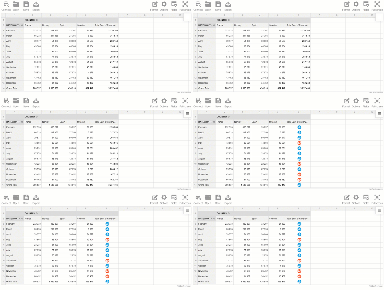
Share the results
Now you can export your report to HTML and send it to your teammates!
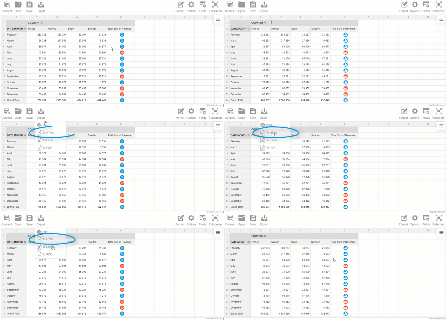
Live demo
Play with the code on CodePen?
Recommended reading
If you want to customize your pivot table more, we suggest reading the following articles:
- How to apply report themes
- How to customize the Toolbar
- How to use conditional formatting
- How to localize the pivot table
Attribution
The icons used in this tutorial are designed by Freepik from www.flaticon.com.

JSON stands for JavaScript Object Notation. It’s a syntax that allows storing information in a self-explanatory and readable manner. Any JSON data can be converted into JavaScript objects. And vice versa: you can convert a JavaScript object into JSON before sending it to a server. This is what makes it so powerful and irreplaceable for fast server-to-browser communication.
Why JSON
It’s favored by developers for its comprehensible structure. A JSON object contains key-value pairs which are called properties. The properties are separated by commas. You can access any property by referring to its name. Each object is surrounded by curly braces.
JSON for reporting
To work with WebDataRocks, you need to pass an array of JSON objects to the reporting tool.
But before loading your JSON data into the pivot table, you should make sure it’s valid.
To prevent any issues with your data, we recommend using JSON validators – special online web services that allow you to load your JSON and check whether it contains any errors. Therefore, we’ve carefully prepared for you an overview of the best JSON validators.
Instead of scrolling hundreds or thousands of lines of code so as find an error, use them. Not only they save a great amount of your time but also format your dataset accurately.
JSONLint
JSONLint is one of the most popular free validators and formatters for JSON data. It’s incredibly simple to use.
To validate your data, follow these steps:
- Paste the JSON data or a link to it into the input field.
- Click “Validate JSON”.
- Read a message – it tells whether there is a problem with your JSON and if so, it specifies the line where the error occurred.
- After correcting the errors, copy the formatted JSON data.
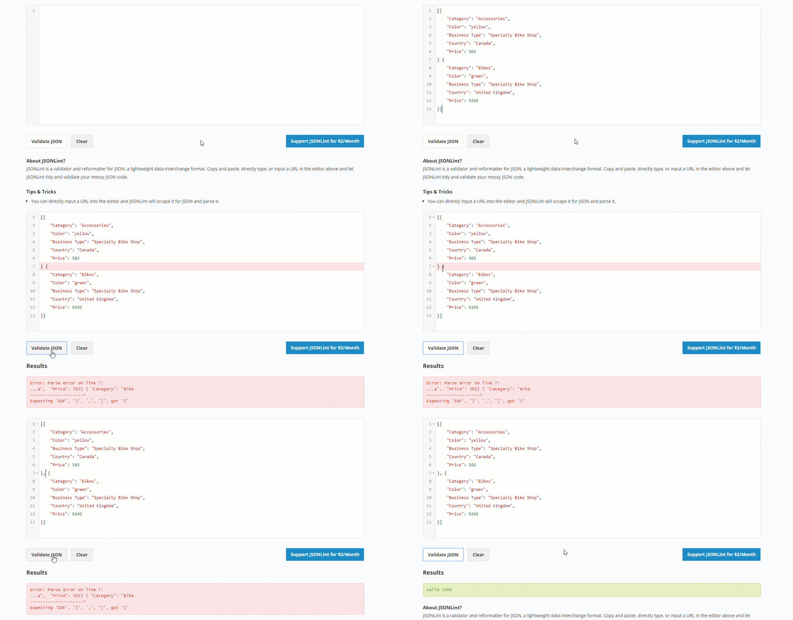
Now your data is ready to be loaded into a pivot grid.
JSON formatter
This free and powerful tool helps you validate, beautify and minify your JSON data. Along with validating functionality, it comes with extra features: you can set indentation levels, print the formatted data, convert it to CSV, YAML or XML formats and download the data into a file. Also, it’s a great option if you have nested JSON objects as it enables you to see the tree view of your data. We tested this validator on browser compatibility – everything works as expected in Chrome, Safari, Edge and Firefox browsers.
How to validate your data:
- Load the data by entering the URL of the file, pasting the data into the input field or browsing the file from your local storage.
- Click “Validate”.
- Choose tabs indentation, format your data and copy the resulting dataset or simply download it.
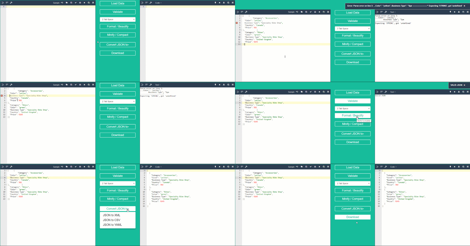
Summary
Preparing your data is the most important step on the way to successful data analysis. We hope these tools will make working with your data a trouble-free process.

When you use static reports to make up a baseline for your data analysis you should always keep in mind that they show only the static view of your data. To take a look at it in real time, the majority of data analysts opt for dashboards. The reason for that is because they provide more opportunities for exploring the data interactively, meaning you can always go deeper into the details or get the big picture.
Challenges
As a developer, one day you may receive a task to configure a dashboard and embed it into the business application. After you’ve found suitable tools, a lot of heavy-lifting may be involved in the integration process: compatibility with the software stack, customization challenges, overall performance, and, of course, budget limitations.
Also, since dashboards are powered by data which often comes from multiple sources, end-users should be able to connect it to the dashboard, switch between data sources and present the data in a consumable form as a result. The whole process needs to be completely time-saving.
What is the solution?
That’s where free JavaScript libraries come to the rescue.
WebDataRocks is a reporting tool that allows aggregating, filtering and sorting the data.
Google Charts is a data visualization library that provides with a wide range of charts and graphs.
With their help, you can build a low-cost yet effective solution for any analytical project with any front-end technology including Angular, AngularJS, jQuery and React. Both tools are lightweight and extremely customizable.
Today we will focus on creating a fully personalized dashboard for monitoring sales metrics. If you are eager to get hands-on experience, scroll down to the section with useful links and run the demo. It will be enriched with the dynamic report and responsive charts. We truly hope this tutorial will help you get a better understanding of how to combine the analytical features of a pivot table and the expressive power of charts.
Ready?
Let’s start!
Step 1: Define your problem & objectives
What is a data analysis without a purpose? Setting your goals from the very beginning is a milestone on the road to successful analysis. It’s better to have a clear idea in mind of what your end-users need to achieve in the long run.
For an illustrative example, let’s analyze the data of a fictional supply chain to understand its sales performance on a monthly basis as well as customer demographics.
Step 2: Add a reporting tool
A pivot table is an engine of a dashboard as it takes all your raw data and transforms into the summarized form.
Firstly, establish all the dependencies of WebDataRocks and include its styles into the <head> of your web page:
<link href="https://cdn.webdatarocks.com/latest/webdatarocks.min.css" rel="stylesheet"/>
<script src="https://cdn.webdatarocks.com/latest/webdatarocks.toolbar.min.js"></script>
<script src="https://cdn.webdatarocks.com/latest/webdatarocks.js"></script>
Secondly, create a container which will hold a pivot table:
<div id="wdr-component"></div>
Thirdly, add the component to your web page:
var pivot = new WebDataRocks({
    container: "#wdr-component",
    toolbar: true
});
Step 3: Prepare and load your data
Pull the CSV or JSON data from your database, CRM or any other data source.
You have three equivalent options of loading it into the pivot table:
- By specifying a URL to your data file:
"dataSource": {
    "dataSourceType": "json",
    "filename": "URL-to-your-data"
}
- By connecting to a data source via the UI:
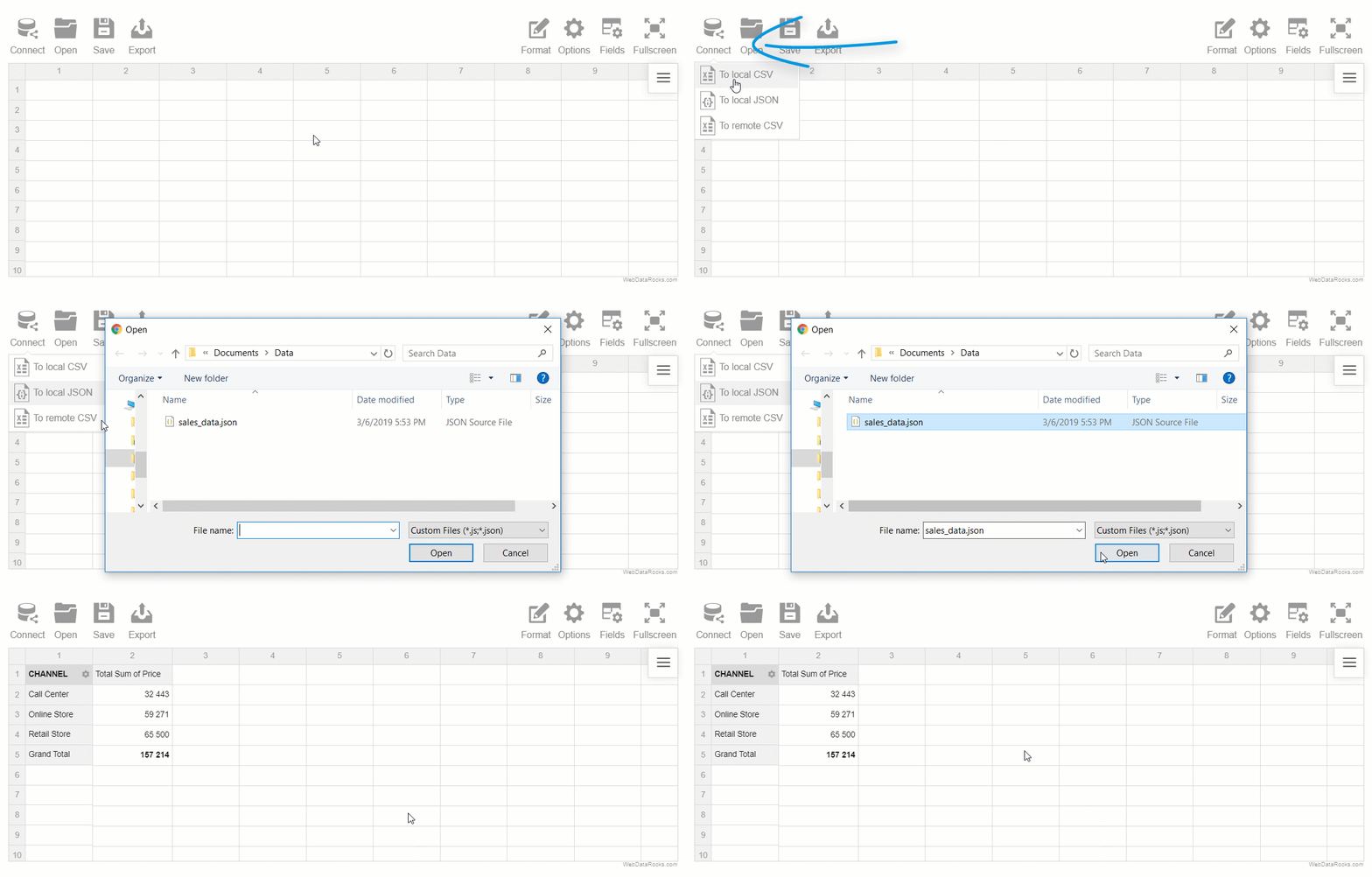
- By defining a function which returns the JSON data.
"dataSource": {
    "data": getJSONData()
}
Step 4: Create a report and aggregate the data
Firstly, set up a slice – it’s the most important part of the report where you specify which hierarchies to place into the rows and columns, apply various filtering and pick aggregation functions for your measures.
To extend the measuring capabilities, calculated values are at your disposal:
- Put the ‘Location’ hierarchy into the rows and ‘Product Group’ into the columns.
- Place the ‘Product’ hierarchy under ‘Product Group’ so as to be able to expand the latter to get more details.
- Create the ‘Sales’ calculated value and put it to the measures. It will help you track the revenue of our organization.
Please refer to the source code at the end of the article to learn how to set a slice.
Step 5: Connect to the charting library
Now that you aggregated data and displayed it on the grid, connect to the Google Charts library by including its Visualization API loader into the <head> of your web page:
<script src="https://www.gstatic.com/charts/loader.js"></script>
After that, load the package for particular types of charts (either in the <head> or <body> section):
google.charts.load('current', {
    'packages': ['corechart']
});
Also, you need to add the WebDataRocks connector for Google Charts that handles all the data pre-processing for the specific types of charts:
<script src="https://cdn.webdatarocks.com/latest/webdatarocks.googlecharts.js"></script>
Lastly, add containers for the charts:
<div id="combo-chart-container"></div>
<div id="pie-chart-container"></div>
<div id="bar-chart-container"></div>
Step 6: Bind the charts to the pivot table
To make the charts show the data from the table, you need to attach an event handler to the pivot table for the reportcomplete event.
reportcomplete: function() {
    pivot.off("reportcomplete");
    pivotTableReportComplete = true;
    createComboChart();
    createPieChart();
    createBarChart();
}
To track the pivot’s and Google Charts readiness, add two flag variables:
var pivotTableReportComplete = false;
var googleChartsLoaded = false;
Also, set the onGoogleChartsLoaded() function as a callback to run after the “
google.charts.load('current', {
    'packages': ['corechart']
});
google.charts.setOnLoadCallback(onGoogleChartsLoaded);
onGoogleChartsLoaded() is responsible for getting the data from the pivot and starting the functions that instantiate our charts:
function onGoogleChartsLoaded() {
    googleChartsLoaded = true;
    if (pivotTableReportComplete) {
        createComboChart();
        createPieChart();
        createBarChart();
    }
}

function createComboChart() {
    if (googleChartsLoaded) {
        pivot.googlecharts.getData({
            type: "column"
        }, drawComboChart, drawComboChart);
    }
}

function drawComboChart(_data) {
    var data = google.visualization.arrayToDataTable(_data.data);
    var options = {
        title: _data.options.title,
        height: 300,
        legend: {
            position: 'top'
        }
    };
    var chart = new google.visualization.ComboChart(document.getElementById('combo-chart-container'));
    chart.draw(data, options);
}
Similarly, you need to define the functions for a pie and a bar chart.
In the definition of each function, specify the chart types as the input arguments for
As the second and the third arguments, pass the functions that act as a callback and update handlers, meaning they are called once the data is loaded into the pivot table or updated. This way we make the chart react to the tiniest changes in our report.
Also, don’t forget to set the charts options to make them look awesome.
Step 7: Apply extra options
Let’s make our dashboard even more expressive and customize the grid cells based on the values.
With the customizeCell function, we’ll redefine the style and content of the cells with totals.
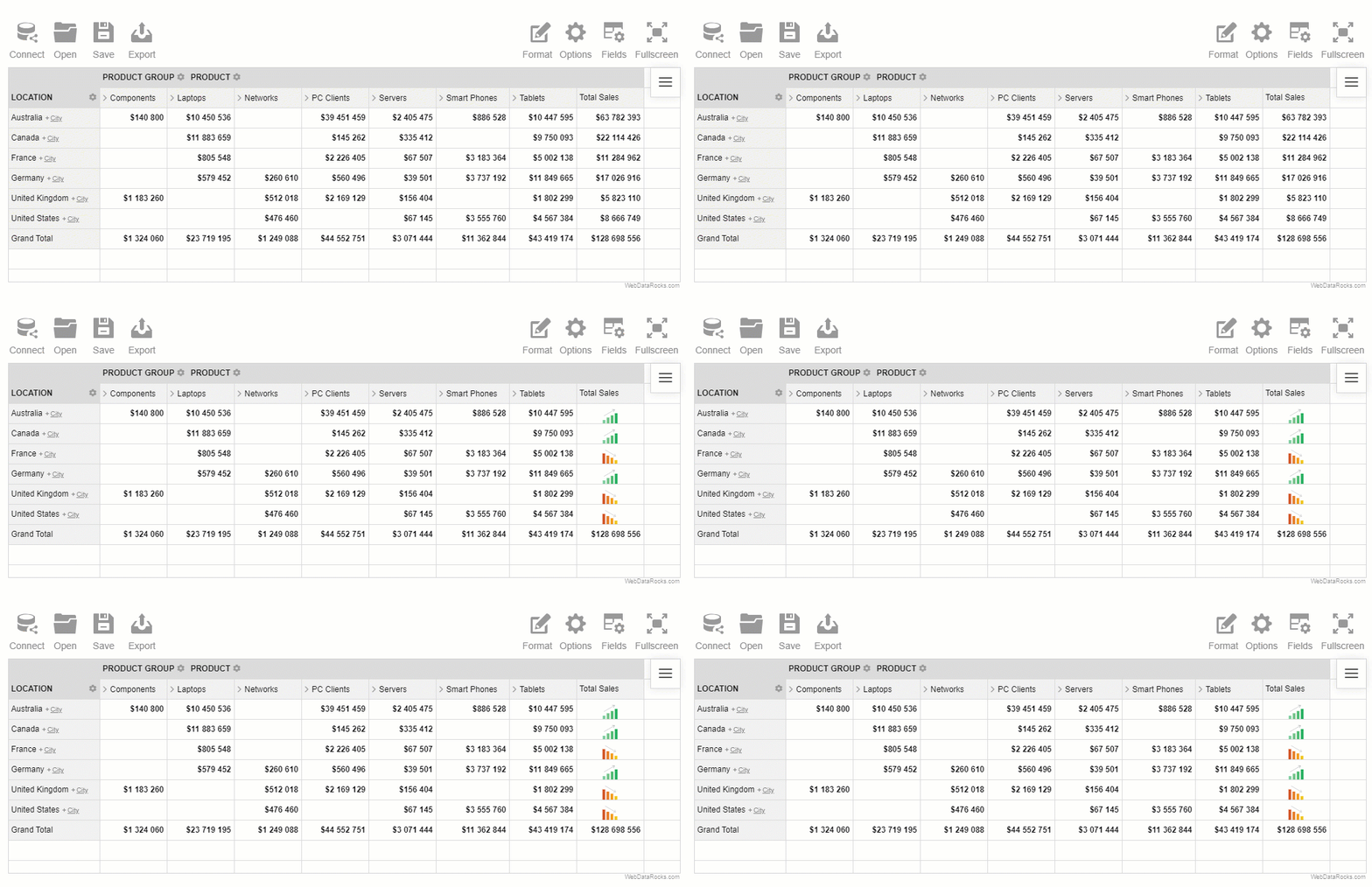
Now we can clearly observe the trends in our sales data, can’t we?
Step 8: Enjoy the result
Summarizing all the steps, today you’ve learned in practice how to build a sales dashboard with minimum code, maximum flexibility, and effectiveness. Now you can share it with your team and help them reveal deeper insights from the data.
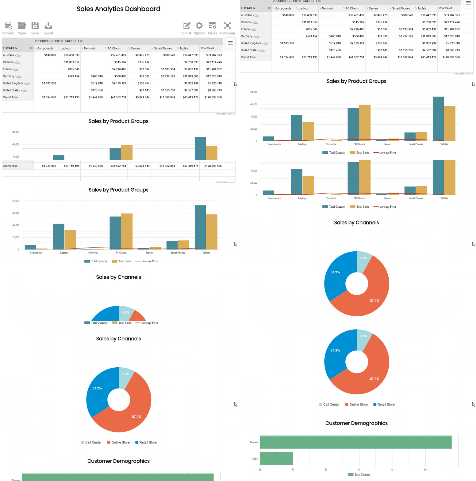
See a complete code in the live demo.
You can always tune the report and get the new view of your data in real-time – simply drag and drop the hierarchies to switch them, expand or collapse their members and drill through the records to see the raw data and reveal more insights. Feel free to add the report filters to focus on the months in which you are interested the most.

- Sales Dashboard Demo
- WebDataRocks Quick Start Guide
- Google Charts Quick Start Guide
- How to integrate WebDataRocks Pivot Table with Google Charts
- JavaScript tutorial on GitConnected for deepening your knowledge in JavaScript