How to build a real-time dashboard with WebDataRocks & Google Charts: a step-by-step guide
In this article
This tutorial walks you through creating a personalized sales dashboard, from defining objectives to integrating WebDataRocks and Google Charts, preparing and loading data, creating reports, and binding charts to the pivot table.
When you use static reports to make up a baseline for your data analysis you should always keep in mind that they show only the static view of your data. To take a look at it in real time, the majority of data analysts opt for dashboards. The reason for that is because they provide more opportunities for exploring the data interactively, meaning you can always go deeper into the details or get the big picture.
Challenges
As a developer, one day you may receive a task to configure a dashboard and embed it into the business application. After you’ve found suitable tools, a lot of heavy-lifting may be involved in the integration process: compatibility with the software stack, customization challenges, overall performance, and, of course, budget limitations.
Also, since dashboards are powered by data which often comes from multiple sources, end-users should be able to connect it to the dashboard, switch between data sources and present the data in a consumable form as a result. The whole process needs to be completely time-saving.
What is the solution?
That’s where free JavaScript libraries come to the rescue.
WebDataRocks is a reporting tool that allows aggregating, filtering and sorting the data.
Google Charts is a data visualization library that provides with a wide range of charts and graphs.
With their help, you can build a low-cost yet effective solution for any analytical project with any front-end technology including Angular, AngularJS, jQuery and React. Both tools are lightweight and extremely customizable.
Today we will focus on creating a fully personalized dashboard for monitoring sales metrics. If you are eager to get hands-on experience, scroll down to the section with useful links and run the demo. It will be enriched with the dynamic report and responsive charts. We truly hope this tutorial will help you get a better understanding of how to combine the analytical features of a pivot table and the expressive power of charts.
Ready?
Let’s start!
Step 1: Define your problem & objectives
What is a data analysis without a purpose? Setting your goals from the very beginning is a milestone on the road to successful analysis. It’s better to have a clear idea in mind of what your end-users need to achieve in the long run.
For an illustrative example, let’s analyze the data of a fictional supply chain to understand its sales performance on a monthly basis as well as customer demographics.
Step 2: Add a reporting tool
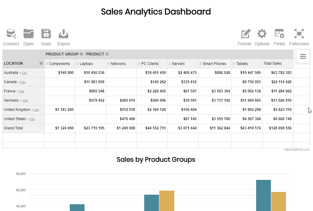
A pivot table is an engine of a dashboard as it takes all your raw data and transforms into the summarized form.
Firstly, establish all the dependencies of WebDataRocks and include its styles into the <head> of your web page:
<link href="https://cdn.webdatarocks.com/latest/webdatarocks.min.css" rel="stylesheet"/>
<script src="https://cdn.webdatarocks.com/latest/webdatarocks.toolbar.min.js"></script>
<script src="https://cdn.webdatarocks.com/latest/webdatarocks.js"></script>
Secondly, create a container which will hold a pivot table:
<div id="wdr-component"></div>
Thirdly, add the component to your web page:
var pivot = new WebDataRocks({
    container: "#wdr-component",
    toolbar: true
});
Step 3: Prepare and load your data
Pull the CSV or JSON data from your database, CRM or any other data source.
You have three equivalent options of loading it into the pivot table:
- By specifying a URL to your data file:
"dataSource": {
    "dataSourceType": "json",
    "filename": "URL-to-your-data"
}
- By connecting to a data source via the UI:
- By defining a function which returns the JSON data.
"dataSource": {
    "data": getJSONData()
}
Step 4: Create a report and aggregate the data
Firstly, set up a slice – it’s the most important part of the report where you specify which hierarchies to place into the rows and columns, apply various filtering and pick aggregation functions for your measures.
To extend the measuring capabilities, calculated values are at your disposal:
- Put the ‘Location’ hierarchy into the rows and ‘Product Group’ into the columns.
- Place the ‘Product’ hierarchy under ‘Product Group’ so as to be able to expand the latter to get more details.
- Create the ‘Sales’ calculated value and put it to the measures. It will help you track the revenue of our organization.
Please refer to the source code at the end of the article to learn how to set a slice.
Step 5: Connect to the charting library
Now that you aggregated data and displayed it on the grid, connect to the Google Charts library by including its Visualization API loader into the <head> of your web page:
<script src="https://www.gstatic.com/charts/loader.js"></script>
After that, load the package for particular types of charts (either in the <head> or <body> section):
google.charts.load('current', {
    'packages': ['corechart']
});
Also, you need to add the WebDataRocks connector for Google Charts that handles all the data pre-processing for the specific types of charts:
<script src="https://cdn.webdatarocks.com/latest/webdatarocks.googlecharts.js"></script>
Lastly, add containers for the charts:
<div id="combo-chart-container"></div>
<div id="pie-chart-container"></div>
<div id="bar-chart-container"></div>
Step 6: Bind the charts to the pivot table
To make the charts show the data from the table, you need to attach an event handler to the pivot table for the reportcomplete event.
reportcomplete: function() {
    pivot.off("reportcomplete");
    pivotTableReportComplete = true;
    createComboChart();
    createPieChart();
    createBarChart();
}
To track the pivot’s and Google Charts readiness, add two flag variables:
var pivotTableReportComplete = false;
var googleChartsLoaded = false;
Also, set the onGoogleChartsLoaded() function as a callback to run after the “
google.charts.load('current', {
    'packages': ['corechart']
});
google.charts.setOnLoadCallback(onGoogleChartsLoaded);
onGoogleChartsLoaded() is responsible for getting the data from the pivot and starting the functions that instantiate our charts:
function onGoogleChartsLoaded() {
    googleChartsLoaded = true;
    if (pivotTableReportComplete) {
        createComboChart();
        createPieChart();
        createBarChart();
    }
}

function createComboChart() {
    if (googleChartsLoaded) {
        pivot.googlecharts.getData({
            type: "column"
        }, drawComboChart, drawComboChart);
    }
}

function drawComboChart(_data) {
    var data = google.visualization.arrayToDataTable(_data.data);
    var options = {
        title: _data.options.title,
        height: 300,
        legend: {
            position: 'top'
        }
    };
    var chart = new google.visualization.ComboChart(document.getElementById('combo-chart-container'));
    chart.draw(data, options);
}
Similarly, you need to define the functions for a pie and a bar chart.
In the definition of each function, specify the chart types as the input arguments for
As the second and the third arguments, pass the functions that act as a callback and update handlers, meaning they are called once the data is loaded into the pivot table or updated. This way we make the chart react to the tiniest changes in our report.
Also, don’t forget to set the charts options to make them look awesome.
Step 7: Apply extra options
Let’s make our dashboard even more expressive and customize the grid cells based on the values.
With the customizeCell function, we’ll redefine the style and content of the cells with totals.
Now we can clearly observe the trends in our sales data, can’t we?
Step 8: Enjoy the result
Summarizing all the steps, today you’ve learned in practice how to build a sales dashboard with minimum code, maximum flexibility, and effectiveness. Now you can share it with your team and help them reveal deeper insights from the data.
See a complete code in the live demo.
You can always tune the report and get the new view of your data in real-time – simply drag and drop the hierarchies to switch them, expand or collapse their members and drill through the records to see the raw data and reveal more insights. Feel free to add the report filters to focus on the months in which you are interested the most.

- Sales Dashboard Demo
- WebDataRocks Quick Start Guide
- Google Charts Quick Start Guide
- How to integrate WebDataRocks Pivot Table with Google Charts
- JavaScript tutorial on GitConnected for deepening your knowledge in JavaScript