
Customizing Pivot Table with Icons
In this article
Learn how to highlight trends in your data by substituting individual values with custom icons.
To help your audience get insights from your report, the best practice is to place accents on the most important chunks of information in it. Highlighting data makes your report more efficient and easier to perceive.
Today we’ll show how to highlight trends in your data by substituting individual values with custom icons.
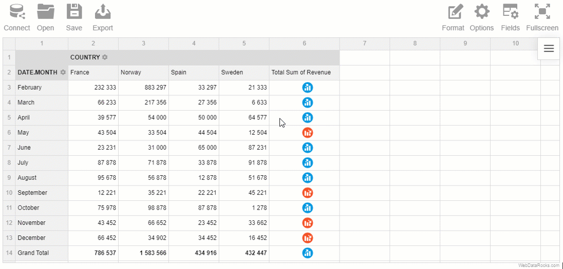
Our reporting goal is to identify successful and unsuccessful months in terms of revenue.
To see the results right away, you can scroll down to the CodePen demo at the end of the tutorial.
Let’s head over to practice!
Initialize Pivot Table
Following the steps from the Quick start guide, embed a pivot table component on the web page.
Now it’s time to fill the pivot table with the data.
Connect to your data source (CSV or JSON) by specifying a URL to the data file or defining a function which returns the data.
Here is how you can define the data provider:
function getData() {
    return [{
            "Country": "Spain",
            "Revenue": 33297,
            "Date": "2018-02-21T08:05:23.683Z"
        },
        {
            "Country": "France",
            "Revenue": 232333,
            "Date": "2018-02-21T08:05:23.683Z"
        },
        {
            "Country": "France",
            "Revenue": 66233,
            "Date": "2018-03-21T08:05:23.683Z"
        },
        {
            "Country": "Spain",
            "Revenue": 27356,
            "Date": "2018-03-02T18:57:56.640Z"
        }
    ]
}
Now tell the pivot table where to get the data by specifying the function in the dataSource attribute of report:
dataSource: {
    data: getData()
}
Specify a slice
Define which hierarchies you need to see on the grid. Put them to the rows and the columns. Choose fields for the measures and apply aggregation to them.
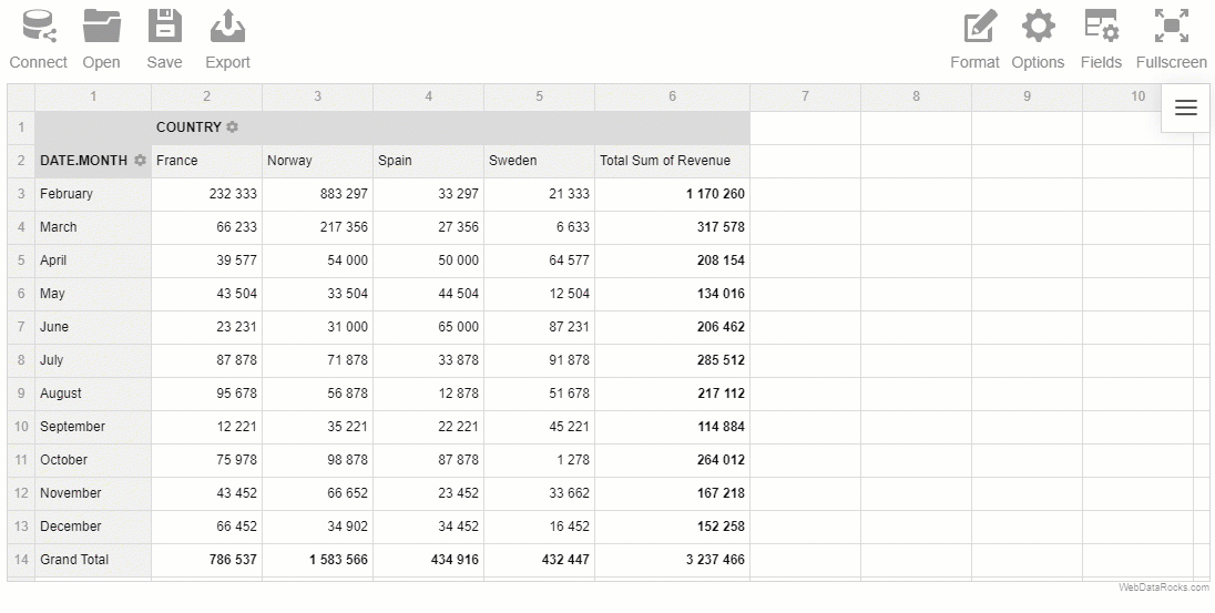
In our sample, we’ll put “Date.Month” to the rows, “Country” to the columns and “Revenue” to the measures.
"slice": {
    "rows": [{
        "uniqueName": "Date.Month"
    }],
    "columns": [{
            "uniqueName": "Measures"
        },
        {
            "uniqueName": "Country"
        }
    ],
    "measures": [{
        "uniqueName": "Revenue",
        "aggregation": "sum"
    }]
}
Also, you can apply filters now or later via the UI.
Customize cells based on a condition
Now that your report is ready, it’s time to emphasize the numbers that speak most.
Our main helper will be customizeCell. With this powerful API call, you can easily change the style and content of any cell on the grid.
Here is how you can define customizeCellFunction:
function customizeCellFunction(cell, data) {
    if (data.type == "value" && !data.isDrillThrough && data.isGrandTotalColumn) {
        if (data.value < 200000) {
            cell.text = "<img src='https://static.webdatarocks.com/uploads/2019/02/21213347/icons8-decline-64-1.png' class='centered'>";
        } else if (data.value >= 200000) {
            cell.text = "<img src='https://static.webdatarocks.com/uploads/2019/02/21213348/icons8-account-64.png' class='centered'>";
        }
    }
}
What does customizeCellFunction do? This piece of code iterates over each cell and replaces the content of grand totals with an appropriate icon depending on its value. In a similar way, you can customize any CSS styles of the cells.
To make the icon fit the cell, apply the following CSS styles for the image:
img.centered {
    margin: auto !important;
    padding-bottom: 10px;
    color: transparent !important;
    width: 22px;
    height: 22px;
    display: flex;
    align-items: center;
    font-size: 12px;
    position: relative;
    bottom: 4px;
    left: 6px;
}
Here is how your pivot table looks now:
Share the results
Now you can export your report to HTML and send it to your teammates!
Live demo
Play with the code on CodePen?
Recommended reading
If you want to customize your pivot table more, we suggest reading the following articles:
- How to apply report themes
- How to customize the Toolbar
- How to use conditional formatting
- How to localize the pivot table
Attribution
The icons used in this tutorial are designed by Freepik from www.flaticon.com.


