Custom component themes
After reading how to apply predefined themes to the component, the next step is to create a custom theme:
Create a theme using the custom theme builder
Our custom theme builder is a tool to help you create themes for WebDataRocks. Here is how to use it:
Step 1. Download or clone the custom theme builder from GitHub:
git clone https://github.com/WebDataRocks/custom-theme-builder
cd custom-theme-builder
Step 2. Install npm packages with the npm install command.
Step 3. Go to the theme builder’s folder and open webdatarocks.less — a file with WebDataRocks’ styles. Customize them by setting your colors and fonts as variables’ values.
Step 4. Run the theme builder to get CSS files with your theme:
npm start
After the files are generated, you can find them in the custom‑theme‑builder/generated‑theme/ folder.
Step 5. Include your newly created theme to a file where you embed WebDataRocks:
<link rel="stylesheet" type="text/css"
 href="custom-theme-builder\generated-theme\webdatarocks.min.css"
/>
Now open WebDataRocks in the browser — the component is styled with your custom theme.
Create a theme manually
Step 1. Open the webdatarocks/theme/ folder, create a new folder inside, and name it respectively to the name of your theme, e.g., original‑theme/.
Step 2. Copy the contents of any predefined theme folder (e.g., lightblue/) to the original‑theme/ folder.
Step 3. Now you need to replace theme colors with your custom ones. There are two possible approaches:
Approach #1 We recommend using Less – it’s a language extension for CSS. Less allows quick setting the values to several variables which later are compiled into CSS code. WebDataRocks provides Less source code available in the webdatarocks.less file of each theme.
Choose colors that you want to apply and set them inside the webdatarocks.less file from the original‑theme/ folder. Having replaced the necessary colors, you need to compile webdatarocks.less into webdatarocks.css and webdatarocks.min.css. Read how to do it in Less documentation. You need to install an npm package manager previously.
Approach #2 Of course, you can also edit colors right inside webdatarocks.css from your theme’s folder. However, we don’t recommend this approach – it complicates the updating of your own theme when the updates are made in the component’s CSS.
Step 4. Now include the reference to CSS or minified CSS. Then your new theme will be applied to the pivot table.
<link rel="stylesheet" type="text/css" href="theme/original-theme/webdatarocks.css" />
Example
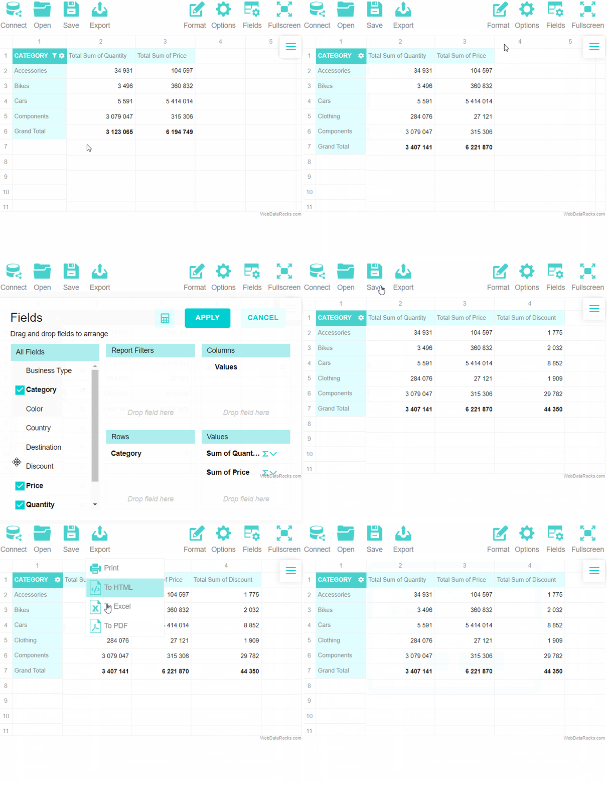
Let’s make a custom turquoise theme. Our main color will be #48D1CC. It’s a medium turquoise color. For light and dark shades we choose #AFEEEE and #00CED1 respectively. We suppose you’ve already created a new folder with theme files. Name it turquoise/. Find the next lines of code in theme/turquoise/webdatarocks.less:
/* ===== theme colors ===== */
@theme-color: #03A9F4;
@theme-color-dark: #039BE5;
@theme-color-superdark: #039BE5;
@theme-color-midlight: #03A9F4; //not used
@theme-color-light: #03A9F4; //not used
@theme-color-superlight: #E1F5FE;
@theme-color-supersuperlight: #F3FAFD;
And change them to:
@theme-color: #48D1CC;
@theme-color-dark: #00CED1;
@theme-color-superdark: #00CED1;
@theme-color-midlight: #03A9F4;
@theme-color-light: #edfffe;
@theme-color-superlight:   #AFEEEE;
@theme-color-supersuperlight: #e0ffff;
Then find where the grid colors are:
/* ===== grid ===== */
and change
@grid-selection-canvas-color: rgba(121, 204, 255, 0.2);
to
@grid-selection-canvas-color: rgba(175, 238, 238, 0.2);
Now compile Less file to CSS and minified CSS.
Update and enjoy the new theme!
