Emerging Technologies That Are Causing An Impact On Java Development

In today’s digital world, a maximum number of websites and applications have been created in Java. Many Java-based applications are introduced on the mediums we use daily. Java is a well-known programming language and is used everywhere, whether it is a mobile phone with the internet or gigantic high-tech computers in big companies. As it is evident – the development in the Java software is continually, and it is continuously developing since its foundation. As development is on pace, so an opportunity in Java development is also growing. The latest trends are transforming the shape of the software and IT world.

Being a successful and competitive developer means always stay aware of the latest updates in your working field. It is equally important to deepen your knowledge and skills according to those updates, too. However, may you not be afraid of this!
Fortunately, we have the Internet to help us accomplish the task of self-education. So, especially for this aim, we’ve prepared a collection of blogs and resources coming handy for people engaged in IT. With such a set, you can be sure that you’re moving with the times!
Resources
SitePoint
Web developers and designers will undoubtedly profit from reading it! The website is self-described as a platform “for web professionals, by web professionals,” so if you categorize yourself as a web-connected person (or desire to become so) – welcome to SitePoint.
You can find here everything you want to know about web-development and even more. Site navigation includes a blog with related articles along with a library containing a good deal of books and online courses.
You may also like: SitePoint has its own forum where you can communicate with like-minded people. Just for fun or to find something out – depends on your choice.
Link: https://www.sitepoint.com/
Smashing Magazine
Do you think that one news website is not enough? Then here’s another publishing resource for you to know the latest trends in web development.
Technical specialists will be interested in reading about JavaScript, frameworks, and software development for mobile platforms. Designers and illustrators can find plenty of articles concerning their field as well.
Additionally, Smashing Magazine offers a collection of books (by the way, paper ones too!).
You may also like: As a nice bonus, the site has blocks with events and job vacancies.
Link: https://www.smashingmagazine.com/
Level Up Coding by GitConnected
One more handy recourse for your consideration. Though it looks like Level Up Coding is generally web-oriented, you can find there amazing articles on other topics, e.g. about work time organizing.
Returning to the web development, notice that the website has lots of information concerning web programming tools. I can also mention articles reviewing the functionality of different frameworks, for instance, React and Vue. Since it’s essential to have a strong knowledge of frameworks, those articles will become beneficial to web developers.
You may also like: Level Up Coding suggests you a special API for creating and editing your developer’s portfolio. The main convenience of this API is that you can share it on various websites and then automatically update on all of them! Visit this page to learn more.
Link: https://levelup.gitconnected.com/
StackExchange
This sounds familiar, doesn’t it? Yes, maybe you’ve thought of StackOverflow. For the record, it is StackExchange’s most viewed and famous “child”. Except for this popular website, StackExchange also hosts many other ones.
Being a network of Q&A websites, it presents you a great variety of communities for every taste: mathematics, web applications, game development, and many others. Thus, if you got stuck with some naughty problem, you can boldly go to StackExchange to ask a question. Be sure that professionals and enthusiasts dwelling on there will help you.
Link: https://stackexchange.com/
GeeksforGeeks
GeeksforGeeks is just a treasure chest for a programmer! With the help of numerous tutorials, you may improve your algorithms understanding, start learning some programming languages, as well as get acquainted with new technologies.
Already feeling assured concerning some topics? In this case, you can share your insights with less skilled technicians.
In a word, GeeksforGeeks is a place to go for people involved in IT.
You may also like: Those yearning to get a job will benefit from a collection of interview questions from different companies such as Amazon or Microsoft.
Link: https://www.geeksforgeeks.org/
Reddit for Developers
As humans must be a part of a community, you can’t just stay beside and read all those fancy programming articles alone. So, the best website to discuss the latest development trends, technical news, any other developers’ issue is… Of course, Reddit for developers!
Make a new exciting post, gather a bunch of comments, and find people with the same interests. This really makes sense: while learning something new and useful to you, you also build an active community ready to interact.
Let me give you a little piece of advice: visit all of dedicated to programming subreddits. To stay as much informed as possible, of course.
Links:
WebsiteSetup
WebsiteSetup.org is a free online resource for learning web development, design and WordPress. It helps people create, customize and improve their websites.
They have more than 80 up-to-date guides, tutorials, and comparisons about CMS platforms, website builders and all sorts of awesome stuff related to web development.
Link: https://websitesetup.org
Blogs
Joel on Software
Joel Spolsky is a co-founder of StackOverflow, former Microsoft program manager, and just a qualified software engineer. Joel’s been into the IT field for almost 30 years now, so he definitely has what to tell you about programming.
Joel’s posts are generally focused on software development, management, and business. Believing his own statistics, Joel’s written about 1444 articles. Enormous number! So, to gain so much useful experience from this knowledgeable man, visit his blog and pick any piece.
Link: https://www.joelonsoftware.com/
David Walsh Blog
David Walsh is a senior software developer for Mozilla and a person expertized in front-end technologies. Therefore, his blog covers subjects directly connected to websites. There you can find excellent articles about CSS, JavaScript, and so on.
David also has a pretty lovely philosophy on learning web technologies: experiment, fail, fix, fail again, fix again, and never give up. As you can notice, this approach can be easily applied to any other educational process.
All the mentioned, as well as David’s focus on open source contributing, make this blog especially an outstanding one.
Link: https://davidwalsh.name/
Overreacted
Greet another prominent person in our list! Dan Abramov is a co-creator of the Redux library for JavaScript working in the Facebook company. As he is also a part of the React team, Dan likes to write about this product (and knows what to tell you, too). Furthermore, even his blog is built with React!
A year ago, Dan Abramov moved from Medium to his own blog, where the time of reading a post is measured in cups of coffee.
This blog isn’t a resource to look through and get informed about the latest news in the IT world. It’s more of a blog for pleasure. After all, it is the feeling you have while reading notes of a person who loves his job, his blog, and is in the right place.
Link: https://overreacted.io/
Robin Wieruch
That’s a blog to enhance your web-development skills! It’s author, Robin Wieruch, is a self-employed programmer, who’s fond of JavaScript. Robin now teaches JS to people through his books and online courses (which can be found on his website) and also provides on-site consulting to companies.
In the blog, Robin writes about everything from tutorials for beginners to Machine Learning in JavaScript.
Many experts in programming, such as already mentioned Dan Abramov, say that Robin offers the content of high quality. For our part, we suggest you check on your own whether that blog is really so useful! Be sure you’ll find lots of exciting stuff to learn there.
Link: https://www.robinwieruch.de/
Oh, one more thing. In case you’re interested not only in reading the news but also studying some topics intensely, consider visiting Coursera. This popular online learning platform suggests lots of high-quality courses in IT.
Moreover, if your field of interest is web development – you are lucky! Especially for you, we made a list of best free online courses for web developers. Enjoy!
If you are already confident in your knowledge and abilities and are looking for an interesting project, then you can find good web developer vacancies on the Jooble.
We made this compilation of resources to save your time and give you additional skills. News websites, a variety of tutorials and online courses, educational blogs – all of this don’t leave you a chance to stay unaware. So, no excuses – just go, read, and do.

React Native is growing at a rapid pace. The platform is all about good tools and faster development. Every business owner wants amazing performance, faster development, and quick release.
(more…)
Digital advancement has happened for good. Brands and companies are gaining online presence to offer a competitive edge to their rivals and competitors in the market. With the wave of modernity, businesses are looking for an advanced functionality framework to develop a high end and powerful application in a very short span of development time. There are numerous frameworks available in the market that develop complicated operations.
An incredible technology that makes the development of an application easy has to be Angular JS. Various reputed brands are using AngularJS to develop web applications right, both aesthetically and functionally. You can use this super-smart technology to build robust web applications within a short time frame. To have a competitive edge, take some good knowledge about the Angular JS 2021 Tools that you can use to develop your business website applications.
Top 10 best JS Tools
Vue
Vue.js is one of the most prominent JavaScript frameworks, whose release date is 2014. Its basic object is to develop a front-end for a web application. Vue has several advantages over others, especially when it comes to its compact size no one can beat Vue. With 18-21 KBs, Vue.js is one of the best light-weighted frameworks. Another factor that makes Vue the best framework tool is that it can handle the app of any size. Vue.js covers the entire app, whether it is a large scale or small scale. The syntax of this framework is easy to read and self-explanatory, which makes understanding and learning easy.
Angular UI Bootstrap
The legacy of one of the best front-end development platforms Angular UI Bootstrap has been passed over the years. As the name suggests, this platform has been developed by Bootstrap. A typical angular will always need an angular-seed that acts as a skeleton. For your website application, it acts as support. Use this tool to bootstrap any project of Angular that you are developing. With this technology, you can also create an efficient development environment that helps in developing your Angular project.
Angular bootstrap has all the features, power, and potential that Bootstrap has provided with native HTML. It is a known fact that the core Bootstrap is based on jQuery; however, that is not the case with AngularUI Bootstrap. It only supports the AngularJS framework, which depicts that it has zero dependencies on jQuery.
Ionic

If you want to enhance the scalability of your code, then Ionic is your perfect choice. Ionic comes under the open-source community. Ideally, Ionic is used for building Hybrid mobile applications and cross-platform applications. Cross-platform means write your code once and run anywhere. This framework works smoothly with AngularJS to build applications. One of the efficient advantages of using Ionic is that it supports other frameworks like Vue. Ionic allows full use and combination of web technologies like HTML, CSS, and JavaScript. The immense command-line interface that helps in managing your application is a great factor that lures the developers to prefer it over others.
React
React is the most popular and super-portable framework of the AngularJS platform. React was developed in 2013, since then it has been gaining popularity, with new features added regularly. While talking about its popularity, it is crucial to mentions that leading companies like Apple, PayPal, and many others, prefer ReactJS for their websites. One of the reasons why developer prefers it is because of the reusability of the source code. It means users can use the same code snippet in different projects. Another reason that captivates users is the virtual DOM that is the Document Object Model. When it comes to speed, the virtual DOM has an advantage over the actual DOM.
Mobile Angular UI
The name must have given you the hint that it provides a complete platform to build native mobile applications. Mobile Angular UI also supports hybrid applications. The sole purpose of Mobile Angular UI is to design and develop the user interface for mobile applications. Even though its frameworks are made of Bootstrap, it offers additional features that are not present in Bootstrap 3. The point that you should note about Mobile Angular UI is that it does power by Bootstrap, but you have zero dependencies of jQuery.
Jasmine
In computer programming, unit testing has a crucial role. It is a sort of software testing, which is used to test individual units or components of the software. It monitors and recognizes the frameworks and classes of JavaScript. Jasmine is an open-source tool that is used for TDD and used for spying on fake calls. Famous names like Accenture and Wal-Mart are using Jasmine as their Angular tool. The developers work on Jasmine to enable testing and monitoring the various frameworks like JavaScript. The purpose behind it is to validate the use of an application. Jasmine is a BDD (Behaviour-driven development) testing framework. Its objective is to test the framework for JavaScript code. It is an independent framework and does not rely on any browser, JavaScript framework, or DOM. It provides leverage of end-to-end and acceptance testing. Hence, it is suited for Node.js projects, websites or anywhere JavaScript can run on it.
Web Storm
Known for its smart editing technology, this Angular JS tool provides great support for the JavaScript framework. Such an integrating tool is a must-have for every developer to build a web application. It extends editing support to HTML, CSS, Node JS, and various modern successors. This angular tool is being used because it can integrate with plenty of technologies. What are the features it holds? It comes with Git Support, Intelligent IDE, and easy debugging for frameworks like JavaScript and CSS. A lot of companies, including Big Fours use this tool for the development of applications.
Protractor
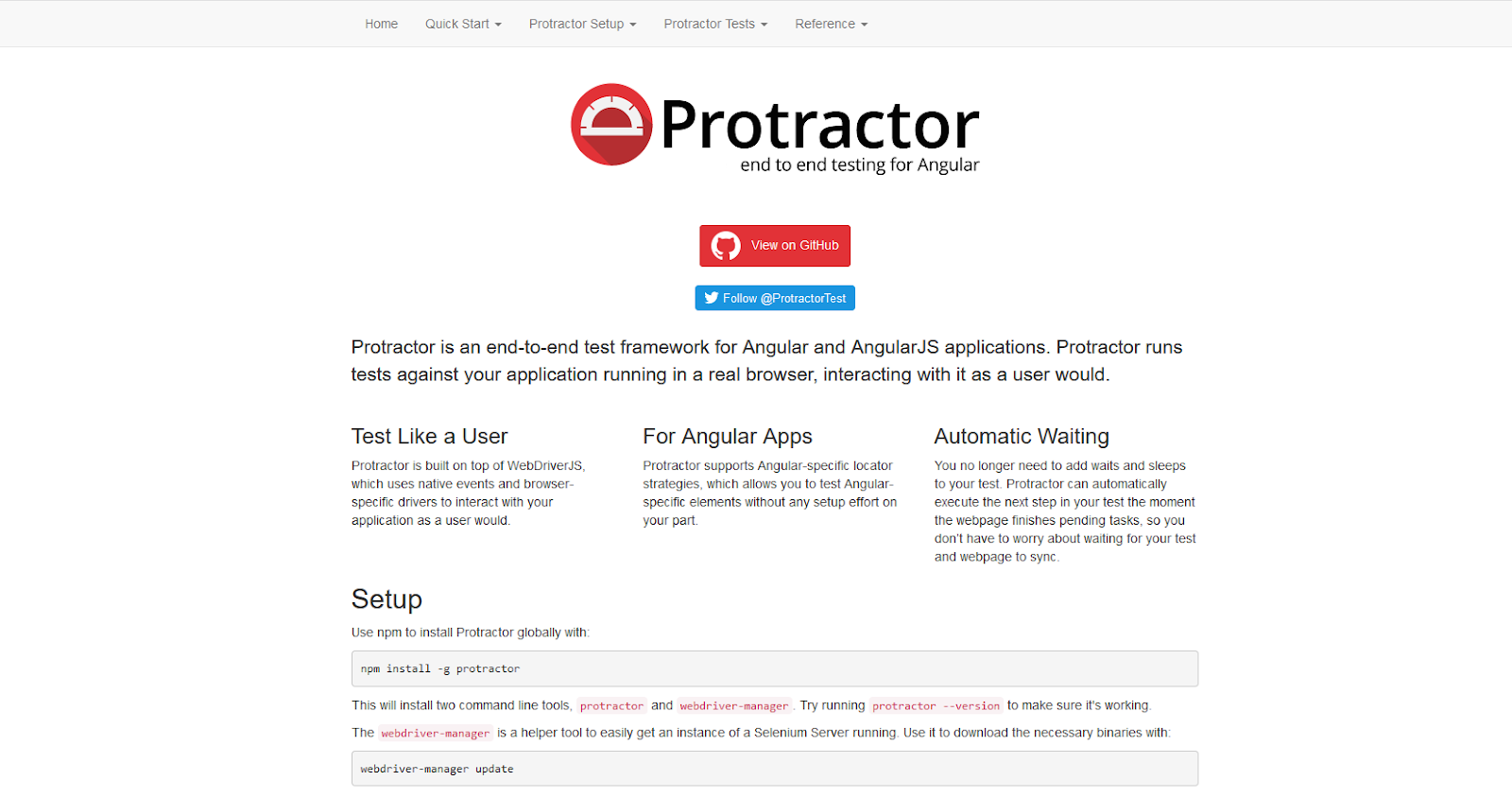
It is a complete end to end development framework that is used for testing. It can run various interesting and creative testing on a real browser while maintaining interaction with the interaction, similar to a user. This tool is developed by all popular Google. You get amazing features when you use this tool, such as automatic waiting. It only functions with the angular applications and offers user like testing experience. Protractor is used by various reputed organizations for application testing.
Onsen UI

Onsen UI is an outstanding open-source user interface framework for HTML5 hybrid mobile app development. It is based on Cordova. This framework allows developers to create a mobile application with the use of HTML5, CSS, and JavaScript. Onsen UI makes hybrid app development much easier. With this framework, you can use your existing HTML5, Angular JS skills to generate your app on all the platforms such as Android, iOS, etc. It automatically adjusts its settings as soon as the user changes the platform. It adds inviting and zestful features to your application like infinite scroll, lists, forms, etc. It is a user-friendly framework. If you are new to it and do not know the usage then learning OnsenUi will be easy and comfortable.
Lumix
Lumix is the foremost sensational and responsive front-end framework. It is based on Google Material Design and Angular JS specifications. It helps web designers to design an extremely enticing layout for the web platforms. It is built with Sass and Bourbon, with this the developer can design the glitch-free app quickly. Here, Sass and Javascript files will automatically be optimized with Gulp. It improves the performance of the application. Moreover, it is an AngularJS friendly framework to build fast one-page apps. It only supports native jQuery to maintain the app speed and keep the framework scalable.
Wrapping up
In a nutshell, you have the most useful and popular Angular JS tools for the year 2021. Developing a robust and dynamic Angular app is no more thought with these powerful tools. These tools are always smart to work for all the hard work you do. 2021 will see a lot of advancement in the era of Angular JS that can transform and develop your business website.
Thank you to our guest author Harikrishna Kundariya. He is a marketer, developer, IoT, ChatBot & Blockchain savvy, designer, co-founder, Director of eSparkBiz Technologies. His experience
enables him to provide awesome digital solutions.
What else to read?
- Best JavaScript frameworks for 2021
- What Vue is all about?
- Top 7 Tools for React Development
- React vs Angular: A Years Old Debate and Here’s the Conclusion
- What is the difference between React.js and React Native?
- Must-have tools for Vue.js developers

Data forms a vital part of marketing. However, just having data is not sufficient. The way you represent the available data has a lot to do with how well you can engage your target customers. Here, data visualization comes into the picture.
(more…)
Confused between React.js vs React Native? Want to know which is better?
Well, is it fair to judge a person without knowing them? No, right. So, to make the right decision between React JS and React Native, let us look at what React JS and React Native individually are and then figure out the answers to the questions above.

Pizza vs French Fries? If you were to pick between one of them, what would be your choice?
Tough right?
The same way when it comes to choosing from two great frameworks React and Angular, it is not a cakewalk!
However, based on what your business or requirements demand, by going through thoroughly we have the conclusion today!
So, React vs Angular, let’s begin!

With any JavaScript development, you always want to make the process as comfortable, fast, and simple as possible while also improving product quality. For this purpose, there are frameworks that greatly simplify the process and save a lot of time.
However, when you just start working on a project, you will immediately run into the problem of choosing the framework. Which one is better? Which one suits my project the best? These are some tricky questions I will try to cover in this article.
How to choose the right framework?
For a better understanding of the topic, let’s highlight that depending on the conditions and your demands, the choice will differ so there is no definite answer to what is better. If this is the first time you faced such a problem, you will most likely try to find the most trustworthy framework. So here are several factors you should rely on.
- The reliability: can be assessed by the awareness and satisfaction of the community.
- The fact of the ease of study and comprehensibility: an important point during the first use.
- The framework’s benefits: you should pay attention to what this framework is “good at”.
- The well-documented guides: will help you to find solutions quickly.
Some statistics
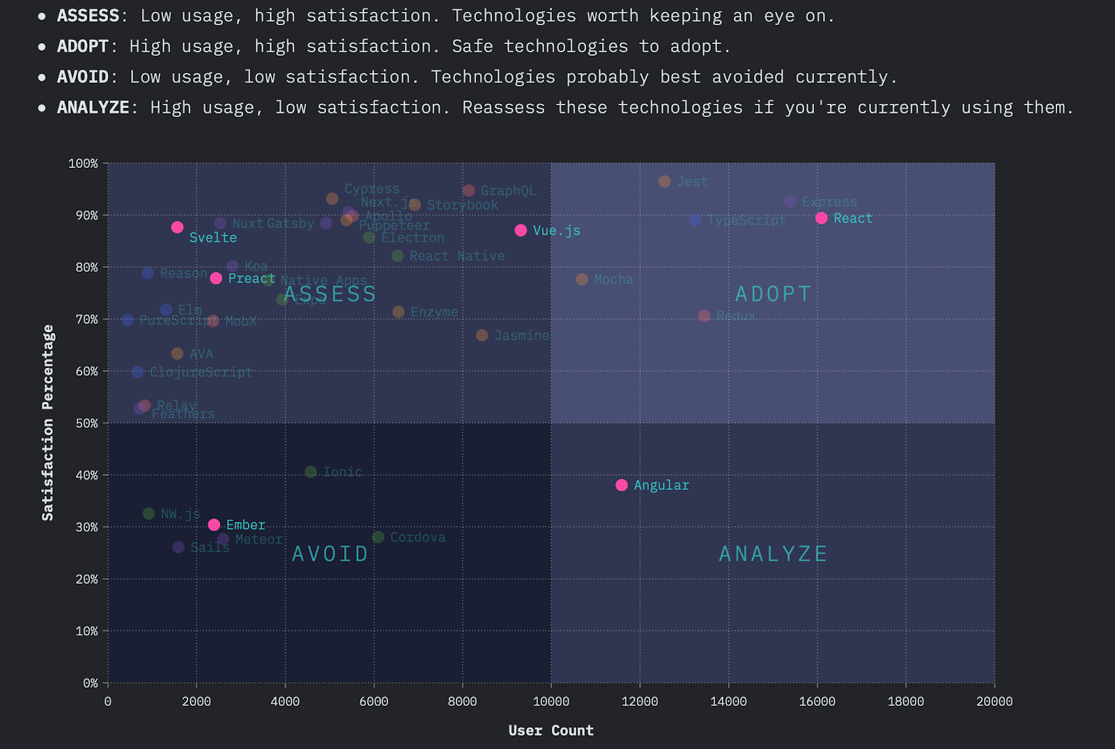
Now when we know what to focus on let’s have a look at some other lists of top JavaScript frameworks. Based on Stack Overflow Developer Survey 2020, we can conclude that the most popular is jQuery, then React and Angular.
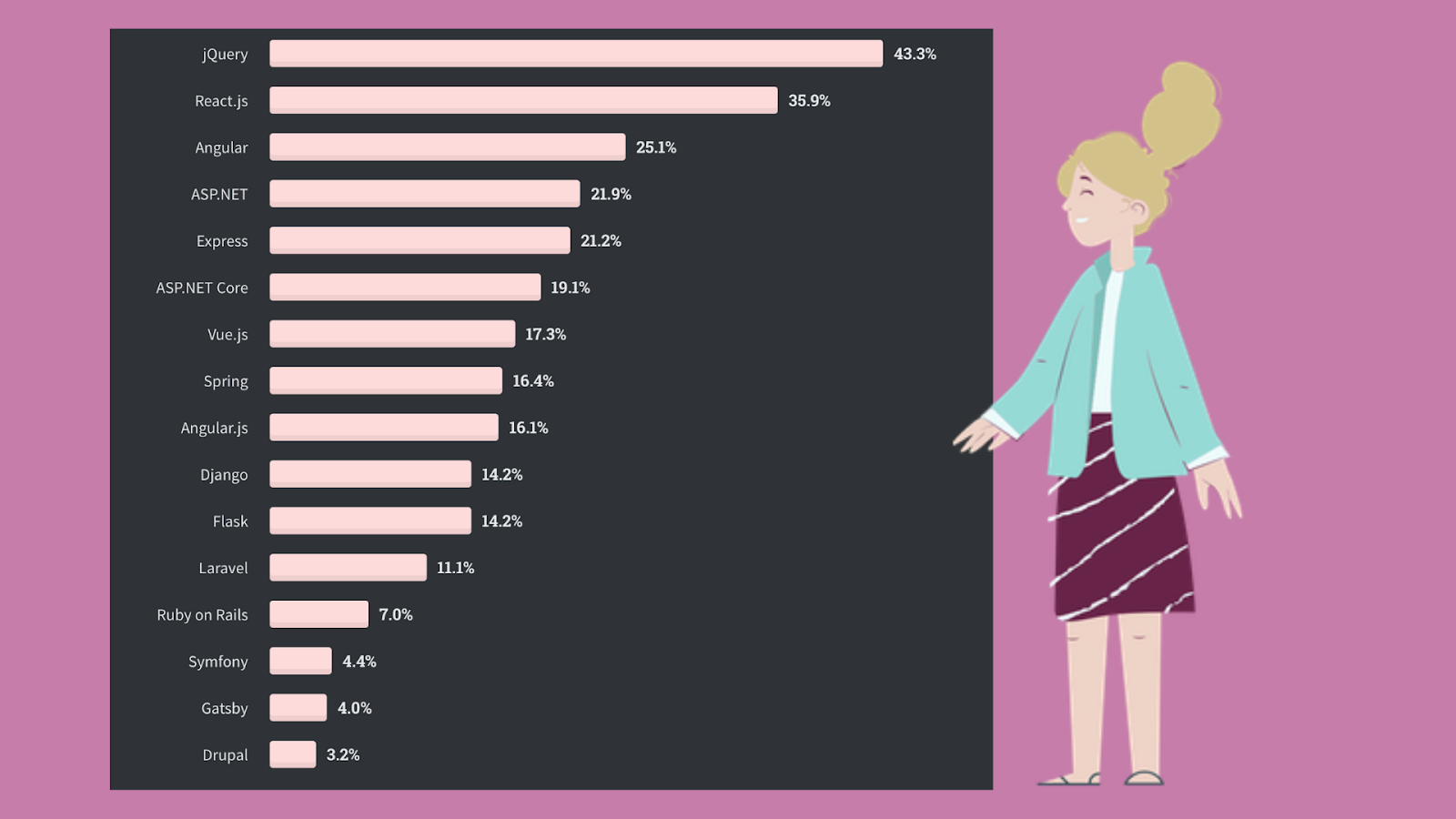
But they also mention that “… jQuery is still king but is slowly losing ground to React.js and Angular year over year. …” jQuery is so popular mainly since many old projects are written on it. Still, now more and more developers are switching to other options.
Accordingly, choosing the most famous framework does not guarantee its coolness.
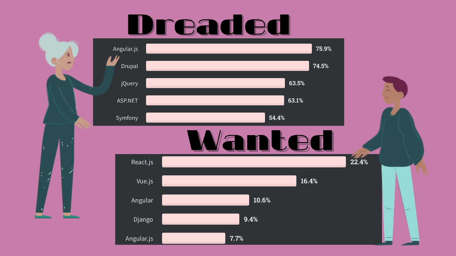
Judging by most dreaded and wanted frameworks, jQuery and Angular have slightly disappointed some users, and Vue.js became one of the most interesting frameworks along with React.
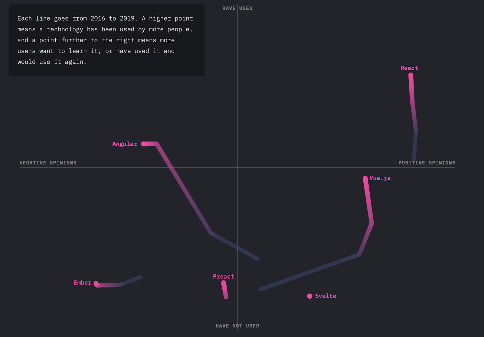
On theState of JavaScript,we can see the development over the years and clearly understand the community’s opinion about each of the frameworks. Altought, we come across several new names that have not been featured previously as Preact, Ember, and Svelte.
Now I suggest making a small overview of each of the above frameworks and learn a little more about their features.

jQuery is an open-source JavaScript library written by John Resig that simplifies HTML, CSS, and JavaScript interaction. It was released in 2006 and has attracted a lot of developers.
What has made jQuery so popular is its ease of use, big community, and ability to keep the code concise and pretty simple. jQuery is primarily designed to find and manipulate elements on a web page easily.
? This framework is used in developing small desktop-based JavaScript applications. But jQuery can’t compete with the modern frameworks with advanced facilitation of JavaScript, less coding, and reusability of components. It makes large applications heavy by putting a lot of code.

React is one of the most talked-about frameworks in the modern world. It was released in 2014 by Facebook and is very similar to Angular but managed to surpass the last one quickly. React is flexible, can be combined with other frameworks, and has a huge community.
On the other hand, due to multiple updates in the framework, it is difficult to make the optimized documentation, which makes it harder to start with it. However, the large community makes it easy for new learners to get the concepts.
? React is the right solution for single-paged applications and creating reusable UI components. Also, it’s a good idea to use it in large web applications.

Angular was officially launched in 2016 by Google and offered all the necessary features. One of the things that distinguish Angular from React is its two-way data binding, which means the real-time synchronization between the model and the view. It usually does not require additional libraries and such functions as component-based routing, project generation, and so on can be implemented with the means of Angular package. Although it requires much effort to learn and documentation can be too complex or confusing to read. Fortunately, the big community will always be there for you to help.
? Angular is useful in developing web and mobile apps, enterprise-based and both single- and multiple-page applications.

Vue is a simple and straightforward framework that continues to conquer the development industry since it was released in 2014. In fact, it combines the best from leading frameworks and at the same time is much easier to learn. At the same time, the Chinese documentation and not a very big community can become a problem.
? Vue is recommended for flexible design structures and is commonly used in building UI, single-paged apps.

Ember is a fast and well-organized framework developed in 2011 with proper documentation but complex syntax and slow updates. Because of the conventional structure and small community, the learning curve of this framework is hard.
? Ember is great for large-scale projects, complex ecosystems, and client-side apps.

Preact was designed to make a JavaScript framework small in size, yet offering all the same features as React. It is quick, effective, small in size and you can understand after several hours of learning.
? If you want to create a small application that does one function well, then Preact may be exactly what you need.

Svelte is one of the most promising frameworks that was launched in 2018. It is not well-known but, regarding its unique approach, is becoming more and more popular. It is faster than any other framework, simple and easy to learn, and uses the existing javascript libraries. The only problem is a very small community so it’s hard to find solutions for your problems.
? Svelte is good to write framework-independent apps or any web app.
Final words
In conclusion, I want to remind you that you can not single out the best framework. You have to build your decision on the desired result. So before choosing a framework for your project, I advise you to first work out its concept well and highlight the main characteristics, which it must satisfy.
If you liked the article and want to keep abreast of the programming news, follow Top Coding News to always know about new trends and exciting developments.
What else to read?
- Best Mobile App Development Tools for iOS & Android
- Best Charts to Show Discrete Data
- Electron.js: Great Tool to Design Powerful Multi-Platform Desktop Apps
- Main Web Development Trends You Should Be Ready For in 2021

At the baseline, every database is a collection of data and information organized in rows and columns in tables, which is stored in a computer system, i.e., a database service. This information is frequently updated, modified, or deleted as needed. We can compare a typical database to a room or rack at the office, which holds important files. If there is no defined and structured process to store and retrieve these files, we may not know how to handle it by understanding which file is stored at which rack and so on.
Like the above example, a database management system or a DBMS is also a software that stacks the given database system’s data. DBMS offers the users and the programmers a defined set of procedures to write data, store it, update it, and backup or retrieve the same when needed. There are various types of database management practices and services used to store and update data. Here in this article, we aim to explore various DBMS applications when you have to make a choice.
What is the objective of database management software?
A typical database management software’s objective is to keep the data stored in good shape and safe. Any standard database software tools will help reduce data redundancy and help maintain data’s overall efficiency. Many of the database management software out there is open source, and there are also some licensed and commercially sold with many add-on features.
Based on your requirement and usage, one can choose the most appropriate database management software to ensure the desired output. Given below is a filtered list of the most popular DB management software in use.
Oracle RDBMS
Oracle is the No.1 database management system, which is used by many top enterprises across the globe. It is relational DBMS or RDBMS software. The current latest version available in the market is Oracle 12C, in which the ‘C’ represents cloud computing. In every aspect, Oracle 12C brings the latest benefits of cloud computing into your enterprise database management.
Oracle DB can support supports multiple operating systems like Windows, Linux, and UNIX versions. The top features of Oracle DB software are:
- 12C is much more secured than many of its predecessors.
- Being cloud-based, it occupies only lesser space.
- It can support huge databases by reducing the CPU and processing time.
For expert advice in choosing an appropriate database for remote DBA, get in touch with RemoteDBA.com.
IBM DB2
Like Oracle, the IBM database management suite is in the top database management systems’ front line. The latest version of IBM DB2 is the release 11.1. IBM started offering DB management services back in 1983. This database is built on assembly languages like C, CPP, etc.
IBM DB2 supports various versions of Windows, Linux, and UNIX, etc. The matures features of this database are:
- It is easy to install and set up.
- Data is easily and highly accessible.
- Can save a fairly huge amount of data.
- Processing speed and accuracy is much higher.
Altibase
It is an enterprise-grade DBMS, which ensures optimum performance and speed. This database falls under the category of open-source relational DBMS. Altibase now boasts of more than 650 top enterprise clients, many of which are Fortune 500 companies. The providers have deployed more than 6000 mission-critical use cases worldwide, covering a wide range of industries. The major characteristics of Altibase are:
Unlike its competitors discussed above, Altibase is a functional hybrid DBMS.
- It can deliver intensive data processing based on an in-memory DB portion and a vast storage capacity due to the on-disk database section.
- Altibase represents a small subset of the conventional relational DBMSs, which offers scale-out technology for better scalability and sharding.
- Altibase is open-source.
Microsoft SQL Server
Microsoft developed its first database monument system back in 1989 and is consistently developing it. The latest version, which came out in 2016, combines relational DBMS benefits with cloud storage. The programming language used to build MS SQL is Assembly C, C++, Linux, etc.
MS SQL can work on both Windows and Linux operating systems. Some of the top-notch features of MSSQL include:
- It is compatible with Oracle DB also and can provide better management of the workload.
- It lets multiple users simultaneously work on the same database.
- However, Microsoft, as we know, is licensed software and a commercial tool.
SAP Sybase ASE
ASE is the short form of Adaptive Server Enterprise. The latest version of this database software is 15.7. SAP started the same back in the middle of the 1980s. Similar to the other middle-level database management systems, Sybase also has many standards features as:
It is capable of performing millions of simultaneous transactions in a matter of seconds.
- It leverages the benefits of cloud computing.
- Mobile devices can be easily synchronized with Sybase DB.
- Like Microsoft, Sybase ASE is also a commercial tool, comes at a licensing fee.
Teradata
Teradata is one of the first-generation database management software, which was established in 1979. It can work on both Windows and Linux operating systems. Some of the top features of the latest version of Teradata DB software are:
- The import and export of data are much easier.
- Multiple simultaneous processing is easy.
- Data can be distributed easily.
- Teradata is useful in the case of managing huge databases.
ADABAS
ADABAS is the short form of an Adaptable Database System. It can run on Windows, Unix, and Linux operating systems. It is also a commercial tool that offers many customized packages for users to choose based on their requirements. The major features of ADABAS are:
- Much faster data processing, whatever the load is.
- The output of transactions on the database are very reliable.
- The architecture of ADABAS DB is much flexible and keeps pace with the fast-changing industry demands.
- It is a commercial tool for enterprise users.
Some other popular options for you to consider are MySQL, FileMaker, Microsoft Access, Informix, SQLite, Couchbase, Toad, Sequel PRO, Redis, CouchDB, Neo4j, PostgreSQL, Amazon RDS, MongoDB, SQL Developer, OrientDB, Cloudera, MariaDB, etc.
You can make a wise choice by comparing the features of each against your requirement at hand.
Data visualization and database reporting tools
Searching for tools to analyze and visualize data from your database? Check out the list of JavaScript libraries to build dashboards with.
In the previous tutorial, you learned how to filter pivot table data to show relevant information first.
Let’s not stop there!
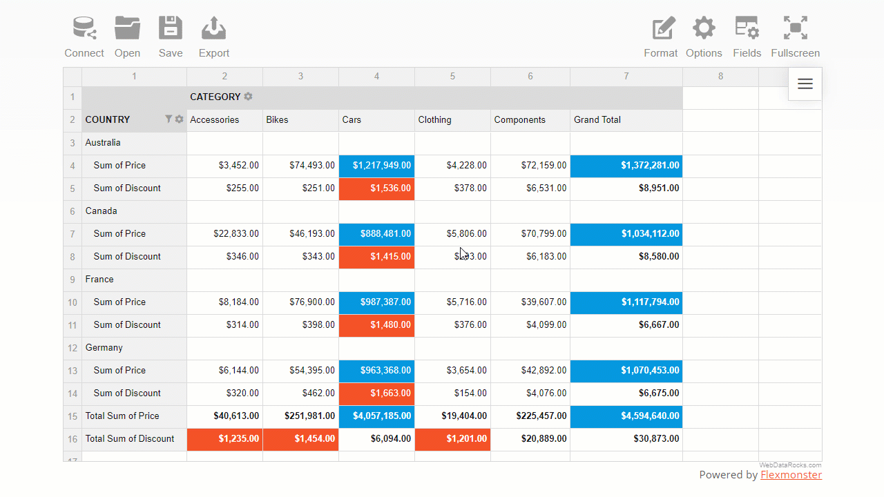
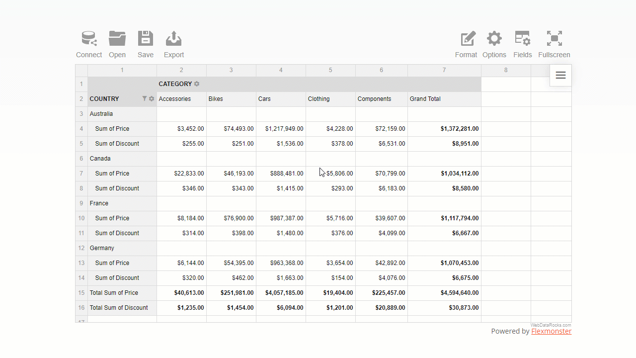
This time you’ll learn how to make your report look visually perfect. For this, you’ll use the interactive formatting feature of WebDataRocks.
Why formatting is important
An essential part of any report or dashboard is its readability. Your audience should understand its meaning at a glance.
Therefore, as a finishing masterstroke of your data analysis, you can format essential data to make it easy to digest.
In this tutorial, we will consider two main types of pivot table formatting, namely:
- Number formatting
- Conditional formatting
Want to get straight to the practice part?
Jump to the Live demos section.
Otherwise, let’s dive into the motivation behind data formatting first.
What is the number formatting
The number format defines how numerical values are shown on the grid. It is useful in many cases, for example:
- Formatting financial data (e.g., adding and aligning currency symbols, showing values as percentages, etc.).
- Making data look cleaner by controlling the number of digits after the decimal separator.
- Handling regional difference, e.g., writing decimal numbers with comma or period, formatting the thousandths place.
Apart from the cases mentioned above, you can also:
- Align values on the right or left side of the cell
- Control how empty cells or infinity values are displayed
- Define the maximum number of symbols to show in a cell
To examine all the number formatting options, check out our detailed Pivot table number formatting guide.
How to use number formatting in a pivot table
You can set a number format for particular measures of the pivot table widget in any of the following ways:
- Via the UI
Here is how end-users can format their data via the intuitive and comfy pop-ups:
- In code
The programmatical approach gives you more freedom to implement custom logic of formatting.
Let’s see the samples and gain some practical coding skills.
- Format values of “Price” with a dollar symbol.
- Format values as percentages.
- Change the number of decimal places displayed in a pivot table.
What is conditional formatting
Conditional formatting is a particular formatting type by cells’ values.
The name itself suggests that formatting is based on conditions, i.e., user-defined rules that describe how values have to be formatted. This rule is a logical statement, also known as a boolean expression). The rules are always applied to the pivot table measures.
With conditional formatting, you can change the color of the cell’s background and text and manage the report’s typography: font color, family, and size.
This feature helps you highlight information that is crucial to see first. It also allows you to make trends in data more noticeable.
How to use conditional formatting in a pivot table
- The most convenient way to apply conditional formatting is via the user interface.
A comfy color picker lets you choose the color that suits your reporting goals best:
You can also set a custom hex color value for text or background.
- In code, it is as simple as defining a tiny JavaScript object in your report’s structure.
For example, here is how you can color pivot grid cells green based on the values of the “Revenue” measure:
"conditions": [
        {
            "formula": "#value > 600",
            "measure": "Revenue",
            "format": {
                "backgroundColor": "#8BC34A",
                "color": "#FFFFFF",
                "fontFamily": "Arial",
                "fontSize": "12px"
            }
        }
    ]
Live demos
- Format values of “Price” with a dollar symbol
- Format values as percentages
- Change the number of decimal places displayed in a pivot table
- Apply conditional formatting to the pivot grid
- Apply conditional formatting to the data grid
Wrapping it all up
Now you made sure how flexible WebDataRocks Pivot is when it comes to prettifying your data. Not only can you analyze your data fast but also prettify your report neatly and make it speak.
Useful reading
Documentation
More reporting tips & tricks
To improve your reporting skills, learn how to filter pivot table data, and set a data slice.
Ready to share results? Not sure how to do it best? We’ve got you covered here as well!
Move on to a detailed tutorial on how to save and export a pivot grid report.
Learn about the pivot table essentials with the detailed UI guide.
Advanced pivot table formatting
If, by any chance, there is an option that you haven’t found in WebDataRocks, we recommend testing Flexmonster Pivot Table & Charts – an even more powerful pivot table component. It offers extra number formatting options: negative numbers formatting, centered alignment of values, and more.