Reporting tips & tricks: slice explained
In this article
This article is your go-to guide for understanding and creating awesome pivot table reports using WebDataRocks. We break down what a slice is, show you its building blocks, and walk you through how to set it up both visually and with code.
If you’re new to the pivot table as an instrument for reporting, this article is a great place to get to know its core capabilities and astructure of a pivot table report. After reading, you can get straight to designing new reports with more confidence and professionalism.
And even if you are a pivot table pro, this tutorial is a great opportunity to refresh your knowledge.
Let’s start!
What is a slice
This time we’re going to learn about the slice. You may have come across this term multiple times when surfing WebDataRocks documentation and blog.
So, what does it mean in the pivot table context?
The slice is a configuration of fields on the grid. In other words, this is a subset of hierarchies you or your end-users currently see in the report.
As well as the report, the slice has its specific structure. Let’s get familiar with it a bit closer.
The slice consists of three main components:
- Rows
- Columns
- Measures
Other important components of the slice are report filters, drills, expands, and sorting objects.
Rows, columns, and report filters are arrays of hierarchy objects. The objects within the array contain information about which fields to put into the rows, columns, or report filters. They can also include filtering by members/value configurations and sorting by members applied to the hierarchy.
Measures contain measure objects that describe by which fields to aggregate the data in rows and columns. Measure objects can be of any data type: string, number, or dates. The type defines which aggregations are available for the measure.
The huge plus of WebDataRocks is that available aggregations are extendable: you can create your own formulas based on the existing summary functions. This feature is known as the calculated value. It makes the reporting configuration flexible and customizable according to the specific business requirements.
How to configure a slice
Let’s get straight to the practice. You have two options on how to define the slice.
-
Via the user interface
The UI approach is comfy for end-users who need to tailor their own reports on the fly, without digging deep into the code configurations.
It’s as simple as it sounds. Let us prove to you that.

Here we’ve opened the Field List, picked the fields we’d like to put into the rows, columns, and measures. And here we go! The fields are neatly arranged on the grid.
After setting the backbone of the slice (i.e., rows, columns, and measures), we can additionally apply sorting by a particular field, expand hierarchies to get to another level of detail. This information is stored in the slice which is stored in the report in its turn.
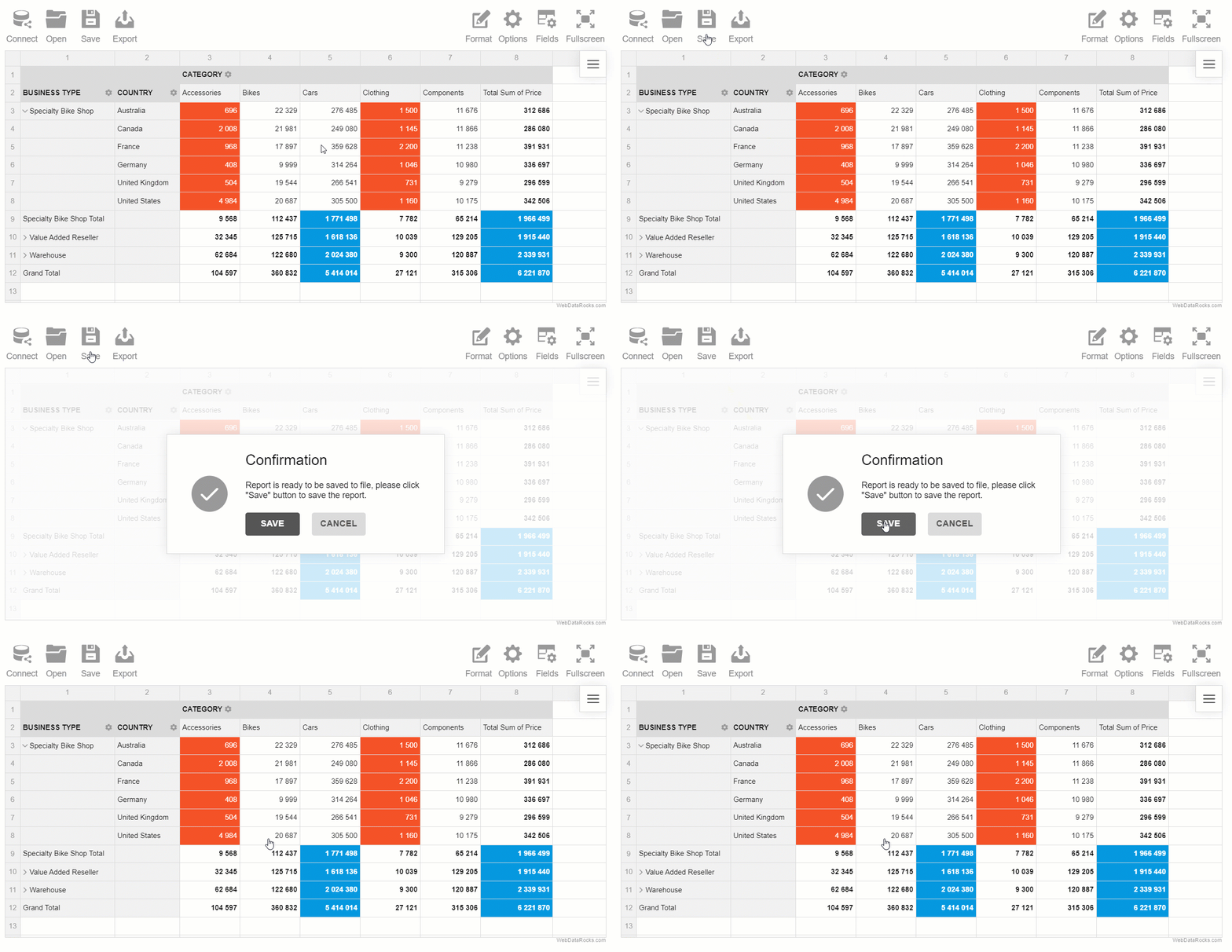
And the final stroke: save the report to your local file system or to the server. Next time you need it, it can be easily restored.

-
With code ⌨️
The approach with code is no more difficult than the visual one. It requires minimum time and effort.
Here’s how the slice looks within the whole pivot table configuration:
var pivot = new WebDataRocks({
    container: "#wdr-component",
    toolbar: true,
    height: 500,
    report: {
        "dataSource": {
            "dataSourceType": "csv",
            "filename": "https://cdn.webdatarocks.com/data/data.csv"
        },
        "slice": {
            "rows": [{
                "uniqueName": "Country"
            }],
            "columns": [{
                    "uniqueName": "Business Type"
                },
                {
                    "uniqueName": "Measures"
                }
            ],
            "measures": [{
                    "uniqueName": "Price",
                    "aggregation": "sum"
                },
                {
                    "uniqueName": "Quantity",
                    "aggregation": "sum"
                }
            ]
        },
        "options": {
            "grid": {
                "type": "classic"
            }
        }
    }
});
A little tip: you can skip defining the slice if you wish! In this case, the pivot table will automatically put the first string hierarchy from the data source to the rows, and the first numerical hierarchy to the measures. But this behavior can be easily overridden. Simply set showDefaultSlice property in an Options Object to false and the grid will be empty unless the slice is explicitly defined.
Bonus
To prettify the look of the fields you put to the rows, columns, measures, and report filters, make use of the data types for CSV and JSON. Using data types, you can set captions for hierarchies, their sublevels, and more. This is a nice option if you want to fully control how the fields are treated by the component and displayed to the end-users.
Experiment with your slice
During experiments, the best ideas emerge.
So, take your time for slicing & dicing and change the report’s layout interactively:
See the Pen Data analysis in Pivot Table by WebDataRocks (@webdatarocks) on CodePen.
Get a unique angle to look at your data. Insights are closer than you think!
Feedback
Stay tuned for more blog posts on reporting tips & tricks.
We’d appreciate it if you share this tutorial on Twitter.


