Reporting tips & tricks: filtering explained
In this article
In this guide, you’ll learn how to apply advanced filters to your WebDataRocks Pivot tables.
We continue exploring the functionality of WebDataRocks Pivot – a reporting tool that integrates seamlessly with the most popular front-end frameworks. You can add it to your product and provide end-users with data visualization and analytics capabilities.
In the previous part of the “Reporting tips & tricks” series, you learned about the purposes of the pivot table’s data slice.
This time, you will learn how to make your reporting more advanced by creating filters in the pivot table.
In WebDataRocks Pivot, you can filter your data interactively or with a simple code configuration.
If you’d like to learn by doing without reading the explanations, jump straight to the section with live demos that show how to filter pivot table data in different ways.
The tutorial is divided into two main parts:
But first, let’s have a quick theoretical introduction.
What is filtering?
With filtering, you can perform a more in-depth analysis. To filter the data means to show a part of the data that meets a certain criterion. In other words, filtering is used to show specific information that’s relevant to a question a data analyst is asking.
Once the data is filtered, it’s narrowed to a smaller portion and doesn’t distract with unnecessary details.
Types of filters
WebDataRocks Pivot provides three main types of filters to end-users.
You can filter data by:
- field members (label filter)
- values (number filter)
These two types filter data in specific rows or columns. Another filter type that stands aside is a report filter. It filters the entire report to show specific data records. In WebDataRocks Pivot, you can place a report filter above the grid’s header by dragging and dropping a field from the Field List.
How to filter data in the pivot table
1. Filtering data via the visual controls
The pivot table is designed to let you filter data on the fly.
Let us guide you through the filtering via the UI process.
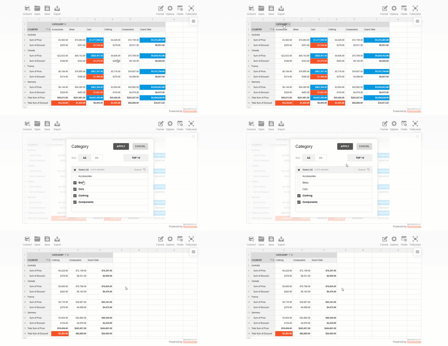
How to filter data by members
After you configured the report, open the field values (members) list by clicking the field’s caption.
Check or uncheck the boxes near the field’s members that you want to include or exclude from the resulting data subset.
If the list of members is too large, using the search box comes in handy.
How to filter data by value
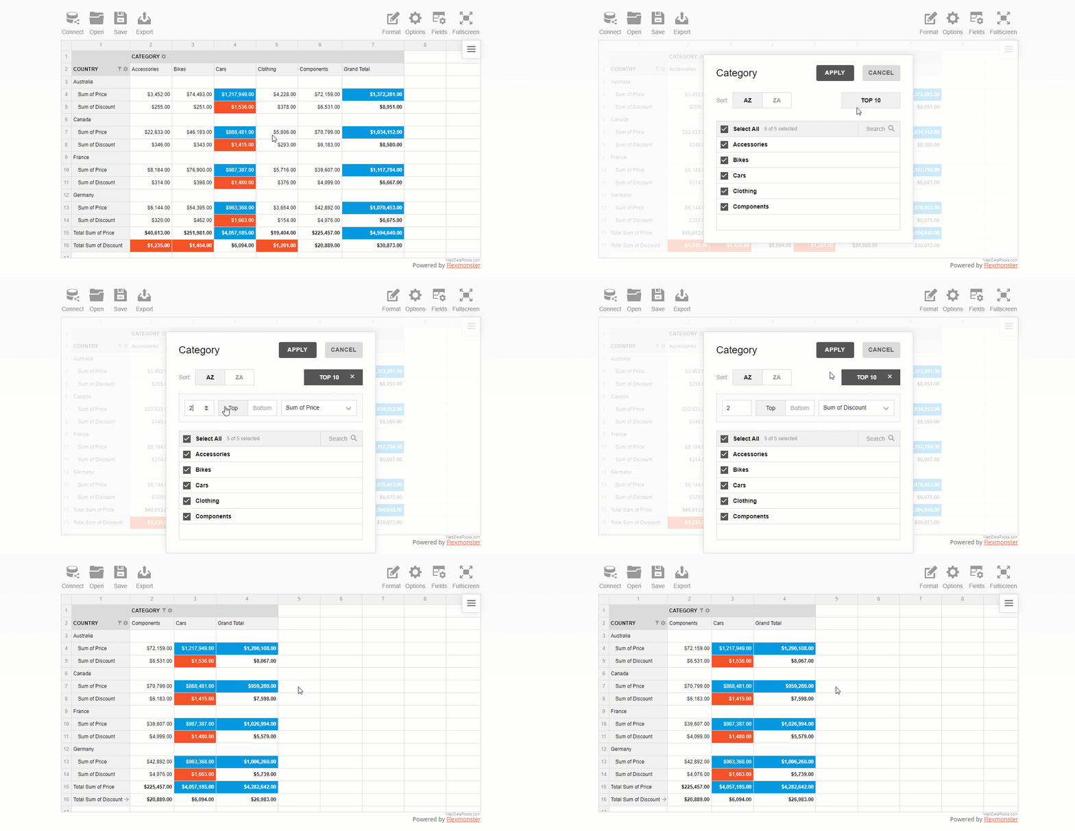
A value (number) filter filters records in a row or column field based on aggregated values.
There are two types of number filters you can use:
- Top X values
- Bottom X values
where X is the number of records to show on the grid.
This is pretty much similar to Excel’s filters by values you got used to.
To use a filter by value, click the field’s caption on the grid, select the number of data records, and the criteria – the highest or lowest measure’s values to display.
How to set a report filter
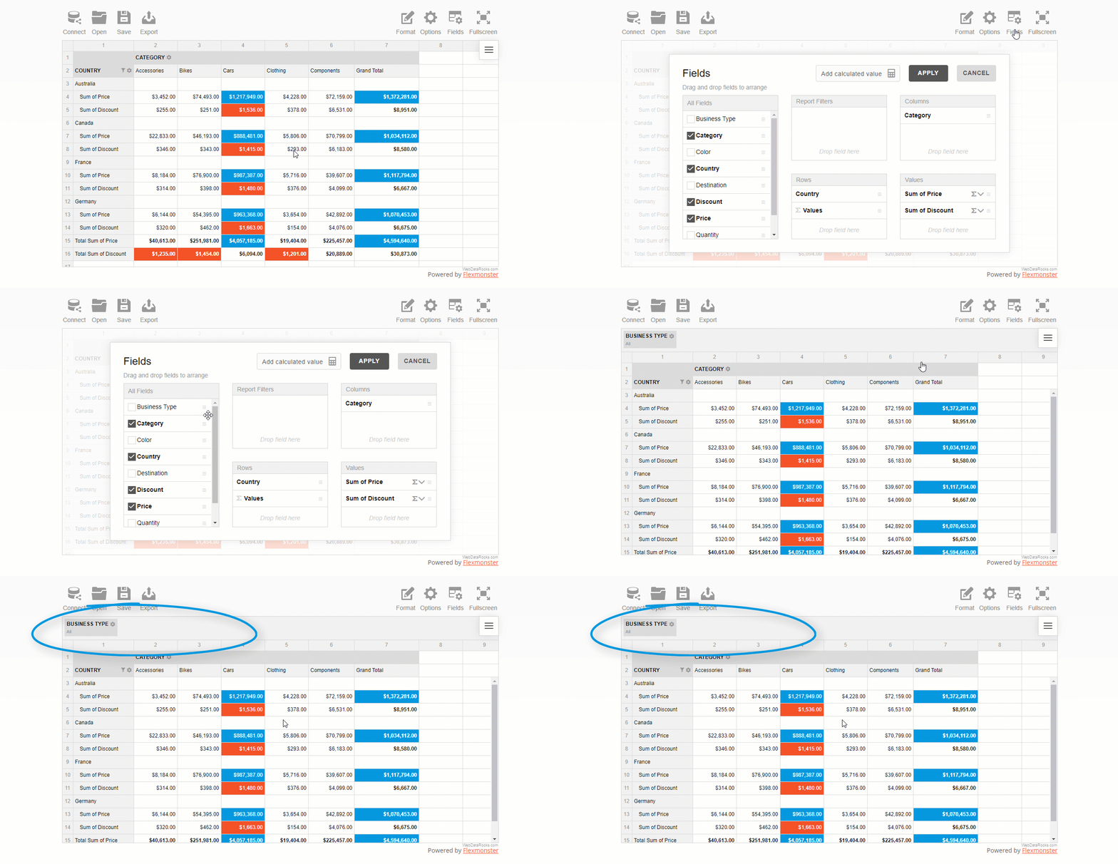
A report filter is applied to the entire report to show values for specific items.
First, open the Field List and choose the field to filter by. Next, open the list of members by clicking the field’s caption and filter data by members or values.
The area above the grid’s header is called the report filtering area:
How to apply multiple filters in the pivot table
You can also apply multiple filters to the hierarchy. For example, here’s how you can combine a filter by value and by member:
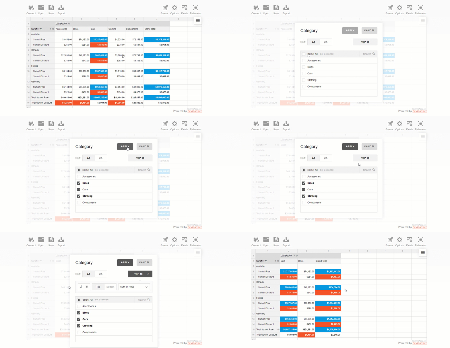
As you see, configuring filtering in a report is as easy as several clicks.
Now let’s get some coding practice and do the same but using JavaScript.
2. Filtering data with code
How to filter data by members
In the chosen hierarchy, add the filter object and specify an array of members. The negation property controls whether to include these members to the subset of fields shown on the grid or not.
Here’s a tiny code snippet that shows how to exclude two specific members from the Country hierarchy that is placed into rows:
"rows": [{
    "uniqueName": "Country",
    "filter": {
        "members": [
            "Country.United Kingdom",
            "Country.United States"
        ],
        "negation": true
    }
}]
How to filter data by value
In the filter’s object of a specific hierarchy, define the filter type, the number of records to show, and a measure to filter by:
"columns": [{
    "uniqueName": "Category",
    "filter": {
        "type": "top",
        "quantity": 2,
        "measure": "Discount"
    }
}]
How to set a report filter
Setting a report filter is similar to the above approach. The only difference is that doesn’t relate to any specific row or columns – the changes are applied to the entire grid. You can choose here any hierarchy you want to filter the data by.
Here’s how you can filter data records by a specific business type:
"reportFilters": [{
    "uniqueName": "Business Type",
    "filter": {
        "members": [
            "Business Type.Warehouse"
        ]
    }
}]
Examples & demos
The best way to learn is by practice.
These demos will help you to understand how to add filters to the pivot table component. Feel free to experiment with code.
- How to filter pivot table data by values: top 3 product categories by sales level
- How to filter pivot table data by labels: shows sales levels for 2 specific countries
- How to use a report filter in a pivot table: filter all the records by a business type
Feedback
We hope you enjoyed this tutorial.
We would be happy to hear your thoughts on your progress with pivot table reporting. If any questions arise, contact our team on Forum.
To keep updated with new blog posts, you are welcome to follow WebDataRocks on Twitter.
What’s next?
This article is a part of the introduction to the web pivot table terminology. We do our best to show how to solve real-life use cases with our reporting tool.
Find more useful tips & tricks in the following blog posts and documentation:
- Everything You Need to Know About a Pivot Table
- How to filter data in a pivot table
- Reporting tips & tricks: slice explained


