How to Choose Charts to Show Data Composition
In this article
From stacked charts that show changes over time to pie charts that highlight proportions, we’ll guide you through the best options. Discover how to use visuals to tell your data’s story effectively.
Recently we discussed which charts are best suited for comparison over time.
Today we’ll shed light upon the main ideas behind a data composition.
The idea of this kind of visualization lies in helping understand how individual parts comprise a whole. With data composition, it’s easy to focus attention on the importance of each part with regard to the total value.
Though most charts show the relative value, you can use some of them to compare absolute values.
Let’s move on to the charts that are best for a part-to-whole analysis.
All these charts can be divided into two categories:
- Charts that show changes in composition over time. In case you have a few periods, it’s preferred to use stacked bar or column charts. If you have a lot of time spans, give your preference to stacked area charts.
- Charts that show the static composition of the data. These include pie, waterfall charts, and treemaps.
Composition over time
Stacked area chart
A stacked area chart works the same way as an area chart but allows comparing multiple data series by placing values of groups on top of each other. It works best if you want to show relative and absolute differences between categories.
Purpose
Use it for tracking changes of a total value across different categories over a period of time.
Recommendations
- Use the data only with positive values.
- It’s better not to use too many groups so as to avoid overlapping of plots.
Example
Measure the company’s performance over the years:
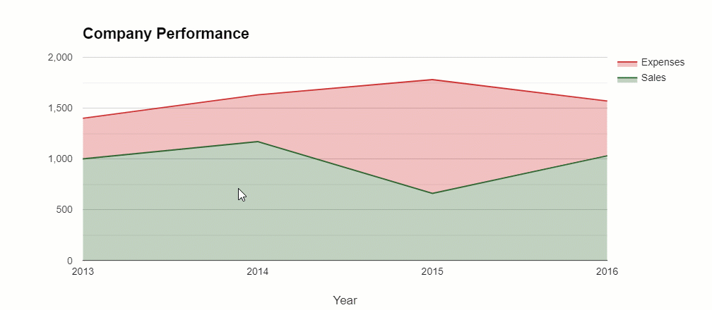
Compare with a version with overlapped plots:
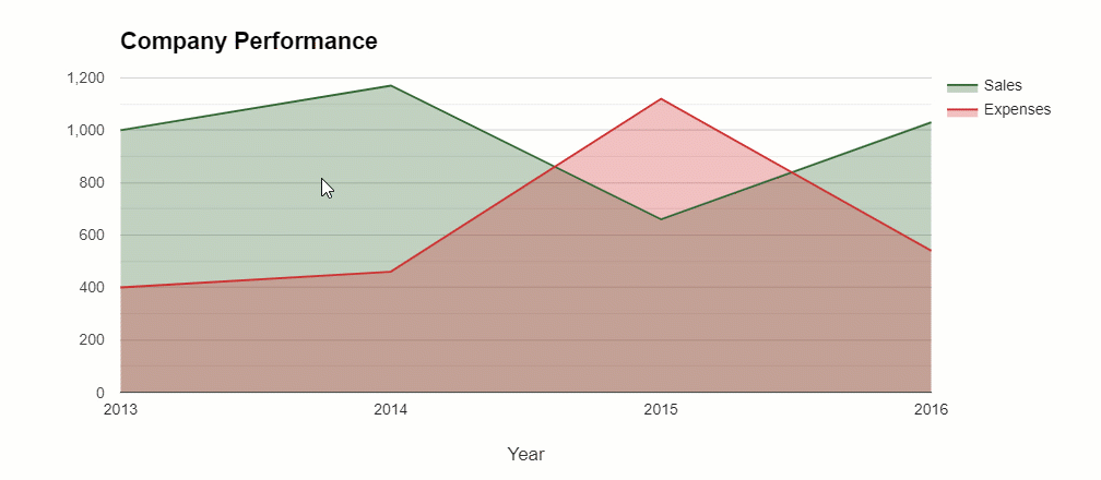
The second one is neater and easier to read, isn’t it?
Stacked bar chart
You may have used a bar chart for comparing the changes in values over time or across the categories but for displaying the size differences for parts of a whole it’s better to take advantage of stacked bar charts. In this chart, the bars are placed on top of each other.
Purpose
Use it to show how a larger category is divided into subcategories and how each subcategory contributes to the total amount. In case you need to show the percentage of each value, use 100% stacked bar graph instead.
Recommendations
- It’s better not to use too many segments for each bar as the graph may become difficult to read and interpret.
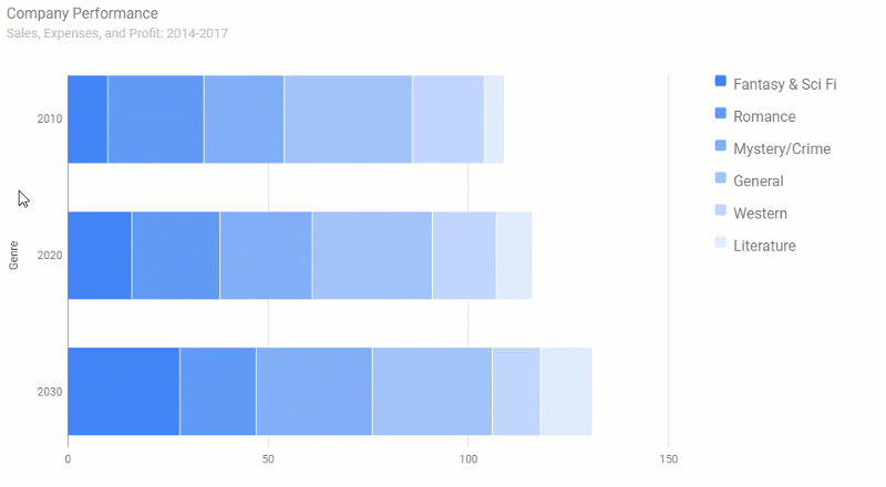
Examples
Over time comparison of sales of books divided by genres:
Static composition
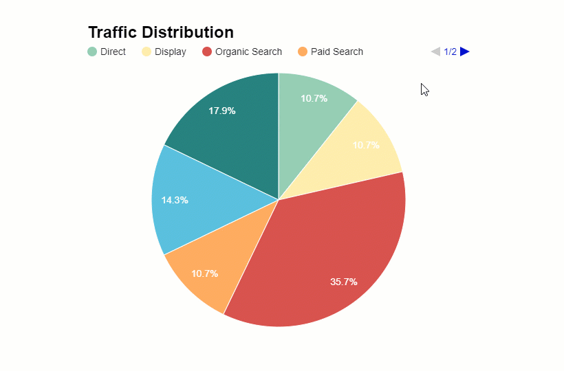
Pie chart
A pie chart is one of the most widely used types of visualization. The first mention of the pie chart is attributed to William Playfair in 1801. Though many people criticize pie charts, they play an important role when it comes to understanding the parts of the whole.
Purpose
Use it to show proportions or percentages of categories in the form of a circle divided into segments. The value of each category is proportional to the corresponding length of the arc.
Recommendations
To make the chart comprehensible, follow these basic rules:
- It’s better not to try visualizing large amounts of data – choose up to 6 categories to make a pie chart easy to interpret.
- Make it readable – label segments outside the chart.
- Make sure your data fits this type of chart. The data should be discrete. Otherwise, incorrect use of the data may lead to misleading visualization.
- Avoid using the 3D version of the pie chart – it may distort true proportions between categories.
Example
Visualizing the categories which bring the most traffic:
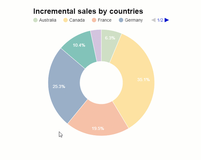
Doughnut (ring) chart
A doughnut chart is a variation of the pie chart with a round hole in the center. It has the same purpose as a pie chart does but its special feature is a capability to contain supplementary information which can improve the readability of the chart.
Example
Shares of sales by countries:
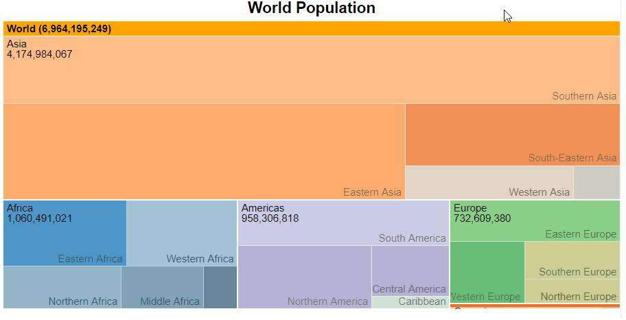
Treemap
A treemap chart looks unpretentious yet it’s powerful. Thanks to their compactness, treemaps help to illustrate a large amount of data in a hierarchical view.
Purpose
Use it to visualize the hierarchical data in a form of clustered rectangles which together represent the whole. Each node (or group) is represented by a rectangle, which area is proportional to the value. Colors help to add dimensions such as groups and subgroups.
Do you want to be the first to test the grid with your data?
Recommendations
- Add some interactivity to the chart to achieve a detailed view of the data and be able to drill through the hierarchies (e.g., from continents to regions and countries).
- To avoid misinterpretation of your data composition analysis, it’s better not to use many parts so as not to confuse the audience.
Examples
This treemap shows the number of the world population. You can drill through to know the levels of a population of each hierarchy and subhierarchy.
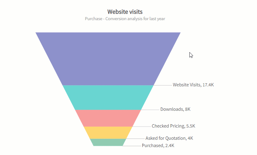
Funnel (pipeline) chart
A funnel chart is a type of chart that depicts the decrease at each stage in a process. In other words, it illustrates how many items are lost at each stage of a particular process. This is why it’s widely used in marketing and sales. The most popular use case is the analysis of conversions.
If there’s an increase at each stage, a funnel chart turns into a pyramid chart.
Purpose
Use it to identify bottlenecks in a workflow by ordering the entire process by stages.
Example
Conversion of website users into customers:
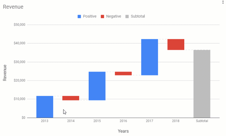
Waterfall chart
A waterfall chart shows how the starting value is increased or decreased by a sequence of intermediate values that lead to the total value. Such a process is called cumulative. This type of chart is commonly used in finance domain.
Purpose
Use it to understand how the value is gradually changed over time or across categories.
Example
Final words
We do hope you enjoyed this overview of charts and recommendations. Now you are ready to pick the right type of visualization to make your data analysis be ahead of the curve.
Thank you for reading!
What’s next?
- Power of Data Visualization and Charts
- Best Charts to Show Discrete Data
- Charts for Comparison Over Time
- Best Charts to Show Correlation
- Best Charts to Show Data Distribution