
Charts for Comparison Over Time
In this article
It’s time to discover charts for one of the most common types of data analysis – a comparison over time.
Recently we’ve talked about the basic principles of data visualization and charts for comparing discrete groups of data. Now it’s time to discover charts for one of the most common types of data analysis – a comparison over time.
Today we’ll dive into a process of choosing the comparison charts that display the data over a period of time and help to track trends in changes for one or multiple categories during that period. All of them prove to be extremely helpful in visualizing the performance with respect to time.
The choice of the comparison chart highly depends on how you treat time – as discrete or continuous data. It’s totally up to whether to use bars to focus on individual dates or lines to observe trends over a continuous interval.
So, let’s start!
Line chart
Line charts (also known as trend lines) are best for illustrating trends and volatility in the data. To draw a line chart, plot the data points on a Cartesian plane and connect them with a line. As a rule, time is plotted on the X-axis (as well as any other independent variables) while the values are plotted on the Y-axis.
Purpose
Use it to depict how the data changes over a continuous time period, either inside one category or among multiple ones.
Recommendations
- If the sum of values is important, consider using an area chart instead of a line chart.
- Keep it neat: don’t plot more than three-four lines per chart.
Examples and variations
- A single-line chart
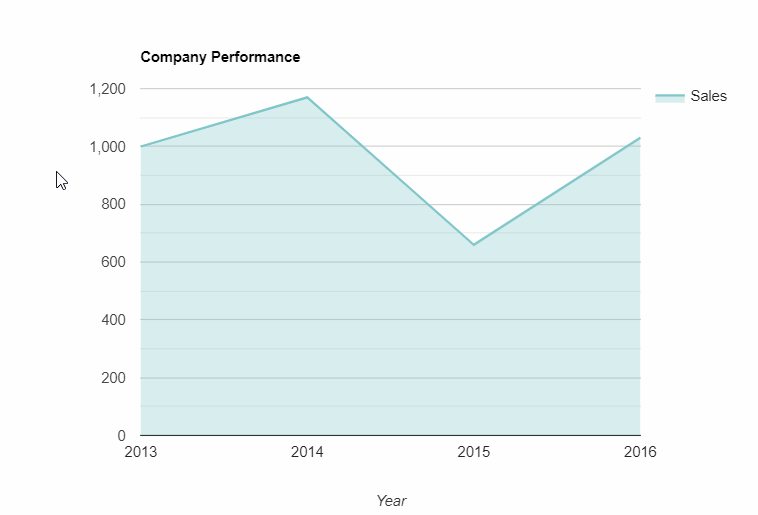
Using this chart, you can compare a single metric over time.
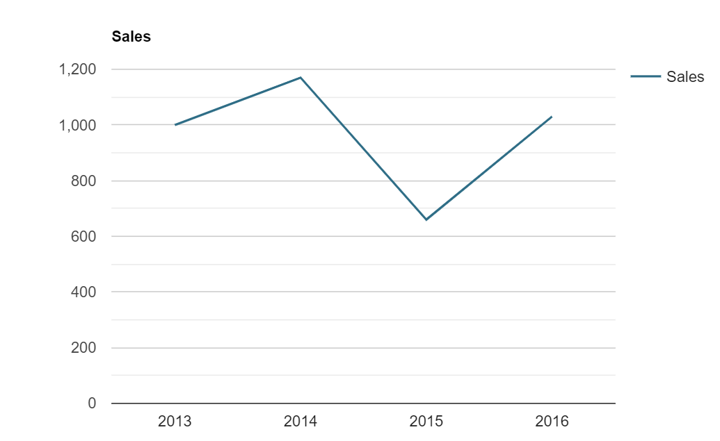
Compare the level of sales over the years
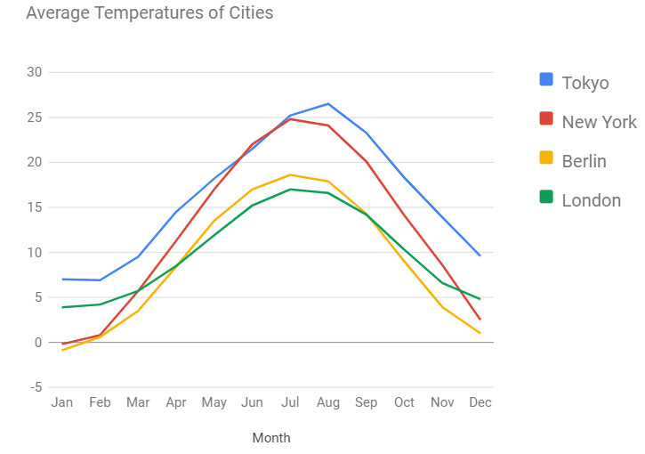
- A multi-line chart
Works best for comparing values of multiple categories or groups to one another over time. To distinguish lines by categories and make the chart as readable as possible, plot lines of distinct colors and widths.
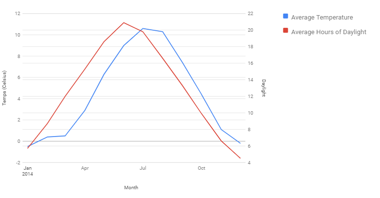
- Dual-axis line chart
It is the same as a multi-line chart but with the second Y-axis being added to it. The several usage scenarios are possible:
- For comparing two data series with the same measure which is expressed using different magnitudes (value ranges).
- For comparing two data series which values are expressed with different units of measurement (e.g., in degrees Celsius and Fahrenheit, in degrees and hours, etc).
Column chart
A column chart consists of vertical bars, the lengths of which are proportional to the values. It’s suitable not only for comparing the data between various categories but also for showing trends for the same or multiple measures over discrete time intervals.
Recommendation
If you have long data labels or/and a large number of data-series, it’s better to use a bar chart instead as it uses space more rationally.
Example
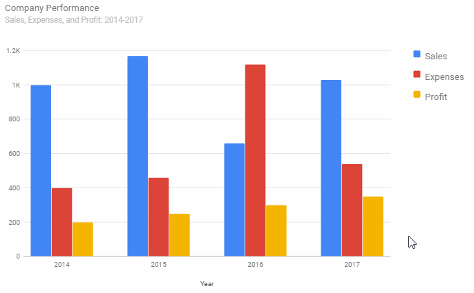
Comparing the company’s sales, expenses, and profit over the years
Step chart
A step chart is also known as a step graph. Its main difference from a line chart lies in a method of connecting the points. Instead of connecting the points using the shortest distance between them, it plots vertical and horizontal lines to connect the data points on a plane. Vertical lines can be interpreted as abrupt changes in time-series data.
Do you want to be the first to test the grid with your data?
Purpose
Use it to track the discrete changes in the data that happen at specific moments of time.
Recommendations
- Use it with a timestamp data, or with one that has missing values for some dates.
- To communicate the magnitude of change, fill an area under the line with color.
Example
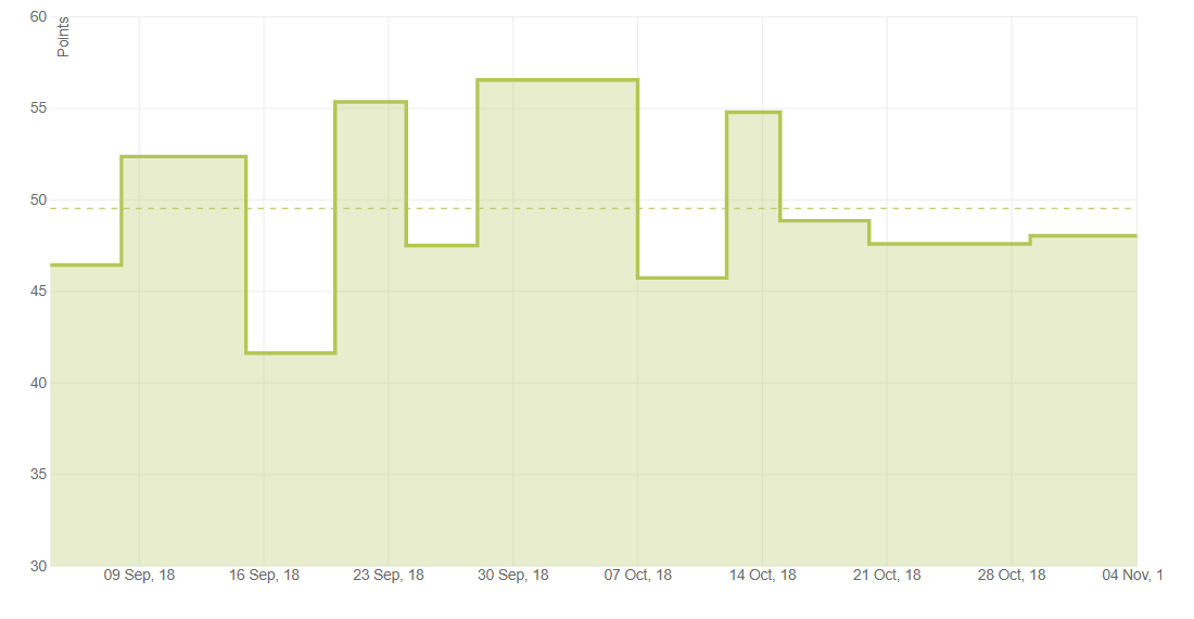
Compare stock prices by days
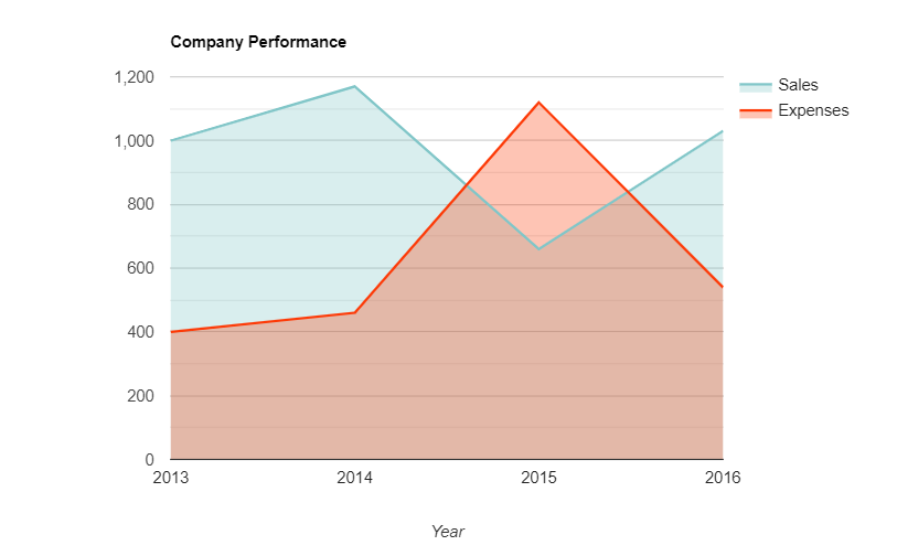
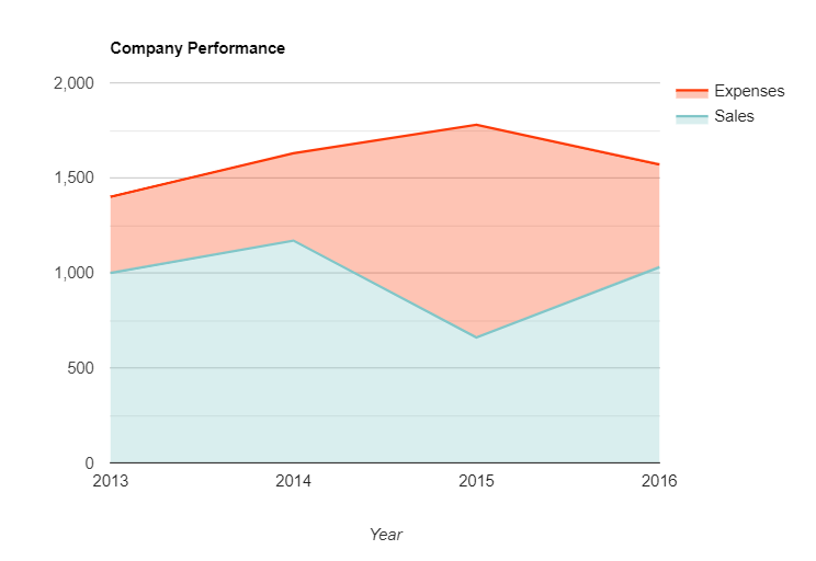
Area chart
This chart is graphed on the X- and Y-axis, with values being connected using line segments. The area between line segments and axes is filled with color.
Purpose
Use it to accentuate on how the magnitude of the cumulative value evolves over time.
Recommendations
- Assign contrast colors to different data series to help your audience compare values at glance.
- When communicating trends of multiple categories, avoid overlapping plots – this representation may be misleading for your audience. Prefer using stacked area charts instead.
- If the differences between the successive values are tiny, give preference to a line chart.
Examples and variations
- A single-series area chart
- A multi-series area chart
- A stacked area chart
The elements for data series are stacked at each value and are rescaled to add up to 100%. This extension of the area chart is more readable, isn’t it?
Summary
At WebDataRocks, not only we enhance your reporting experience but share knowledge about the best modern visualization techniques.
Hopefully, this third step of our data visualization journey helps to deepen your knowledge of the charts. We are sure that all of them deserve to take a worthy place in your presentation.
What’s next?
To keep up with all the contributions to our project, check out all the blog posts on the data visualization topic:
- Power of Data Visualization and Charts
- Best Charts to Show Discrete Data
- How to Choose Charts to Show Data Composition
- Best Charts to Show Correlation
- Best Charts to Show Data Distribution