Updating Your Tech Stack: Migrating from PivotTable.js to alternatives
If you’re working with data visualization, you probably have heard about PivotTable.js. It’s a lightweight, open-source JavaScript Pivot Table written by Nicola Kruchten and has been a well-known tool in data visualization for a long time.
You can explore the library yourself on its official GitHub repository, where the full source code is available, or check out a quick demo on YouTube recorded by the author to see how it works in practice.
What makes it stand out is its openness. Because it’s fully open source, you can get free access to the code and full control. It works quite well when you want to build a custom solution from the ground up.
There’s also even a React version called react-pivottable and maintained by the same author, which makes integration into modern apps a bit easier.
At the same time, the library shows its age, as it was built in 2012. It wasn’t updated at all recently, and you can feel that in the overall experience.
This is where WebDataRocks pivot grid component takes a different direction.
It gives you a complete, polished solution out of the box. The built-in UI is already there; it looks modern, and you can integrate it into your project much faster without building everything from scratch. But even if you want to add more customization, you can also achieve it!
As examples, we’ve got lots of showcases that demonstrate how WebDataRocks can be used in different ways: from complex analytical dashboards to daily usage habits trackers.
- HR Analytics with WebDataRocks
- Marketing Campaigns Analysis
- WebDataRocks analytical sport Dashboard
- WebDataRocks Bento Styles Dashboard
- Santa’s Letter Management System
Even just looking at these titles, you can already see how diverse the use cases are and, for sure, it’s not even near the limit of its possibilities.
In reality, it’s a very flexible data visualization component that can be used across many areas and industries, including finance, analytics, audit, logistics, and more. Also, we’ve got some practical examples about how to use it in marketing, sales, industry, and HR analytics. Some of the more “fun” demos are just there to show how flexible it is and how easily it can work with very different kinds of data.
In short, WebDataRocks works as a universal tool for handling data. You can structure, filter, and display it however you need. That’s why it’s useful both for serious, data-heavy projects and for more creative use cases.
What people say about PivotTable.js and WebDataRocks
PivotTable.js struggles with large datasets, which may be problematic for users. There’s no information about its limits in official docs, but some users on StackOverflow inform that while working with 2000 rows, there’s a slight delay, but with 5000 rows, it completely freezes.
On the other hand, WebDataRocks handles larger datasets (the limit is 1 MB, but it’s actually enough for most use cases) more comfortably and continues to receive updates, which makes it feel better aligned with current development needs. Also, WebDataRocks appears in numerous Reddit discussions. You may notice that people there describe it as a feature-rich component.
Flexmonster as an alternative to PivotTable.js & WebDataRocks
Even though WebDataRocks isn’t open source, it’s still completely free. Unlike many similar tools that are limited to non-profit or personal use, you’re welcome to use it in commercial projects and real business applications as well. And if you ever need something more advanced, there’s also Flexmonster – a commercial product created by the same team. It’s designed to handle even larger datasets, advanced analytics, and enterprise-level requirements.
For example, it has better performance with really large datasets, including built-in support for server-side processing. This means you can work with millions of records without loading everything into the browser, which isn’t really possible with lighter tools.
Another big advantage is the wide range of integrations. Flexmonster allows connecting to more advanced data sources, such as backend databases, and supports server-side technologies.
Also, it supports many popular frameworks such as React, Angular, and Vue.js (which are also supported by WebDataRocks), but it doesn’t stop there. It also works with less common or newer tools like Svelte, Flutter, Blazor, Nuxt, Next.js, and much more. This makes it a very flexible choice for real-world applications.
Wrap-up
In conclusion, it really depends on what you really need. PivotTable.js is great when you value openness and want full control, especially for smaller projects. But when the goal is to move faster, work with more data, and get a clean interface without extra effort, WebDataRocks feels like a better choice.
That’s why it works so well as an alternative – not because one is completely better than another, but because they’re designed for slightly different tasks.
What is a web pivot table?
A web pivot table is a data visualization component used in web applications to summarize, analyze, and explore information directly in the browser.
It allows users to dynamically group, filter, sort, and aggregate data. This makes it easier to identify patterns, compare values, and build reports without writing complex queries.
What is the difference between WebDataRocks and Flexmonster?
WebDataRocks and Flexmonster are created by the same team but serve different needs.
<ul>
<li>WebDataRocks is completely free and works well for small to medium datasets. It’s ideal for dashboards, internal tools, and typical business use cases.</li>
<li>Flexmonster is a commercial solution designed for enterprise-level applications. It can handle very large datasets, server-side processing, and more advanced integrations.</li>
</ul>
If your project grows or requires more scalability, Flexmonster can be a great next step.
Is open-source better than free software?
Not always. Open-source gives full access to the code, which is great for flexibility and customization. However, free closed-source tools can offer a better out-of-the-box experience and support, be more polished, and be easier to integrate.
Can WebDataRocks be integrated into an existing dashboard?
Yes. WebDataRocks is a flexible component that can be used on a web page or dashboard. Also, it easily integrates with other visualization libraries.
For example, it can be combined with popular charting libraries such as amCharts, Highcharts, Google Charts, and more to create interactive dashboards where they both work smoothly together.
You can also find practical integration examples in our blog:
<ul>
<li>Turn Your Data Into a Halloween Treat with WebDataRocks </li>
<li>Tutorial: How to create a dashboard with WebDataRocks and AnyChart</li>
<li>Data visualization with WebDataRocks & Chart.js: create a dashboard in 5 min</li>
</ul>
We are sure you’ve received many surveys on various topics and have been filling them out. But have you ever thought about how to better store this info in one place so it can be easily analyzed and navigated in the future? For sure, we’ve got a solution for you, and it’s WebDataRocks Pivot Grid!
As you know, better to learn anything by example. So, we’d love to present our new Medical Survey demo to you and walk you through the process of building it. Let’s start!
Step 1: Adding WebDataRocks Pivot Table to the Page
First step is easy as always: just add WebDataRocks to your project. It’s possible to achieve it with this code snippet:
<link href="https://cdn.webdatarocks.com/latest/theme/default/webdatarocks.min.css" rel="stylesheet" />
<script src="https://cdn.webdatarocks.com/latest/webdatarocks.toolbar.min.js"></script>
<script src="https://cdn.webdatarocks.com/latest/webdatarocks.js"></script>
Step 2: Building the Patients’ Experience Report’s Structure
Next, we create a pivot table where each row represents a patient visit, and each column reflects hospital performance metrics. In other words, just building the structure of our dashboard: include which rows, columns, and measures we’d like to display:
const pivot = new WebDataRocks({
  container: "#pivotContainer",
  width: "100%",
  report: {
    dataSource: {
      data: getData()
    },
    slice: {
      rows: [
        { uniqueName: "Name" },
        { uniqueName: "Surname" },
        { uniqueName: "Department" }
      ],
      columns: [{ uniqueName: "Measures" }],
      measures: [
        { uniqueName: "StaffFriendly" },
        { uniqueName: "WouldRecommend" },
        { uniqueName: "VisitSuccessful" },
        { uniqueName: "FacilityClean" }
      ]
    },
    options: {
      grid: {
        type: "flat",
        showGrandTotals: false
      }
    }
  }
});
Step 3: Preparing and Preprocessing the Info for Better Data Analysis
Okay, now we need to make sure our data is ready for analysis. In our case, the survey contains many Boolean values (true/false), which are not ideal for aggregation.
To solve this, we preprocess the data by converting all Boolean values into numeric ones (1 and 0). This allows WebDataRocks to correctly calculate totals and, in the future, implement a wide variety of aggregation functions.
function preprocessData(data) {
	return data.map(function (record) {
		var result = {};
		for (var key in record) {
			result[key] =
				typeof record[key] === "boolean" ? (record[key] ? 1 : 0) : record[key];
		}
		return result;
	});
}
Now, instead of using raw data, we first transform it and then pass it to the pivot table:
dataSource: {
	data: preprocessData(getData())
}
Step 4: From Raw Data to Visual Feedback with Data Visualization Techniques
The thing is, in our survey are too many true/false answers (which are now converted into 1/0 numeric values), and they are not really readable in this format. Let’s transform them into visual signals!
And at the beginning, we just list columns that contain these boolean-type answers:
const fieldsToFormat = [
  "StaffFriendly",
  "WouldRecommend",
  "VisitSuccessful",
  "FacilityClean"
];
But the question is, in which format is better to represent them then?
Why should we even choose the one? We can apply a few of them! So, the user can pick the option that’s most convenient: pills, emojis, or colored dots.
let currentMode = "pills";

function customizeCellFunction(cell, data) {
  if (
    data &&
    data.type === "value" &&
    fieldsToFormat.includes(data.hierarchy.uniqueName)
  ) {
    if (currentMode === "pills") {
      cell.text = data.value == 1
        ? `<span class="pill yes">Yes</span>`
        : `<span class="pill no">No</span>`;
    }

    if (currentMode === "emojis") {
      cell.text = data.value == 1 ? "✅" : "❌";
    }

    if (currentMode === "dots") {
      cell.text = data.value == 1
        ? `<span class="dot yes"></span>`
        : `<span class="dot no"></span>`;
    }
  }
}
Step 5: Switching How Insights Are Displayed in an Interactive Report
Here’s the time to do switching button for it. So, just add a simple dropdown so users can change the visualization style:
<select onchange="changeDisplayMode(this.value)">
  <option value="pills">Pills</option>
  <option value="emojis">Emojis</option>
  <option value="dots">Colored Dots</option>
</select>
And, for sure, connect it:
function changeDisplayMode(mode) {
  currentMode = mode;
  pivot.customizeCell(customizeCellFunction);
}
Now it feels like completely different dashboards depending on the view:
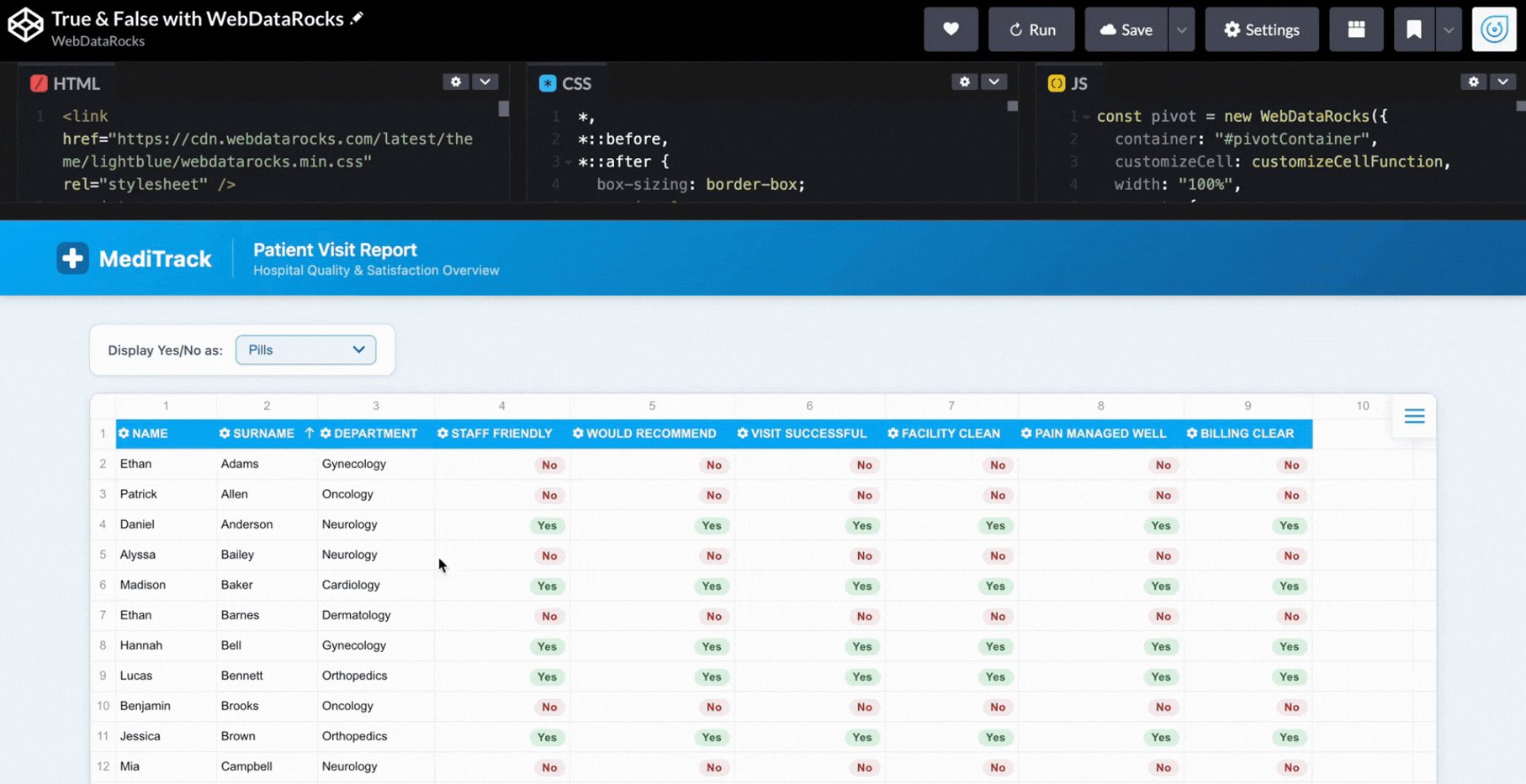
Step 6: Styling Web Pivot Table
And now, let’s bring real medical style to our dashboard so everyone understands what the topic is at first glance!
With WebDataRocks, you don’t need to create the whole design from scratch. It has 8 already built-in themes, and look, there’s a light-blue one! I guess it’s a perfect match for our dashboard. To implement it, just add this code snippet to your project:
<link href="https://cdn.webdatarocks.com/latest/theme/lightblue/webdatarocks.min.css" rel="stylesheet" />But don’t be scared, we don’t limit our users to just built-in themes, you can also create your own custom component theme!
Still not enough styling? We’ve got another idea. Let’s add a header to make our dashboard even more recognizable.
<header class="page-header">
<div class="header-inner">
<div class="header-logo">
<svg width="32" height="32" viewBox="0 0 32 32">
<rect width="32" height="32" rx="8" fill="#1A6BAA" />
<rect x="13" y="6" width="6" height="20" rx="2" fill="white" />
<rect x="6" y="13" width="20" height="6" rx="2" fill="white" />
</svg>
<span class="header-brand">MediTrack</span>
</div>
<div class="header-title">
<h1>Patient Visit Report</h1>
<p>Hospital Quality & Satisfaction Overview</p>
</div>
</div>
</header>And for sure, don’t forget to style it properly. You can see how it all comes together in the demo.
So here it is: our dashboard is ready to help hospitals track patient experience! Hope this demo helped you learn new features of WebDataRocks and gave you ideas for implementing them in your real projects.
By the way, #CodePenChallenge inspired the idea for this dashboard. And being honest, it’s not our first time experimenting with it. If you want to see more creative projects, we recommend reading our articles on dev.to about it:
- #CodePenChallenge Halloween Time: Building a Pivot Table with Horror Movies using WebDataRocks
- Building a Snowy Weather Dashboard with Free Pivot Grid Library
- #CodePenChallange: Colorful Way of Data Presentation Using Data Viz Library
HR analytics is always on the hunt for clean, simple visualizations. You’re dealing with complex, fragmented data from multiple systems that needs to be two things at once: a high-level summary for leadership and a granular, actionable view for managers. That’s why WebDataRocks pivot table with Highcharts integration is such a perfect match. It bridges the gap between complex data structures and clean, intuitive visuals, letting you pivot from the big picture to deep-dive details in a few clicks.
Data We Use
This dataset is a comprehensive mix of demographic, financial, and performance metrics designed to provide a 360-degree view of a workforce. It balances individual identifiers (such as Job Title and Country) with critical KPIs, including Revenue per Employee and Turnover Rate, making it ideal for identifying correlations among compensation, engagement, and productivity.
Here’s a sample data entry from the dataset:
{
  "id": 7,
  "Full Name": "Doralia Scedall",
  "Job Title": "Geological Engineer",
  "Country": "Spain",
  "Department": "Human Resources",
  "Month Salary": 3900,
  "Employee Engagement": 0.8,
  "Overtime Hours": 12,
  "Age Group": ">70",
  "Turnover Rate": 0.31
}
HR Analytics Dashboard
Pivot Grids
We use a pivot grid as the core of our dashboard. All the data is already there; you can play around with the slice to show only what you need, and sort or filter the data as needed.
GENERAL DATA PIVOT
WebDataRocks’ grid gives you the flexibility to customize the cells and even include icons representing, for example, engagement or performance levels. This way, important information is immediately visible.
SALARY RANGES BY DEPARTMENTS
You can visualize the minimum, maximum, and average salary for each department. Conditional formatting helps highlight outliers and identify unusual values or patterns.
Moreover, by integrating WebDataRocks with charting libraries you can get even more powerful insights.
Bar Charts
For this dashboard, we chose Highcharts because we already have a ready-made connector, which makes implementation easy. All the charts pull their data directly from our pivot grid, so any filtering, sorting, or slicing done there is automatically reflected in the charts.
This way, you can focus on visualizing exactly what you need without having to handle the raw data separately.
With bar charts, you can visualize core metrics by department, such as average overtime or training costs. It allows you to quickly compare different teams or roles side by side and spot trends.
Pie Charts
Pie charts show how a whole breaks down into different groups, such as employees by gender or the top countries where your staff work. Each slice clearly represents a group’s size, making it easy to compare categories at a glance.
Area Charts
Area charts display trends over time, such as hiring growth or workload changes across weeks, months, or even years. By filling the space under the line, area charts make it easy to see patterns.
Why Choose WebDataRocks for HR Reporting?
- Present people data in a clear and easy-to-understand way,, making HR insights easier to communicate with managers and leadership.
- Real-time interaction makes it easier to notice trends in employee engagement, workload, and overall team stability.
- Visual summaries help highlight key HR signals that might be missed when looking at just raw data.
You can play with our HR Analytics demo on CodePen and explore all the features you can implement.
Also, feel free to embed the interactive demo and make any necessary adjustments to better suit your specific content and style.
As you may have already noticed, we love participating in CodePen Challenges! This time, the topic was “food”, so we decided to use a dataset that is familiar to everyone — McDonald’s menu items. You can find McDonald’s almost everywhere, and their burgers? Loved by lots of people. We thought it’d be fun to turn their menu data into an insightful visual report.
(more…)
The Paradigm Shift to Data-Driven Decision-Making
We are living in an era of big data, where data-driven decision-making has become a pivotal part of business operations. From healthcare to retail, industries across the board are leveraging data science to refine their strategies, optimize resources, and predict future trends. However, abstract concepts and theories often fail to convey the true potential of data science projects. Therefore, examining real-world case studies and their practical applications can provide a more tangible understanding of data science in action.
Predictive Analytics in Healthcare
One of the primary applications of data science is in the healthcare industry. By employing predictive analytics, medical professionals can anticipate disease outbreaks, improve patient care, and optimize resource allocation. A case in point is the use of machine learning to predict diabetes in patients.
The Center for Disease Control and Prevention (CDC) conducted a project to predict diabetes in individuals based on various factors like age, BMI, insulin level, and family history of diabetes. They developed a predictive model using various machine learning algorithms. This model was able to accurately predict individuals at high risk of developing diabetes, thus enabling early intervention and preventive care. The use of such data-driven models can not only improve patient care but also reduce healthcare costs significantly.
Retail and E-commerce Analytics
Data science has revolutionized the retail and e-commerce industry by providing insights into customer behavior, optimizing pricing strategies, and improving supply chain management. Amazon, one of the largest e-commerce companies, harnesses the power of data science in numerous ways.
Amazon’s recommendation system is a perfect example of a data science application. The company uses collaborative filtering, a machine learning technique, to predict a customer’s preferences based on their past behavior as well as similar customers’ behavior. This personalized recommendation system has significantly boosted Amazon’s sales, proving the efficacy of data science in enhancing customer experience and driving business growth.
Traffic Management and Urban Planning
Data science is also playing an essential role in improving urban planning and traffic management. A remarkable example is the Google-owned company, Waze. This GPS navigation software app uses real-time traffic data from its community of users to provide the fastest possible routes to destinations.
The app collects data on users’ speed, location, and route and uses these insights to inform other users about the quickest and most efficient routes. This real-time data analysis not only saves time for individual drivers but also has wider implications for urban planning and reducing carbon emissions.
Educational Pathways for Aspiring Data Scientists
Aspiring data scientists often question the best way to get a foot in the door of this exciting field. Quality education and practical exposure to real-world projects are essential components of a comprehensive data science education.
One resource that offers a solid foundation is the MIT Applied Data Science Program. This rigorous and well-structured program equips students with the necessary theoretical knowledge and practical skills to tackle real-world data science problems. It offers a comprehensive curriculum covering data collection, analysis, visualization, and interpretation, all critical skills for budding data scientists.
Bridging the Gap with Online Courses
While formal education lays the groundwork, supplementary resources can enhance learning and provide practical exposure to diverse data science applications. Online courses are an excellent way to bridge this gap.
Enrolling in a comprehensive Data Science Course can be particularly beneficial. These courses typically encompass a wide array of topics, including machine learning, statistics, Python programming, and more. They also often provide real-world projects to work on, enabling students to apply the theoretical knowledge they have gained.
Impact of Data Science on Finance
Adding another significant feather to its cap, data science has made a significant impact in the financial sector. The complex and voluminous data in this industry necessitates advanced tools and techniques to extract valuable insights. This is where data science steps in.
For example, American Express, a multinational financial services corporation, leverages big data and machine learning to predict potential churn and fraud. They analyze structured (transaction details) and unstructured data (social media interactions) to develop predictive models. These models help identify potential customer churn before it happens and detect fraudulent transactions, ensuring a seamless customer experience while minimizing loss for the company.
Data Science in Sports Analytics
The influence of data science has extended to the world of sports as well. Sports teams and franchises use data science techniques to improve their strategies, optimize player performance, and enhance injury management.
The NBA team, Houston Rockets, is a pioneer in leveraging data science for game strategy. They use analytics to determine the most efficient shots on the basketball court and develop their offensive strategy accordingly. Furthermore, they analyze player data to manage player fatigue and prevent injuries, showcasing another practical application of data science.
Data Science and Social Impact
The extent of data science is not solely confined to business applications. It also plays a pivotal role in tackling societal problems and creating a beneficial influence. Data science has the capability to recognize patterns and tendencies in domains like criminal activity levels, economic hardship, and community well-being, thus providing valuable insights for implementing effective approaches to combat these obstacles.
One such instance is the use of data science to fight hunger in developing countries. The World Food Programme uses data analysis to identify regions most affected by food scarcity and optimize the allocation of resources. By predicting potential crisis zones, data science can assist in more targeted interventions and proactive problem-solving.
The Predictive Intelligence in Manufacturing Efficiency
General Motors’ Predictive Maintenance
General Motors is utilizing data science to predict potential failures in machinery and reduce downtime in its manufacturing processes. With thousands of sensors monitoring the condition of equipment, real-time data is analyzed through machine learning algorithms to predict when a machine is likely to fail. This has enabled GM to perform maintenance proactively, minimizing production delays. The system’s significant reduction in unexpected equipment failures is enhancing overall efficiency and cost reduction, transforming the way manufacturing industries operate. By adding a layer of intelligence and foresight, GM showcases how data science can drive innovation and efficiency in manufacturing.
The Customized Approach to Tourism and Hospitality
Marriott’s Personalized Guest Experience
Marriott Hotel Chain uses data science to provide personalized services and offers to guests based on their preferences and behaviors. From room selection to dining preferences, data-driven insights are used to curate a unique experience for each guest. The personalized approach extends to Marriott’s mobile app, where guests receive tailored recommendations and can select specific rooms. The marriage of data science and hospitality has not only led to increased customer satisfaction and loyalty but has also set a new standard for guest experience, proving that data can be a game-changer in customer service industries.
Do you want to be the first to test the grid with your data?
The Integrated Governance in Singapore’s Smart Nation Initiative
Singapore’s Data-Driven Public Transportation
Singapore’s government has embraced data science through its Smart Nation Initiative, leveraging data to optimize public transportation, environmental monitoring, and urban planning. The data-driven approach has significantly reduced congestion and improved commuter experience, promoting sustainable urban living. Singapore is also applying these methods to other areas such as healthcare, safety, and governance. By integrating data across various public domains, Singapore is pioneering a new era of efficient, responsive governance, serving as a global example of how data science can revolutionize public administration and enhance the quality of urban life.
The Personalized Entertainment Experience on Netflix
Netflix’s Recommendation Algorithm
Netflix’s streaming services are shaped by data science, using machine learning to analyze viewing habits, ratings, and user interactions to offer personalized recommendations. The success of this recommendation system has had a profound impact on subscriber retention and content engagement. By continuously learning from user behavior, the algorithm evolves, offering more precise suggestions over time. This targeted approach ensures that viewers find content that resonates with them, leading to increased watch time and customer satisfaction. Netflix’s case study underlines the influence of data science in reshaping the media and entertainment landscape, making content consumption more personalized and engaging.
The Data-Driven Approach to Environmental Conservation
Wildlife Protection through Data Analysis
Worldwide conservation organizations, including the WWF, are employing data science to protect endangered species and preserve biodiversity. By using camera traps and sensors to monitor wildlife and environmental conditions, these organizations can analyze vast amounts of data to guide conservation strategies and timely interventions. Beyond informing local actions, these insights are contributing to global knowledge and collaboration on conservation issues. The innovative use of data science in wildlife protection demonstrates its potential to have a meaningful social impact, moving beyond commercial applications and contributing to the global effort to preserve our planet’s biodiversity and ecological balance.
The Transformation of Agricultural Efficiency through Data Science
John Deere’s Precision Farming
John Deere’s embrace of data science has revolutionized farming practices, making agriculture more sustainable and efficient. By integrating data analytics and IoT devices into farming equipment, they have enabled farmers to monitor and manage their machinery and crops in real-time. These insights are used to optimize planting times, soil management, and irrigation, resulting in more productive yields and reduced waste. Additionally, predictive analytics helps farmers to anticipate machinery breakdowns and mitigate potential problems. John Deere’s case exemplifies how data science can transform traditional industries, marrying technology with age-old practices to usher in a new era of agricultural innovation.
The Advancement of Personalized Medicine with Data Analytics
23andMe’s Genetic Insights
The personal genomics company 23andMe uses data science to provide individuals with insights into their genetic heritage and potential health risks. Through genetic testing and sophisticated data analysis, the company offers personalized reports on ancestry, wellness, and predisposition to specific diseases. This information empowers individuals to make more informed healthcare decisions and encourages a more personalized approach to treatment and prevention. The marriage of genetics and data science in 23andMe’s offerings exemplifies a profound shift in healthcare towards personalized medicine, highlighting the potential of data to revolutionize medical understanding and patient care.
The Enhancement of Law Enforcement through Predictive Policing
Los Angeles Police Department’s Operation LASER
The Los Angeles Police Department (LAPD) has implemented a data-driven program known as Operation LASER to predict and prevent criminal activity. Using historical crime data, social media monitoring, and spatial algorithms, the system identifies crime hotspots and predicts potential criminal activities. Officers receive real-time insights that guide patrol routes and investigative priorities. This approach has led to more proactive policing, helping reduce crime rates in targeted areas. The LAPD’s use of data science showcases the transformative potential of predictive analytics in law enforcement, leading to more efficient resource allocation and a proactive approach to community safety.
The Reinvention of Customer Support with AI and Data Analysis
IBM’s Watson in Technical Support
IBM has leveraged its AI system, Watson, to reinvent customer support, especially in complex technical domains. Watson can analyze vast amounts of data, including product manuals, support documents, and customer interaction logs, to understand and solve customer issues. By combining natural language processing and machine learning, Watson offers real-time assistance to support agents, suggesting solutions and even interacting directly with customers through chatbots. This data-driven approach has dramatically reduced response times and increased customer satisfaction rates. IBM’s integration of AI and data science into customer support showcases the potential to enhance efficiency and customer experience in service industries, offering a glimpse into the future of human-AI collaboration.
Deepening Knowledge through Certifications
As data science continues to penetrate various sectors, the demand for skilled data scientists is on the rise. Supplementing your knowledge with certifications can give you an edge in the competitive job market.
Specifically, earning a Data Science Certification can help you demonstrate your expertise and commitment to prospective employers. It can validate your skills, showcase your knowledge of cutting-edge data science tools and techniques, and help you stand out in the crowd.
Final Thoughts
From healthcare to finance, retail to sports, and even social impact initiatives, the potential applications of data science are broad and diverse. The need for professionals with a firm grasp of data science concepts and the ability to apply them in real-world scenarios is growing exponentially. Educational programs such as the MIT Applied Data Science Program, supplemented with online courses and professional certifications, can provide an ideal pathway to enter and thrive in this dynamic and rapidly evolving field. The future is data-driven, and data science is leading the way.
Thank you to our guest author Nisha Nemasing Rathod, a Technical Content Writer at Great Learning. She focuses on writing about cutting-edge technologies like Cybersecurity, Software Engineering, Artificial Intelligence, Data Science, and Cloud Computing and holds a B.Tech Degree in Computer Science and Engineering . She is a lifelong learner, eager to explore new technologies and enhance her writing skills.
What else to read?
- List of Top Database Management Software
- How data visualization transforms the way you do business
- Top 11 splendid data visualization blogs to follow in 2020
- Best JavaScript frameworks for 2021
- Top resources every developer should read
- Developer’s choice: an overview of the best front-end frameworks in 2020
- Best Code Editors For Web Development – The Ultimate Latest List

In this article, we’ll take a look at the best free pivot table libraries you can integrate into your project to improve your web reporting. Pivot tables are great tools that not only help you organize and visualize data but also allow you to sort, filter, and export it. Here you can read more detailed information about what a pivot table is. The pivot table component can transform your data into a readable format and provide valuable insights. However, many developers have the challenge “how to choose a pivot table for your project.” That is why we decided to evaluate various pivot controls.
(more…)Collapses all nodes and performs the drill-up of all hierarchies in the slice on the grid.
Example
webdatarocks.collapseAllData();
Check out the CodePen example.
See also
expandAllData(withAllChildren: Boolean)
Expands all nodes and performs the drill-down of all hierarchies in the slice on the grid.
Parameters
| Name | Type | Description |
|---|---|---|
| withAllChildren | Boolean | optional Defines whether to drill down all levels of all hierarchies or not. Set this property to false to expand all nodes and not to drill down hierarchies. Default value is true. |
Examples
1) Expand all nodes and drill down all hierarchies in the slice:
webdatarocks.expandAllData();
Check out the CodePen example.
2) Expand all nodes without drilling down the hierarchies in the slice:
webdatarocks.expandAllData(false);
See also
dataloaded: String
The event is triggered once the component loads data.
Example
webdatarocks.on('dataloaded', function(){
  alert('Data loaded!');
});
Check out the CodePen example.

Correlation is a powerful statistical concept that refers to a linear relationship between variables. It lies in the center of regression analysis techniques.
And when it comes to visualizing relationships between variables, you cannot avoid using charts. They are a great assistance in assessing the quality of predictive regression models.
Charts that show correlation are used at the first step toward detection of cause-effect relationships (but one should remember that correlation doesn’t always imply causation).
In this article, we’ll to cover the purpose and the structure of two basic charts – a scatter plot and bubble chart.
Scatter plot (scattergram)
A classical chart for any statistician when it comes to correlation and distribution analysis. It’s perfect for searching distribution trends in data.
Structure
The variable on the y-axis is a dependent variable while the x-axis variable – independent.
Purpose
Use it to check whether there is any relationship between two variables. The presence of a certain kind of relationship simply means that changes in the independent variable lead to changes in values of the dependent variable.
With this chart, you can also notice anomalies or clusters in data.
Recommendations
- The more data, the better – include as much data points as you can.
- To measure how strong the linear relationship is, a single chart is not enough – you need to calculate a correlation coefficient. The sign of the correlation coefficient can be defined by the direction of the line on the plot.
- Data points of each variable should be depicted with different colors so as to be able to distinguish them easily.
- You can transform the horizontal axis into a logarithmic scale – this way you’ll see the relationships between more widely distributed points.
Example
Check the relationship between the spent amount of hours studied and final grades results

If data points are scattered in a random pattern or form a curve, that means that there is no correlation. However, it’s possible that there is a non-linear relationship between variables.
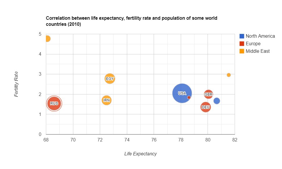
Bubble chart
A bubble chart is simply a variation of a scatter chart.
Purpose
Use it to identify the relationship between data points.
The bubble chart is essential for visualizing the 3- or 4-dimensional data on the plane.
Do you want to be the first to test the grid with your data?
Structure
The x-axis corresponds to an independent variable, the y-axis – to a dependent. The third and fourth variables can be represented by the size of a data point and its color. The size should be proportional to the value of the dependent variable and the color should correspond to a certain category.
Recommendations
- If you can want to show time, you can add animation to present how the values of the variables change over time.
- Limit the number of bubbles – don’t use too many of them. Otherwise, a plot may become hard to read.
- Rather than labeling each value, add tooltips that appear once you hover over the bubbles and show hidden information. Such an interactive approach can help keep your chart not overcluttered and laconic.
Examples
- Identify the correlation between life expectancy, fertility rate and the population of countries
- The brightest example of using this kind of chart is for project assessment: the projects can be evaluated by cost, risks, and value. The higher the value, the farther this project is to the right part of the chart. And the higher the risks, the closer the project is to the top of the chart. The size depicts its expected ROI. Such an approach helps companies to choose projects to invest in.

Summary
Today we’ve discussed the charts which are widely used in predictive analytics.
We aim to share with you the most important information related to data visualization.
What’s next?
To deepen your knowledge about charts, check out other parts of the data visualization project:
- Power of Data Visualization and Charts
- Best Charts to Show Discrete Data
- Charts for Comparison Over Time
- How to Choose Charts to Show Data Composition
- Best Charts to Show Data Distribution
Tutorials
If you want to visualize aggregated data in charts, you can integrate WebDataRocks Pivot Table with Google Charts or Highcharts: