
How to Report Digital Marketing Metrics With a Pivot Table

It is well known that digital marketing is an irreplaceable way to connect and communicate online with potential customers of your business with the help of different channels, both free and paid. Its set of tactics comprises diverse tools such as search engine marketing, email marketing, posting content to social media, remarketing, which help stay engaged with prospects and much more. When combined together, they are called integrated marketing methods and help achieve the most sophisticated goals.
According to Gartner’s Digital Marketing Spend report, marketers invest 25% of marketing expense budget in digital marketing methods as they remain the most effective tactics to convert traffic into leads, subscribers, and sales.
To make the investments profitable, the first and foremost rule for a marketer is to plan the campaign thoroughly and analyze results afterward. Only thus can the efforts be rewarding.
Where to get the data?
Data is the heart of any analysis. And marketing analysis is no exception.
There are plenty of ways of storing marketing data and pulling it out – from databases to analytical platforms. Not all of them are suitable for reporting and data analysis, though. By blending the data from various sources, you can collect a versatile dataset to work with.
For you, as a marketer, keeping the analytics in one place is vital. Having finished your campaign and collected enough data, it’s the best time to put your raw data to work. That’s exactly where a pivot table may stand you in good stead.
Pivot Table Magic for Marketing Analysis
Recently we’ve sorted out the structure and purpose of the pivot table as a powerful tool for web reporting. Now it is the best time to find out how it may come in handy for shaping your marketing strategy.
Today we’ll analyze and measure paid marketing campaigns: track their results and evaluate the performance so as to maximize the return on the investment of time and money.
What metrics to consider?
For this, we should take a look at trends in the engagement metrics (such as conversion rates, sessions, bounce rates) and the overall amount of leads, opportunities, and sales over a certain time period (let’s say, six months).
When you think of metrics, naturally you imagine a performance dashboard. That’s why we’ll try a mixed technique that lies in combining reporting features of a pivot table and visualization capabilities of charts.
How to calculate performance measures
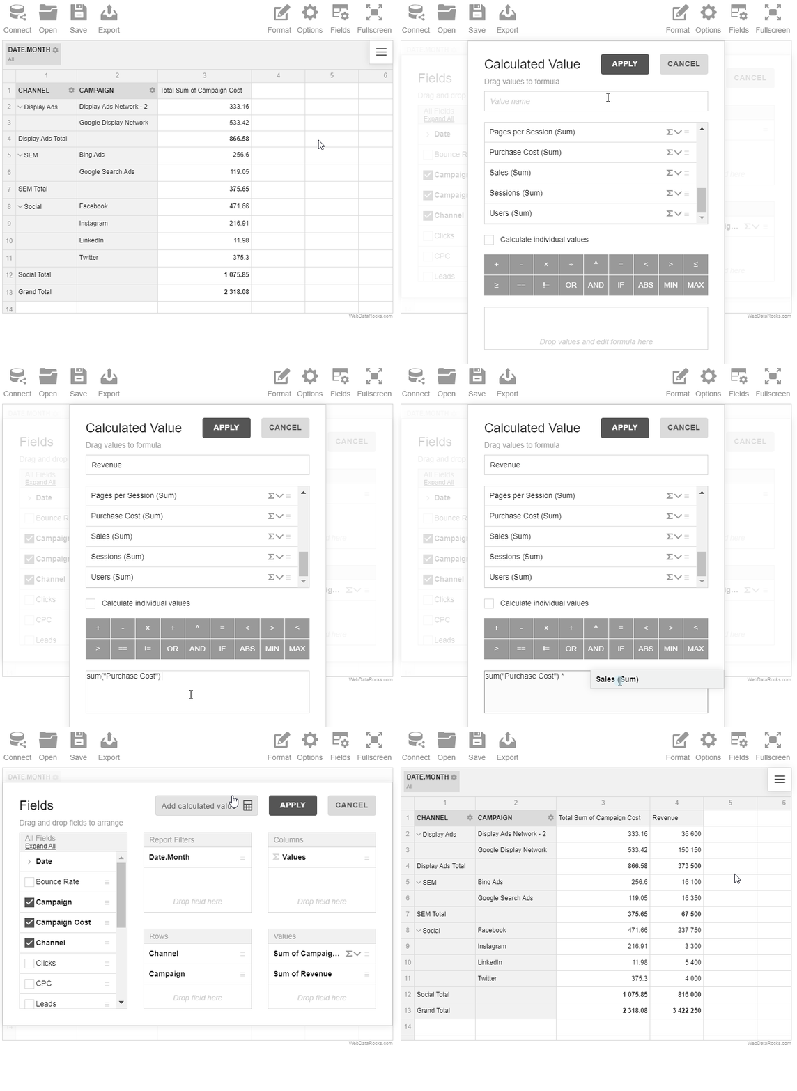
- Revenue = Total Sales * Purchase Cost
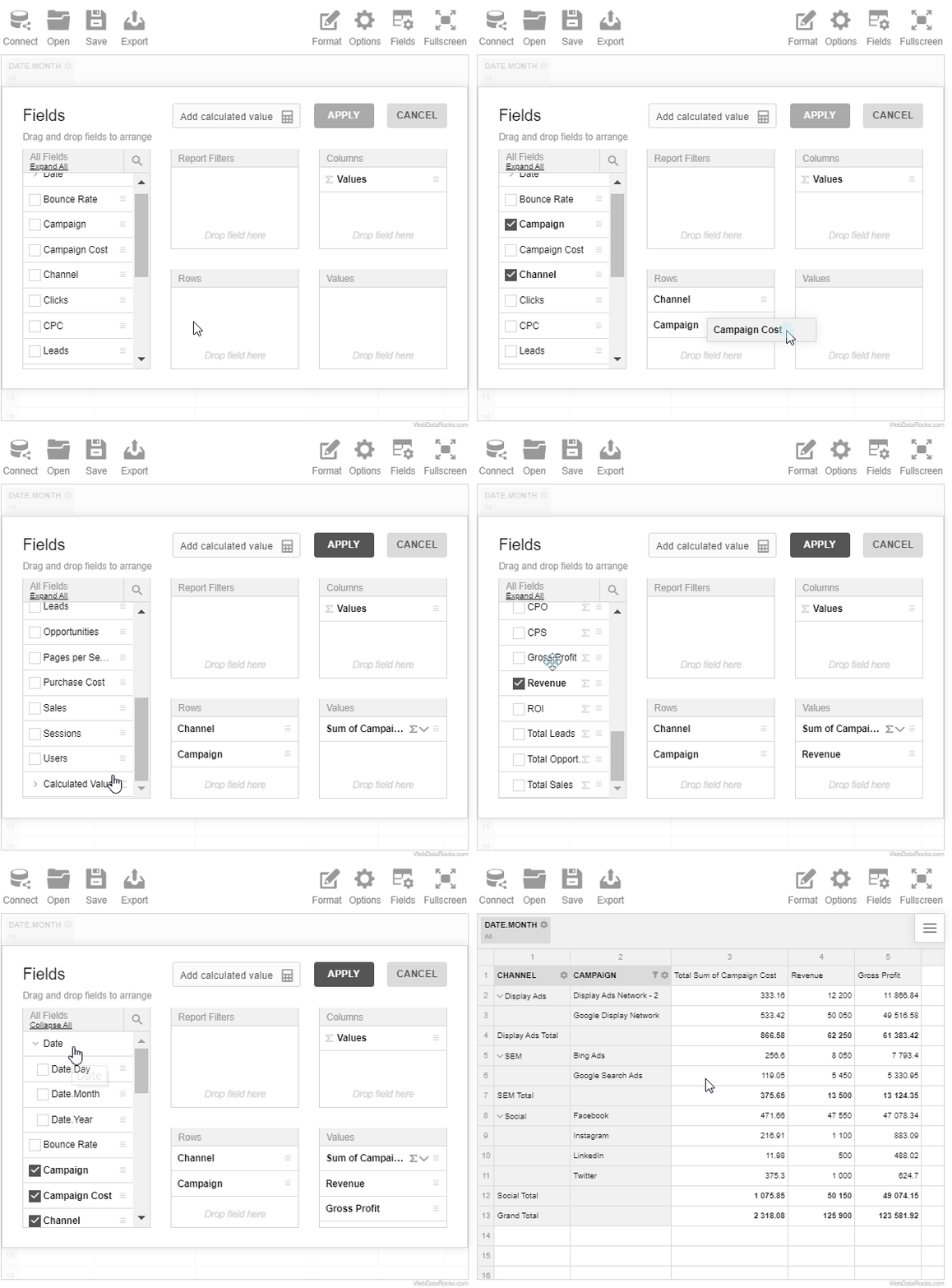
- Gross Profit = Revenue – Campaign Cost
- ROI (return on investment) = (Gross Profit – Campaign Cost) / Campaign Cost
- Conversion Rate = Total Leads / Total Clicks
- CPL (Cost Per Lead) = Total Marketing Spend / Total New Leads
- CPO (Cost Per Opportunity) = Total Marketing Spend / Total Opportunities
- CPS (Cost Per Sale) = Total Marketing Spend / Total Sales
Methods of calculating these metrics depend greatly on the specifics of the industry you’re working in, that’s why your formulas may differ from ours. The purpose of this article is to show how you can take advantage of pivot table capabilities for effective analysis of various metrics.
Goals of analysis
Before the start, we should know what results we want to achieve in the long run.
Our far-reaching goal is to optimize leads-opportunities and opportunities-sales conversions.
That’s why we’ll pay particular attention to amounts of leads, opportunities, and sales generated by channels and campaigns. Also, we’ll calculate ROI, CPL, CPO, and CPC as these metrics are the foundation of measuring how successful the campaign was. ROI is of special importance – it shows how profitable the marketing investment was.
We’ll show you how to analyze real live data and provide you with the link to the demo at the end of the article.
Reporting
Let’s master the process of creating reports together.
Connect to a data source
Let’s connect to a CSV/JSON data file that has been previously exported from the platform you’re using for marketing.
The fields from our dataset are represented as the hierarchies in the rows, columns, and measures. Particularly, we have the following fields:
- Channel
- Campaign
- Campaign Cost
- Clicks
- CPC
- Date
- Users
- Sessions
- Leads
- Opportunities
- Sales
- Bounce rate
- Purchase Cost
Let’s take a quick glance at the structure of the data in a flat view:
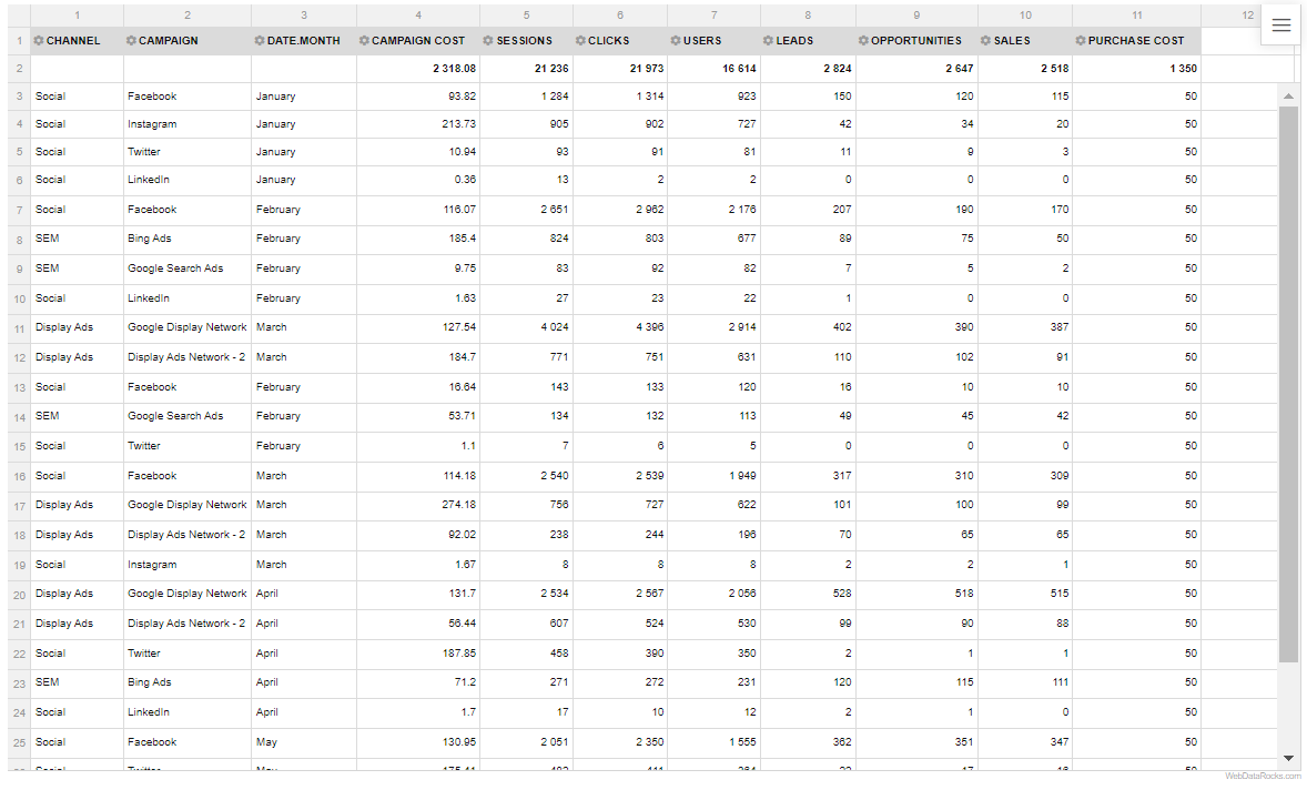
Add custom measures
To get a complete picture of our analysis, let’s add our own metrics by using the calculated values. Simply define the formulas for these measures in the Field List.
Arrange the hierarchies
Organize the data on the grid and aggregate it via the Field List or by defining a slice in code. Here is the result:
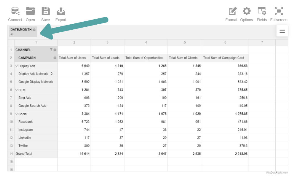
Note that we’ve added the “Month” level of the “Date” hierarchy to the report filters so as to be able to evaluate metrics over specific months.
Put the accent on individual cells
To tailor the report, highlight the cells with conditional formatting based on their values:
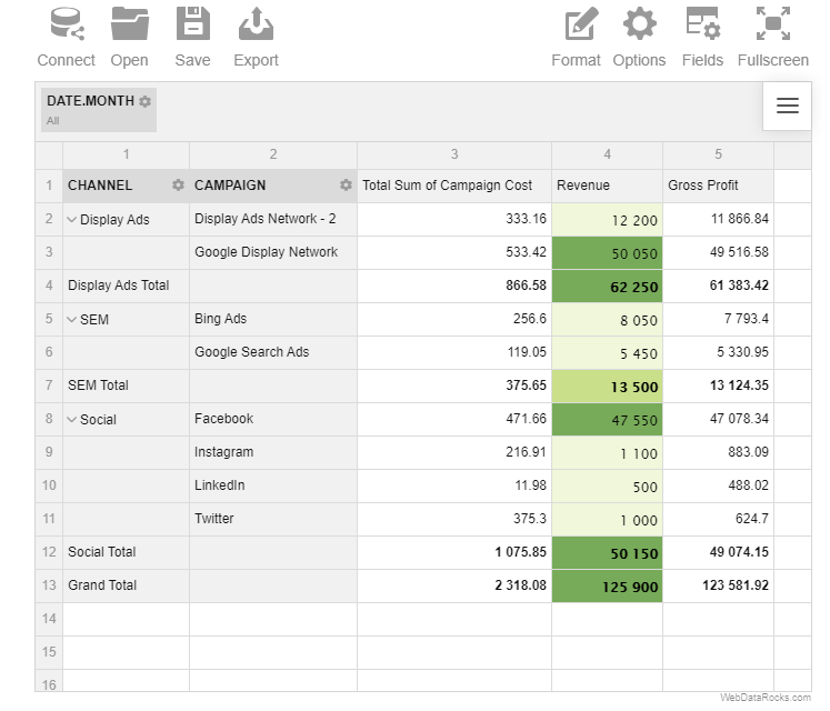
Campaigns Analysis
It’s time to perform a campaigns analysis. Let’s focus on three types of campaigns: Social Media, SEM, and Display Advertising and define which channel is the main driver of traffic to your website.
Social Media Channel
We took the four most popular social media platforms to find out whether social media campaigns have any impact on generating leads.
SEM Channel
Also, we added the results of search engines advertising campaigns to measure their effectiveness:
- Bing Ads
- Google Search Ads
Display Advertising Campaigns
To define how many impressions your display advertising brings and whether your strategy needs improvement, we’ll analyze the flow of traffic from these campaigns:
- Google Display Network
- Display advertisement network – 2
We’ll analyze all this data using a top-down approach: starting from the big picture, we’ll drill down to the deeper levels of detail. In our case, the most logical way is to analyze the metrics of channels and then assess particular campaigns.
Charting
To gain even more insights, you can enhance the report with visual elements such as charts or diagrams that make information easier to grasp.
Let’s add these kinds of graphs to our dashboard:
- Multiple-series line charts for illustrating the trend in the conversion rate over months, comparing clicks, CPL, CPO, and CPS across channels.
- Column charts for comparing the number of leads, opportunities, and sales generated by the campaigns and channels; bounce rates across channels and campaigns and the largest revenue drivers.
And others. All of them are designed to communicate the results of the analysis as effectively as possible. There are no limitations on your choice as we hope you’ll discover your unique way of visualizing the data.
Displaying the results
Now it’s time to estimate what we’ve achieved by following these guidelines.
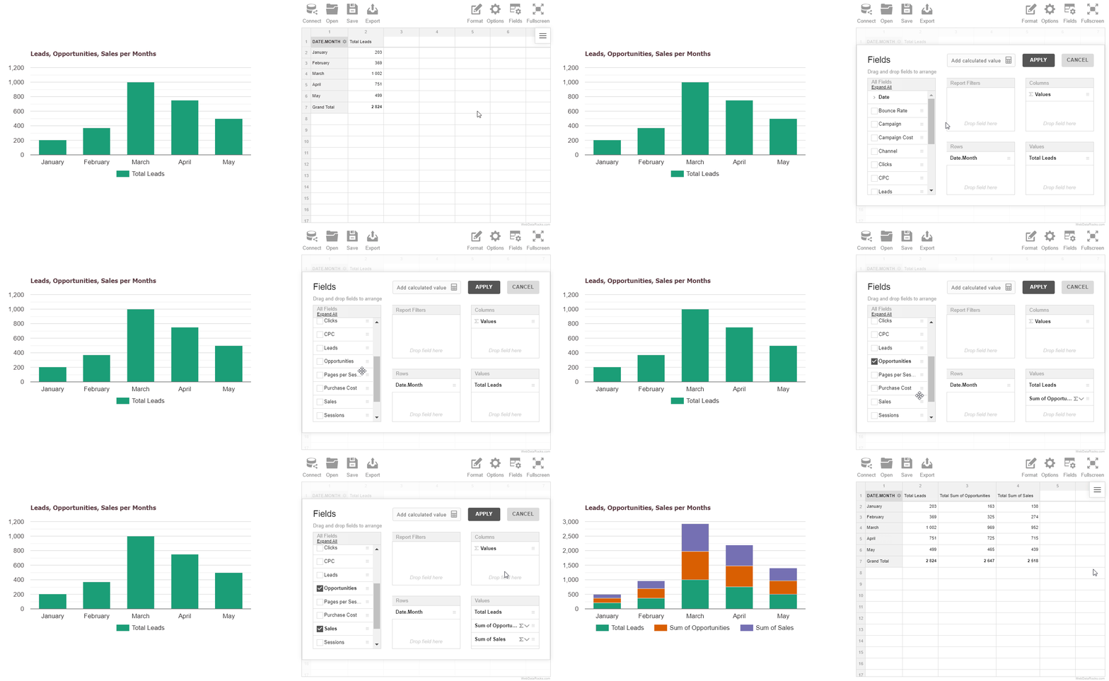
For example, the next stacked column chart presents how many leads, opportunities, and sales were generated monthly by all the channels:
Moreover, we can observe which channels are the drivers of revenue:
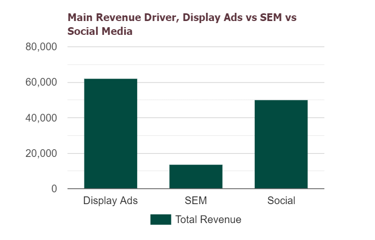
From the chart above it’s clear that the SEM channel brought the least profit and we should analyze Display Ads and Social channels more closely:
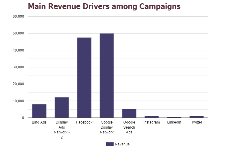
This chart answers the question: “Which campaigns were the most profitable?”
Afterward, let’s dig deeper into the analysis of social media campaigns:
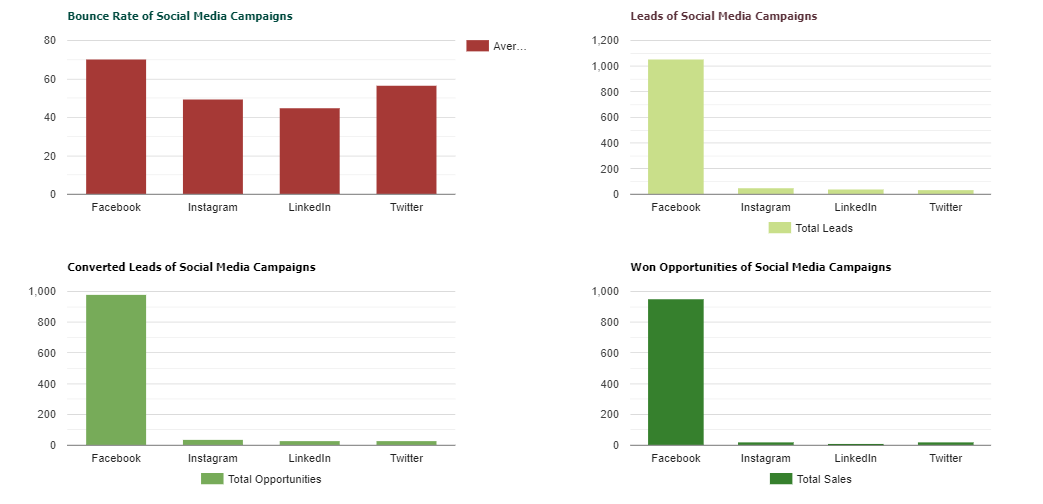
Using these charts, we’ve checked whether the bounce rate was high and how many leads, opportunities and sales were delivered by social media campaigns.
Likewise, you can create interactive dashboards for the rest of the campaigns by using the dashboard templates we’ve carefully prepared for you.
What’s next?
Now that you understand the results of your marketing efforts, feel free to share the report with colleagues or boss.
Bringing it all together
Today you’ve learned how to use a pivot table as a leading tool for doing research on the effectiveness of campaigns. We do hope you are inspired to use it for improving your strategic marketing goals.
Live demo
Experience is the best teacher. We’ve prepared the interactive demos for you – load your own data and try exploring it to reveal more details about your marketing campaigns.
Search the ways to rock the data with us. Stay tuned not to miss new blog posts!
Useful tutorials
- Using conditional formatting
- Integration of WebDataRocks and Google Charts
- Integration of WebDataRocks and Highcharts

Numerous researches in the field of cognitive neuroscience show that your brain loves a visual content more than plain text.
(more…)Being a web component it’s important to be easily fittable to any web project.
WebDataRocks is as customizable as it’s required by the application where it is embedded.
When you are creating your website or application, the design of the user interface comes as an important part of the developing process. (more…)

We understand your JSON data may contain different types of fields: numbers, dates, strings, time, days of the week and many others!
Setting proper data types at the very beginning is important for correct aggregation in the pivot table and successful data analysis.
Let WebDataRocks take care of handling data types in your JSON dataset. (more…)
There are no insignificant details when it comes to the design of your application. That’s why our team pays attention to every little detail and provides an opportunity to define how your reports will look and feel.
(more…) class=”alignnone size-full wp-image-990″ />
As we appreciate the importance of personalization for you, we cannot allow the component to stand out from the general color scheme of your application. (more…)
Bring the brightness to your data
Do you want to make your web report look more interactive and appealing?
To emphasize on the visual representation of your data you are able to use any of the most popular charting libraries – Google Charts, Highcharts, FusionCharts or any third-party charting library you prefer.
(more…)
This article explains how to quickly start using WebDataRocks pivot grid in your AngularJS applications. AngularJS is an open-source front-end application framework written in JavaScript. Declarative templates with data-binding, MVC, dependency injection – these are only the most obvious reasons why we love AngularJS. Moreover, the framework is maintained by Google, which is always a quality guarantee. You can see how to get started with AngularJS on their official website.
WebDataRocks officially supports AngularJS framework.

Good news, our JavaScript pivot grid is free and available to everyone. All you need is to download it into your project.
I have decided to come up with the new portion of useful tips. In the previous post, I shared the insights on how to prepare data from Excel and connect it to our demo. Today I am gonna describe which kind of JSON data is the best for our Free Web Reporting Tool.
(more…)
Hello and welcome from our WebDataRocks community!
We offer you to see your own data on the grid so you can play around with our live demo and try the functionality it provides. In our today’s blog post I am going to guide you through the process of preparing your Excel data and explain how to connect it to our demo. The process is simple and consists of a few steps:
Step 1. Clean up your data using a set of tools from Excel
Preparation of the dataset is an essential process that should precede any data analysis. Unprepared dataset often contains excessive or incomplete information which interferes with the analysis process. Before any manipulations we advise to create a backup copy of data, just to be able to revert the changes if the result is not satisfying. Follow our tips to clean up your data:
- Use Sort & Filter to locate duplicates, apply naming conventions, find blank or incomplete records
- Try one of the lookup and reference functions to add the columns with necessary details to your dataset
- Format cells with phone numbers, zip codes, etc. to make sure they look the same way
- Use Find and Replace feature to remove the unnecessary characters such as dashes of empty spaces
Step 2. Export the data from Excel
In this step, we are going to save the data we were preparing in the previous step. CSV format is considered to be really convenient for data analysis. Save data in this format by choosing Save As -> CSV UTF-8. To display your data correctly WebDataRocks requires the content to be encoded as UTF-8.
Step 3. Connect your dataset to WebDataRocks
Now it is time to display your data on the grid. Please open our demo, choose Connect -> To local CSV and select the CSV file generated in the previous step. Hooray! Your data from Excel is displayed in our demo. You do not have to worry about the security of your data as WebDataRocks is a client-side tool and we never store your data on our side.
Thank you for your attention. Want to add WebDataRocks to your website? Just go to our integration guide.
Stay tuned, in the upcoming posts, we will share some hints about JSON data preparation and the best ways to use our demo.