Change a theme of your pivot table
In this article
Want to make this pivot table fit into the overall design of your project? WebDataRocks offers a set of predefined themes which you can use to customize the look of your web reporting tool.
 class=”alignnone size-full wp-image-990″ />
As we appreciate the importance of personalization for you, we cannot allow the component to stand out from the general color scheme of your application.
So to make a pivot table fit into the overall design, WebDataRocks offers a set of predefined themes which you can use to customize the Look&Feel of your web reporting tool.
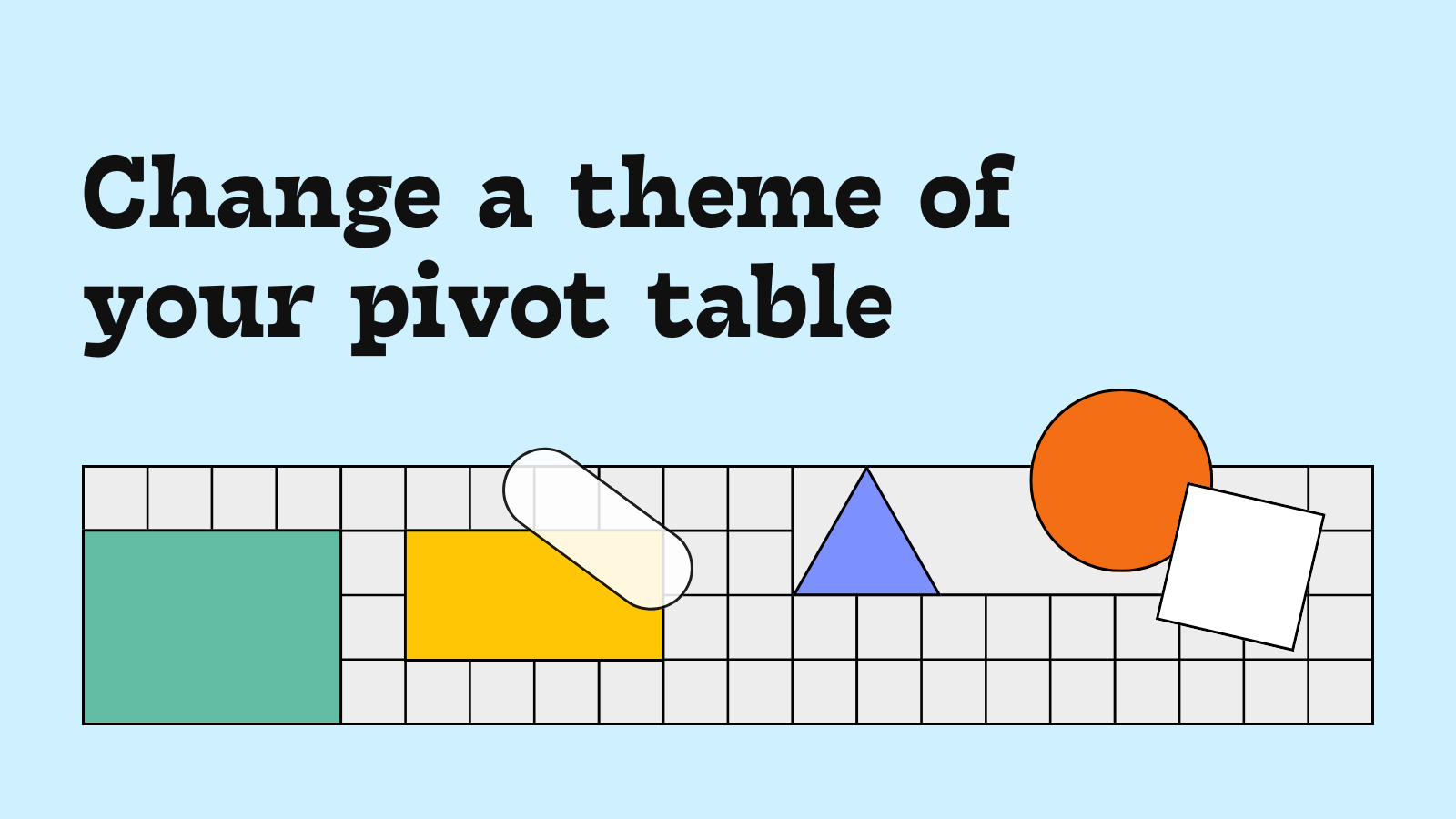
We have four predefined themes to present:
- Default (noble grey)
- Light blue
- Orange
- Teal
How to change a theme simply
- Embed the pivot table
We hope you’ve managed to embed a WebDataRocks reporting tool. If so, go to step 2. Otherwise, you are welcome to turn to our detailed href=”https://www.webdatarocks.com/doc/how-to-start-online-reporting/”>Quick start. We promise it’s a quick and effortless process.
- Include the CSS file
WebDataRocks comes with predefined CSS themes. You can see all of them in webdatarocks/theme/ folder. If you don’t specify a theme, the component uses the default theme.
Its CSS file is available inside webdatarocks/webdatarocks.css
and webdatarocks/webdatarocks.min.css (a minified version of CSS file).
Firstly, open the code of a page where the component is placed. Include to a <head>section
the <link>element with a reference to the minified CSS file of the theme you like.
For example, let’s apply the Light blue theme: style="display: none;">
<link rel="stylesheet" type="text/css" href="theme/lightblue/webdatarocks.min.css"/>
Simply replace lightblue in CSS reference with the name of the theme you need.
- Enjoy the new Look&Feel of your pivot table
Update the page and see the results. Your patience is rewarded and WebDataRocks reporting tool looks even more attractive!
 width=”764″ height=”531″
class=”alignnone size-full wp-image-991″ />
width=”764″ height=”531″
class=”alignnone size-full wp-image-991″ />
Stay tuned to new updates!


