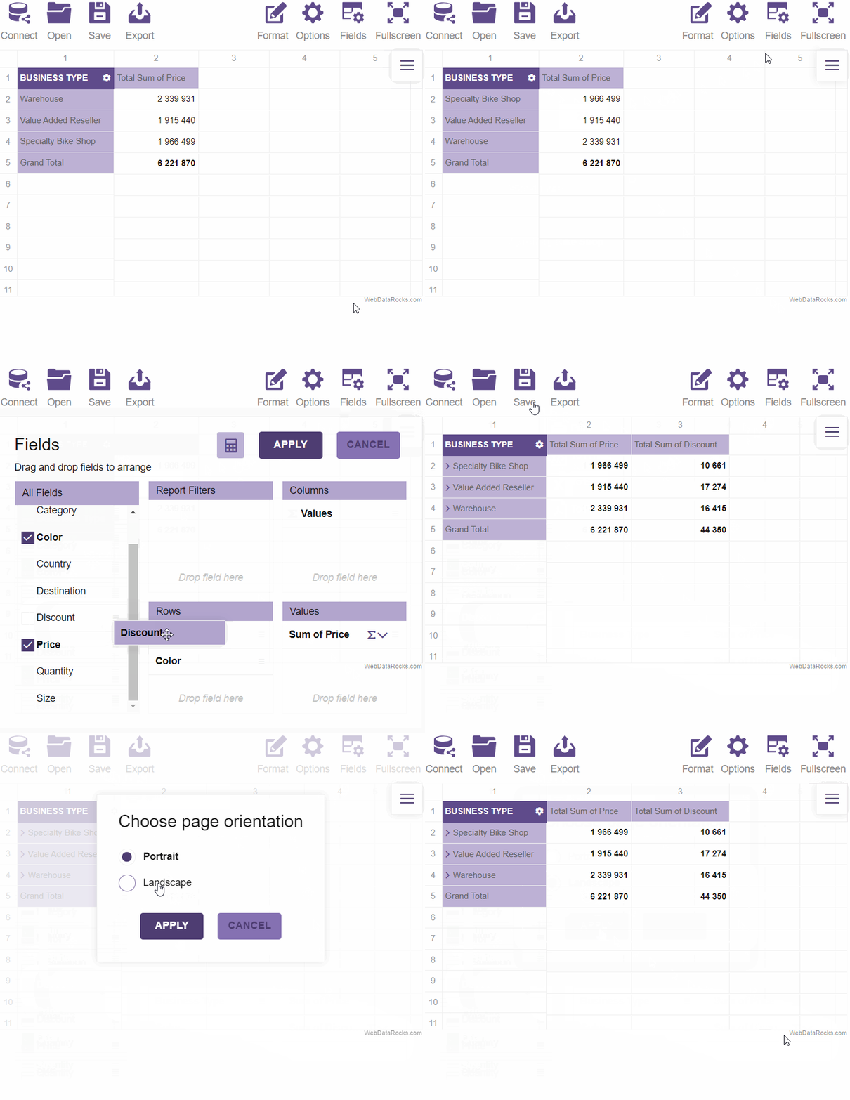
Create a custom theme
In this article
Be creative! Design our own theme to make your web reporting tool look stylish and laconic.
There are no insignificant details when it comes to the design of your application. That’s why our team pays attention to every little detail and provides an opportunity to define how your reports will look and feel.
Recently we made a tutorial on how to change the predefined themes of your pivot table.
But in case you want to further customize the Look & Feel of your pivot table, we’re ready to explain how to make a custom theme quickly and easily so that it corresponds to your corporate colors.
Today we will design our own theme to make your web reporting tool look stylish and laconic.
So let's start!
Step 1: Choose the colors
After a careful choice, we stopped at UltraViolet color. Its purple shade embodies the desire to pursue the world and this fact totally resonates with our intentions to investigate the data.
A code of the main color is #5F4B8B.
Define the full palette of tints:
- Dark -
#4e3d72 - Superdark -
#453665 - Midlight -
#7b65ac - Light -
#8672b3 - Superlight -
#b2a5ce - Supersuperlight -
#bdb1d5
Use Colorhexa to choose a color palette that matches your design.
Step 2: Create a new folder for your theme
Open the webdatarocks/theme/ folder and create the new folder inside. Name it accordingly to your color. We've chosen ultraviolet. Copy the contents of any predefined theme folder (e.g. lightblue/) to the ultraviolet/ folder.
Step 3: Change the colors
There are two possible approaches:
-
We recommend using Less - a pre-processor for CSS and allows to set the values to several variables which later are compiled into CSS code. It helps to keep a cleaner structure of the code, provides a better performance and a cross-browser compatibility. WebDataRocks Less source code is available in
webdatarocks.lessfile of each theme. Just define variables for colors and change them in the appropriate moment.
- Of course, you can also edit colors right inside
webdatarocks.cssfrom your theme’s folder. However, we don’t recommend such an approach – it complicates the updating of your own theme when the updates are made in the component's CSS.
Start with opening theme/ultraviolet/webdatarocks.less file. On
this occasion, our base Less file theme/webdatarocks-base.less won’t be changed and won’t cause any issues while
updating. Find the following lines:
/* ===== theme colors ===== */
@theme-color: #03A9F4;
@theme-color-dark: #039BE5;
@theme-color-superdark: #039BE5;
@theme-color-midlight: #03A9F4;
@theme-color-light: #03A9F4;
@theme-color-superlight: #E1F5FE;
@theme-color-supersuperlight: #F3FAFD;
Replace the above code with the next lines:
/* ===== theme colors ===== */
@theme-color: #5F4B8B;
@theme-color-dark: #4e3d72;
@theme-color-superdark: #453665;
@theme-color-midlight: #7b65ac;
@theme-color-light: #8672b3;
@theme-color-superlight: #b2a5ce;
@theme-color-supersuperlight: #bdb1d5;
Next, find this line:
@grid-selection-canvas-color: rgba(121, 204, 255, 0.2);
and change it to:
@grid-selection-canvas-color: rgba(232, 228, 241, 0.2);
Don't forget to reduce the opacity. As the new color will be applied when the cells are selected, it's important to make it semi-transparent.
To make names of members look more clear, find:
@theme-text-color-midlight: #888;
and change it to:
@theme-text-color-midlight: #616161;
You can also write some custom CSS code at the bottom of the webdatarocks.less file if you want to redefine borders of cells, etc.
Step 4: Compile the Less file
You need to compile webdatarocks.less into
webdatarocks.css and
webdatarocks.min.css to apply changes. Read how to do it in Less documentation. It's easy to do in your IDE or in the console.
Step 5: Include the reference to CSS
Now you need to open the code of a page where the component is embedded and include to a <head> section the <link> element with a reference to CSS or minified CSS. After that, your new theme will be applied to the pivot table.
<link rel="stylesheet" type="text/css" href="theme/ultraviolet/webdatarocks.css" />
Step 6: Enjoy the result
Update the page and see how creative your web reporting tool looks like.
 Try experimenting with colors! We believe you may come up with a totally new view of your pivot table.


