How to use WebDataRocks Pivot Table with Google Charts
In this article
Do you want to make your web report look more interactive and appealing? To help you emphasize on the visual representation of your data, WebDataRocks supports integration with Google Charts library.
Bring the brightness to your data
Do you want to make your web report look more interactive and appealing?
To emphasize on the visual representation of your data you are able to use any of the most popular charting libraries – Google Charts, Highcharts, FusionCharts or any third-party charting library you prefer.
WebDataRocks supports integration with all of them.
But today we will set up the integration with Google Charts library and show how easily you can visualize your data with WebDataRocks Pivot Table.
The road to successful integration consists of 5 steps. Move further to walk them through! If suddenly you feel that you don’t understand some of the steps, just scroll down to the end of the article and click on the CodePen link. There is a ready-to-use code snippet waiting for you.
Prerequisites: an enthusiasm to analyze the business data.
Our goal: to create a dashboard with the data in the table and a chart. The chart must be updated in the real-time with changing the data in the table.
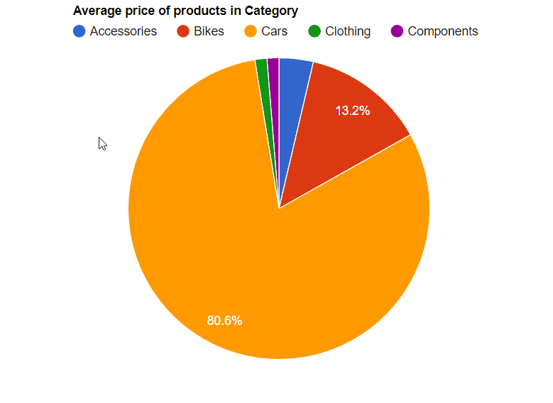
Case study: today we will calculate the average price of products in each category and display its percent distribution in a Pie Chart (by the way, it’s one of the earliest known charts in statistics).
Step 1: Load your data
To do it, you can write a simple function which returns an array of JSON objects.
function getJSONData() {
    return [{
            "Color": "green",
            "Country": "Canada",
            "State": "Ontario",
            "City": "Toronto",
            "Price": 174,
            "Quantity": 22
        },
        {
            "Color": "red",
            "Country": "USA",
            "State": "California",
            "City": "Los Angeles",
            "Price": 166,
            "Quantity": 19
        }
    ]
}
Or add a URL to CSV or JSON file directly into the report. It doesn’t matter if it’s a local or a remote
one. For this example we consider two cases:
- the data is returned by getJSONData() function;
- the data is loaded via the URL to CSV/JSON file.
This is how the report configuration will look like:
-
var pivot = new WebDataRocks({ container: "#wdr-component", toolbar: true, report: { dataSource: { "data": getJSONData() }, }); -
var pivot = new WebDataRocks({
    container: "#wdr-component",
    toolbar: true,
    report: {
      dataSource: {
        filename: https://cdn.webdatarocks.com/data/data.csv
      },
    });
Both cases will work great.
Step 2: Configure the slice and aggregate the data
Now it’s time to define the structure of the slice for the report.
We hope you’ve managed to embed the WebDataRocks component into your project. Otherwise, please, turn to the Quick start. It won’t take much
of your time, we promise.
Next step to take is to choose which data is going to be displayed within the rows and the columns.
For example, put the Category in rows, Country in columns. Define measures and apply the aggregation function to them: we’ve chosen the “average” function. By default, all data will be summarized if you don’t apply another function.
We’ve chosen to highlight the cells where the average price is higher than 20 000. It will correspond to the biggest sector of our Pie chart. You can apply your own logic of highlighting the cells using our Conditional formatting tutorial.
Step 3: Connect to the Charting Library
- At first, add the loader of Google Charts by including the script into your webpage:
<script src="https://www.gstatic.com/charts/loader.js"></script>
- Then, add our connector for Google Charts:
<script src="https://cdn.webdatarocks.com/latest/webdatarocks.googlecharts.js"></script>
- After that, you have to add a container where the chart will be displayed:
<div id="googlechartContainer"></div>
- Next, add the event handler to the pivot instance by pasting this code into the configuration of your pivot table:
reportcomplete: function() {
	pivot.off("reportcomplete");
	pivotTableReportComplete = true;
	createGoogleChart();
}
It helps to know when the pivot table is ready to display the data.
- Create flags to know when the report is completed and the chart is loaded.
var pivotTableReportComplete = false;
var googleChartsLoaded = false;
- Then load the chart from
google.chartslibrary
google.charts.load('current', {'packages':['corechart']});
Step 4: Show the data from the pivot table on the chart
To do it, you need to add functions for drawing and creating the chart.
Firstly, set the onGoogleChartsLoaded() function as a callback to google.charts eventhandler:
google.charts.setOnLoadCallback(onGoogleChartsLoaded);
Secondly, you need to define a createGoogleChart() and onGoogleChartsLoaded() functions:
function createGoogleChart() {
	if (googleChartsLoaded) {
		pivot.googlecharts.getData({ type: "pie" }, // specify the chart type
			drawChart,
			drawChart
		);
	}
}
function onGoogleChartsLoaded() {
    googleChartsLoaded = true;
    if (pivotTableReportComplete) {
        createGoogleChart();
    }
}
We pass a drawChart() function as callbackHandler andupdateHandler arguments to the webdatarocks.googlecharts.getData() method.
Learn about the webdatarocks.googlecharts.getData()
method in a title="Read More">Read More section.
Thirdly, write a function which will be called once the data is ready and updated. It will be responsible for
drawing and redrawing the chart. Also, here you can choose the type of the chart you need.
function drawChart(_data) {
	var data = google.visualization.arrayToDataTable(_data.data);
	var options = {
		title: _data.options.title,
		height: 300,
                legend: { position: 'top' }
};
	var chart = new google.visualization.PieChart(document.getElementById('googlechartContainer'));
	chart.draw(data, options);
}
The cherry on top: to make your chart even more extraordinary, set the is3D option totrue.

Now it looks like it is a 3-dimensional chart.
To customize your chart more, please visit the Google Chart Documentation.
Step 5: Enjoy the colorful chart
Finally, you can see how wonderful the pivot table looks in combination with Google Charts.
You can confidently change the data in the table and see the results reflected in the chart immediately! This is what we call a real-time interaction. Be open to new experiments - filter, sort data, change measures and aggregation functions. Getting new insights is closer than you think!
We hope that after reading this tutorial you will also consider charting an integral part of data
visualization as we do.
Check out the sample with the full code in Codepen.io.
Thank you for using our product! And stay tuned to updates in our blog.
Read more
A webdatarocks.googlecharts.getData(options:Object, method
callbackHandler:Function, updateHandler:Function)
takes the following parameters:
-
options– Object. It has a propertytypein which you have to specify the type of the chart:
"area", "bar", "column", "line", "pie" or "sankey". -
callbackHandler– Function. It specifies what happens once the data is ready. -
updateHandler– Function. It specifies what happens when the data is updated.
getData() method is responsible for requesting the data from the Pivot table and preprocessing it to
the appropriate format for the required type of the chart. To use this method it is necessary to include the webdatarocks.googlecharts.js
Google Charts.


