
Reporting tips & tricks: format data in a pivot table
In this article
This tutorial shows you how to make your pivot table look great with various formatting options. Learn to format numbers for currency and percentages, align data neatly, and use conditional formatting to highlight important details.
In the previous tutorial, you learned how to filter pivot table data to show relevant information first.
Let’s not stop there!
This time you’ll learn how to make your report look visually perfect. For this, you’ll use the interactive formatting feature of WebDataRocks.
Why formatting is important
An essential part of any report or dashboard is its readability. Your audience should understand its meaning at a glance.
Therefore, as a finishing masterstroke of your data analysis, you can format essential data to make it easy to digest.
In this tutorial, we will consider two main types of pivot table formatting, namely:
- Number formatting
- Conditional formatting
Want to get straight to the practice part?
Jump to the Live demos section.
Otherwise, let’s dive into the motivation behind data formatting first.
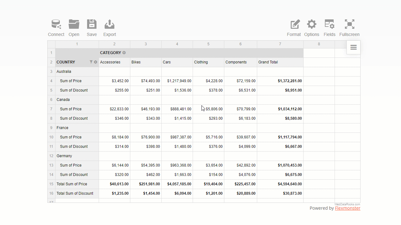
What is the number formatting
The number format defines how numerical values are shown on the grid. It is useful in many cases, for example:
- Formatting financial data (e.g., adding and aligning currency symbols, showing values as percentages, etc.).
- Making data look cleaner by controlling the number of digits after the decimal separator.
- Handling regional difference, e.g., writing decimal numbers with comma or period, formatting the thousandths place.
Apart from the cases mentioned above, you can also:
- Align values on the right or left side of the cell
- Control how empty cells or infinity values are displayed
- Define the maximum number of symbols to show in a cell
To examine all the number formatting options, check out our detailed Pivot table number formatting guide.
How to use number formatting in a pivot table
You can set a number format for particular measures of the pivot table widget in any of the following ways:
- Via the UI
Here is how end-users can format their data via the intuitive and comfy pop-ups:
- In code
The programmatical approach gives you more freedom to implement custom logic of formatting.
Let’s see the samples and gain some practical coding skills.
- Format values of “Price” with a dollar symbol.
- Format values as percentages.
- Change the number of decimal places displayed in a pivot table.
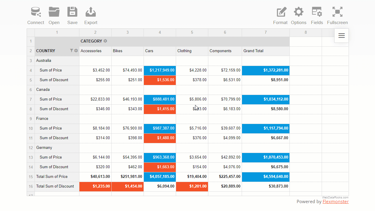
What is conditional formatting
Conditional formatting is a particular formatting type by cells’ values.
The name itself suggests that formatting is based on conditions, i.e., user-defined rules that describe how values have to be formatted. This rule is a logical statement, also known as a boolean expression). The rules are always applied to the pivot table measures.
With conditional formatting, you can change the color of the cell’s background and text and manage the report’s typography: font color, family, and size.
This feature helps you highlight information that is crucial to see first. It also allows you to make trends in data more noticeable.
How to use conditional formatting in a pivot table
- The most convenient way to apply conditional formatting is via the user interface.
A comfy color picker lets you choose the color that suits your reporting goals best:
You can also set a custom hex color value for text or background.
- In code, it is as simple as defining a tiny JavaScript object in your report’s structure.
For example, here is how you can color pivot grid cells green based on the values of the “Revenue” measure:
"conditions": [
        {
            "formula": "#value > 600",
            "measure": "Revenue",
            "format": {
                "backgroundColor": "#8BC34A",
                "color": "#FFFFFF",
                "fontFamily": "Arial",
                "fontSize": "12px"
            }
        }
    ]
Live demos
- Format values of “Price” with a dollar symbol
- Format values as percentages
- Change the number of decimal places displayed in a pivot table
- Apply conditional formatting to the pivot grid
- Apply conditional formatting to the data grid
Wrapping it all up
Now you made sure how flexible WebDataRocks Pivot is when it comes to prettifying your data. Not only can you analyze your data fast but also prettify your report neatly and make it speak.
Useful reading
Documentation
More reporting tips & tricks
To improve your reporting skills, learn how to filter pivot table data, and set a data slice.
Ready to share results? Not sure how to do it best? We’ve got you covered here as well!
Move on to a detailed tutorial on how to save and export a pivot grid report.
Learn about the pivot table essentials with the detailed UI guide.
Advanced pivot table formatting
If, by any chance, there is an option that you haven’t found in WebDataRocks, we recommend testing Flexmonster Pivot Table & Charts – an even more powerful pivot table component. It offers extra number formatting options: negative numbers formatting, centered alignment of values, and more.