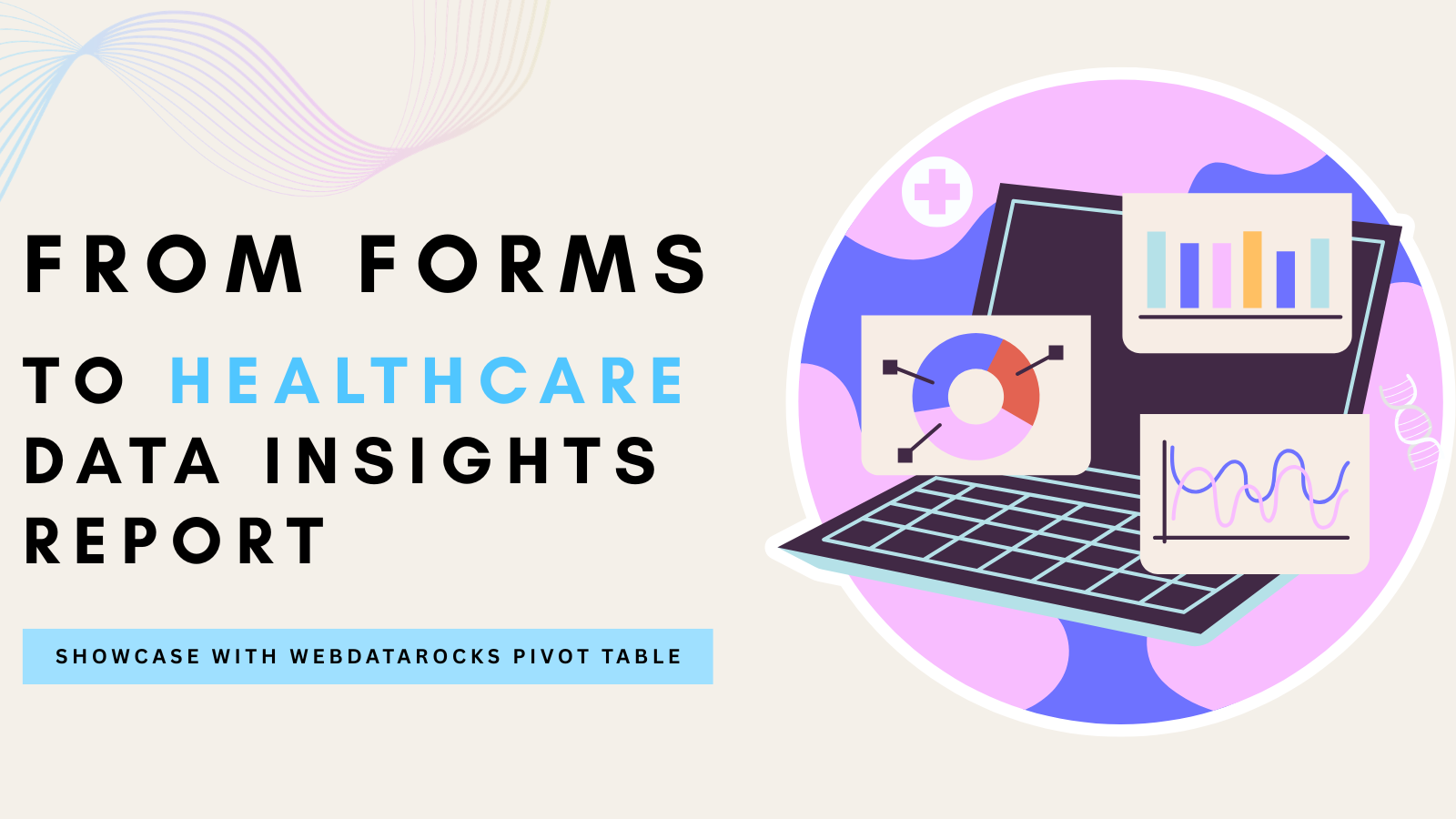
How to Use Pivot Table to Create Web Reports in Different Styles. Inspired by #CodepenChallange
In this article
Discover how visual styling can transform your web reports. From minimalist Bento to bold Neo-Brutalism, explore diverse styles and see how WebDataRocks adapts to create stunning, informative dashboards.
When it comes to web reporting, the main focus is on the performance and functionality of your software. Still, visual styling can also positively impact your reports or dashboards. It can enhance key points, highlight hierarchy, and even give you the vibe of the epoch.
Our pivot table component comes with eight predefined themes, but sometimes, it’s not enough to create a unique style or to adapt to your existing brand style. Webdatarocks has great potential for customization of your report as you need. To prove it, we participated in the CodePen challenge dedicated to styling. We wanted to show that our component can be a part of any style solution, no matter how diverse or creative. And what better way to do that than to join a challenge that tests your coding skills and imagination?
But first, a little bit about what Codepen challenge is.
CodePen gives you a new task every week based on a monthly theme. We decided to try the November challenge about Style Trending, which covered such styles as Bento Style, Neo-Brutalism, Y2K Style, and the Gradient Glow Style. The template included the very basics of a fitness app dashboard and style was on us.
Bento Style
The first task was about Bento Style, an ode to digital minimalism. This style emphasizes simplicity, order, and elegance. It is not overloaded with details, so it gives full focus on your data to get valuable insights from it. In our demo, we did exactly that. Our dashboard echoes the Japanese art of bento box arrangement with simplicity and no mess. Each element is where it is supposed to be without any unnecessary decorative elements. Everything is clear, intuitive, and easy to understand, living up to the “less is more” principle.
This style can be excellent for data reporting and analytics thanks to its structural and stylish presentation of information.
Use cases: BI dashboards, financial and executive reports (highlights key insights).

Neo-brutalism
The next style was Neo-Brutalism, so we switched from elegant/structural minimalism to a rebellious style. This style takes its roots from the “raw” brutalist architecture of the 50s-80s, which you can see in hard shapes and strict lines. Nowadays, this style is about bright colors, clean lines, bold fonts, and geometrical shapes.
We managed to implement all this in our demo, which was inspired by Rubik’s Cube. Our dashboard features eye-catching geometric shapes and a vibrant color palette, making the data stand out.
Use cases: Public awareness campaigns, social impact dashboards, scientific visualizations ( it helps to make a strong impression and highlight the contrast between different data segments.).

Y2K Style
The third style was Y2K Style great style for old schoolers that works almost as a time machine and makes you nostalgic. It’s the place where the analog and digital worlds meet – bright colors, bold fonts and patterns, and a modern twist.
This style can be fun and engaging for web reporting and data visualization, especially if you want to target a younger or more nostalgic audience. It can also add some humor and personality to your data presentation. It can give the feeling of the early 2000s era.
Use-cases: marketing, educational, social media and trends reports( to give the vibe of the 2000s and retro it can help soften complex data, and increase user interaction)
Begin to time travel with this demo.

Gradient Glow Style
Our final stop was Gradient Glow Style. This modern trend, rooted in early web design, adds depth and vibrancy to digital spaces. Explore the dashboard, capturing attention with a deep green gradient and matcha-colored accents that soften the seriousness of the report.
It can also help you emphasize the most important data points using colors and gradients.
Use cases: investment dashboards, market research web reports ( it can help make data hierarchy more understandable, improves comprehension.)
Here is our demo to check.

Conclusion
No matter what style you need, the WebDataRocks pivot grid can be customized to it. Explore more examples in our CodePen collection. This is not all customization opportunity, WebDataRocks can also integrate with third-party charting libraries, such as amCharts, Highcharts, Google Charts, or FusionCharts. This way, you can create both eye-catching and interactive data visualizations. If you want to learn more about how to do that, check out our list of tutorials below.
What else to read?
- How to make annual report with WebDataRocks
- Trick or Pivot! Interactive Demos on this Halloween
- Tutorial: How to create a dashboard with WebDataRocks and AnyChart
- Data visualization with WebDataRocks & Chart.js: create a dashboard in 5 min