Data visualization with WebDataRocks & Chart.js: create a dashboard in 5 min
In this article
In the tutorial, you will learn how to prepare your data, install the libraries, create a pivot table, design a chart, and connect them for interactive data visualization.
Data visualization is the key 21st-century skill. It’s crucial for making information easier to perceive and holding the interest of an audience longer.
A dashboard is a preferred tool for building effective data visualizations. Dashboards help to fully reveal insights about your data and share them among departments easily. Most often, they present an interactive way to visualize the data and contain charts, graphs, controls, grids, and pivot tables. Such a combination of elements enhances the understanding of the data.
This step-by-step tutorial is aimed at mastering your visualization skills using two free & flexible JavaScript libraries.
Prerequisites
To go through this tutorial, you need to have a bit of understanding of JS and HTML.
What will you get
As a result, you’ll get a dashboard with well-crafted charts and an analytical pivot table, which is ready to be embedded into an app.
Tools for data visualization
The first tool is a pivot table component.

To make your pivot table even more visually appealing, you can customize it:
The simplest way to get started with WebDataRocks is from the integration guide. For React, Angular and Vue developers, there are npm packages available.
The second tool is a charting library.

Being extremely lightweight and responsive, it offers eight basic types of charts: bar, line, pie, radar, polar area, bubble, scatter and area.
What makes this library stand out is its out-of-the-box customization options:
- animations
- layout, legend, and tooltips configurations
- updating colors dynamically
You can find everything about installing it in your project and configuring your first chart in the comprehensible documentation. It covers various aspects of working with charts.
Let’s move on to powering up your project with analytics and visualization!
TL;DR: If you are eager to play with the demo, hop right to the last section with examples.
Prepare your data
Every data visualization starts with the data. Once you’ve collected your dataset, you are ready to move on.
Note: this tutorial is ONLY for plain JavaScript. If your project is based on any of the following frameworks, check our documentation: React, Angular, Vue.
Step 1: Install WebDataRocks
You have three options of adding a pivot table to your project.
- Download a package into your project.
- Use a CDN to add WebDataRocks scripts and styles to your HTML page:
<link href="https://cdn.webdatarocks.com/latest/webdatarocks.min.css" rel="stylesheet"> <script src="https://cdn.webdatarocks.com/latest/webdatarocks.toolbar.min.js"></script> <script src="https://cdn.webdatarocks.com/latest/webdatarocks.js"></script>
- Install WebDataRocks as an npm package:
npm install @webdatarocks/webdatarocks
Next, add the container where you want to display the pivot table:
<div id="pivot-container"></div>
Initialize the pivot table instance on your page by writing this JS code:
var pivot = new WebDataRocks({
    container: "#pivot-container",
    toolbar: true,
    report: {
        dataSource: {
            filename: "https://cdn.webdatarocks.com/data/data.csv"
        }
    }
});
Step 2: Create a report
Now that you see the pivot table is rendered on the page and filled with data, it’s time to define a slice – a fundamental part of the report that specifies the hierarchies for the rows, columns, and measures. At this step, choose an aggregation function to apply to your measures. You can change it anytime later. If you want to create a custom measure, take advantage of calculated values.
Define a slice like in the snippet below:
"slice": {
    "rows": [{
        "uniqueName": "Country",
        "sort": "asc"
    }],
    "columns": [{
        "uniqueName": "Measures"
    }],
    "measures": [{
        "uniqueName": "Profit",
        "aggregation": "sum"
    }]
}
Step 3: Customizing appearance
To highlight the values on which you need to focus, apply conditional formatting via UI:

Step 4: Install ChartJS into your project
You have two options of adding this library to your app:
- Use a CDN to add the link to the library to the
<head>section of your HTML page:<script src="https://cdnjs.cloudflare.com/ajax/libs/Chart.js/2.7.2/Chart.js"></>
- Or use an npm package:
npm install chart.js --save
Then, define where the chart will be rendered by adding an HTML5 Canvas placeholder and set the size of this canvas:
<canvas id="polarChart" width="800 height="500"></canvas>
Adding an ID to the canvas element is necessary for the library to know in which container chart will be rendered. When adding multiple charts, every ID must be unique.
Create a canvas context:
var ctx = document.getElementById("polarChart").getContext('2d');
Step 5: Pass the data from the pivot table to the charts
Let’s add a bit of real-time interaction between the components.
We need to do the following: wait until the data is ready, get the data from the pivot table, prepare it to the format required for charts, and create a chart.
Firstly, we get the data from the pivot table as soon as the pivot table is rendered (line 74 in our example):
reportcomplete: function() {
	pivot.off("reportcomplete");
	createPolarAreaChart();
}
The second step is to define createPolarAreaChart() which will get the data we need from the pivot table (line 82 in our example). To achieve that, we used the getData() method. It requests the data from the current report and asynchronously passes this data to callbackHandler and updateHandler. Additionally, you can define which data you’d like to get. callbackHandler should draw the chart and updateHandler should redraw the chart on updates.
The third step is to draw the chart. We prepare the data to the format required for the polar chart (line 121 in our
example), set the necessary options for the chart and render it (lines 122-164).
Final step
Hooray! Now you have a responsive dashboard with data visualization capabilities of charts and pivot table:
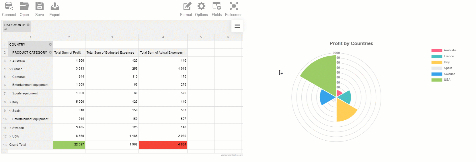
Feel free to embed it into any project and share with your colleagues. Experience real-time interaction: rearrange the hierarchies by using the drag-and-drop feature of the pivot table or set different aggregations. Filter the records and see how immediately the chart reacts to these changes.
Try experimenting to get fabulous results!
Thank you for reading!
Try it on CodePen
Recommended reading
About WebDataRocks:
About Chartjs:
Integration with other charting libraries
If you are still wondering what is the best charting library for you, you can try amCharts, Highcharts, Google Charts and FusionCharts in a combination with WebDataRocks.
- Integration with FusionCharts
- Integration with Highcharts
- Integration with amCharts
- Integration with Google Charts
What else to read?
- Tutorial: How to create a dashboard with WebDataRocks and AnyChart
- Complete Guide to Mobile App Development: Process, Trends, Costs
- WebDataRocks Pivot Grid for Flutter: Integration Guide
- Top resources every developer should read


