
How to make annual report with WebDataRocks
In this article
Transform your annual report from a dull document into a captivating visual story. WebDataRocks Pivot Table offers the tools to effortlessly create interactive and informative reports.
Have you already checked your achievements this year? That is what an annual report is created for. You collect data, analyze it, and explore which of your decisions led to such a result and, based on conclusions, develop further strategies for the next year.
How to create an annual report
Words “data” and “analyze” should nudge you towards the fact you have to deal with data visualization. So an annual report essentially means to be a convenient way to present information. But to make it as comfortable as it can be it is important to choose the right way to provide your data.
The well-known thing is that charts and graphics are the best both for visualizing and analyzing information because it is very easy to compare measures. Although there can be situations when you can not use either of those. For example, you decided to check the progress of the employees. There are thousands of them which means your column chart (as for an example) will look like a comb and going through it would not be a pleasant thing. How to get around that?
I suggest reviewing the real case
Imagine… December. Several days before Christmas. The North Pole. Everything is nearly ready: presents are wrapped, and the sleigh is on the way. But Santa still has some spare time, so he decides to reward elves for their outstanding work. Also, he wants to motivate them to do their job even better next year. So he makes a big report where each elf can see himself, his indicators and compare them to others. How to do it beautifully and just in several steps?
Santa will definitely use WebDataRocks Pivot Table because it is free and provides all necessary features. Let’s have a look at his grid and how he managed to create it.
Step 1. Connecting data
As a data source, Santa used JSON and created a function that returns all this data right in code.
function getJSONData() {
     return [{
     "Employee name": "Gerald Tumini",
     "Working hours": 2089,
     "Percentage of satisfied customers": 100,
     "Amount of processed applications": 2052,
     "Amount of customers brought by": 46,
     }
     ...
]
"dataSource": {
     "data": getJSONData()
 }
Step 2. Counting efficiency ratio
As you can see, there is no such column as efficiency ratio. Actually, it is the thing that needed to be found out so Santa created a calculating value using formula:
sum(\"Amount of toys made\") * sum(\"Percentage of satisfied customers\") / 100 / sum(\"Working hours\") "
It will calculate how many satisfied customers an elf “produces” per hour.
{
     "uniqueName": "Efficiency ratio",
     "formula": " sum(\"Amount of toys made\") * sum(\"Percentage of satisfied customers\") / 100 / sum(\"Working hours\") ",
     "caption": "Efficiency ratio"
 }
Also, Santa used sorting for this column so elves could easily understand how good or bad they are compared to the others.
"sorting": {
     "column": {
         "type": "desc",
         "tuple": [],
         "measure": "Efficiency ratio"
     }
 }
Step 3. Replacing values with icons
Why not display the efficiency ratio with icons instead of numbers? For such an interesting look, Santa implemented the customizeCell function, which adds an emoji to a cell depending on its value.
customizeCell is applied to all cells on the grid, but since the ratio is the only metric we’d like to highlight with emoji, we can use extra conditions to prevent our emojis from appearing in other columns.
function customizeCell(cell, data) {
    if (data.type == "value") {
        if (data.value < 0.45 && data.value > 0) {
            cell.text = "😖";
        } else if (data.value > 0.45 && data.value < 0.5) {
            cell.text = "🥲";
        } else if (data.value > 0.5 && data.value < 1) {
            cell.text = "😬";
        } else if (data.value > 1 && data.value < 1.17) {
            cell.text = "🤗";
        } else if (data.value > 1.17 && data.value < 2) {
            cell.text = "😁";
        }
    }
}
Step 4. Coloring the cells
As it is an official report, Santa created a beautiful pattern with corporate colors, red and green. For this, he simply applied conditional formatting to each measure: he wrote the format of the cell after conditioning and formula that will always return true so the formatting will apply to the whole column.
"conditions": [
         {
             "formula": "#value > 1.17",
             "measure": "Efficiency ratio",
             "format": {
                 "backgroundColor": "#FDD835",
                 "color": "#FFFFFF",
                 "fontFamily": "Arial",
                 "fontSize": "12px"
             }
         },
         {
             "formula": "#value >= 2900",
             "measure": "Working hours",
             "format": {
                 "backgroundColor": "#689F38",
                 "color": "#FFFFFF",
                 "fontFamily": "Arial",
                 "fontSize": "12px"
             }
         },
         ...
]
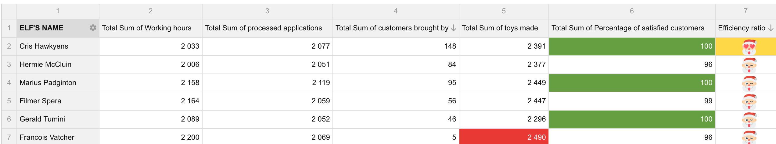
And… Puff! The result
See the Pen Annual report – Santa edition by WebDataRocks (@webdatarocks) on CodePen.
Now all the elves will see how much they have made through this year and how proud Santa is of them (or not…) And Santa knows exactly who will receive some extra candies for his great work. Also, with such a beautiful Christmas report, everybody will feel the holiday spirit and be in the right mood!
With such an example, now you can create amazing and functional reports by yourself. If you are interested and want to learn more, check out the full demo on CodePen.


