We’ll show you how to create reusable Claude Skills for reporting with WebDataRocks Pivot, from creating regular data digests and comparing periods to getting formatting recommendations for your pivot table.
We explained earlier how to build a working WebDataRocks pivot table from a single Claude prompt. It’s a quick way to test the component and see how it works without setting up a full project. However, that’s great for a one-off report, but if you’re pulling the same kind of summary every week, or asking Claude to compare periods over and over, retyping the full setup each time gets old fast.
But what if WebDataRocks could be part of your regular reporting workflow with Claude Skills? Instead of rebuilding the same report from scratch, you can save the workflow once and reuse it whenever you need it.
So, here we’ll look at how to “package” those requests into Claude Skills, so you describe the workflow once and reuse it on demand. This time, we’re working with real economic data, since that’s closer to what an analytical report usually looks like.
From one-time prompts to something you don’t have to retype
When you write prompts, every step starts from scratch: describe the fields, describe the layout, describe the formatting rules. That’s fine when you’re exploring an idea. But it’s more difficult when this idea is repetitive, for example, every Monday morning.
A Claude Skill is a saved set of instructions, a short markdown file with a name, a description, and the steps Claude should follow, that Claude picks up automatically once your request matches what the skill is for. You’re not pasting the same links and dataset shape into chat every time; you save them once, and from then on, a short request like “run this week’s digest” is enough.
More info about Claude’s skills
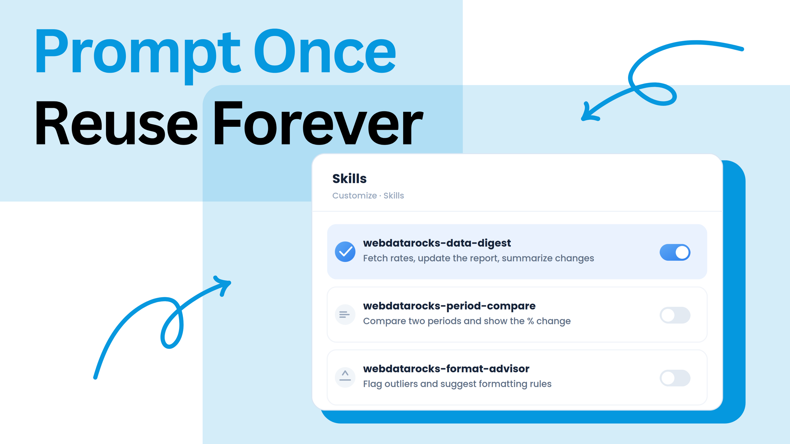
If you’ve never used this feature of Claude, Skills are located under Customize > Skills in your account. At a minimum, a skill is:
Anameand adescription: the description is what Claude matches against your request, so it needs to say plainly what the skill does and when it applies
Markdowninstructions: the actual steps, written the same way you’d explain them to a new teammate
So now we know all the needed basic info about Claude Skills, so we’ll walk through three skills that are worth setting up if you work with WebDataRocks reports regularly. Also, it can be a great start to implementing pivot tables into your work.
Skill 1: The daily/weekly/monthly data digest
The idea: instead of asking “what happened this week” from scratch, you ask for the digest, and Claude rebuilds the same report, pulls out what actually moved, and summarizes it — no new dataset, no re-explaining the layout.
In this example, we’ll use the Frankfurter API to get live exchange rates.
webdatarocks-data-digest.md
---
name: "webdatarocks-data-digest"
description: "Fetch the latest exchange rates from the Frankfurter API,
update the WebDataRocks report and summarize what changed. Use when the
user asks for a "digest," "recap," or "what changed" for their exchange
rate report."
---

# WebDataRocks Data Digest

1. Fetch the latest exchange rates

Fetch the current exchange rates from the Frankfurter API:

https://api.frankfurter.app/latest?from=EUR

Use the currencies already defined in the report.

2. Build or update the WebDataRocks pivot

If there is no existing WebDataRocks report, build an interactive WebDataRocks pivot table in the Claude artifact.

Load WebDataRocks from jsDelivr:

* CSS: https://cdn.jsdelivr.net/npm/webdatarocks/webdatarocks.min.css
* Core script: https://cdn.jsdelivr.net/npm/webdatarocks/webdatarocks.js

Create the report using the fetched exchange-rate data.

Keep the report structure simple and consistent so it can be compared across runs:

* Rows: Currency
* Measure: Exchange Rate
* Aggregation: Sum
* Toolbar: enabled
* Container height: 520px

If an existing report is available, update its data with the new exchange rates instead of rebuilding the report. Keep the same rows, columns, and measure structure.

3. Compare with the previous fetch

Compare the new exchange rates with the last fetched values.

Recall the previous values from the conversation when available. If there are no previous values, state that this is the first run and skip the comparison.

4. Summarize what changed

Write 3–5 plain-language bullets describing:

* which currencies moved the most;
* whether each moved up or down;
* any other notable changes.

Do not simply repeat the raw exchange-rate table.

5. Attach the updated report

Provide the updated interactive WebDataRocks pivot table as a Claude artifact alongside the summary.
Trigger it with something as short as:
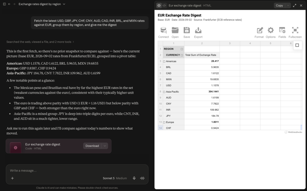
Fetch the latest USD, GBP, JPY, CHF, CNY, AUD, CAD, INR, BRL, and MXN rates against EUR, group them by region, and give me the digest
Skill 2: Comparing two periods on request
This one’s for the “how does X stack up against Y” question. It can be anything: two months, two store formats, two anything that exists in your table. Rather than rebuilding the report and manually analyzing two columns/rows/values, the skill does it for you.
webdatarocks-period-compare.md
---
name: "webdatarocks-period-compare"
description: "Compare two periods, categories, or filter values in a WebDataRocks report and show the absolute difference and percent change. Use when the user asks to “compare,” “vs.,” or wants to see how one period or segment stacks up against another."
---

1. Identify the two periods, categories, or filter values from the user's request. If they are not specified, ask which two values to compare.

2. Build or update an interactive WebDataRocks pivot table in the Claude artifact.

   If there is no existing WebDataRocks pivot table, create one from the available data. Do not use Claude's native charts or tables instead.

   Load WebDataRocks from jsDelivr:

   - CSS: "https://cdn.jsdelivr.net/npm/webdatarocks/webdatarocks.min.css"

   - Core script: "https://cdn.jsdelivr.net/npm/webdatarocks/webdatarocks.js"

   Configure the pivot with:

   - the category being compared in rows;

   - the two periods or values in columns;

   - the relevant numeric field as the measure;

   - the appropriate aggregation;

   - the toolbar enabled;

   - a container height of 520px.

3. Keep the original data and report structure whenever an existing report is available. Do not regenerate the underlying data unnecessarily.

4. Add calculated values for:

   - Absolute Change = New Period − Previous Period

   - Percent Change = (New Period − Previous Period) / Previous Period × 100

5. Format the change values:

   - increases: green text with a "+" prefix;

   - decreases: red text with a "-" prefix.

6. If multiple categories are compared, identify the biggest increase and biggest decrease.

7. Summarize the main changes in 3–5 plain-language bullets. Do not simply repeat the raw pivot table.

8. The final artifact must contain an actual interactive WebDataRocks pivot table. Do not replace it with a custom HTML table, chart, or another visualization library.
Trigger prompt:
Compare exchange rates this year vs. last year
You get a report with both months side by side, a column showing the difference, and a quick note on which store format changed the most, instead of comparing two separate tables and doing the math yourself.
Skill 3: Formatting recommendations for an existing pivot
This one assumes you already have a pivot table built and just want a second opinion on how to present it, for example, which values actually better to be highlighted, and for which use a conditional formatting rule.
webdatarocks-format-advisor.md
---
name: "webdatarocks-format-advisor"
description: "Review an existing WebDataRocks pivot table and recommend or
apply conditional formatting to highlight values that stand out. Use when
the user asks Claude to “highlight,” “make the outliers stand out,” or
wants formatting suggestions for a report."
---

1. Inspect the existing pivot

Find the existing WebDataRocks instance and inspect the measure currently displayed in the pivot.

Use the actual values currently available in the pivot/report. Do not invent sample data or thresholds.

2. Determine the formatting threshold

Calculate the mean and standard deviation of the relevant measure values.

Use values more than one standard deviation above or below the mean as candidates for highlighting.

The rule must be based on the actual data distribution:

* Lower bound = mean − standard deviation
* Upper bound = mean + standard deviation

Do not use arbitrary values such as $2,000 or 100 unless they are explicitly requested by the user.

3. Apply conditional formatting directly

If the user asks to highlight, make values stand out, show outliers, or otherwise requests formatting to be applied, apply the formatting immediately.

Do not ask for confirmation.

Use WebDataRocks conditional formatting on the existing pivot table. Apply the rule to the relevant measure only.

The formatting should make matching cells visually stand out using:

* bold text
* a visible background/text color

The conditional formatting must be implemented through the existing WebDataRocks report configuration or WebDataRocks API used by the artifact.

Do not replace the pivot with another library or create a second pivot.

4. Modify the artifact, not just the explanation

After determining the rule, update the code/configuration of the current Claude artifact so that the change is visible in the rendered WebDataRocks pivot.

The final artifact must contain the conditional formatting rule.

Do not merely:

* explain what code the user could add
* return a code snippet without applying it
* describe the formatting without changing the pivot
* create a new standalone HTML example
* create a second WebDataRocks instance

The user’s existing pivot is the target of the change.

5. Preserve the existing report

Keep the existing:

* WebDataRocks instance
* dataset
* rows
* columns
* measures
* filters
* layout
* theme
* other report settings

Only add or modify the conditional formatting required for the user’s request.

6. Verify the result

After updating the artifact, verify that:

1. the WebDataRocks pivot still renders;
2. the conditional formatting is attached to the correct measure;
3. cells matching the calculated rule are visually highlighted;
4. no unrelated report configuration was removed.

If the artifact uses an existing report object, modify that configuration instead of creating a new report from scratch.

7. Response

Keep the response short.

State that the formatting was applied and briefly mention the threshold used, for example:

“Applied conditional formatting to values more than one standard deviation from the mean. The rule is based on the current data distribution.”
Trigger prompt:
Look at this pivot and highlight anything that stands out
Claude looks at your numbers before suggesting a rule. It also explains why it chose that number, so you can change it before using the rule.
Adapt these to your workflow
By the way, you are not limited to these 3 skills demonstrated in this article. You can combine them into one skill. For example, one that fetches data, compares periods, and highlights outliers all at once. You can also edit the Markdown file directly. And if none of these three skills fit your use case, the same approach still works: write down the steps you’d like to implement, save them, and you have a skill for any task you do repeatedly.
Where Claude Skills help
Spend less time typing the same setup for recurring reports
Keep formatting rules the same across reports and for teammates using the same skill
Explore reporting workflows before adding anything to a real app
They’re still not a substitute for a production integration, because a skill runs within a chat conversation with whatever data you give it. Connecting a live data source, syncing it outside of Claude, or presenting it to real users still means the actual WebDataRocks setup in your project.
Try It Yourself
Pick whichever of the three matches something you already ask for on repeat, save it as a skill, and try triggering it with a one-line request instead of a full prompt. If none of them quite fit, the same shape works for other repeat asks — describe the steps once, and let the skill remember them for you.
Discover how ChatGPT can help you prototype a WebDataRocks report, experiment with different layouts, and turn plain-English requests into interactive data reports
We’ll show you how to go from a simple prompt to a working WebDataRocks pivot table, exploring different layouts, calculated values, formatting, and themes — all without setting up a project first.
The article discusses how visual data representation can improve problem-solving by making complex information easier to understand. It offers practical tips on using tools like charts and infographics to simplify data and enhance decision-making.