5 Tips on How to Visualize Data for Insightful Solutions
In this article
The article discusses how visual data representation can improve problem-solving by making complex information easier to understand. It offers practical tips on using tools like charts and infographics to simplify data and enhance decision-making.
The human brain processes visual cues faster than written ones. According to Visme (2022), 90% of the information communicated to our brain is visual. This is why utilizing visual aids in problem-solving helps people to find solutions faster. Visual problem-solving refers to the process of finding solutions to problems with the use of visual aids like flowcharts, diagrams, maps, infographics, etc. In simple terms, you solve problems using visual aids. This method helps people understand the situation better as visual tools showcase how elements relate to each other more clearly.
The significance of visual data representation lies in its ability to make people see and understand data easier and better. With visual elements, complex data becomes easier to grasp so that everyone can understand them no matter their level of expertise. Visual data representation also helps businesses to gather insight from vast amounts of data. It simplifies data representation and allows it to be used efficiently by entrepreneurs.
The Role of Visual Data Representation in Problem-Solving
1. Communicating Complex Information
Visual data representation can transform complex ideas into simple information, making them easier to communicate to other people. It can bridge gaps in the communication process, especially when working with people from different backgrounds and levels of expertise. Visual data representation makes it faster to disseminate concepts, findings, and solutions to others, enabling efficient collaboration within teams.
2. Enhancing Understanding and Analysis
Visual data representation makes individuals understand and analyze complicated problems more easily. Visual tools to convey data and abstract ideas can make complex concepts easier to grasp, particularly when handling and analyzing essential aspects and relationships within a problem. It aids in breaking down difficult problems transforming them into smaller components that are easier to manage and understand.
3. Enabling Informed Decision-Making
Visual data representation enables informed decision-making. Visualization tools help people evaluate and compare different concepts or solutions, allowing for more informed decision-making. Its decomposition of complex problems into manageable components allows for a more structured problem-solving process. Furthermore, it reduces the probability of having cognitive biases that may affect choices.
Types of Visual Data Representation
1. Graphs and Charts
a. Line Graphs
A line graph is a chart that displays a line joining several points or a line that shows the relationship between two points. It is commonly used to display data or information that changes over time. It consists of the horizontal “x-axis” and vertex “y-axis”.
b. Bar Charts
A bar chart is a graph that displays categorical data using horizontal or vertical bars with heights or lengths in proportion to the values they represent. It is commonly used to present categorical and discrete or continuous variables grouped in class intervals.
c. Pie Charts
A pie chart is a circular graph that is divided into slices or sectors to present numerical proportions. The length or size of each slice or section is proportional to the data it is meant to represent.

2. Infographics
a. Visual Storytelling Through Data
An infographic is a visual image used to represent information, data, or knowledge. It tells a story visually through data, enabling a more compelling way to make people learn and understand information. An infographic with good visual storytelling includes great content, typography, colors, symbols, grids, hierarchies, icons, white space, and more. You can create and enhance your infographics by using a background remover to efficiently remove unnecessary backgrounds from the visual elements in your infographic so people can focus more on the visual storytelling and not get distracted.
b. Combining Text and Graphics for Clarity
Infographics provide clarity by combining text and graphics. It helps in summarizing complex situations, managing information, heightening engagement, and increasing comprehension. By having graphics and text together, infographics give a clearer view of the data or information presented so different individuals can easily understand them.

3. Heatmaps and Treemaps
a. Identifying Patterns in Data Density
A heatmap is a 2D data visualization tool that represents data using colors to show density or magnitude. Heatmaps are commonly used in marketing, website analytics, and consumer behavior. For example, heatmaps are used to display the behavior of users on a website through pattern recognition. Particular colors are used to show the website’s frequent and infrequent clicks.
b. Hierarchical Representation of Information
A treemap is another data visualization tool used to showcase the hierarchical representation of information. It includes nested rectangles which represent categories within the area in a “tree”. Individuals can compare and display the hierarchy, quantity, and pattern based on their space on the chart.

5 Tips on How to Visualize Data to Facilitate Problem-Solving

1. Identify Trends and Patterns
a. Recognizing Correlations in Data
You can visualize data by recognizing their correlations. Once you know their relationship, you get to group them, identify patterns and trends, or display their correlation visually to enable faster communication and more efficient problem-solving.
b. Uncovering Anomalies and Outliers
Anomaly and outlier detection is another power of data visualization. You get to uncover anomalies and outliers that pertain to data that are significantly different from other data. By detecting these, you get to know what area you should focus on during problem-solving.
2. Simplify Complex Information
a. Condensing Large Datasets
Data visualization tools like charts allow you to break down or condense large datasets into smaller and easy-to-understand formats. You categorize data or divide them into groups instead of just seeing them as a whole. By simplifying large amounts of data, it is easier to get insights and show findings you won’t get just by looking at the raw datasets.
b. Enhancing Data Accessibility for Stakeholders
By making complex data easier to understand, you enhance their accessibility for stakeholders. Your stakeholders, whatever their profession or level of expertise, can easily grasp the information you want to deliver because you have made the data accessible enough for them to understand quickly. This allows for more effective communication between you and your stakeholders.
3. Support Hypothesis Testing
a. Visual Confirmation or Refutation of Hypotheses
Data visualization tools enhance hypotheses by confirming, refuting, challenging, or expanding the ideas based on the existing data. Visualization can showcase if the hypotheses are affected by the division of shapes, data outliers, and particular subgroups.
b. Iterative Problem-Solving Processes
You can discover contradictory or unexpected findings to your hypotheses during your iterative problem-solving process through data visualization tools. You test your hypothesis repeatedly until you achieve your desired result. With visualization, you can continually improve your hypothesis.
4. Tools and Software for Visual Problem-Solving
a. ClickUp
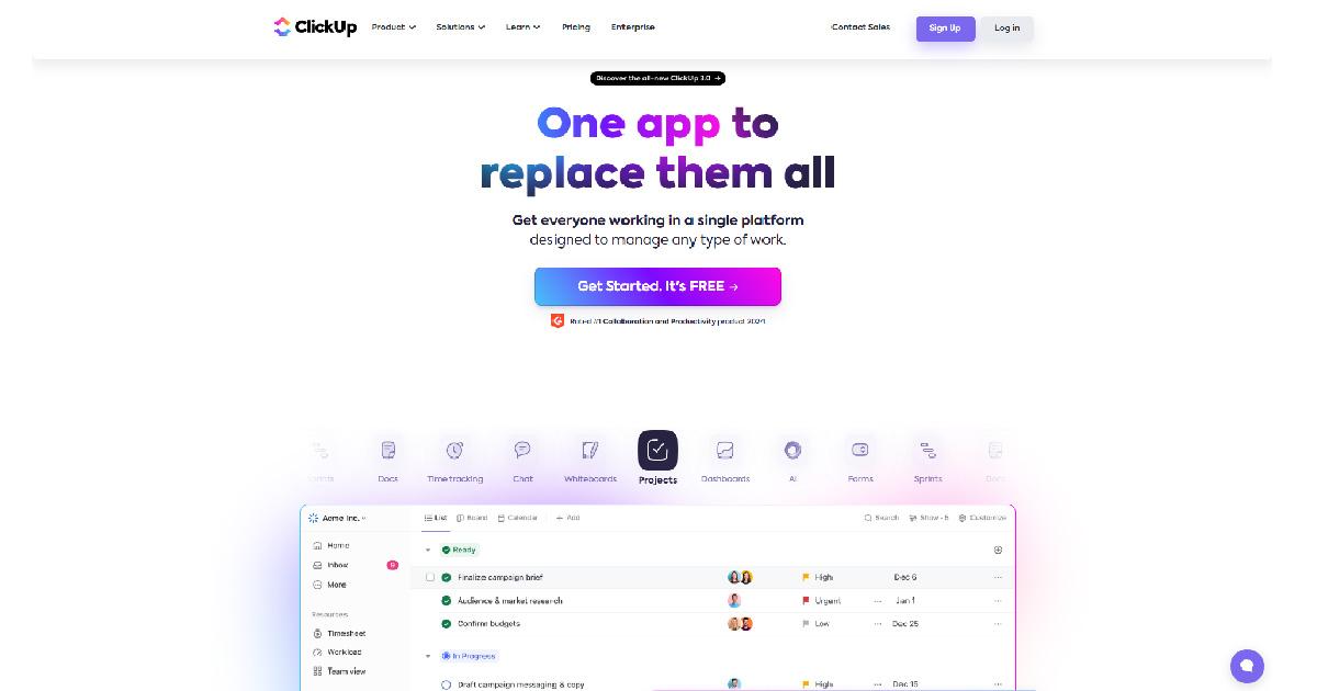
ClickUp is a visual problem-solving software that ensures the efficiency of your team’s collaboration. It makes sure that the members of your team are on the same page all the time. A live collaboration tool lets you create or edit documents with your team. It also includes virtual whiteboards to aid you in your problem-solving processes. The whiteboard feature helps your team brainstorm or generate ideas to solve problems you want to address. Mind maps are also available on the site, which lets you identify significant relations, gather useful insights, and execute creative approaches through mapping the connections between datasets and concepts.
b. Hive
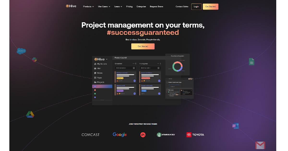
Hive is a data visualization tool that provides insightful solutions to your problem-solving processes. With Hive, you can get your team to face difficult challenges and improve their problem-solving abilities. It’s an engaging visual problem-solving platform that makes you see what your team members are doing. Its collaborative work management feature allows you to work with your team to address and solve issues efficiently. It has a user-friendly interface, project hierarchy, Gantt view, and Kanban view, which help you better manage your timelines and progress.
c. Tableau
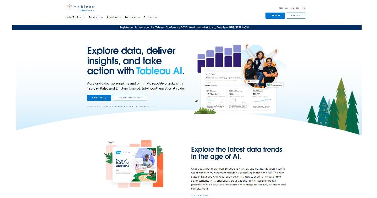
Tableau is one of the most popular tools for visual problem-solving big companies use. With the platform, you can make several types of maps, graphs, and charts and connect to various sources of data. It efficiently produces visualizations from small-scale to large-scale datasets commonly used for artificial intelligence and machine learning. Tableau is known for its high-quality performance, user-friendly interface, and great data visualization tools.
d. Trello
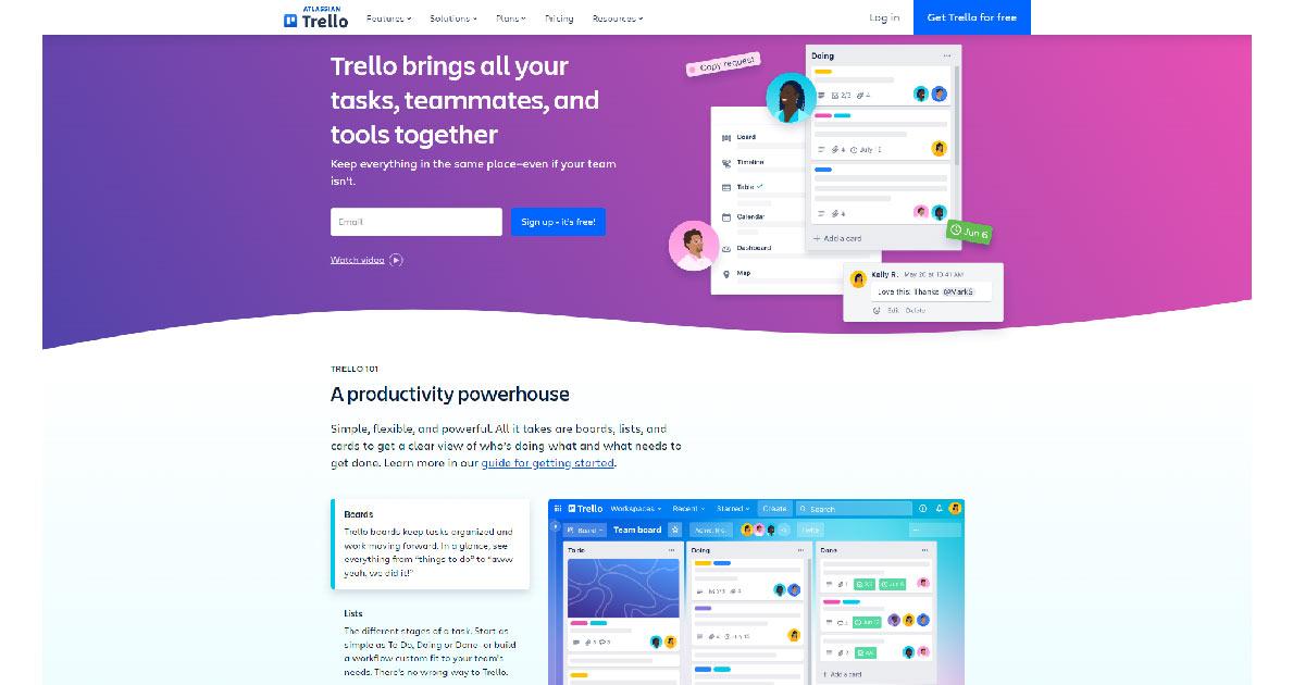
Trello is a visual problem-solving platform that effortlessly streamlines your work processes by organizing tasks using the drag-and-drop feature. Its collaboration and communication tools let you prioritize tasks and responsibilities efficiently. It has a map that exhibits an overview of your projects so you can see tasks, progress, and dependencies visually. Trello ensures you can solve issues through its effective task-management tools
e. Asana
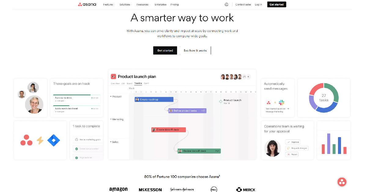
Last on the list is Asana. It is another well-known visual problem-solving platform that improves your decision-making efficiency. It can be used for several small projects and for teams without complicated workflows. It has a customizable workflow feature aids your team in their unique needs by automating repetitive tasks. It has Kanban boards, Gantt charts, and other data visualization tools used to enhance your problem-solving processes. Lastly, it can be integrated with popular tools like Google Drive, Microsoft, Zoom, etc.
5. Integration with Business Intelligence Systems
a. Leveraging Data for Strategic Decision-Making
Data visualization tools help you leverage data to have strategic decision-making. Visualized data integration allows you to access the data you need making it easier for you to make informed decisions for your business, fueling your business’ competitive intelligence.
b. Real-Time Analytics and Reporting
Real-time analytics and reporting involve gathering live data and sending it to users as it happens. You relay information based on the latest happenings so you or your managers can decide quickly based on the visualized real-time data you reported.
Practical Applications of Visual Problem-Solving
1. Business and Financial Analysis
a. Visualizing Key Performance Indicators (KPIs)
You can use visual problem-solving in a practical setting by using it for your business and financial analysis. You can apply it by visualizing your Key Performance Indicators or KPIs. To do it, you can simply compare a base value to a target value. You can also use charts and graphs to efficiently present the quantitative nature of your KPIs so you can bring out insightful observations from your team. It simplifies evaluating your project or campaign by clearly seeing the KPIs in place.
b. Forecasting and Trend Analysis
Another way to apply visual problem-solving is to forecast and analyze trends. Using visual tools like line and bar graphs, you see trends over time and draw forecasts from them. You see and build a pattern recognition over time, allowing you to create assumptions that you can use in your next problem-solving sessions. With visual tools, you get the idea of what may happen in the future based on your previous reliable visual data.
2. Scientific Research and Exploration
a. Visualizing Experimental Data
Data visualization plays a significant role in scientific research and exploration. It is applied by visualizing experiments to make them easier for stakeholders to understand. Using graphs, charts and other tools allows stakeholders to efficiently determine issues, identify new trends, and gain insightful information from hard-to-grasp experimental or novel data.
b. Communicating Research Findings Effectively
With visual aids, you also get to communicate your research findings effectively. You can use line graphs to see the changes in trends over time. You can use pie charts to show the percentage of an item from a whole and draw conclusions from them. Visual aids make it easier for you to convey the results of your research to other people.
Best Practices for Visual Problem-Solving
1. Choosing Appropriate Visualization Techniques
To maximize the potential of visual problem-solving, you need to pick the appropriate visualization techniques for your team. You have to ensure that the strategy you employ will help you and make your job easier rather than burden you. By choosing the appropriate data visualization techniques, you can efficiently solve even complex problems with your team. You ensure that your team members are knowledgeable of the strategy so you can reap its full potential.
Consider tools like WebDataRocks, which seamlessly integrate with various charting libraries. This flexibility empowers you to choose the perfect chart type for your data and audience, maximizing the impact of your visualizations.
2. Ensuring Data Accuracy and Integrity
Whatever industry you are in, you must ensure your data’s accuracy and integrity. You have to make sure that all data you present visually are facts and are based on research. You must have evidence to prove and back them up when questions arise. You must double-check all the data present and be 100% sure that they are accurate. This will allow you to provide real information to your team or stakeholders and prevent you from having problems in the future.
3. Encouraging Iterative Exploration and Analysis
You improve by repeating or doing the same thing daily. The same is true for visual problem-solving. You should employ iterative exploration and analysis to ensure that you are constantly improving your decision-making. By exploring and analyzing things continually, you allow continuous adjustment to your project or business process based on the results and feedback you get.
Conclusion
All in all, data visualization truly helps in the decision-making and problem-solving process. It simplifies data and makes them easier to understand for stakeholders. It also enables more engagement from your team and allows them to gain new insights based on the data they see visually. Visual tools and platforms enhance your and your team’s decision-making abilities, providing you with more insightful solutions to solve problems and challenges.
Thank you for the article to Vy, she a content writer for Removal.AI– an AI tool used to remove bg from images for social media, eCommerce, web, app development, and marketing automation. She loves to share her insights about tech, AI, and marketing.
What else to read?
- Data visualization with WebDataRocks & Chart.js: create a dashboard in 5 min
- Navigating the Future of Big Data and Analytics: Trends and Best Practices for 2024
- Tutorial: How to create a dashboard with WebDataRocks and AnyChart
- Top data visualization blogs to follow in 2023
- Pivot Tables: The Ultimate Guide