Best Charts to Show Correlation

Correlation is a powerful statistical concept that refers to a linear relationship between variables. It lies in the center of regression analysis techniques. And when it comes to visualizing relationships between variables, you cannot avoid using charts. They are a great assistance in assessing the quality of predictive regression models.
Charts that show correlation are used at the first step toward detection of cause-effect relationships (but one should remember that correlation doesn’t always imply causation).
Here, we’ll cover the purpose and the structure of three basic charts – a scatter plot, a bubble chart, and a heatmap.
Correlation charts become even more powerful when combined with interactive analytical tools like WebDataRocks, allowing users to explore relationships in aggregated business data.
Scatter plot (scattergram)
A classical chart for any statistician when it comes to correlation and distribution analysis. It’s perfect for searching distribution trends in data.
Structure
The variable on the y-axis is a dependent variable while the x-axis variable – independent.
Purpose
Use it to check whether there is any relationship between two variables. The presence of a certain kind of relationship simply means that changes in the independent variable lead to changes in values of the dependent variable.
With this chart, you can also notice anomalies or clusters in data.
Recommendations
- The more data, the better – include as much data points as you can.
- To measure how strong the linear relationship is, a single chart is not enough – you need to calculate a correlation coefficient. The sign of the correlation coefficient can be defined by the direction of the line on the plot.
- Data points of each variable should be depicted with different colors so as to be able to distinguish them easily.
- You can transform the horizontal axis into a logarithmic scale – this way you’ll see the relationships between more widely distributed points.
Example
Check the relationship between the spent amount of hours studied and final grades results

If data points are scattered in a random pattern or form a curve, that means that there is no correlation. However, it’s possible that there is a non-linear relationship between variables.
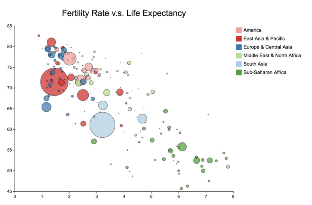
Bubble chart
A bubble chart is simply a variation of a scatter chart.
Purpose
Use it to identify the relationship between data points.
The bubble chart is essential for visualizing the 3- or 4-dimensional data on the plane.
Do you want to be the first to test the grid with your data?
Structure
The x-axis corresponds to an independent variable, the y-axis – to a dependent. The third and fourth variables can be represented by the size of a data point and its color. The size should be proportional to the value of the dependent variable and the color should correspond to a certain category.
Recommendations
- If you can want to show time, you can add animation to present how the values of the variables change over time.
- Limit the number of bubbles – don’t use too many of them. Otherwise, a plot may become hard to read.
- Rather than labeling each value, add tooltips that appear once you hover over the bubbles and show hidden information. Such an interactive approach can help keep your chart not overcluttered and laconic.
Examples
- Identify the correlation between life expectancy, fertility rate and the population of countries
- The brightest example of using this kind of chart is for project assessment: the projects can be evaluated by cost, risks, and value. The higher the value, the farther this project is to the right part of the chart. And the higher the risks, the closer the project is to the top of the chart. The size depicts its expected ROI. Such an approach helps companies to choose projects to invest in.

Heatmap
A heatmap is a commonly used and visually intuitive chart that relies on color gradients to represent the magnitude of values across a two-dimensional space.
Purpose
Use it to reveal patterns, correlations, and concentrations across a dataset at a glance.
A heatmap is especially effective when comparing multiple variables simultaneously or spotting clusters that would be difficult to detect in a standard scatter plot.
Structure
The x- and y-axes represent two categorical or continuous variables. Each cell at their intersection is filled with a color corresponding to a numerical value — typically ranging from cool tones (low values) to warm tones (high values). A color scale legend is always included to make values interpretable.
Recommendations
- Choose your color palette carefully — a sequential palette works best for showing magnitude, while a diverging palette suits data with a meaningful midpoint (such as positive and negative correlation values).
- Keep the number of rows and columns manageable; overly dense heatmaps become hard to read.
- Add tooltips on hover to display exact values without cluttering the chart surface.
- If your goal is to show a correlation matrix of multiple variables, a heatmap is often the clearest option.
Example
Visualize the correlation matrix between a set of financial indicators — such as revenue, profit margin, customer acquisition cost, and churn rate — across different time periods or product lines.
A strong positive correlation between two variables will appear as a deep, warm cell, while a strong negative correlation stands out in a contrasting cool tone, making relationships immediately visible without reading a single number.
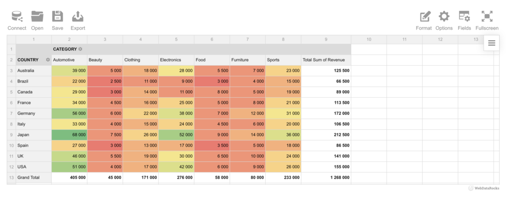
Turn your pivot table into a heatmap
Great news, if you’re already working with a pivot table, you don’t need to build a heatmap from scratch. With Flexmonster, you can transform your pivot table data directly into a heatmap visualization. Check out this tutorial to see how it’s done step by step.
Moreover, the same capability is available in WebDataRocks. As you can see in our example below, revenue data broken down by country and product category instantly becomes a readable, color-coded heatmap, making it easy to spot top performers like Japan’s Automotive and Electronics figures at a glance.
Summary
Today we’ve discussed the charts which are widely used in predictive analytics.
We aim to share with you the most important information related to data visualization.
What’s next?
To deepen your knowledge about charts, check out other parts of the data visualization project:
- Power of Data Visualization and Charts
- Best Charts to Show Discrete Data
- Charts for Comparison Over Time
- How to Choose Charts to Show Data Composition
- Best Charts to Show Data Distribution
Tutorials
If you want to visualize aggregated data in charts, you can integrate WebDataRocks Pivot Table with Google Charts or Highcharts: