Creating multilevel hierarchies in JSON
Using the metadata object for JSON, you can create multilevel hierarchies from fields of any type.
In this guide, we’ll create a Food hierarchy with Category, Item, and Serving Size levels based on the data below:
[
  {
    "Category": "Breakfast",
    "Item": "Frittata",
    "Serving Size": "4.8 oz (136 g)",
    "Calories": 300
  },
  {
    "Category": "Breakfast",
    "Item": "Boiled eggs",
    "Serving Size": "4.8 oz (135 g)",
    "Calories": 250
  }
]
Step 1. In the metadata object, set the type of Category, Item, and Serving Size fields as "level":
[
  {
    "Category": {
      type: "level"
    },
    "Item": {
      type: "level"
    },
    "Serving Size": {
      type: "level"
    },
    "Calories": {
      type: "number"
    }
  },
  {
    "Category": "Breakfast",
    "Item": "Frittata",
    "Serving Size": "4.8 oz (136 g)",
    "Calories": 300
  },
  {
    "Category": "Breakfast",
    "Item": "Boiled eggs",
    "Serving Size": "4.8 oz (135 g)",
    "Calories": 250
  }
]
Step 2. Use the hierarchy, parent, and level properties of the metadata object to create the Food hierarchy:
[
  {
    "Category": {
      type: "level",
      hierarchy: "Food"
    },
    "Item": {
      type: "level",
      hierarchy: "Food",
      level: "Dish",
      parent: "Category"
    },
    "Serving Size": {
      type: "level",
      hierarchy: "Food",
      level: "Size",
      parent: "Dish"
    },
    "Calories": {
      type: "number"
    }
  },
  {
    "Category": "Breakfast",
    "Item": "Frittata",
    "Serving Size": "4.8 oz (136 g)",
    "Calories": 300
  },
  {
    "Category": "Breakfast",
    "Item": "Boiled eggs",
    "Serving Size": "4.8 oz (135 g)",
    "Calories": 250
  }
]
See how this dataset will be visualized in WebDataRocks:
Check out a live demo on CodePen.
See also
In this guide, you can learn how to format your JSON data so WebDataRocks can process it.
JSON formats
WebDataRocks supports two JSON formats:
1) Array of objects. Each object is an unordered collection of key-value pairs, where the key is a field name and the value is a field member. Example:
[
  {
    "Product": "Apple",
    "Price": 2.50
  },
  {
    "Product": "Cherry",
    "Price": 5.25
  }
]
2) Array of arrays. The first subarray contains field names, while the other subarrays contain the respective field members. The field’s name and members must have the same position in the subarrays. Example:
[
  ["Product", "Price"],
  ["Apple", 2.50],
  ["Cherry", 5.25]
]
Regardless of what JSON format you choose, the first element of each array can be the metadata object for JSON. This object is used to set data types and create multilevel hierarchies.
Input value formats
Number field format
Number values can contain digits, -, and + characters. Point . must be used as a decimal separator. Numbers in exponential notation are also supported. Examples of valid values: -20, 2.50, 1.0E+2.
String field format
String values must be enclosed in double quotation marks. Special characters, such as line breaks or double quotation marks, must be escaped using the backslash. Examples of valid values: "Apple", "\"A-Z\" section".
Date field format
Date fields must be defined in one of the following formats:
- ISO 8601. Examples:
"2018-01-10"(date),"2018-01-10T08:14:00"(date and time),"2018-01-10T06:14:00Z"(date and time in UTC). - Unix timestamps in milliseconds. Examples:
1515535200000(timestamp of the"2018-01-10"date),1515564860000(timestamp of the"2018-01-10 08:14:20"date and time).
Note. By default, Unix timestamps are interpreted in WebDataRocks as numbers. To use them as dates, explicitly set the type property in the metadata object to the needed date type. - JavaScript Date objects. Can be used only with inline JSON data. Examples:
new Date(2018, 0, 10)(creates the"2018-01-10"date),new Date("January 10, 2018 08:14:20")(creates"2018-01-10 08:14:20"date and time).
Note. In the array of arrays, JavaScript Date objects are interpreted in WebDataRocks as strings. To use them as dates, explicitly set the type property in the metadata object to the needed date type.
Time field format
Time values must be specified as a number of seconds. The component displays values in the "HH:mm:ss" format. Example: 5400 (displayed as "01:30:00").
To ensure the detection of time values, set the field type to "time" in the metadata object. Otherwise, they will be processed as numbers.
Month field format
Month values must start with a capital letter. Full names and 3-letter abbreviations of months are supported. Examples: "October", "Dec", "May".
To ensure the detection of month values, set the field type to "month" in the metadata object. Otherwise, they will be processed as strings.
Weekday field format
Weekday values must start with a capital letter. Full names and 3-letter abbreviations of the days of the week are supported. Examples: "Monday", "Sun", "Friday".
To ensure the detection of weekday values, set the field type to "weekday" in the metadata object. Otherwise, they will be processed as strings.
See also
- Setting data types
- Connecting to JSON
- Creating multilevel hierarchies in JSON
- Metadata object for JSON
This guide describes how to integrate WebDataRocks with Flutter.
Prerequisites
- Flutter 2.17.6 or greater
- Internet connection
Run our sample project from GitHub
Step 1. Download or clone the sample project from GitHub with the following commands:
git clone https://github.com/WebDataRocks/pivot-flutter
cd pivot-flutter
Step 2. Install dependencies described in the pubspec.yaml file:
dart pub get
If you get an error on this step, add the Flutter SDK location to the PATH environment variable. Learn more in the Flutter docs.
Step 3. Connect a mobile device. Learn how to configure Android and iOS devices.
Step 4. Run the project:
flutter run
You can see the result on your mobile device.
To stop the project, press Ctrl + C (Control + C on macOS) in the console.
Available examples
The sample project contains the following examples:
- Pivot table demo – Shows how to specify WebDataRocks initialization parameters in Flutter.
- Using API calls – Shows how to invoke WebDataRocks API calls in Flutter.
- Handling events – Shows how to handle WebDataRocks events in Flutter.
- Customizing cells – Shows how to access all WebDataRocks features using JavaScript.
Integrate with Flutter
To integrate WebDataRocks into a Flutter app, take the following steps:
Step 1 (optional). Create a project
If you don’t have an existing Flutter project, create one with the following command:
flutter create wdr_project && cd wdr_project
If you get an error on this step, add the Flutter SDK location to the PATH environment variable. Learn more in the Flutter docs.
Step 2. Download WebDataRocks
Get WebDataRocks package for Flutter by running the following command from your project’s root folder:
flutter pub add flutter_webdatarocks
Note. Our flutter_webdatarocks wrapper loads WebDataRocks files from CDN.
Step 3. Configure build settings
Ensure the required Android and iOS versions are used in your Flutter project.
Android
compileSdkVersion≥ 32.targetSdkVersion≥ 32.minSdkVersion≥ 19.
iOS
iOS Deployment Target≥ 9.MinimumOSVersion≥ 9.
Learn how to configure Android and iOS build settings in Flutter.
Step 4. Add WebDataRocks
Step 4.1. Create a .dart file (e.g., WDR.dart) in the lib/ folder of your project:
import 'package:flutter/material.dart';

class WDR extends StatelessWidget {
  const WDR({super.key});

  @override
  Widget build(BuildContext context) {
  }
}
Step 4.2. Import flutter_webdatarocks into the WDR.dart file:
import 'package:flutter/material.dart';
import 'package:flutter_webdatarocks/flutter_webdatarocks.dart';

class WDR extends StatelessWidget {
  const WDR({super.key});

  @override
  Widget build(BuildContext context) {
  }
}
Step 4.3. Create a WebDataRocks instance and return it from the build() method:
import 'package:flutter/material.dart';
import 'package:flutter_webdatarocks/flutter_webdatarocks.dart';

class WDR extends StatelessWidget {
  const WDR({super.key});

  @override
  Widget build(BuildContext context) {
    WebDataRocks pivot = WebDataRocks(
      toolbar: true,
      report: const {
        "dataSource": {
          "dataSourceType": "csv",
          "filename": "https://cdn.webdatarocks.com/data/data.csv"
        }
      }
    );
    return pivot;
  }
}
The toolbar and the report are WebDataRocks initialization parameters. See the list of supported parameters.
Step 4.4. Add the WebDataRocks instance to a Flutter widget where the pivot table should appear. For example, copy and paste the code below into your main.dart file:
import 'package:flutter/material.dart';
import 'WDR.dart';

void main() {
  runApp(MaterialApp(
    title: 'WebDataRocks Demo',
    home: Scaffold(
      appBar: AppBar(
        backgroundColor: const Color.fromARGB(255, 5, 152, 223),
        foregroundColor: const Color.fromARGB(255, 233, 233, 233),
        title: const Text('WebDataRocks Demo')),
      // The WebDataRocks instance
      body: const WDR()))
  );
}
Step 5. Launch the app
Step 5.1. Run the following command to make sure a mobile device is connected:
flutter devices
If the device is not shown, check out Flutter setup guides for Android and iOS.
Step 5.2. Launch your app with the following command:
flutter run
See the results on the mobile device.
To stop the project, press Ctrl + C (Control + C on macOS) in the console.
WebDataRocks initialization parameters
In Flutter, most WebDataRocks initialization parameters are supported, except for the following:
containercustomizeCell- Event handlers. See how to subscribe to WebDataRocks events.
Use methods and events
Using methods
You can invoke WebDataRocks methods via the variable with the WebDataRocks instance (e.g., pivot):
pivot.openFieldsList();
Check out an example on GitHub.
Note. In Flutter, all WebDataRocks API calls are asynchronous, except for on() and off().
Supported WebDataRocks methods
Most WebDataRocks methods are supported in Flutter, apart from the following:
Note. Unsupported methods can be accessed via JavaScript.
Using events
Subscribing
Attach a handler to a WebDataRocks event using the on() API call:
void updateHandler() {
  // Event handler
}

pivot.on("update", updateHandler);
An event handler can also be defined as an anonymous function:
pivot.on("update", () {
  // Event handler
});
To get data from an event, add the data input parameter to the handler:
pivot.on("cellclick", (data) {
  // Event handler
});
Check out an example on GitHub.
See the full list of WebDataRocks events.
Unsubscribing
Event handlers can be removed via the off() API call:
- Remove all handlers from a specific event:
pivot.off("cellclick"); - Remove a specific event handler:
pivot.off("cellclick", cellclickHandler);
Access unsupported WebDataRocks features through JavaScript
Using JavaScript, you can access WebDataRocks methods that are not directly supported in Flutter.
For instance, let’s highlight cells you click using customizeCell:
Step 1. Import webview_flutter in the .dart file with WebDataRocks (e.g., WDR.dart):
import 'package:flutter/material.dart';
import 'package:flutter_webdatarocks/flutter_webdatarocks.dart';
import 'package:webview_flutter/webview_flutter.dart';

class WDR extends StatelessWidget {
  const WDR ({super.key});

  @override
  Widget build(BuildContext context) {
    WebDataRocks pivot = WebDataRocks(
      toolbar: true,
      report: const {
        "dataSource": {
          "dataSourceType": "csv",
          "filename": "https://cdn.webdatarocks.com/data/data.csv"
        }
      }
    );
    return pivot;
  }
}
Step 2. Create an anonymous async handler for the cellclick event. JavaScript code will be run in the handler:
@override
Widget build(BuildContext context) {
  WebDataRocks pivot = WebDataRocks(
    toolbar: true,
    report: const {
      "dataSource": {
        "dataSourceType": "csv",
        "filename": "https://cdn.webdatarocks.com/data/data.csv"
      }
    }
  );
  pivot.on("cellclick", (data) async {
    // Your JavaScript code will be run here
  });
  return pivot;
}
Step 3. Create a WebViewController instance (e.g., controller) in the handler:
pivot.on("cellclick", (data) async {
  // Your JavaScript code will be run here
  WebViewController controller = await pivot.controller.future;
});
Step 4. Call the runJavascript() method on the controller and specify JavaScript code as a parameter:
pivot.on("cellclick", (data) async {
  // Your JavaScript code will be run here
  WebViewController controller = await pivot.controller.future;
  controller.runJavascript('''
    webdatarocks.customizeCell((cellStyle, cellData) => {
      if(cellData.label === "${data['label']}") {
        cellStyle.style.background = "rgba(5, 152, 223, 0.5)";
      }
    });
  ''');
});
Note. runJavascript() does not return the result of your JavaScript code. To return the result, use the runJavascriptReturningResult() method instead.
Now every time you click a grid cell, it is highlighted with a blue color.
Check out another example of using JavaScript in our sample GitHub project.
Troubleshooting
If you run into any issues during the integration, please create an issue on our GitHub.
We use only open-source components in WebDataRocks. Here is a list of all libraries and links to their respective licenses:
- html2canvas v1.0.0-rc.1 – MIT License
- FileSaver.js v1.3.1 (modified by Flexmonster) – MIT License
- jsPDF v1.5.3 – MIT License
- JSZip v3.1.5 – MIT License
See also
This page contains information about browsers compatible with WebDataRocks.
Starting from version 1.4, WebDataRocks follows the ES6 standard. As a result, the component will work correctly only in browsers that fully support ES6. You can find these browsers and their versions in the below table:
| Browser | Version |
|---|---|
| Chrome | 51+ |
| Firefox | 54+ |
| Microsoft Edge | 15-18, 79+ |
| Opera | 38+ |
| Safari | 10+ |
| iOS Safari | 10+ |
| Internet Explorer | Not supported* |
*To work with WebDataRocks in Internet Explorer, use WebDataRocks versions earlier than 1.4. The component’s version history is available on npm. See how to install a specific package version from npm.
To include exact WebDataRocks versions from our CDN, follow this guide.
These tutorials show how to integrate the WebDataRocks reporting tool with the Vue.js framework using Composition API.
Choose one of the following tutorials:
You can also run our sample project from GitHub.
Prerequisites
Integrate WebDataRocks into a Vue 2 project
The guidelines below describe how to integrate WebDataRocks with Vue 2. You can also integrate WebDataRocks into a Vue 3 project.
Step 1. Create a project (optional)
Step 1.1. If you don’t have a Vue 2 application yet, create one by running the following command in the console:
npm create vue@2
During the creation process, you will be prompted to choose configurations for your project. For simplicity, select No for all the configurations.
Step 1.2. Install npm packages for the project:
cd <project-name>
npm install
Step 2. Get WebDataRocks
Install the WebDataRocks Vue wrapper from npm:
npm install @webdatarocks/vue-webdatarocks
Step 3. Include WebDataRocks
Step 3.1. Import WebDataRocks in the component where you need the pivot table (e.g., src/App.vue):
<script setup>
import { Pivot } from "@webdatarocks/vue-webdatarocks";
import "@webdatarocks/webdatarocks/webdatarocks.css";
</script>
Step 3.2. Add Pivot to the component’s template:
<template>
  <div>
    <Pivot
       toolbar
    />
  </div>
</template>
Note that the <template> must contain only one root <div> element.
Step 4. See the result
Run your application:
npm run dev
Open http://localhost:5173/ in the browser — WebDataRocks is embedded into your Vue 2 project.
You can shut down the app with Ctrl + C.
Integrate WebDataRocks into a Vue 3 project
Follow the steps below to integrate WebDataRocks with Vue 3.
Note that WebDataRocks does not have a ready-to-use Vue 3 wrapper. In this tutorial, the Vue 2 wrapper is used for the integration with Vue 3.
Step 1. Create a project (optional)
Step 1.1. If you don’t have a Vue 3 application yet, create one by running the following command in the console:
npm create vue@3
During the creation process, you will be prompted to choose configurations for your project. For simplicity, select No for all the configurations.
Step 1.2. Install npm packages for the project:
cd <project-name>
npm install
Step 2. Get WebDataRocks
Install WebDataRocks from npm:
npm install @webdatarocks/webdatarocks
Step 3. Include WebDataRocks
Step 3.1. Download the Pivot.vue file from our GitHub and place it in the src/components/ folder.
Step 3.2. In the Pivot.vue file, find the <style> block and edit it as follows:
Before
<style scoped>
@import '~@webdatarocks/webdatarocks/webdatarocks.min.css';
</style>
After
<style scoped>
@import '@webdatarocks/webdatarocks/webdatarocks.min.css';
</style>
Step 3.3. Import WebDataRocks from Pivot.vue in the component where you need the pivot table (e.g., src/App.vue):
<script setup>
import Pivot from "./components/Pivot.vue";
</script>
Step 3.4. Import WebDataRocks CSS:
<script setup>
import Pivot from "./components/Pivot.vue";
import "@webdatarocks/webdatarocks/webdatarocks.css";
</script>
Step 3.5. Add WebDataRocks to the component’s template:
<template>
  <div>
    <Pivot
      toolbar
    />
  </div>
</template>
Step 4. See the result
Run your application:
npm run dev
Open http://localhost:5173/ in the browser — WebDataRocks is embedded into your Vue 3 project.
You can shut down the app with Ctrl + C.
Troubleshooting
If you run into any issues during the integration, please create an issue on our GitHub.
See also
WebDataRocks allows visualizing the data from the pivot table using 3rd-party charting libraries. Feel free to use the following tutorials:
- Integration with amCharts
- Integration with Highcharts
- Integration with Google Charts
- Integration with FusionCharts
- Integration with any charting library
This step-by-step tutorial will help you integrate WebDataRocks with amCharts. Our tutorial is based on the V4 of amCharts.
Supported chart types
WebDataRocks Connector for amCharts takes the data from the pivot table and prepares it according to the structure of an array of objects required by amCharts. As a result, any chart type will work with WebDataRocks Pivot Table.
Here is the list of demos that show how to integrate different chart types with WebDataRocks:
- Column Chart (demo)
- Line Chart (demo)
- Stacked Column Chart (demo)
- Bar Chart (demo)
- Clustered Bar Chart (demo)
- Stacked Bar Chart (demo)
- Radar Chart (demo)
- Bubble Chart (demo)
- Pie Chart (demo)
- Semi-circle Pie Chart (demo)
- Donut Chart (demo)
- Nested Donut Chart (demo)
- Radar Chart with switched axes (demo)
Follow the steps below to start creating interactive data visualizations.
Step 1. Add WebDataRocks to your project
Step 1.1. Complete the integration guide. Your code of the web page with WebDatarocks should look similar to the following:
<html>
  <head>
    <script src="https://cdn.webdatarocks.com/latest/webdatarocks.js"></script>
    <script src="https://cdn.webdatarocks.com/latest/webdatarocks.toolbar.min.js"></script>
    <link href="https://cdn.webdatarocks.com/latest/webdatarocks.min.css" rel="stylesheet"/>
  </head>

  <body>
    <div id="pivotContainer"></div>
    <script>
      const pivot = new WebDataRocks({
        container: "#pivotContainer",
        toolbar: true,
      });
    </script>
  </body>
</html>
Step 1.2. Create a report for WebDataRocks — connect to the data source and define which fields should be displayed in rows, columns, and measures:
const pivot = new WebDataRocks({
  container: "#pivotContainer",
  toolbar: true,
  report: {
    dataSource: {
      filename: "https://cdn.webdatarocks.com/data/data.csv",
    },
    slice: {
      rows: [
        {
          uniqueName: "Country",
        },
      ],
      columns: [
        {
          uniqueName: "Measures",
        },
      ],
      measures: [
        {
          uniqueName: "Price",
          aggregation: "sum",
        },
      ],
    },
  },
});
The fields you’ve specified in the report will be shown on the chart.
Step 2. Add amCharts
Step 2.1. Include the scripts for amCharts into your web page:
<script src="https://www.amcharts.com/lib/4/core.js"></script>
<script src="https://www.amcharts.com/lib/4/charts.js"></script>
<script src="https://www.amcharts.com/lib/4/themes/animated.js"></script>
Find more information about other ways of amCharts installation in the official amCharts documentation.
Step 2.2. Apply the theme imported in the previous step:
am4core.useTheme(am4themes_animated);
Step 2.3. Add a container to your web page where the chart should be rendered:
<div id="amchartsContainer"></div>
Step 3. Show the data from the pivot table on the chart
Step 3.1. Include the WebDataRocks Connector for amCharts:
<script src="https://cdn.webdatarocks.com/latest/webdatarocks.amcharts.js"></script>
The Connector provides the amcharts.getData() method, which gets data from WebDataRocks and converts it to the format required by amCharts.
Step 3.2. If the amcharts.getData() method is called before WebDataRocks is fully loaded, an empty result will be returned. To ensure that WebDataRocks is ready to provide data for the chart, handle the reportcomplete event:
const pivot = new WebDataRocks({
  container: "#pivotContainer",
  toolbar: true,
  report: {
    // ...
  },
  reportcomplete: function() {
    pivot.off("reportcomplete");
    createChart();
  }
});
Now the chart will be created only when the data is loaded and the report is ready.
Step 3.3. Declare a variable for the chart:
let chart;
Step 3.4. Implement the createChart() function using the amcharts.getData() method from the Connector:
function createChart() {
  pivot.amcharts.getData({},
  // Function called when data for the chart is ready
  drawChart,
  // Function called on report changes (filtering, sorting, etc.)
  drawChart);
}
Step 3.5. Implement the drawChart() function specified in the previous step. drawChart() initializes the chart, sets all the configurations specific for this chart type, and fills it with the data provided by WebDataRocks:
function drawChart(chartConfig, rawData) {
  // Create a chart instance
  // The selector must match the id of the <div> container for the chart
  chart = am4core.create("amchartsContainer", am4charts.XYChart);

  // Add data processed by WebDataRocks to the chart
  chart.data = chartConfig.data;

  // Create category axis for a column chart
  let categoryAxis = chart.xAxes.push(new am4charts.CategoryAxis());
  categoryAxis.dataFields.category = pivot.amcharts.getCategoryName(rawData);
  // Create value axis
  let valueAxis = chart.yAxes.push(new am4charts.ValueAxis());
  // Create and configure series
  let series = chart.series.push(new am4charts.ColumnSeries());
  series.dataFields.categoryX = pivot.amcharts.getCategoryName(rawData);
  series.dataFields.valueY = pivot.amcharts.getMeasureNameByIndex(rawData, 0);
}
The lines of code that are highlighted in bold are related to the interaction between the pivot table and charts. Let’s break down what they stand for. After passing the data from the pivot table to the chart, set the name of the category to the category axis using the webdatarocks.amcharts.getCategoryName() method:
categoryAxis.dataFields.category = pivot.amcharts.getCategoryName(rawData);
This method returns the name of the category of the prepared data. By default, it’s a caption of the first hierarchy from the rows. If the rows do not contain fields, webdatarocks.amcharts.getCategoryName() returns a caption of the first hierarchy from the columns. The same method is used for setting the chart’s category to the series:
series.dataFields.categoryX = webdatarocks.amcharts.getCategoryName(rawData);
To set the series values, the webdatarocks.amcharts.getMeasureNameByIndex() method is used:
series.dataFields.valueY = webdatarocks.amcharts.getMeasureNameByIndex(rawData, 0);
Find more details on the API calls available in the Connector for amCharts in the API reference.
Step 3.6. Set the autoDispose global option to true. As a result, the chart will be automatically disposed when it is necessary:
am4core.useTheme(am4themes_animated);
am4core.options.autoDispose = true;
Step 4. See the result
Open your web page in the browser to see how the pivot table looks in combination with amCharts.
To see what a real-time interaction is, try experimenting: filter the data, change the measures and the aggregation functions — the results are reflected on the chart at once.
To learn more about chart customization, please refer to the amCharts Documentation.
Check out the full code
After completing this tutorial, the full code of the web page should look as follows:
<html>
  <head>
    <script src="https://cdn.webdatarocks.com/latest/webdatarocks.js"></script>
    <script src="https://cdn.webdatarocks.com/latest/webdatarocks.toolbar.min.js"></script>
    <link href="https://cdn.webdatarocks.com/latest/webdatarocks.min.css" rel="stylesheet"/>

    <script src="https://www.amcharts.com/lib/4/core.js"></script>
    <script src="https://www.amcharts.com/lib/4/charts.js"></script>
    <script src="https://www.amcharts.com/lib/4/themes/animated.js"></script>

    <script src="https://cdn.webdatarocks.com/latest/webdatarocks.amcharts.js"></script>
  </head>

  <body>
    <div id="pivotContainer"></div>
    <div id="amchartsContainer"></div>
    <script>
      am4core.useTheme(am4themes_animated)
      am4core.options.autoDispose = true;

      let chart;

      const pivot = new WebDataRocks({
        container: "#pivotContainer",
        toolbar: true,
        report: {
          dataSource: {
            filename: "https://cdn.webdatarocks.com/data/data.csv",
          },
          slice: {
            rows: [
             {
                uniqueName: "Country",
             },
            ],
            columns: [
              {
                uniqueName: "Measures",
              },
            ],
            measures: [
              {
                uniqueName: "Price",
                aggregation: "sum",
              },
            ],
          },
        },
        reportcomplete: function() {
          pivot.off("reportcomplete");
          createChart();
        }
      });

      function createChart() {
        pivot.amcharts.getData({},
        drawChart,
        drawChart);
      }

      function drawChart(chartConfig, rawData) {
        chart = am4core.create("amchartsContainer", am4charts.XYChart);
        chart.data = chartConfig.data;
        let categoryAxis = chart.xAxes.push(new am4charts.CategoryAxis());
        categoryAxis.dataFields.category = pivot.amcharts.getCategoryName(rawData);
        let valueAxis = chart.yAxes.push(new am4charts.ValueAxis());
        let series = chart.series.push(new am4charts.ColumnSeries());
        series.dataFields.categoryX = pivot.amcharts.getCategoryName(rawData);
        series.dataFields.valueY = pivot.amcharts.getMeasureNameByIndex(rawData, 0);
    }
    </script>
  </body>
</html>
Live example
Interact with the following sample where WebDataRocks Pivot Table is integrated with amCharts to see how they work together:
See the Pen amCharts column chart minimal configuration and Pivot Table by WebDataRocks (@webdatarocks) on CodePen.
See also
This guide will walk you through the integration of WebDataRocks Pivot Table with Django – a Python web development framework. Upon completion, you will get a Django application empowered with reporting functionality.
Prerequisites
Get the latest or specific-release version of Python 3 and install Django on your machine. We recommend using the latest versions of both Python and Django to benefit from their newest features.
See the Python-Django compatibility matrix to know which Python 3 version you can use with a specific version of Django.
Run a Django sample project with WebDataRocks Pivot Table
Step 1. Download or clone our sample project from GitHub:
git clone https://github.com/WebDataRocks/pivot-django
cd pivot-django
Step 2. Run the following command:
On Windows
py manage.py migrate
On macOS or Ubuntu/Linux
python3 manage.py migrate
This will create database tables for the default Django apps. Learn about the migrate command.
Step 3. Open the command line and start the Django development server locally:
On Windows
py manage.py runserver
On macOS or Ubuntu/Linux
python3 manage.py runserver
Step 4. Open http://localhost:8000/ in the browser and see the result: the pivot table is rendered on the page.
To stop the Django development server, press Ctrl+C.
Integrate WebDataRocks Pivot Table into a new/existing Django application
To successfully add WebDataRocks Pivot Table to a Django application, follow the next steps:
Step 1. If you’re building an app from scratch, create a Django project by running the following commands:
django-admin startproject analytics_project
cd analytics_project
Step 2. Create a new application inside the project:
On Windows
py manage.py startapp pivot_table_app
On macOS or Ubuntu/Linux
python3 manage.py startapp pivot_table_app
Step 3. Go to analytics_project/settings.py and register the app’s name to the INSTALLED_APPS list to make the app accessible at the project level:
INSTALLED_APPS = [
    'django.contrib.admin',
    'django.contrib.auth',
    'django.contrib.contenttypes',
    'django.contrib.sessions',
    'django.contrib.messages',
    'django.contrib.staticfiles',
    'pivot_table_app',
]
Note that you can always check the exact name of the application in the your_app/apps.py file.
Step 4. Run the following command:
On Windows
py manage.py migrate
On macOS or Ubuntu/Linux
python3 manage.py migrate
This will create database tables for the apps from the INSTALLED_APPS.
Step 5. Add an app-specific template.
Start by creating a templates folder within the app’s directory (pivot_table_app). Here, we will keep the HTML templates for the application. Then, create a new HTML file (e.g., home.html). Add WebDataRocks dependencies, namely scripts and styles, within the <head> or <body> elements of the HTML page. Within the <script> tags, initialize the pivot table component and set a basic report according to the structure of your data:
<!DOCTYPE html>
<html lang="en">
<head>
<meta charset="UTF-8">
<title>WebDataRocks Example</title>
<link href="https://cdn.webdatarocks.com/latest/webdatarocks.min.css" rel="stylesheet"/>
</head>
<body>
<script src="https://cdn.webdatarocks.com/latest/webdatarocks.toolbar.min.js"></script>
<script src="https://cdn.webdatarocks.com/latest/webdatarocks.js"></script>
<div id="pivotContainer"></div>
<script>
var pivot = new WebDataRocks({
        container: "pivotContainer",
        toolbar: true,
        width: "100%",
        height: 600,
        report: {
            "dataSource": {
                "dataSourceType": "csv",
                "filename": "https://cdn.webdatarocks.com/data/data.csv"
            },
            "slice": {
                "rows": [
                    {
                        "uniqueName": "Category"
                    }
                ],
                "columns": [
                    {
                        "uniqueName": "Country"
                    },
                    {
                        "uniqueName": "[Measures]"
                    }
                ],
                "measures": [
                    {
                        "uniqueName": "Price",
                        "aggregation": "sum"
                    }
                ]
            }
        }
    }
);
</script>
</body>
</html>
Note that you also can create templates at the project level.
Step 6. In pivot_table_app/views.py create a view – a function that accepts a web request and returns a rendered HTML template as a web response:
from django.shortcuts import render
def home(request):
   return render(request, 'home.html')
Step 7. Create the pivot_table_app/urls.py file if it is not created yet. Then, open this file and map a URL pattern to the view in the urlpatterns list:
from django.urls import path
from . import views
urlpatterns = [
  path('', views.home, name='pivot_table'),
]
Step 8. Register the application’s URL patterns at the project level. Go to analytics_project/urls.py and append a new URL pattern:
from django.contrib import admin
from django.urls import path, include
urlpatterns = [
   path('admin/', admin.site.urls),
   path('', include('pivot_table_app.urls')),
]
This line of code makes all the URL patterns from pivot_table_app accessible by / within the project.
Step 9. Open the command line and start the Django development server locally:
On Windows
py manage.py runserver
On macOS or Ubuntu/Linux
python3 manage.py runserver
The server runs on the 8000 port by default.
Step 10. Open http://localhost:8000/ in the browser and see the result: the pivot table is rendered on the page and filled with data.
To stop the Django development server, press Ctrl+C.
Troubleshooting
If you run into any issues during the integration, please create an issue on our GitHub.
See also
- Getting started with WebDataRocks Pivot Table
- Integration of WebDataRocks with Jupyter
- Getting started with Django
- About projects and applications in Django
- Writing views in Django
- The Django template language
This tutorial will guide you through the process of integrating WebDataRocks Pivot Table with Jupyter – a web-based interactive application for sharing notebooks with live code, visualizations, text, and other media. As a result, you will get a notebook empowered with a pivot table for interactive data exploration and data analysis.
Prerequisites
Before installing a Jupyter environment, make sure Python is installed on your machine. Jupyter requires Python 3.3 or greater, or Python 2.7.
Next, start using Jupyter in one of the following ways:
- Using Anaconda – an open-source distribution with plenty of pre-installed Python packages for data science and scientific computing.
- Using pip – a Python’s package manager.
- Via a web version of classic Notebook or JupyterLab.
Ways to integrate WebDataRocks with Jupyter
- Integrate WebDataRocks Pivot Table with a new/existing Jupyter application
- Run a Jupyter project with WebDataRocks sample from GitHub
Integrate WebDataRocks Pivot Table into a new/existing Jupyter application
To integrate WebDataRocks Pivot Table with Jupyter, follow the next steps:
Step 1. Start the notebook server. Then, create a new Notebook or open the existing one.
You can start the notebook server in the following ways:
- From the Anaconda Navigator.
- From the command line.
- Using the web version.
Step 2. Import the following Python libraries into the notebook:
IPython.display– an API for display tools in IPython. From this module, import only theHTMLclass for rendering the HTML content in the notebook.json– a module for serializing and de-serializing Python objects.pandas– a library for working with data frames.
from IPython.display import HTML
import json
import pandas as pd
Step 3. Define a function that accepts JSON-formatted string and renders it as a pivot table on the HTML page:
def pivot(webdatarocks_json_object):
   code = '''
     <link href="https://cdn.webdatarocks.com/latest/webdatarocks.min.css" rel="stylesheet"/>
     <script src="https://cdn.webdatarocks.com/latest/webdatarocks.toolbar.min.js"></script>
     <script src="https://cdn.webdatarocks.com/latest/webdatarocks.js"></script>
     <h1>WebDataRocks Integration with Jupyter</h1>
     <div id="pivotContainer"></div>
     <script>
     new WebDataRocks({0});
     </script>
     '''.format(webdatarocks_json_object)
   return HTML(code)
Step 4. Create a pandas DataFrame and fill it with data. The data can come from a CSV/JSON/Excel file, SQL database, or other type of storage. For simplicity, we will use the static inline data:
df = pd.DataFrame(
    [["Apple pie", "20"], ["Lemon cake", "30"]],
    index=["row 1", "row 2"],
    columns=["Product", "Quantity"],
)
Step 5. Convert the DataFrame to a JSON string:
json_data = df.to_json(orient='records')
Note that it’s important to set the orient parameter to 'records'. This way, the object will be translated into a list-like structure: [{column -> value}, … , {column -> value}]. This structure corresponds to the format of a JSON data source accepted by WebDataRocks.
Step 6. Create an instance of WebDataRocks using the dictionary as follows:
webdatarocks = {
    "container": "#pivotContainer",
    "width": "100%",
    "height": 430,
    "toolbar": True,
    "report": {
        "dataSource": {
            "type": "json",
            "data": json.loads(json_data)
        },
        "slice": {
            "rows": [
                {
                    "uniqueName": "Product"
                }
            ],
            "columns": [
                {
                    "uniqueName": "[Measures]"
                }
            ],
            "measures": [
                {
                    "uniqueName": "Quantity",
                    "aggregation": "sum"
                }
            ]
        }
    }
}
Here we have specified the initialization parameters and set the slice. For connecting to a data source, we have decoded JSON using the json.loads() method and set the response to the dataSource.data property of the pivot table.
Step 7. Use json.dumps() to encode the webdatarocks object to a JSON-formatted string.
webdatarocks_json_object = json.dumps(webdatarocks)
Step 8. Pass the JSON-formatted string with the pivot table’s configuration to the previously defined pivot function:
pivot(webdatarocks_json_object)
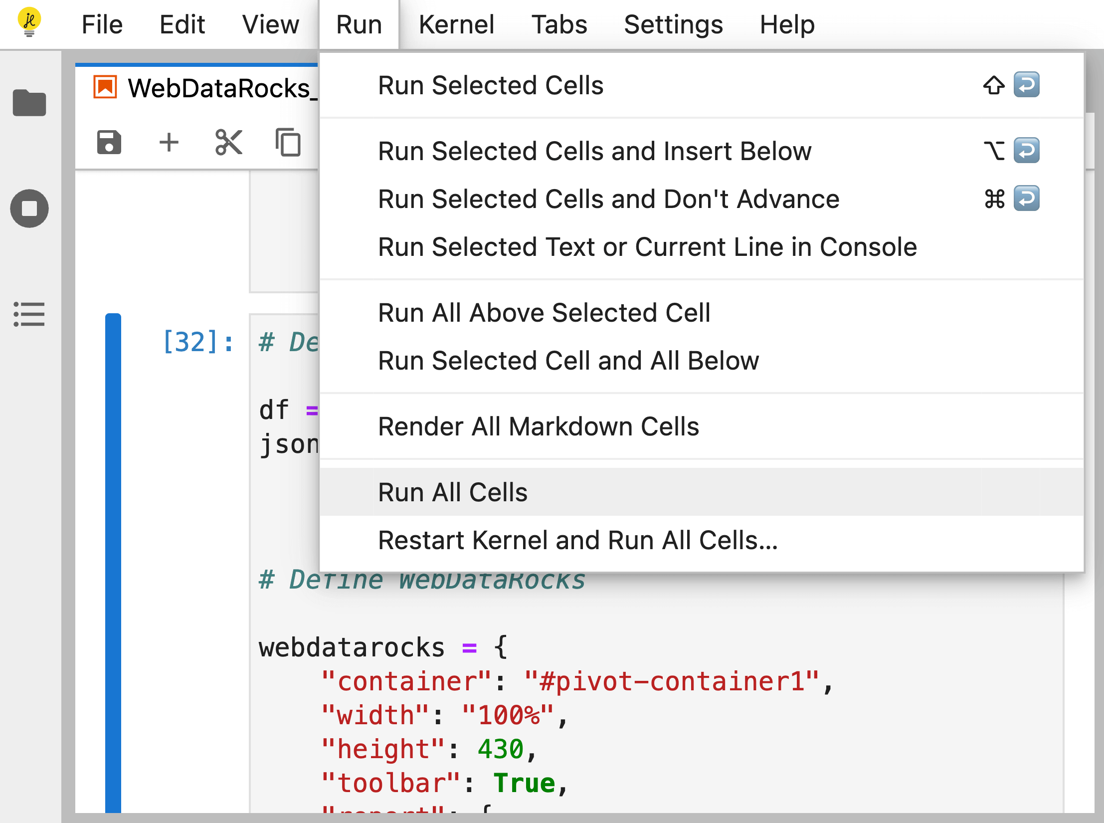
Step 9. Run the code contained in the notebook’s cells by selecting Run > Run All Cells. You can also run the cells separately, one after another.
The pivot table component will be rendered as an output of the cell where the pivot function is called.
Run a Jupyter project with WebDataRocks sample from GitHub
Step 1. Download or clone our sample project from GitHub:
git clone https://github.com/WebDataRocks/pivot-jupyter-notebook/
Step 2. Start the notebook server. You can do it in the following ways:
- From the Anaconda Navigator.
- From the command line.
- Using the web version.
Step 3. Import the WebDataRocks_in_Jupyter_Notebook.ipynb file into the Jupyter working directory.
Step 4. Run the code in the notebook’s cells by selecting Run > Run All Cells. You can also run the cells separately, one after another.
The pivot table component will be rendered as an output of the cell where the pivot function is called.
Troubleshooting
If you run into any issues during the integration, please create an issue on our GitHub.