Updating Your Tech Stack: Migrating from PivotTable.js to alternatives
If you’re working with data visualization, you probably have heard about PivotTable.js. It’s a lightweight, open-source JavaScript Pivot Table written by Nicola Kruchten and has been a well-known tool in data visualization for a long time.
You can explore the library yourself on its official GitHub repository, where the full source code is available, or check out a quick demo on YouTube recorded by the author to see how it works in practice.
What makes it stand out is its openness. Because it’s fully open source, you can get free access to the code and full control. It works quite well when you want to build a custom solution from the ground up.
There’s also even a React version called react-pivottable and maintained by the same author, which makes integration into modern apps a bit easier.
At the same time, the library shows its age, as it was built in 2012. It wasn’t updated at all recently, and you can feel that in the overall experience.
This is where WebDataRocks pivot grid component takes a different direction.
It gives you a complete, polished solution out of the box. The built-in UI is already there; it looks modern, and you can integrate it into your project much faster without building everything from scratch. But even if you want to add more customization, you can also achieve it!
As examples, we’ve got lots of showcases that demonstrate how WebDataRocks can be used in different ways: from complex analytical dashboards to daily usage habits trackers.
- HR Analytics with WebDataRocks
- Marketing Campaigns Analysis
- WebDataRocks analytical sport Dashboard
- WebDataRocks Bento Styles Dashboard
- Santa’s Letter Management System
Even just looking at these titles, you can already see how diverse the use cases are and, for sure, it’s not even near the limit of its possibilities.
In reality, it’s a very flexible data visualization component that can be used across many areas and industries, including finance, analytics, audit, logistics, and more. Also, we’ve got some practical examples about how to use it in marketing, sales, industry, and HR analytics. Some of the more “fun” demos are just there to show how flexible it is and how easily it can work with very different kinds of data.
In short, WebDataRocks works as a universal tool for handling data. You can structure, filter, and display it however you need. That’s why it’s useful both for serious, data-heavy projects and for more creative use cases.
What people say about PivotTable.js and WebDataRocks
PivotTable.js struggles with large datasets, which may be problematic for users. There’s no information about its limits in official docs, but some users on StackOverflow inform that while working with 2000 rows, there’s a slight delay, but with 5000 rows, it completely freezes.
On the other hand, WebDataRocks handles larger datasets (the limit is 1 MB, but it’s actually enough for most use cases) more comfortably and continues to receive updates, which makes it feel better aligned with current development needs. Also, WebDataRocks appears in numerous Reddit discussions. You may notice that people there describe it as a feature-rich component.
Flexmonster as an alternative to PivotTable.js & WebDataRocks
Even though WebDataRocks isn’t open source, it’s still completely free. Unlike many similar tools that are limited to non-profit or personal use, you’re welcome to use it in commercial projects and real business applications as well. And if you ever need something more advanced, there’s also Flexmonster – a commercial product created by the same team. It’s designed to handle even larger datasets, advanced analytics, and enterprise-level requirements.
For example, it has better performance with really large datasets, including built-in support for server-side processing. This means you can work with millions of records without loading everything into the browser, which isn’t really possible with lighter tools.
Another big advantage is the wide range of integrations. Flexmonster allows connecting to more advanced data sources, such as backend databases, and supports server-side technologies.
Also, it supports many popular frameworks such as React, Angular, and Vue.js (which are also supported by WebDataRocks), but it doesn’t stop there. It also works with less common or newer tools like Svelte, Flutter, Blazor, Nuxt, Next.js, and much more. This makes it a very flexible choice for real-world applications.
Wrap-up
In conclusion, it really depends on what you really need. PivotTable.js is great when you value openness and want full control, especially for smaller projects. But when the goal is to move faster, work with more data, and get a clean interface without extra effort, WebDataRocks feels like a better choice.
That’s why it works so well as an alternative – not because one is completely better than another, but because they’re designed for slightly different tasks.
What is a web pivot table?
A web pivot table is a data visualization component used in web applications to summarize, analyze, and explore information directly in the browser.
It allows users to dynamically group, filter, sort, and aggregate data. This makes it easier to identify patterns, compare values, and build reports without writing complex queries.
What is the difference between WebDataRocks and Flexmonster?
WebDataRocks and Flexmonster are created by the same team but serve different needs.
<ul>
<li>WebDataRocks is completely free and works well for small to medium datasets. It’s ideal for dashboards, internal tools, and typical business use cases.</li>
<li>Flexmonster is a commercial solution designed for enterprise-level applications. It can handle very large datasets, server-side processing, and more advanced integrations.</li>
</ul>
If your project grows or requires more scalability, Flexmonster can be a great next step.
Is open-source better than free software?
Not always. Open-source gives full access to the code, which is great for flexibility and customization. However, free closed-source tools can offer a better out-of-the-box experience and support, be more polished, and be easier to integrate.
Can WebDataRocks be integrated into an existing dashboard?
Yes. WebDataRocks is a flexible component that can be used on a web page or dashboard. Also, it easily integrates with other visualization libraries.
For example, it can be combined with popular charting libraries such as amCharts, Highcharts, Google Charts, and more to create interactive dashboards where they both work smoothly together.
You can also find practical integration examples in our blog:
<ul>
<li>Turn Your Data Into a Halloween Treat with WebDataRocks </li>
<li>Tutorial: How to create a dashboard with WebDataRocks and AnyChart</li>
<li>Data visualization with WebDataRocks & Chart.js: create a dashboard in 5 min</li>
</ul>
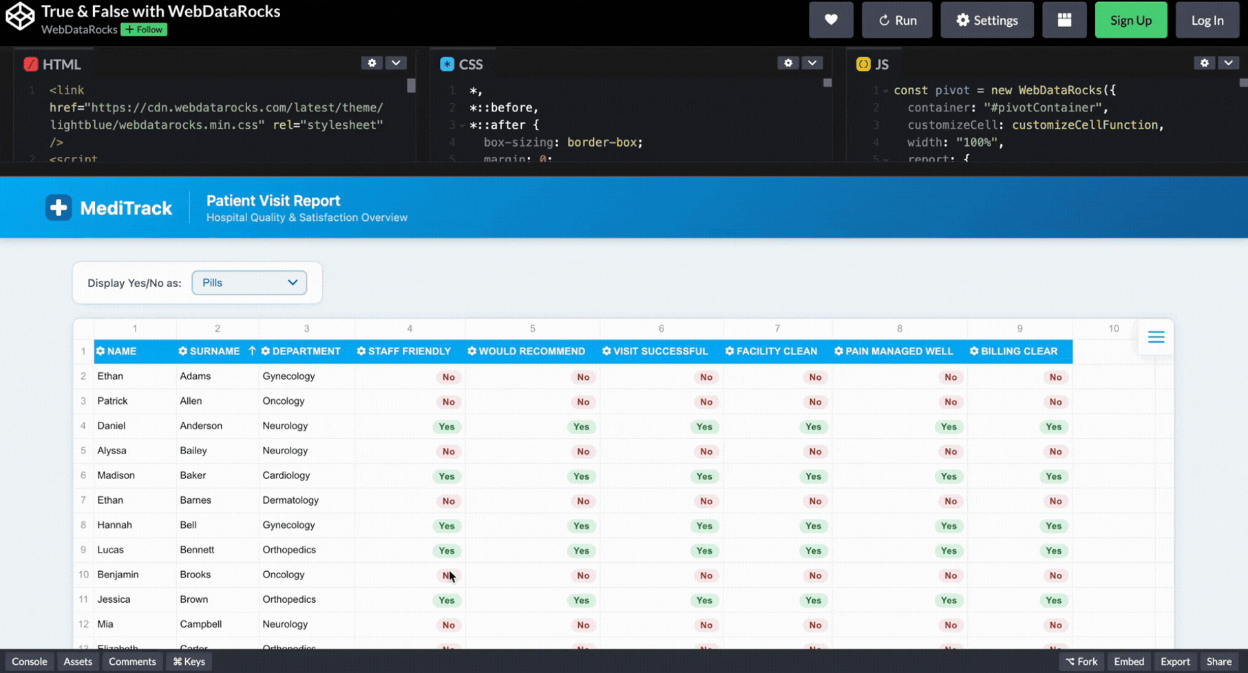
We are sure you’ve received many surveys on various topics and have been filling them out. But have you ever thought about how to better store this info in one place so it can be easily analyzed and navigated in the future? For sure, we’ve got a solution for you, and it’s WebDataRocks Pivot Grid!
As you know, better to learn anything by example. So, we’d love to present our new Medical Survey demo to you and walk you through the process of building it. Let’s start!
Step 1: Adding WebDataRocks Pivot Table to the Page
First step is easy as always: just add WebDataRocks to your project. It’s possible to achieve it with this code snippet:
<link href="https://cdn.webdatarocks.com/latest/theme/default/webdatarocks.min.css" rel="stylesheet" />
<script src="https://cdn.webdatarocks.com/latest/webdatarocks.toolbar.min.js"></script>
<script src="https://cdn.webdatarocks.com/latest/webdatarocks.js"></script>
Step 2: Building the Patients’ Experience Report’s Structure
Next, we create a pivot table where each row represents a patient visit, and each column reflects hospital performance metrics. In other words, just building the structure of our dashboard: include which rows, columns, and measures we’d like to display:
const pivot = new WebDataRocks({
  container: "#pivotContainer",
  width: "100%",
  report: {
    dataSource: {
      data: getData()
    },
    slice: {
      rows: [
        { uniqueName: "Name" },
        { uniqueName: "Surname" },
        { uniqueName: "Department" }
      ],
      columns: [{ uniqueName: "Measures" }],
      measures: [
        { uniqueName: "StaffFriendly" },
        { uniqueName: "WouldRecommend" },
        { uniqueName: "VisitSuccessful" },
        { uniqueName: "FacilityClean" }
      ]
    },
    options: {
      grid: {
        type: "flat",
        showGrandTotals: false
      }
    }
  }
});
Step 3: Preparing and Preprocessing the Info for Better Data Analysis
Okay, now we need to make sure our data is ready for analysis. In our case, the survey contains many Boolean values (true/false), which are not ideal for aggregation.
To solve this, we preprocess the data by converting all Boolean values into numeric ones (1 and 0). This allows WebDataRocks to correctly calculate totals and, in the future, implement a wide variety of aggregation functions.
function preprocessData(data) {
	return data.map(function (record) {
		var result = {};
		for (var key in record) {
			result[key] =
				typeof record[key] === "boolean" ? (record[key] ? 1 : 0) : record[key];
		}
		return result;
	});
}
Now, instead of using raw data, we first transform it and then pass it to the pivot table:
dataSource: {
	data: preprocessData(getData())
}
Step 4: From Raw Data to Visual Feedback with Data Visualization Techniques
The thing is, in our survey are too many true/false answers (which are now converted into 1/0 numeric values), and they are not really readable in this format. Let’s transform them into visual signals!
And at the beginning, we just list columns that contain these boolean-type answers:
const fieldsToFormat = [
  "StaffFriendly",
  "WouldRecommend",
  "VisitSuccessful",
  "FacilityClean"
];
But the question is, in which format is better to represent them then?
Why should we even choose the one? We can apply a few of them! So, the user can pick the option that’s most convenient: pills, emojis, or colored dots.
let currentMode = "pills";

function customizeCellFunction(cell, data) {
  if (
    data &&
    data.type === "value" &&
    fieldsToFormat.includes(data.hierarchy.uniqueName)
  ) {
    if (currentMode === "pills") {
      cell.text = data.value == 1
        ? `<span class="pill yes">Yes</span>`
        : `<span class="pill no">No</span>`;
    }

    if (currentMode === "emojis") {
      cell.text = data.value == 1 ? "✅" : "❌";
    }

    if (currentMode === "dots") {
      cell.text = data.value == 1
        ? `<span class="dot yes"></span>`
        : `<span class="dot no"></span>`;
    }
  }
}
Step 5: Switching How Insights Are Displayed in an Interactive Report
Here’s the time to do switching button for it. So, just add a simple dropdown so users can change the visualization style:
<select onchange="changeDisplayMode(this.value)">
  <option value="pills">Pills</option>
  <option value="emojis">Emojis</option>
  <option value="dots">Colored Dots</option>
</select>
And, for sure, connect it:
function changeDisplayMode(mode) {
  currentMode = mode;
  pivot.customizeCell(customizeCellFunction);
}
Now it feels like completely different dashboards depending on the view:
Step 6: Styling Web Pivot Table
And now, let’s bring real medical style to our dashboard so everyone understands what the topic is at first glance!
With WebDataRocks, you don’t need to create the whole design from scratch. It has 8 already built-in themes, and look, there’s a light-blue one! I guess it’s a perfect match for our dashboard. To implement it, just add this code snippet to your project:
<link href="https://cdn.webdatarocks.com/latest/theme/lightblue/webdatarocks.min.css" rel="stylesheet" />But don’t be scared, we don’t limit our users to just built-in themes, you can also create your own custom component theme!
Still not enough styling? We’ve got another idea. Let’s add a header to make our dashboard even more recognizable.
<header class="page-header">
<div class="header-inner">
<div class="header-logo">
<svg width="32" height="32" viewBox="0 0 32 32">
<rect width="32" height="32" rx="8" fill="#1A6BAA" />
<rect x="13" y="6" width="6" height="20" rx="2" fill="white" />
<rect x="6" y="13" width="20" height="6" rx="2" fill="white" />
</svg>
<span class="header-brand">MediTrack</span>
</div>
<div class="header-title">
<h1>Patient Visit Report</h1>
<p>Hospital Quality & Satisfaction Overview</p>
</div>
</div>
</header>And for sure, don’t forget to style it properly. You can see how it all comes together in the demo.
So here it is: our dashboard is ready to help hospitals track patient experience! Hope this demo helped you learn new features of WebDataRocks and gave you ideas for implementing them in your real projects.
By the way, #CodePenChallenge inspired the idea for this dashboard. And being honest, it’s not our first time experimenting with it. If you want to see more creative projects, we recommend reading our articles on dev.to about it:
- #CodePenChallenge Halloween Time: Building a Pivot Table with Horror Movies using WebDataRocks
- Building a Snowy Weather Dashboard with Free Pivot Grid Library
- #CodePenChallange: Colorful Way of Data Presentation Using Data Viz Library

The right choice of web reporting tool can be a crucial factor for any data-driven business. Software development is a truly complex process that requires managing and coordinating many different modules and components for a reporting solution to work flawlessly. So in this article, we decided to dive into the exciting world of JavaScript libraries and components for report applications, web reporting tools, or software with reporting elements and created a collection of the best JavaScript libraries for report applications.
(more…)Have you already received gifts from your dearest ones? So, guess what? WebDataRocks prepared a present for you, too. We’ve mentioned already that our pivot table can be used by anyone, but have you ever thought that even Santa can use WebDataRocks?
We think that our pivot table can be a really convenient way to store and process all the children’s letters.
Didn’t expect that? However, today we want to show you how to do it yourself.
Step 1: Adding WebDataRocks to the Page
First, let’s include WebDataRocks styles and scripts in our HTML:
<link href="https://cdn.webdatarocks.com/latest/theme/stripedteal/webdatarocks.min.css" rel="stylesheet" />
<script src="https://cdn.webdatarocks.com/latest/webdatarocks.toolbar.min.js"></script>
<script src="https://cdn.webdatarocks.com/latest/webdatarocks.js"></script>
Step 2: Initializing the Pivot Table
Now, let’s bring the pivot table to life, where each letter will be shown as a single row. Probably, it will be quite convenient for Santa to ensure that no present for a child is forgotten.
var pivot = new WebDataRocks({
  container: "wdr-component",
  customizeCell: customizeCellFunction,
  width: "100%",
  height: "100%",
  report: {
    dataSource: {
      type: "json",
      data: getData()
    },
    slice: {
      rows: [
        { uniqueName: "name" },
        { uniqueName: "city" },
        { uniqueName: "date" },
        { uniqueName: "gifts" },
        { uniqueName: "letter" }
      ]
    },
    options: {
      grid: {
        type: "flat",
        showTotals: "off",
        showGrandTotals: "off"
      },
      datePattern: "MMMM d, yyyy",
      showAggregationLabels: false
    }
  }
});
Step 3: Replacing Long Letters with a Button
But here’s a tiny problem: in our dataset, the text of letters is too long to display, so let’s replace it with a button, clicking on which we will see the whole text in a convenient format. To achieve it, just add a customizeCellFunction:
function customizeCellFunction(cell, data) {
  if (
    data &&
    data.type === "value" &&
    data.hierarchy &&
    data.hierarchy.uniqueName === "letter"
  ) {
    const escapedLabel = data.label
      .replace(/\n/g, "\\n")
      .replace(/'/g, "\\'")
      .replace(/"/g, '\\"');

    cell.addClass("letter-cell");
    cell.text = `
      <button class="letter-btn" onclick="openLetter('${escapedLabel}')">
        View Letter
      </button>
    `;
  }
}
And add this function to customizeCell in our pivot table component:
var pivot = new WebDataRocks({
  container: "wdr-component",
  customizeCell: customizeCellFunction,
…
)}
And another functions for opening our letter in a new window and closing it:
function openLetter(letterContent) {
  const unescapedContent = letterContent
    .replace(/\\n/g, "\n")
    .replace(/\\'/g, "'")
    .replace(/\\"/g, '"');

  document.getElementById("letterContent").textContent = unescapedContent;
  document.getElementById("letterModal").style.display = "block";
}

function closeLetter() {
  document.getElementById("letterModal").style.display = "none";
}
Step 4: Styling
Now, let’s create an actual Christmas atmosphere magic using customization.
Step 4.1: Choosing a Theme for the Pivot Table
Before creating custom styling, we’ll apply the built-in Striped-Teal theme:
<link href="https://cdn.webdatarocks.com/latest/theme/stripedteal/webdatarocks.min.css" rel="stylesheet" />
Moreover, you can choose from our eight built-in themes to quickly change the appearance of the pivot table.
Step 4.2: Styling the Letter Pop-up
Next, let’s focus on how the letter itself is displayed in a pop-up window:
#letterModal {
  display: none;
  position: fixed;
  inset: 0;
  background-color: rgba(0, 0, 0, 0.5);
  z-index: 999;
}

#letterModalContent {
  background: #ffffff;
  max-width: 600px;
  margin: 10% auto;
  padding: 24px;
  border-radius: 12px;
  box-shadow: 0 10px 30px rgba(0, 0, 0, 0.3);
}

#letterContent {
  white-space: pre-wrap;
  line-height: 1.5;
}
Step 4.3: Styling the Background of The Dashboard
As a final touch, let’s add even more holiday vibes in our background by adding a soft gradient with some present emojis:
body {
  background: linear-gradient(135deg, #0f4c75, #3282b8, #0f4c75);
  background-image: url("data:image/svg+xml,%3Csvg xmlns='http://www.w3.org/2000/svg' width='40' height='40' viewBox='0 0 40 40'%3E%3Ctext x='20' y='25' font-size='20' text-anchor='middle' opacity='0.1'%3E🎁%3C/text%3E%3C/svg%3E");
  background-repeat: repeat;
  background-size: 40px 40px;
  background-attachment: fixed;
  font-family: "Segoe UI", Tahoma, Geneva, Verdana, sans-serif;
  margin: 0;
  padding: 20px;
  min-height: 100vh;
}
And that was it, our winter festive demo is ready for Santa’s use to ensure that all presents will be delivered this year. Hopefully, this example gives you a few ideas on how you can experiment with WebDataRocks in your own projects, no matter how festive they are.
Okay, we’re being honest — we love all our demos! But we did put together a list of the Top 6 for you today. They’re a perfect way to explore our features, discover how they can be used in different ways, and experience the magic of customization.
Let’s take a look at them together!
Stranger Things Episode Rating
Probably the best example to demonstrate that your pivot table can be customized precisely as you want. Here, we’ve used everyone’s familiar series style, “Stranger Things”. And not only colors and fonts, but we went much further by creating an “upside-down world” effect. You can enter this mysterious and spooky world by simply clicking one button: the demo changes completely and appears with a spotlight effect.
By the way, in this demo specifically for the pivot table, we’ve used our predefined Striped-Teal theme (we have seven more). It can be achieved by easily adding this code snippet:
<link id="wdr-theme" href="https://cdn.webdatarocks.com/latest/theme/stripedteal/webdatarocks.min.css" rel="stylesheet" />
Nutrition Facts for McDonald’s Menu
Okay, but let’s come back to reality. Our next demo is about the worldwide popular fast-food restaurant McDonald’s, and more specifically, the nutritional values of its menu items. And now it is full of bright colors, which we all associate with this cafe. To make it even more obvious, we added burger emojis in the background. Must admit, looks quite tasty.
body {
	font-family: "Quicksand", serif;
	height: 100vh;
	margin: 20px;
	background: #ffd700;
	display: flex;
	flex-direction: column;
	align-items: center;
	background-image: url("data:image/svg+xml,<svg xmlns='http://www.w3.org/2000/svg' width='32' height='32'><text x='0' y='24' font-size='24'>🍔</text></svg>");
	background-repeat: repeat;
	background-size: 64px 64px;
}
Christmas Sales
The Christmas atmosphere is already in the air. Have you prepared presents already? What about packing cells of your pivot as Christmas gifts? Easy to achieve with WebDataRocks! Just a few lines of code, and your dashboard is also ready for the winter holidays.
pivot.on("cellclick", (cell) => {
  if (cell.columnIndex === 3) {
    // Update visibleNumber only for column 3
    visibleNumber.rowIndex = cell.rowIndex;
    visibleNumber.columnIndex = cell.columnIndex;
    pivot.refresh(); // Refresh to apply customization
  }
});
Pumpkin WebDataRocks and Highcharts
As you guessed, our customization can go much further; for example, you can style the Toolbar! Add/delete buttons, change icons, or do whatever you want. In our pumpkin demo, you can notice spooky buttons. To apply it to your own project, just write these code snippet:
function customizeToolbar(toolbar) {
	var tabs = toolbar.getTabs();
	toolbar.getTabs = function () {
		for (let i = 0; i < tabs.length; i++) {
			switch (i % 4) {
				case 0:
					tabs[
						i
					].icon = `<img width=30 height=30 src="https://cdn-icons-png.flaticon.com/512/6433/6433146.png"/>`;
					break;
				case 1:
					tabs[
						i
					].icon = `<img width=30 height=30 src="https://cdn-icons-png.flaticon.com/512/3330/3330533.png "/>`;
					break;
...
			}
		}

		return tabs;
	};
}
But not only is the Toolbar special in this demo. We want to remind you that WebDataRocks can integrate with many charting libraries, and here you can see an example of its interaction with Highcharts
function createAreaChart() {
	pivot.highcharts.getData(
		{
			type: "area",
			slice: {
				rows: [
					{
						uniqueName: "Date.Month"
					}
				],
				columns: [
					{
						uniqueName: "Measures"
					}
				],
				measures: [
					{
						uniqueName: "Price",
						aggregation: "average"
					}
				]
			}
		},
		drawAreaChart,
		drawAreaChart
	);
}
WebDataRocks Pivot Table with Google Charts Map
So, let’s continue the topic of integrations with charts. This demo perfectly demonstrates how a wide diversity of charts can be applied to your data visualization. Your structured table data can be displayed even as a world map with Google Charts Map!
WebDataRocks integrates with Google Charts through a connector that sends aggregated pivot data directly into any chart you choose. Once both components are loaded, the pivot prepares the data, the connector formats it, and Google Charts instantly turns it into a visual. All you really do is place both components on the page, load the connector, and call a function to draw the chart.
<script src="https://cdn.webdatarocks.com/latest/webdatarocks.googlecharts.js"></script>
<script src="https://www.gstatic.com/charts/loader.js"></script>
And more about any chart integrations with WebDataRocks, you can read in our “Available Tutorials” page.
Analytical Sport Dashboard: Y2K Style
Not only for serious work projects, but WebDataRocks can also be used for personal purposes. Plan your daily routine, track habits, manage budgets, or organize any kind of personal data with the same clarity you use at work. This Analytical Sport Dashboard demo perfectly shows how flexible and insightful your personal analytics can become.
These demos are just a glimpse of what’s possible. WebDataRocks can become anything: from a spooky scene to a tasty fast-food board or even a Christmas gift grid. Try out these examples and have fun creating your own unique dashboards!
What else to read?
- Trick or Pivot! Interactive Demos on this Halloween
- Turn Your Data Into a Halloween Treat with WebDataRocks
Spooky atmosphere is everywhere in the air, and WebDataRocks isn’t staying behind!
Our pivot grid is highly flexible, allowing you to easily change its look and style to suit any theme or event. Since it’s Halloween, we want to show you a few fun examples to demonstrate you features for customizing your reports and making them more exciting!
So, let’s start!
Rating of Candies with WebDataRocks Pivot Grid
Did you know that Halloween 2025 is expected to be the most expensive one? Total spending on candy is anticipated to reach $3.9 billion! It’s evident that candies are an essential part of this holiday. But which sweets do people love the most, and which are likely to be left at the bottom of buckets?
All this info you can find in our demo:
Every candy rating is colored based on how much people love (or don’t love) it:
Top-rated treats are colored orange, and lower-rated ones are yellow.
We easily achieve this using our conditional formatting. You can set it up using our toolbar, or this snippet of code:
conditions: [
  {
    formula: "#value >= 4",
    format: {
      backgroundColor: "#ff9933",
      color: "#000000"
    }
  },
  {
    formula: "#value <= 2",
    format: {
      backgroundColor: "#ffcd55",
      color: "#000000"
    }
  }
]
Pumpkin WebDataRocks and Highcharts
Okay, now what first comes to your mind when you hear “Halloween”? Most likely it’s pumpkins. They’ve become a defining symbol of this holiday, but have you ever considered which state has the most expensive ones and how their prices fluctuate throughout the entire Halloween season?
This demo will help you find out! You can see how they vary by color, and thanks to Highcharts, our dashboard has become more interactive and easier to use for valuable insights.
Look at these toolbar icons! Would you also like to customize your own to add a festive atmosphere?
This can be done using the beforetoolbarcreated property in WebDataRocks:
var pivot = new WebDataRocks({
  container: "#wdr-component",
  toolbar: true,
  beforetoolbarcreated: customizeToolbar,
  height: 500,
…
});

function customizeToolbar(toolbar) {
  const tabs = toolbar.getTabs();

  toolbar.getTabs = function () {
    for (let i = 0; i < tabs.length; i++) {
      switch (i % 4) {
        case 0:
          tabs[i].icon = `<img width=30 height=30 src="https://cdn-icons-png.flaticon.com/512/6433/6433146.png"/>`;
          break;
        case 1:
          tabs[i].icon = `<img width=30 height=30 src="https://cdn-icons-png.flaticon.com/512/3330/3330533.png"/>`;
          break;
        case 2:
          tabs[i].icon = `<img width=30 height=30 src="https://cdn-icons-png.flaticon.com/512/8490/8490308.png"/>`;
          break;
        case 3:
          tabs[i].icon = `<img width=30 height=30 src="https://cdn-icons-png.flaticon.com/512/3277/3277415.png"/>`;
          break;
      }
    }
    return tabs;
  };
}
If you want to style your toolbar even further, we recommend reading our Toolbar documentation to explore all the possibilities.
Halloween Time with WebDataRocks
Still not enough spooky atmosphere? Horror movies are gonna fix it!
Advanced Television mentions that nearly 3 in 5 people worldwide (59%) are likely to pick a horror movie or show over other genres during the autumn season. Horror is especially popular in Mexico (76%), Spain (71%), and the US (61%).
In our demo, you can see both movie lengths and ratings, or explore whether longer movies receive better ratings or if shorter ones are more popular.
The thing is that the Runtime column is stored as seconds in the dataset, but WebDataRocks automatically converts it into the familiar HH:MM:SS format. This makes it much easier to work with durations and compare movie lengths, since everyone is used to reading time this way.
function getData() {
	return [
		{
			"Movie Title": {
				caption: "Movie Title",
				type: "string"
			},
			"Movie Year": {
				caption: "Movie Year",
				type: "string"
			},
			Runtime: {
				caption: "Runtime",
				type: "time"
			…
		},
Now it’s much easier to choose what to watch this Halloween movie night!
So we can confidently say that you’re ready to dive into your own Halloween dashboards and uncover all the seasonal insights. You can customize it for any needs (more interactive pivot table demos you can find on our webpage), and we hope these examples were helpful and brought you some festive mood!
What else to read?


Storytelling with data is a must-have 21st-century skill. Whether you are a marketer, a business analyst, or a data scientist, you will need to be able to communicate your findings to others in a simple and concise way. Data visualization is an effective tool that can help you with your data.
To turn raw data into insights, it is essential to acquire skills and master techniques for working effectively with data. That’s where data visualization blogs come in handy.
Data visualization blogs are a great resource for learning about data visualization techniques and best practices. They can help you to get a better understanding of your data, to come up with new ideas for data visualizations, and to improve your storytelling skills.
We have compiled a list of excellent blogs that we believe will help you improve your storytelling-based data visualization skills. We hope that this article will help you to find the data visualization blogs that are right for you.
Information is beautiful
Information is Beautiful is a blog by David McCandless, known for its visually stunning and informative data visualizations. As soon as you are taken to its main page, you may become struck by rich and engaging visualizations. The blog’s mission is to show how to present data in captivating graphics and make the numbers speak loudly. The visualizations provided offer insightful answers to a wide range of pertinent questions spanning demographics, politics, economics, and more.
For example, check out interactive infographics about Hollywood films and see it with your own eyes.
Flowing Data
Flowing Data is an exploration of the impact of data on our everyday lives. Founded by statistician Nathan Yau. This blog offers a fresh perspective on data visualization, combining data, art, and storytelling, and covers a variety of topics.
FlowingData is a veritable paradise for R programmers and statisticians. Besides, it contains versatile content for all tastes and purposes.
Here, you not only gain a deeper understanding of how data shapes our daily lives, but also learn how to create visualizations like an expert (mostly in R). We highly recommend paying attention to the guides which focus on specific topics and courses which explain in a step-by-step manner how to excel at data visualization in R.
Cool Infographics
Cool Infographics is a blog that showcases the best infographics from the web. It is run by Randy Krum, a data visualization expert. The blog explores various topics, such as science, technology, business, and social issues. It also offers helpful articles on how to create and use infographics effectively.
This blog is a valuable resource worth following if you’re fascinated by infographics.
DataQuest Blog
The DataQuest Blog is a treasure trove of up-to-date articles dedicated to data science and career paths. You can get here the essential knowledge required to become a skilled data scientist, reveal new ways of working with data and discover scholarships. Whether you are a Python or R programmer, you’ll find something beneficial for yourself. At your service, there are career tips that help sharpen both technical and soft skills, student stories and courses which are divided into missions for convenience – such a breaking a big task into smaller ones help you feel less overwhelmed with studying new things.
The blog gives you the feeling that the content is created with the care of learning experience and keeping students motivated and deeply engaged in what they are studying.
Here you have an opportunity to learn the building concepts of data science and choose your own path you want to excel at.
Gitconnected
One more valuable source for staying up-to-date with the latest news and trends in software development and technologies. Here, you can explore insightful articles that review the functionalities of different frameworks, find great tutorials and many other educational materials While this website not focused on data visualization, it still serves as a valuable source of practical knowledge that you can apply to your data visualization projects.
In addition, Gitconnected has a blog – the LevelUP Coding. That is a great resource for learning about the features, advantages, and disadvantages of different JavaScript data visualization libraries. You can use this information to choose the library that best suits your data visualization project needs. Do you want to be the first to test the grid with your data?![]()
The Economist: Graphic detail
The Economist: Graphic Detail is a blog that showcases the best of data journalism and data storytelling from The Economist magazine. It is run by the magazine’s talented graphics team, who create high-quality infographics and data visualizations on various topics, such as economics, business, politics, and social issues. The blog is updated every weekday and features daily charts that reflect the expertise and interests of the journalists. If you are interested in data-driven insights and compelling visuals, The Economist: Graphic Detail is a blog worth following.
Tableau Blog
The Tableau Public Blog is a must-follow resource for anyone using Tableau for data visualization. It is a blog that teaches you how to use Tableau for data visualization. It has tutorials, case studies, and tips from Tableau experts around the world. Here you’ll find not only product updates, news, and useful tips, but also lets you see’ll how other data analysts use data to make a difference. Here you can dive into experiences of like-minded people from all over the world, learn about the social impact of data and become motivated to start new data visualization projects.
Data Visualization Communities on Reddit
Blogs are great for structured, expert advice, but sometimes, the best way to learn is by actually talking to other people who are figuring things out too. That’s when Reddit comes in. It’s a great place where you can find communities to share projects, ask questions, discuss tools, get inspired, and more.
Subreddits for Data Visualization
r/dataisbeautiful
This is probably the first subreddit you’ll come across. r/dataisbeautiful is dedicated to showcasing polished and interesting visualizations on a wide range of topics, from global economics to pop culture trends. It’s a goldmine for inspiration and a good place to see what types of visuals catch people’s attention and make complex data easy to grasp.
r/dataviz
While r/dataisbeautiful is mostly about finished projects, r/dataviz is where the behind-the-scenes conversations happen. Here, people talk about how to build visualizations, which tools to use, what makes a chart misleading or effective, and so on.
r/visualization
This one leans a bit more toward theory and research. This subreddit explores the why behind effective visual communication, things like perception, cognition, and design principles. It’s a good place if you’re curious about the science behind what makes visualizations work (or fail), or if you enjoy discovering new open-source tools and tutorials.
Final words
We hope you enjoyed this article and found some data visualization blogs that suit your interests and needs. These blogs are excellent sources of inspiration, learning, and insight for anyone who wants to create engaging and effective data visualization. They show you how to use data visualization tools, techniques, and best practices to communicate your data clearly and persuasively.
We hope that these blogs will inspire you to explore different data visualization methods and styles. Data visualization is a powerful way to communicate your business data effectively. You can also check out this article with the resources for developers to read, which can help you improve and polish your skills in data visualization and other areas.
So, don’t hesitate and start your data visualization adventure today!

Are you ready for Halloween?
In celebration of this spooky holiday, we’ve decided to pick top WebDataRocks samples dedicated to Halloween. Not only you’ll play with fun demos but also learn how to create analytical reports based on any kind of data.
Let’s start!
A dashboard for analysis of pumpkin prices
See the Pen Halloween demo with WebDataRocks and Highcharts: pumpkin prices analysis by WebDataRocks (@webdatarocks) on CodePen.
More than 1.5 billion pounds of pumpkin are grown in the US each year. What are their prices? In this demo, you’ll see how to analyze the prices of pumpkins that are grown in different cities of the US and varied by size, color, package, and grade. You may even notice the trends in how the prices change depending on the season.
The only tools you need to create such an interactive dashboard are WebDataRocks and Highcharts – JavaScript libraries for reporting and data visualization. With WebDataRocks, you can pre-process data before further visualization. Simply load it into the pivot, arrange the fields on the grid, aggregate the data, sort it and highlight important cells. With Highcharts, you can build custom charts based on the summarized data retrieved from WebDataRocks Pivot.
The entire process is as simple as a pumpkin pie – you can find all the instructions in the guide and learn how to make the pivot table and charts work together swiftly.
As a result, you get a ready-to-use tool for generating insightful reports in PDF, HTML, or Excel.
Analysis of IMDB Horror Movie Dataset with WebDataRocks and FusionCharts
See the Pen WebDataRocks: Analysis of IMDB Horror Movie Dataset by WebDataRocks (@webdatarocks) on CodePen.
What’s your favorite way to celebrate Halloween? If you’re searching for a creepy movie to watch on All Hallows Eve – great news! We did it for you!
The next demo is built using WebDataRocks and FusionCharts. With it, you’ll find the movies with the highest rankings grouped by genres and release dates.
The last but not least – the dashboard is dark-themed, meaning you can apply dark styles both to WebDataRocks and FusionCharts.
What else can match the mood of Halloween if not the black color?
Candy Power Ranking Analysis with WebDataRocks Pivot
See the Pen WebDataRocks Pivot: Analysis of Candy Power Ranking by WebDataRocks (@webdatarocks) on CodePen.
Not a big fan of pumpkins and horror movies? Looking forward to Halloween just for the sake of Halloween candies?
If you have a sweet tooth, this demo is for you.
With the Candy Power Ranking data set and WebDataRocks Pivot, you’ll discover the most and the least popular Halloween candies, as well as the sweetest and the most expensive ones. Try rearranging the report’s fields to group the candies by constituents and extract new insights from the data.
Explore Pivot Table’s features
If you’d like to take a closer look at the out-of-the-box features of WebDataRocks Pivot, you are welcome to see our comprehensive UI guide that covers every piece of functionality available to the end-users.
If you are more interested in how to configure the reporting tool with code, check out our API reference and get hands-on experience with demos on CodePen.
References
All the demos mentioned in the blog post are based on the data from Kaggle.
Feel free to download the full data sets, connect them to the pivot table and come up with your own way of the report’s layout. Take the full advantage of filtering, aggregating, sorting, drag-and-drop, and drill-down features – they are designed exactly for bringing your reporting to new heights.
What else to read?
As you may have already noticed, we love participating in CodePen Challenges! This time, the topic was “food”, so we decided to use a dataset that is familiar to everyone — McDonald’s menu items. You can find McDonald’s almost everywhere, and their burgers? Loved by lots of people. We thought it’d be fun to turn their menu data into an insightful visual report.
(more…)
Data Warehouse is a single repository to store all the data from an organization’s databases and related sources in one place. All the forms of structured and unstructured data in different formats and visualizations are extracted from the organization and transformed. Depending upon an organization’s approach, data could be transformed before or after loading into the Warehouse.
Besides acting as a single source of truth for your organization, Data Warehouse services offer storing large amounts of data, finding correlation patterns, and recognition for business decision-making. It effectively helps in data analytics, visualizations, and reporting.
(more…)