Interactive Insights: How Data Visualization Software Turns Static Data into Dynamic Experiences
In this article
Explore how businesses are moving beyond static spreadsheets to transform data into interactive insights. Learn about the advantages of dynamic data visualization, the evolution from static to dynamic data, and how innovative tools like AI and analytics optimize customer experiences through engaging, visually compelling formats.
Data is one of the core components of every business. Data helps to improve the efficiency in problem solving, decision making, generating an ability to function proactively, and focus on sustainability. It is the backbone of customer service, marketing, sales, accounting, etc. Earlier, businesses managed with just static data from spreadsheets and other documents to analyze their performance and suggest relevant improvements. With the innovative technologies like AI, analytics etc, businesses can now transform the static data and use them to optimize customer experiences.
Advanced data visualization software helps in curating the static data into easy-to-understand, interactive, and innovative data structures in the form of graphics and charts. Such tools not only improve the data collection, visualization, and analysis but also help remove the noisy data to highlight relevant and meaningful information. In this blog, we will discuss how businesses can leverage data visualization tools to turn static data into interactive insights for delivering dynamic experiences.
What is Static Data?
A rudimentary data representation which rarely requires an update is categorized as static data. Examples include financial revenue, product information, basic employee information, regulatory compliance data, reference data like country code, geographical data, spreadsheet data, etc., that remain static over a time. The data are viewed in a simple format with less creativity.
Disadvantage of Static Data
- Focuses straight on delivering the message
- Single media format
- Less control on creativity/storytelling
- Often the users are stuck on data expression
- No updates
- Although quick to make, lacks innovation
- Limitation in cross device compatibility
- Lacks color and design principle
- Lacks visual appeal
- Lacks delivering experience
What is Dynamic data?
Dynamic data is regularly updated or modified depending upon the business and process requirements. This process can be executed manually or automatically based on the data analysis capabilities of the systems. Data such as stock prices, sensor readings, weather forecasts, social media analytics are considered as dynamic data that keeps on changing on a regular basis to represent the real state of the system. Dynamic data is viewed in multiple formats, and there is creativity involved.
Advantages of Dynamic Data
- Interactive and innovative data
- Cross-device compatibility
- Space for data exploration
- Easy to update
- Allows intricate focus on minor data details
- Space for creativity
- Multiple media format
- Excels in color and design principle
- Visually appealing
- Dynamic experience
Why Is It Critical to Offer Dynamic Content?
While static data provides a general point of view to measure operational performance, dynamic content helps look at data from multiple points of view, meaning looking for things that may have been ignored when handling static data. Here’s how dynamic content benefits you:
- Creating a more personalized user experience.
- Providing a versatile method to improve content effectiveness.
- Offering better navigation and flexibility.
- Tailoring to the user’s needs.
- Increasing conversion and engagement rates.
- Helping users see the most relevant real-time data and content.
- Assisting in the delivery of time-sensitive information and promotions.
- Being cost, time, and resource-efficient.
- Ensuring access to high-quality data in real time.
What is Data Visualization?
Data visualization refers to the representation of complex data sets into visual charts and graphs to better deconstruct the data, understand the relationship between different data sets and identify the patterns. Data Visualization Software is used by businesses to convert the static and raw data into meaningful insights besides improving data precision, accessibility, digestibility and scalability. While some argue that data visualization tools are costly, others state them a good investment. Two of the most appropriate reasons to use these tools are as follows;
- The global data creation size is expected to reach 394 zettabytes by 2028, making efficient data management very crucial.
- 96% data professionals confirmed that better data and analytics capabilities improve decision making.

Businesses from every industry ranging from education and healthcare to manufacturing and retail benefit from data visualization tools.
How Can You Use Static Data to Create Dynamic Experiences?
Businesses can leverage the information in the static datasets to generate interactive and personalized content transforming the user experiences. They achieve this by using data analysis, personalized recommendations, real time updates, interactive dashboards, predictive analytics, etc. To convert the static data into enhanced dynamic experiences, businesses mainly use a sophisticated approach as follows.
Understand your data
It is critical for businesses to properly understand their data before visualizing it for the decision making process. They should have a clear understanding of the data structure, what the data represents and how it can improve the business operations. Through this, errors can be avoided in the overall process meaning better accuracy and decision making capabilities.
Know your audience
The needs and choices of the audience are dynamic and keep on changing over time. Therefore businesses should also focus on knowing their audience so that they can visualize the relevant data to relevant audiences. By knowing the target audience, businesses can also personalize or customize the data as per the requirements.
Choose the right tools
Choosing the right data visualization software is a critical step. From easy-to-use Python libraries to sophisticated tools, a wide range of software dominate the data visualization market. It is vital for businesses to select the one that perfectly meets their business and project needs for optimal results.
Create a Dynamic Experience with Visualization
With the help of the data visualization tool, businesses can visualize the data, and gather insights, and offer a dynamic experience.
How to Leverage Data Visualization Tools to Transform the Static Data Into Dynamic Experiences?
Transforming static data into dynamic experiences is very easy by using the assistance of data visualization tools. Below mentioned are some examples;
Personalize videos
In video personalization, the messages are tailored to the requirements of individual viewers aimed at enhancing the engagement and attracting more visitors. It uses interactive hotspots, social sharing, gamification and many other features to craft shareable and interactive experiences. These videos come with options to click, swipe, speak, tap and many more customizations for immersive storytelling experiences. Just give data to the data visualization tools and they will analyze it to generate personalized video for each user as per its data.
Develop dynamic websites
Dynamic websites use static data and server side programming language to generate pages in real time, respond to dynamic characteristics and dynamically insert relevant advertising into the content. These respond to the user actions to display relevant content and data in an easy to understand manner. Dynamic websites are widely used by social media companies, photo and video sharing sites, web applications, eCommerce portals, etc. The common elements of dynamic websites include responsive page elements, localization, personalized suggestions, social media integration and dynamic visual display which are used to increase the content relevance.
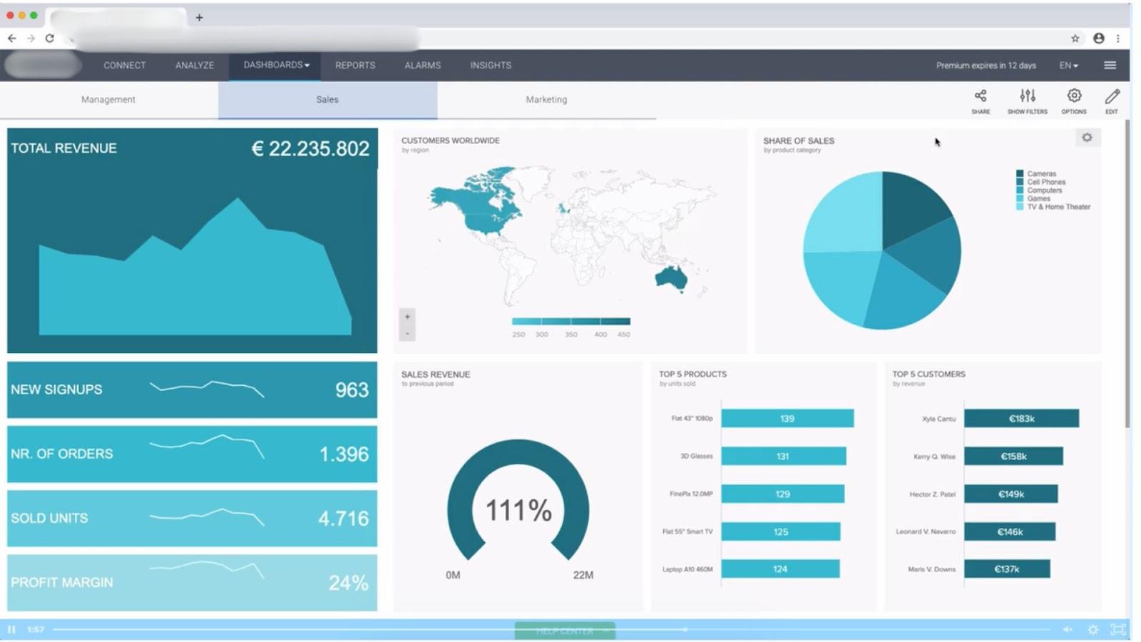
Create data visualization dashboards
Data visualization dashboards are digital instruments that transform static data into interactive, visual representations. They’re widely used for analyzing trends, monitoring key metrics (KPIs), and identifying relationships within an organization’s data. Dashboards consolidate information from various sources into a single, centralized location, boosting decision-making capabilities.

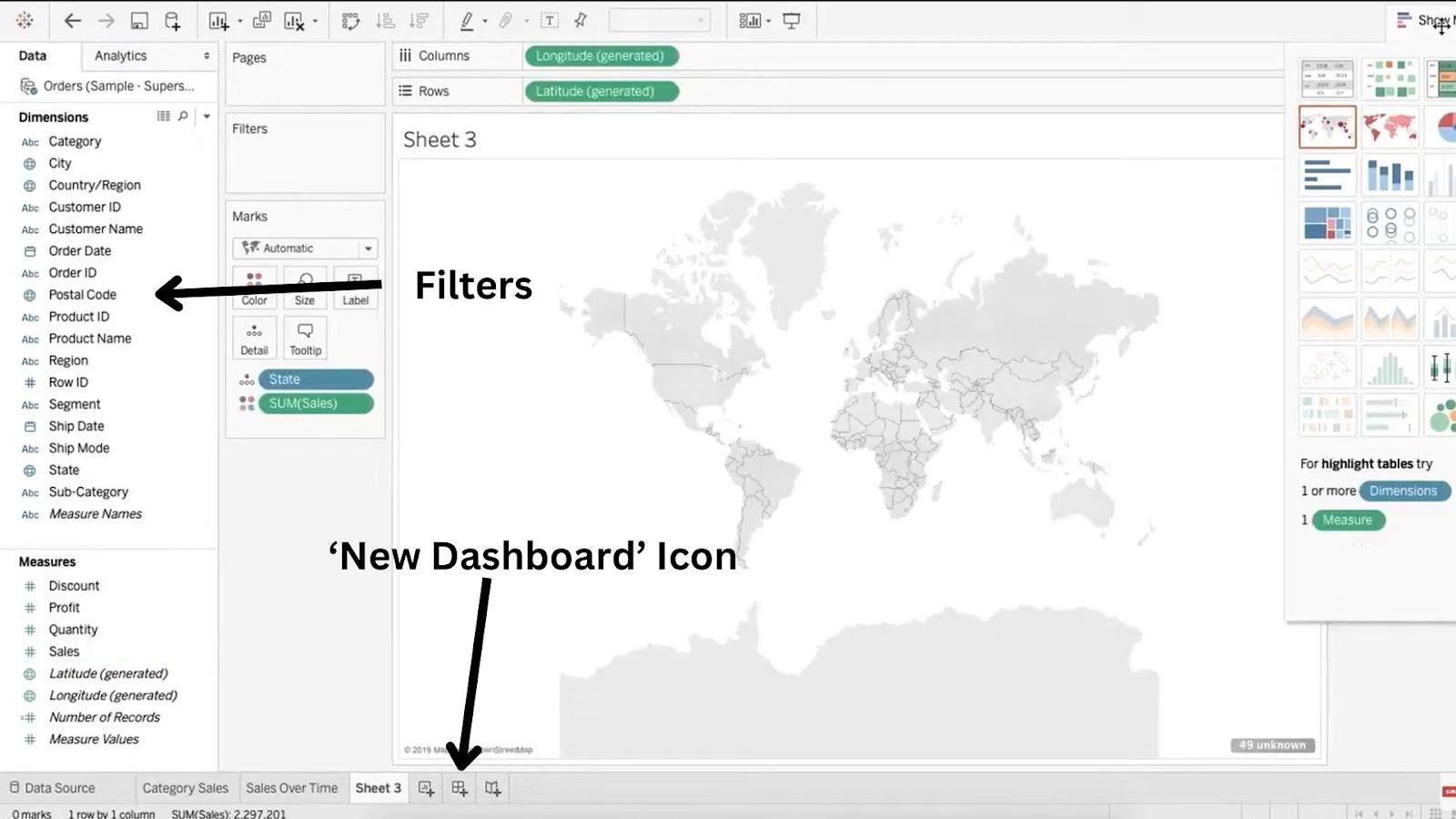
Building Your Dashboard
Most data visualization tools follow a similar process for creating dashboards:
- Locate the Dashboard Creation Feature: This is usually found in the top bar labeled “Dashboards” or with an “Add Dashboard” icon.
- Prepare Your Data: In some cases, you might need to create or open the data sheets you want to include in the dashboard before creating the dashboard itself.
- Customize Visualizations: Apply filters on the left panel to tailor the visuals to your specific needs. Advanced filtering options may also be available.
4. Use interactive elements
Data visualization software offers a range of visual elements to make your dashboards informative and visually appealing. These elements include:
- Heatmaps
- Bar graphs
- Line charts
- Scatter plots
- Pie charts
These elements can be customized with dynamic color schemes, animated transitions, and user-driven exploration features, allowing you to create charts and graphs that respond to user interactions.
Do you want to be the first to test the grid with your data?
5. Leverage visual animations
Visual animations can enhance your data storytelling by providing an immersive user experience and revealing deeper insights within the data. However, this is an optional step.
Generate Interactive and Dynamic Data Visualization
Generating dynamic content from static data is a way to ensure dynamic experiences for users. Dynamic content leverage addons, integrations, recommender systems, self service systems and various other technologies that change and display the content dynamically as per user signals. Dynamic content increases creativity, enhances possibilities, creates several purposes and expands future applications.
Conclusion
The need for immersive and dynamic experiences will keep on increasing the demand and growth scope of best Data Visualization Software. Emerging technologies like AI, deep learning, IoT, machine learning, augmented analytics, etc., will further help these systems improve their processing speed, dynamic data representation and data handling capabilities. Moreover, these advancements in the data visualization software could also help businesses explore, analyze and communicate insights effectively.