Best Charts for Data Distribution
In this article
Let’s dive into the world of data visualization! Today, we’re unraveling the secrets of histograms and box plots – two powerful tools for understanding data distributions.
In the final part of the data visualization project, we’ll discuss the charts that visualize the distribution of univariate and bivariate data.
Histogram
A histogram is the most commonly used plot type for visualizing distribution. It shows the frequency of values in data by grouping it into equal-sized intervals or classes (so-called bins). In such a way, it gives you an idea about the approximate probability distribution of your quantitative data.
Structure
The histogram is composed of vertical or horizontal bars. The height of each bar corresponds to the frequency of values that fall into this bin. By changing the bin width, you also change the number of bins – this will affect the shape of a distribution.
Purpose
To visually represent the distribution of univariate data. Additionally, with the histogram, you can figure out information about the center, spread, and skewness of data, as well as the extreme values, missing or non-typical values (outliers). In addition, you can check whether the data has multiple modes.
One should not confuse histograms with bar or column charts – though these graphs are alike, they play totally different roles in data visualization:
- The histogram illustrates the frequency of continuous values that are grouped into ranges of a data series and represents distribution while the column chart compares values of a categorical data.
- The most noticeable visual difference is in the existence of spaces between bars: there are no spaces between bars in the histogram but they can be in the column/bar chart.
- It’s impossible to rearrange the bars in the histogram. With the column chart, it can be done without the loss of meaning.
- Columns in the column chart have equal widths but columns in the histogram – don’t.
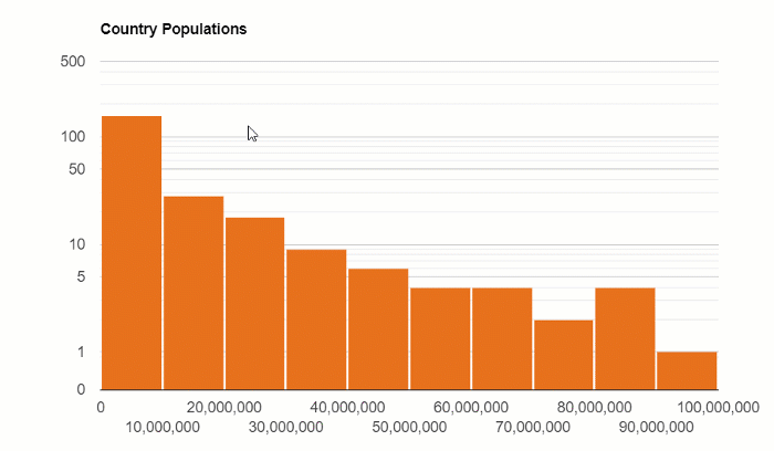
Example
The distribution of the country’s population:
Box and Whisker Plot
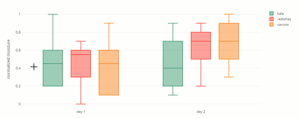
A box and whisker plot is one of the most popular charts when it comes to statistical analysis of data distribution.
Structure
A box contains three important numbers: the first quartile, median, and third quartile. The other two numbers are the minimum and maximum – these are represented by whiskers.
These five numbers divide the dataset into sections. Each section contains around 25% of the data.
Example
Conclusion
Today you’ve learned more about charts that can be used for visualizing data distribution. We encourage you to learn by doing and try creating such charts in your data analysis project.
Analyzing data distribution with pivot tables
A useful starting point for distribution analysis is summarizing your raw data into frequency groups. With WebDataRocks, you can quickly aggregate datasets and export the results to build histograms or box plots in your preferred charting library. Check out the WebDataRocks + Google Charts integration for a practical example.
What’s next?
Eager to learn about other chart types? You are welcome to read the previous blog posts of the data visualization project:
- Power of Data Visualization and Charts
- Best Charts to Show Discrete Data
- Charts for Comparison Over Time
- How to Choose Charts to Show Data Composition
- Best Charts to Show Correlation