Browser compatibility
This page contains information about browsers compatible with WebDataRocks.
Starting from version 1.4, WebDataRocks follows the ES6 standard. As a result, the component will work correctly only in browsers that fully support ES6. You can find these browsers and their versions in the below table:
| Browser | Version |
|---|---|
| Chrome | 51+ |
| Firefox | 54+ |
| Microsoft Edge | 15-18, 79+ |
| Opera | 38+ |
| Safari | 10+ |
| iOS Safari | 10+ |
| Internet Explorer | Not supported* |
*To work with WebDataRocks in Internet Explorer, use WebDataRocks versions earlier than 1.4. The component’s version history is available on npm. See how to install a specific package version from npm.
WebDataRocks allows visualizing the data from the pivot table using 3rd-party charting libraries. Feel free to use the following tutorials:
- Integration with amCharts
- Integration with Highcharts
- Integration with Google Charts
- Integration with FusionCharts
- Integration with any charting library
After reading how to apply predefined themes to the component, the next step is to create a custom theme:
Create a theme using the custom theme builder
Our custom theme builder is a tool to help you create themes for WebDataRocks. Here is how to use it:
Step 1. Download or clone the custom theme builder from GitHub:
git clone https://github.com/WebDataRocks/custom-theme-builder
cd custom-theme-builder
Step 2. Install npm packages with the npm install command.
Step 3. Go to the theme builder’s folder and open webdatarocks.less — a file with WebDataRocks’ styles. Customize them by setting your colors and fonts as variables’ values.
Step 4. Run the theme builder to get CSS files with your theme:
npm start
After the files are generated, you can find them in the custom‑theme‑builder/generated‑theme/ folder.
Step 5. Include your newly created theme to a file where you embed WebDataRocks:
<link rel="stylesheet" type="text/css"
 href="custom-theme-builder\generated-theme\webdatarocks.min.css"
/>
Now open WebDataRocks in the browser — the component is styled with your custom theme.
Create a theme manually
Step 1. Open the webdatarocks/theme/ folder, create a new folder inside, and name it respectively to the name of your theme, e.g., original‑theme/.
Step 2. Copy the contents of any predefined theme folder (e.g., lightblue/) to the original‑theme/ folder.
Step 3. Now you need to replace theme colors with your custom ones. There are two possible approaches:
Approach #1 We recommend using Less – it’s a language extension for CSS. Less allows quick setting the values to several variables which later are compiled into CSS code. WebDataRocks provides Less source code available in the webdatarocks.less file of each theme.
Choose colors that you want to apply and set them inside the webdatarocks.less file from the original‑theme/ folder. Having replaced the necessary colors, you need to compile webdatarocks.less into webdatarocks.css and webdatarocks.min.css. Read how to do it in Less documentation. You need to install an npm package manager previously.
Approach #2 Of course, you can also edit colors right inside webdatarocks.css from your theme’s folder. However, we don’t recommend this approach – it complicates the updating of your own theme when the updates are made in the component’s CSS.
Step 4. Now include the reference to CSS or minified CSS. Then your new theme will be applied to the pivot table.
<link rel="stylesheet" type="text/css" href="theme/original-theme/webdatarocks.css" />
Example
Let’s make a custom turquoise theme. Our main color will be #48D1CC. It’s a medium turquoise color. For light and dark shades we choose #AFEEEE and #00CED1 respectively. We suppose you’ve already created a new folder with theme files. Name it turquoise/. Find the next lines of code in theme/turquoise/webdatarocks.less:
/* ===== theme colors ===== */
@theme-color: #03A9F4;
@theme-color-dark: #039BE5;
@theme-color-superdark: #039BE5;
@theme-color-midlight: #03A9F4; //not used
@theme-color-light: #03A9F4; //not used
@theme-color-superlight: #E1F5FE;
@theme-color-supersuperlight: #F3FAFD;
And change them to:
@theme-color: #48D1CC;
@theme-color-dark: #00CED1;
@theme-color-superdark: #00CED1;
@theme-color-midlight: #03A9F4;
@theme-color-light: #edfffe;
@theme-color-superlight:   #AFEEEE;
@theme-color-supersuperlight: #e0ffff;
Then find where the grid colors are:
/* ===== grid ===== */
and change
@grid-selection-canvas-color: rgba(121, 204, 255, 0.2);
to
@grid-selection-canvas-color: rgba(175, 238, 238, 0.2);
Now compile Less file to CSS and minified CSS.
Update and enjoy the new theme!
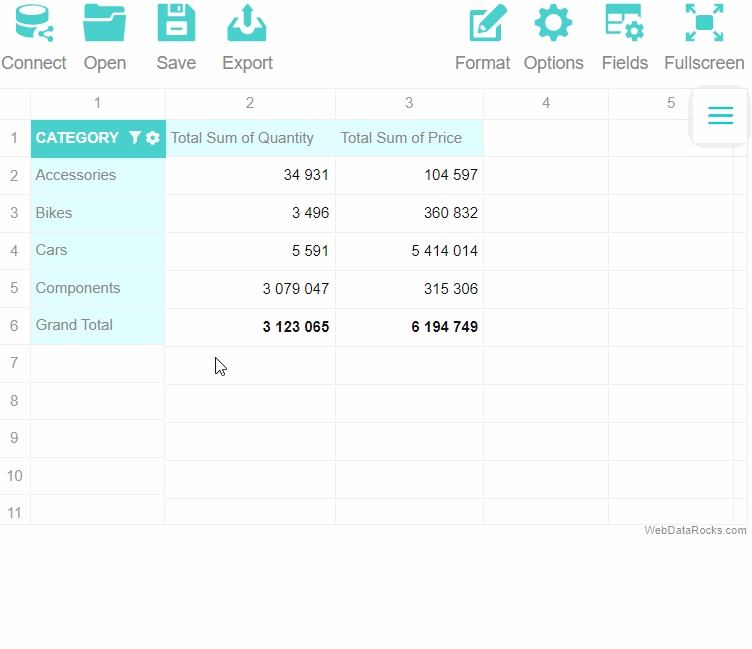
Our reporting tool comes with the Toolbar, which gives you access to the most useful features. This article explains how to use the Toolbar.
Show the Toolbar
By default, the Toolbar is hidden in WebDataRocks.
To show the Toolbar, specify the toolbar prop when creating a WebDataRocks instance:
<Pivot
  toolbar
/>
Hide the Toolbar
If you want to display the component without the Toolbar, you can remove the toolbar prop from your code:
<Pivot />
Available functionality
The Toolbar contains the following tabs:
| Connect | Allows connecting to your JSON or CSV data source. Has a drop-down menu with the following tabs: To local CSV, To local JSON, To remote CSV, and To remote JSON. |
| Open | Allows opening locally or remotely saved reports. Has a drop-down menu with the following tabs: Local report and Remote report. |
| Save | Saves your current report configuration into a local JSON file. |
| Export | Allows printing the current report or exporting it into various formats. Has a drop-down menu with the following tabs: Print, To HTML, To Excel, and To PDF. |
| Format | Allows printing the current report or exporting it into various formats. Has a drop-down menu with the following tabs: Format cells and Conditional formatting. |
| Options | Opens the Layout options pop-up window, where you can show/hide totals or switch between the classic, compact, and flat forms. |
| Fields | Opens the Field List, where you can select which data is shown in rows, columns, measures, and report filters. |
| Fullscreen | Switches WebDataRocks between the fullscreen and windowed mode. You can also exit fullscreen by pressing Esc. |
Specifics of the Toolbar on mobile devices
If you are using WebDataRocks on a mobile device, the mobile version of the Toolbar with a different set of tabs will be shown. For example, instead of the Connect tab, you will see CSV and JSON tabs for loading remote data. Local files cannot be used.
To switch to the desktop Toolbar version on your mobile device, you can request the desktop site in the browser settings.
Adjust the Toolbar to your needs
You can customize the standard view and functionality of the Toolbar (e.g., add new tabs or remove the ones you don’t need). If you are interested in such an option, follow this tutorial: Customize the Toolbar.