Loading the report
If you want to pick up where you left while working with the previous report, you can load it into the pivot table:
Loading the report via the Toolbar
To load a local report
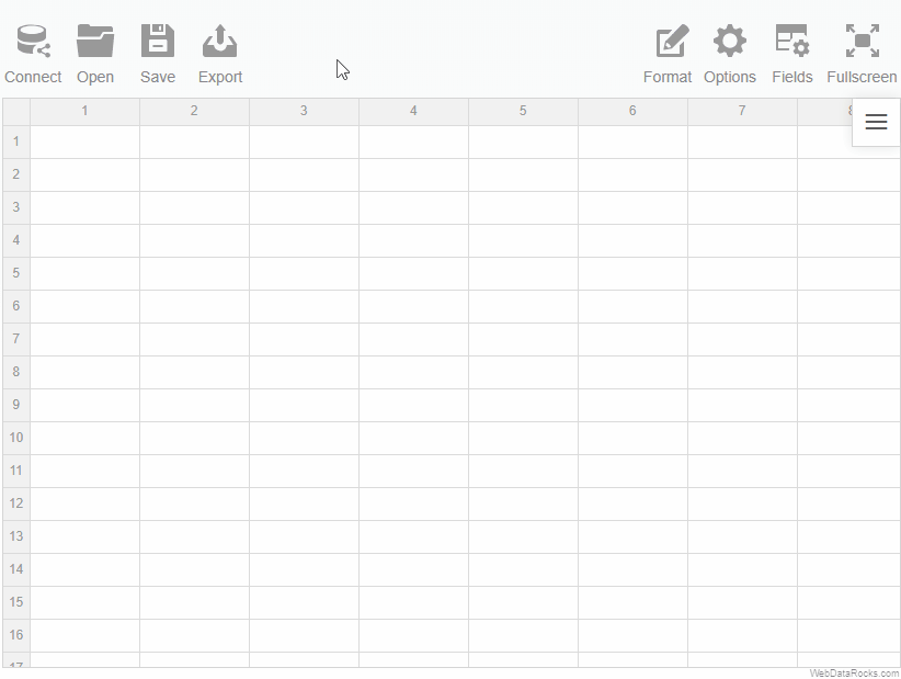
- Go to the Open tab () on the Toolbar.
- Select Local report.
To load a remote report
- Go to the Open tab () on the Toolbar.
- Select Remote report.
- Enter the URL of the remote report.

Loading the report programmatically
Load your report while embedding WebDataRocks by specifying a path to your report file:
<app-wbr-pivot
 [toolbar]="true"
 [report]="https://cdn.webdatarocks.com/reports/report.json">
</app-wbr-pivot>
WebDataRocks Toolbar is designed to make your web reporting experience easier and more convenient. You can customize the Toolbar in the following ways:
- Add new custom tabs.
- Remove the tabs you don’t need.
- Reorder/change the existing tabs.
- Set your custom icons for tabs.
Important Before customizing the Toolbar, ensure it is enabled.
Let’s see how to customize the Toolbar in practice.
All customization can be made using the beforetoolbarcreated event which is triggered before the Toolbar is created. The event’s handler will be responsible for changing the Toolbar.
How to remove tabs
Step 1. Assign a handler (e.g., customizeToolbar) to the beforetoolbarcreated event. The handler function has the toolbar as a parameter that contains information about the Toolbar.
Step 2. Inside the handler (e.g., customizeToolbar), retrieve all the tabs using the toolbar.getTabs() method. It returns an array of objects that describe tabs’ properties.
Step 3. To remove a tab, delete a corresponding object from the array of tabs.
Your code should look similar to the following example:
<script setup>
import { Pivot } from "@webdatarocks/vue-webdatarocks";
import "@webdatarocks/webdatarocks/webdatarocks.css";

const customizeToolbar = (toolbar) => {
  // Get all tabs from the Toolbar
  let tabs = toolbar.getTabs();
  if (tabs.length > 0) {
    // Delete the Connect tab
    tabs = tabs.filter(tab => tab.id !== "wdr-tab-connect");
  }
  toolbar.getTabs = () => tabs;
};
</script>

<template>
 <div>
  <Pivot
    toolbar
    :beforetoolbarcreated="customizeToolbar"
  />
 </div>
</template>
How to add new tabs
Step 1. Assign a handler (e.g., customizeToolbar) to the beforetoolbarcreated event. The handler function has the toolbar as a parameter that contains information about the Toolbar.
Step 2. Inside the handler (e.g., customizeToolbar), retrieve all the tabs using the toolbar.getTabs() method. It returns an array of objects that describe tabs’ properties.
Step 3. Add a new tab to the array of tabs.
Your code should look similar to the following example:
<script setup>
import { Pivot } from "@webdatarocks/vue-webdatarocks";
import "@webdatarocks/webdatarocks/webdatarocks.css";

const customizeToolbar = (toolbar) => {
  // Get all tabs from the Toolbar
  let tabs = toolbar.getTabs();
  toolbar.getTabs = () => {
    // Add a new tab
    tabs.unshift({
      id: "fm-tab-newtab",
      title: "New Tab",
      handler: yourCustomFunction,
      icon: toolbar.icons.open,
    });
    return tabs;
  };
};

const yourCustomFunction = () => {
  // Your functionality
}
</script>

<template>
 <div>
  <Pivot
    toolbar
    :beforetoolbarcreated="customizeToolbar"
  />
  </div>
</template>
How to add a tab with a drop-down
Step 1. Add a new tab.
Step 2. Define the menu property of this tab. This property should contain an array of drop-down menu items, each with a Tab Object structure.
In the example below, we add a new tab with a drop-down menu to change themes:
<script setup>
import { Pivot } from "@webdatarocks/vue-webdatarocks";
import "@webdatarocks/webdatarocks/webdatarocks.css";

// There will be one drop-down tab in the Toolbar
const customizeToolbar = (toolbar) => {
  let tabs = [];
  toolbar.getTabs = () => {
    tabs.unshift({
      id: "theme-dropdown",
      title: "Theme",
      menu: [
        {
          id: "default-theme",
          title: "Default",
          handler: () => setTheme("/")
        },
        {
          id: "dark-theme",
          title: "Dark",
          handler: () => setTheme("/theme/dark/"),
        },
        {
          id: "lightblue-theme",
          title: "Light Blue",
          handler: () => setTheme("/theme/lightblue/"),
        },
      ],
      icon: toolbar.icons.options,
    });
    return tabs;
  };
};

const setTheme = (theme) => {
  // ...
};
</script>

<template>
  <div>
    <Pivot
      toolbar
      :beforetoolbarcreated="customizeToolbar" />
  </div>
</template>
Even more advanced customization
In this guide, we mentioned how to remove the Toolbar tabs and how to add a new one. For further customization, you can reorder the tabs, set the custom icons for the tabs, or implement new functionality. We recommend investigating the existing code to understand how the Toolbar works:
- Open the source code of the Toolbar –
webdatarocks.toolbar.jsfile. - Find a prototype of the
toolbar.getTabs()method. - Investigate how this method works.
You can also change the appearance of the Toolbar by changing the component theme.
See also
WebDataRocks Toolbar is designed to make your web reporting experience easier and more convenient. You can customize the Toolbar in the following ways:
- Add new custom tabs.
- Remove the tabs you don’t need.
- Reorder/change the existing tabs.
- Set your custom icons for tabs.
Important Before customizing the Toolbar, ensure it is enabled.
Let’s see how to customize the Toolbar in practice.
All customization can be made using the beforetoolbarcreated event which is triggered before the Toolbar is created. The event’s handler will be responsible for changing the Toolbar.
How to remove tabs
Step 1. Assign a handler (e.g., customizeToolbar) to the beforetoolbarcreated event. The handler function has the toolbar as a parameter that contains information about the Toolbar.
Step 2. Inside the handler (e.g., customizeToolbar), retrieve all the tabs using the toolbar.getTabs() method. It returns an array of objects that describe tabs’ properties.
Step 3. To remove a tab, delete a corresponding object from the array of tabs.
Your code should look similar to the following example:
import { Component } from "@angular/core";
import { WebdatarocksPivotModule } from "@webdatarocks/ngx-webdatarocks";

@Component({
  selector: "app-root",
  standalone: true,
  imports: [WebdatarocksPivotModule],
  templateUrl: "./app.component.html",
  styleUrls: ["./app.component.css"]
})
export class AppComponent {
  customizeToolbar(toolbar: any) {
    // Get all tabs from the Toolbar
    let tabs = toolbar.getTabs();
    toolbar.getTabs = function() {
      // Delete the Connect tab
      return tabs.filter((tab: any) => tab.id !== 'wdr-tab-connect');
    }
  }
}
<app-wbr-pivot
 [toolbar]="true"
 (beforetoolbarcreated)="customizeToolbar($event)">
</app-wbr-pivot>
How to add new tabs
Step 1. Assign a handler (e.g., customizeToolbar) to the beforetoolbarcreated event. The handler function has the toolbar as a parameter that contains information about the Toolbar.
Step 2. Inside the handler (e.g., customizeToolbar), retrieve all the tabs using the toolbar.getTabs() method. It returns an array of objects that describe tabs’ properties.
Step 3. Add a new tab to the array of tabs.
Your code should look similar to the following example:
import { Component } from "@angular/core";
import { WebdatarocksPivotModule } from "@webdatarocks/ngx-webdatarocks";
@Component({
selector: "app-root",
imports: [WebdatarocksPivotModule],
templateUrl: "./app.component.html",
styleUrls: ["./app.component.css"]
})
export class AppComponent {
customizeToolbar(toolbar: any) {
// Get all tabs from the Toolbar
let tabs = toolbar.getTabs();
toolbar.getTabs = () => {
// Add a new tab
tabs.unshift({
id: "fm-tab-newtab",
title: "New Tab",
handler: () => this.yourCustomFunction(),
icon: toolbar.icons.open,
});
return tabs;
};
}
yourCustomFunction() {
// Your functionality
}
}
<app-wbr-pivot
 [toolbar]="true"
 (beforetoolbarcreated)="customizeToolbar($event)">
</app-wbr-pivot>
How to add a tab with a drop-down
Step 1. Add a new tab.
Step 2. Define the menu property of this tab. This property should contain an array of drop-down menu items, each with a Tab Object structure.
In the example below, we add a new tab with a drop-down menu to change themes:
import { Component } from "@angular/core";
import { WebdatarocksPivotModule } from "@webdatarocks/ngx-webdatarocks";

@Component({
  selector: "app-root",
  imports: [WebdatarocksPivotModule],
  templateUrl: "./app.component.html",
  styleUrl: "./app.component.css",
})
export class AppComponent {
  // There will be one drop-down tab in the Toolbar
  customizeToolbar(toolbar: any) {
    let tabs = [];
    toolbar.getTabs = () => {
      tabs.unshift({
        id: "custom-select-view",
        title: "Theme",
        menu: [
          {
            id: "select-tab-one",
            title: "Default",
            handler: () => this.setTheme("/"),
          },
          {
            id: "select-tab-two",
            title: "Dark",
            handler: () => this.setTheme("/theme/dark/"),
          },
          {
            id: "select-tab-three",
            title: "Light Blue",
            handler: () => this.setTheme("/theme/lightblue/"),
          },
        ],
        icon: toolbar.icons.options,
      });
      return tabs;
    };
  }

  setTheme(theme: any) {
    // ...
  }
}
<app-wbr-pivot
  [toolbar]="true"
  (beforetoolbarcreated)="customizeToolbar($event)">
</app-wbr-pivot>
Even more advanced customization
In this guide, we mentioned how to remove the Toolbar tabs and how to add a new one. For further customization, you can reorder the tabs, set the custom icons for the tabs, or implement new functionality. We recommend investigating the existing code to understand how the Toolbar works:
- Open the source code of the Toolbar –
webdatarocks.toolbar.jsfile. - Find a prototype of the
toolbar.getTabs()method. - Investigate how this method works.
You can also change the appearance of the Toolbar by changing the component theme.
See also
WebDataRocks Toolbar is designed to make your web reporting experience easier and more convenient. You can customize the Toolbar in the following ways:
- Add new custom tabs.
- Remove the tabs you don’t need.
- Reorder/change the existing tabs.
- Set your custom icons for tabs.
Important Before customizing the Toolbar, ensure it is enabled.
Let’s see how to customize the Toolbar in practice.
All customization can be made using the beforetoolbarcreated event which is triggered before the Toolbar is created. The event’s handler will be responsible for changing the Toolbar.
How to remove tabs
Step 1. Assign a handler (e.g., customizeToolbar) to the beforetoolbarcreated event. The handler function has the toolbar as a parameter that contains information about the Toolbar.
Step 2. Inside the handler (e.g., customizeToolbar), retrieve all the tabs using the toolbar.getTabs() method. It returns an array of objects that describe tabs’ properties.
Step 3. To remove a tab, delete a corresponding object from the array of tabs.
Your code should look similar to the following example:
import * as WebDataRocksReact from "@webdatarocks/react-webdatarocks";

function App() {
  function customizeToolbar(toolbar) {
    // Get all tabs from the Toolbar
    let tabs = toolbar.getTabs();
    toolbar.getTabs = function() {
      // Delete the Connect tab
      tabs = tabs.filter(tab => tab.id !== "wdr-tab-connect");
      return tabs;
    }
  }

  return (
    <div>
      <WebDataRocksReact.Pivot
        toolbar={true}
        beforetoolbarcreated={customizeToolbar}
      />
    </div>
  );
}

export default App
How to add new tabs
Step 1. Assign a handler (e.g., customizeToolbar) to the beforetoolbarcreated event. The handler function has the toolbar as a parameter that contains information about the Toolbar.
Step 2. Inside the handler (e.g., customizeToolbar), retrieve all the tabs using the toolbar.getTabs() method. It returns an array of objects that describe tabs’ properties.
Step 3. Add a new tab to the array of tabs.
Your code should look similar to the following example:
import * as WebDataRocksReact from "@webdatarocks/react-webdatarocks";

function App() {
  const customizeToolbar = (toolbar) => {
    // Get all tabs from the Toolbar
    let tabs = toolbar.getTabs();
    toolbar.getTabs = () => {
      // Add a new tab
      tabs.unshift({
        id: "war-tab-new tab",
        title: "New Tab",
        handler: yourCustomFunction,
        icon: toolbar.icons.open,
      });
      return tabs;
    };
  };

  const yourCustomFunction = () => {
    // Your functionality
  }

  return (
    <div>
      <WebDataRocksReact.Pivot
        toolbar={true}
        beforetoolbarcreated={customizeToolbar}
      />
    </div>
  );
}

export default App
How to add a tab with a drop-down
Step 1. Add a new tab.
Step 2. Define the menu property of this tab. This property should contain an array of drop-down menu items, each with a Tab Object structure.
In the example below, we add a new tab with a drop-down menu to change themes:
import * as WebDataRocksReact from "@webdatarocks/react-webdatarocks";

function App() {
  // There will be one drop-down tab in the Toolbar
  const customizeToolbar = (toolbar) => {
    let tabs = [];
    toolbar.getTabs = function () {
      tabs.unshift({
        id: "custom-select-view",
        title: "Theme",
        menu: [
          {
            id: "select-tab-one",
            title: "Default",
            handler: () => setTheme("/"),
          },
          {
            id: "select-tab-two",
            title: "Dark",
            handler: () => setTheme("/theme/dark/"),
          },
          {
            id: "select-tab-three",
            title: "Light Blue",
            handler: () => setTheme("/theme/lightblue/"),
          },
        ],
        icon: toolbar.icons.options,
      });
      return tabs;
    };
  };

  const setTheme = (theme) => {
    // ...
  };

  return (
    <div>
      <WebDataRocksReact.Pivot
        toolbar={true}
        beforetoolbarcreated={customizeToolbar}
      />
    </div>
  );
}
export default App;
Even more advanced customization
In this guide, we mentioned how to remove the Toolbar tabs and how to add a new one. For further customization, you can reorder the tabs, set the custom icons for the tabs, or implement new functionality. We recommend investigating the existing code to understand how the Toolbar works:
- Open the source code of the Toolbar –
webdatarocks.toolbar.jsfile. - Find a prototype of the
toolbar.getTabs()method. - Investigate how this method works.
You can also change the appearance of the Toolbar by changing the component theme.
See also
We use only open-source components in WebDataRocks. Here is a list of all libraries and links to their respective licenses:
- html2canvas v1.0.0-rc.1 – MIT License
- FileSaver.js v1.3.1 (modified by Flexmonster) – MIT License
- jsPDF v1.5.3 – MIT License
- JSZip v3.1.5 – MIT License
See also
We use only open-source components in WebDataRocks. Here is a list of all libraries and links to their respective licenses:
- html2canvas v1.0.0-rc.1 – MIT License
- FileSaver.js v1.3.1 (modified by Flexmonster) – MIT License
- jsPDF v1.5.3 – MIT License
- JSZip v3.1.5 – MIT License
See also
We use only open-source components in WebDataRocks. Here is a list of all libraries and links to their respective licenses:
- html2canvas v1.0.0-rc.1 – MIT License
- FileSaver.js v1.3.1 (modified by Flexmonster) – MIT License
- jsPDF v1.5.3 – MIT License
- JSZip v3.1.5 – MIT License
See also
| Feature | Availability |
|---|---|
| – Grid | |
| Virtual grid that ensures smooth rendering and scrolling the rows | |
| Sort the members of the rows and columns | |
| Sort by values | |
| Drag and drop the hierarchies on the grid | |
| Drill through the cells | |
| Drill the hierarchies up and down | |
| Expand and collapse the hierarchies on the grid | |
| Resize the rows and columns on the grid | |
| Grand totals and subtotals | |
| Compact pivot table | |
| Classic pivot table | |
| Flat table | |
| Add multiple fields to the rows | |
| Add multiple fields to the columns | |
| Add multiple fields to the measures | |
| Create multilevel hierarchies | |
Select the string field as a measure (with count or distinctcount aggregation applied) |
|
| Select cells | |
| Copy selected cells | |
| Keyboard shortcuts to navigate on the grid | * |
| Highlight the rows and columns via the conditional formatting | |
| – Filter | |
| Filter by members using the checkbox | |
| Filtering by members using the search input box | |
| Filtering by value (Top X records) | |
| Filtering by value (Bottom X records) | |
| Report filters | |
| – Fields | |
| Adding and editing calculated values via UI | |
| Dragging fields in the Field List | |
| Displaying hierarchy levels in the Field List | |
| The Expand All option in the Field List | |
| The Field List in the drill-through pop-up window | |
| – Aggregation functions | |
| “sum” | |
| “count” | |
| “distinctcount” | |
| “average” | |
| “median” | |
| “product” | |
| “min” | |
| “max” | |
| “percent” | |
| “percentofcolumn” | |
| “percentofrow” | |
| “index” | |
| “difference” | |
| “%difference” | |
| “stdevp” (Population Standard Deviation) | |
| “stdevs” (Sample Standard Deviation) | |
| “runningtotals” | |
| – The Toolbar | |
| Save a report | |
| Open a report | |
| Conditional formatting | |
| Number formatting | |
| Connect to a CSV data source | |
| Connect to a JSON data source | |
| Full-screen mode | |
| – Export | |
| Print reports | |
| Export reports to HTML | |
| Export reports to MS Excel | |
| Export reports to PDF | |
| Add custom headers and footers (PDF, HTML) | |
| Add custom sheet names (Excel) | |
| – Options | |
| Language localization | |
| Apply a pre-defined report theme | |
| Date and time patterns | |
| – Integration with charting libraries | |
| amCharts | |
| Highcharts | |
| Google Charts | |
| FusionCharts | |
| Any charting library | |
| – Integration with frameworks and web technologies | |
| React | |
| Angular | |
| Vue | |
| Django | |
| Jupyter | |
| Flutter | |
| jQuery | |
| AngularJS |
* WebDataRocks supports basic keyboard shortcuts for navigation:
UpArrow,DownArrow,LeftArrow, andRightArrowto move the focus when navigating between cells.Shift + UpArrow,Shift + DownArrow,Shift + LeftArrow, andShift + RightArrowto extend cell selection.Ctrl + A(Command + A|Control + Aon macOS) to select all cells.Ctrl + C(Command + Con macOS) to copy selected cells.Spaceto expand and collapse a hierarchy.
Options available for developers:
| Feature | Availability |
|---|---|
| – General options | |
| Show or hide the Toolbar | |
| Show or hide the Field List | |
| Open or close the Field List via UI or API | |
| Show or hide the aggregation selection control in the Field List | |
| Show or hide the “Add calculated value” control in the Field List | |
| Enable or disable the drill-through feature | |
| Configure a slice in the drill-through pop-up window | |
| Show or hide the Field List in the drill-through pop-up window | |
| Show or hide the sorting controls | |
| Enable a default slice for the component | |
| Set a default sorting type for the hierarchy members: “asc”, “desc” or “unsorted” | |
| Change the aggregation labels via localization | |
| Define data types in CSV | |
| Define data types in JSON | |
| Different field separators for CSV | |
| Set global options for all reports | |
| Customize the Toolbar | |
| Define custom report themes | |
| Customize the context menu | |
| Expand or collapse all hierarchy members via API | |
| – Grid options | |
| Set the grid form. Possible values are: “compact”, “classic”, “flat” | |
| Set the grid title | |
| Show or hide the filtering controls | |
| Show or hide spreadsheet headers | |
| Show or hide subtotals | |
| Show or hide grand totals in the rows and/or columns | |
| Show or hide the hierarchy captions | |
| Show or hide report filters on the grid |
| Feature | Availability |
|---|---|
| – Grid | |
| Virtual grid that ensures smooth rendering and scrolling the rows | |
| Sort the members of the rows and columns | |
| Sort by values | |
| Drag and drop the hierarchies on the grid | |
| Drill through the cells | |
| Drill the hierarchies up and down | |
| Expand and collapse the hierarchies on the grid | |
| Resize the rows and columns on the grid | |
| Grand totals and subtotals | |
| Compact pivot table | |
| Classic pivot table | |
| Flat table | |
| Add multiple fields to the rows | |
| Add multiple fields to the columns | |
| Add multiple fields to the measures | |
| Create multilevel hierarchies | |
Select the string field as a measure (with count or distinctcount aggregation applied) |
|
| Select cells | |
| Copy selected cells | |
| Keyboard shortcuts to navigate on the grid | * |
| Highlight the rows and columns via the conditional formatting | |
| – Filter | |
| Filter by members using the checkbox | |
| Filtering by members using the search input box | |
| Filtering by value (Top X records) | |
| Filtering by value (Bottom X records) | |
| Report filters | |
| – Fields | |
| Adding and editing calculated values via UI | |
| Dragging fields in the Field List | |
| Displaying hierarchy levels in the Field List | |
| The Expand All option in the Field List | |
| The Field List in the drill-through pop-up window | |
| – Aggregation functions | |
| “sum” | |
| “count” | |
| “distinctcount” | |
| “average” | |
| “median” | |
| “product” | |
| “min” | |
| “max” | |
| “percent” | |
| “percentofcolumn” | |
| “percentofrow” | |
| “index” | |
| “difference” | |
| “%difference” | |
| “stdevp” (Population Standard Deviation) | |
| “stdevs” (Sample Standard Deviation) | |
| “runningtotals” | |
| – The Toolbar | |
| Save a report | |
| Open a report | |
| Conditional formatting | |
| Number formatting | |
| Connect to a CSV data source | |
| Connect to a JSON data source | |
| Full-screen mode | |
| – Export | |
| Print reports | |
| Export reports to HTML | |
| Export reports to MS Excel | |
| Export reports to PDF | |
| Add custom headers and footers (PDF, HTML) | |
| Add custom sheet names (Excel) | |
| – Options | |
| Language localization | |
| Apply a pre-defined report theme | |
| Date and time patterns | |
| – Integration with charting libraries | |
| amCharts | |
| Highcharts | |
| Google Charts | |
| FusionCharts | |
| Any charting library | |
| – Integration with frameworks and web technologies | |
| React | |
| Angular | |
| Vue | |
| Django | |
| Jupyter | |
| Flutter | |
| jQuery | |
| AngularJS |
* WebDataRocks supports basic keyboard shortcuts for navigation:
UpArrow,DownArrow,LeftArrow, andRightArrowto move the focus when navigating between cells.Shift + UpArrow,Shift + DownArrow,Shift + LeftArrow, andShift + RightArrowto extend cell selection.Ctrl + A(Command + A|Control + Aon macOS) to select all cells.Ctrl + C(Command + Con macOS) to copy selected cells.Spaceto expand and collapse a hierarchy.
Options available for developers:
| Feature | Availability |
|---|---|
| – General options | |
| Show or hide the Toolbar | |
| Show or hide the Field List | |
| Open or close the Field List via UI or API | |
| Show or hide the aggregation selection control in the Field List | |
| Show or hide the “Add calculated value” control in the Field List | |
| Enable or disable the drill-through feature | |
| Configure a slice in the drill-through pop-up window | |
| Show or hide the Field List in the drill-through pop-up window | |
| Show or hide the sorting controls | |
| Enable a default slice for the component | |
| Set a default sorting type for the hierarchy members: “asc”, “desc” or “unsorted” | |
| Change the aggregation labels via localization | |
| Define data types in CSV | |
| Define data types in JSON | |
| Different field separators for CSV | |
| Set global options for all reports | |
| Customize the Toolbar | |
| Define custom report themes | |
| Customize the context menu | |
| Expand or collapse all hierarchy members via API | |
| – Grid options | |
| Set the grid form. Possible values are: “compact”, “classic”, “flat” | |
| Set the grid title | |
| Show or hide the filtering controls | |
| Show or hide spreadsheet headers | |
| Show or hide subtotals | |
| Show or hide grand totals in the rows and/or columns | |
| Show or hide the hierarchy captions | |
| Show or hide report filters on the grid |