Grid forms
In WebDataRocks Pivot Table, data can be displayed in aggregated views or as a simple table. You can switch between three standard layouts to display the report data differently:
- Compact pivot table – neat and concise data presentation.
- Classic pivot table – an Excel-like layout.
- Flat table – a simple grid with non-aggregated data.
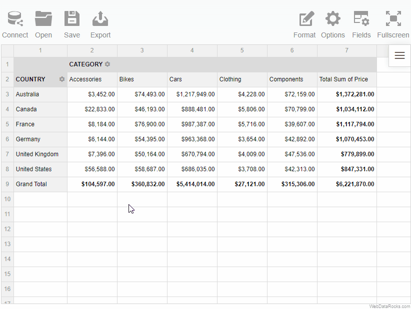
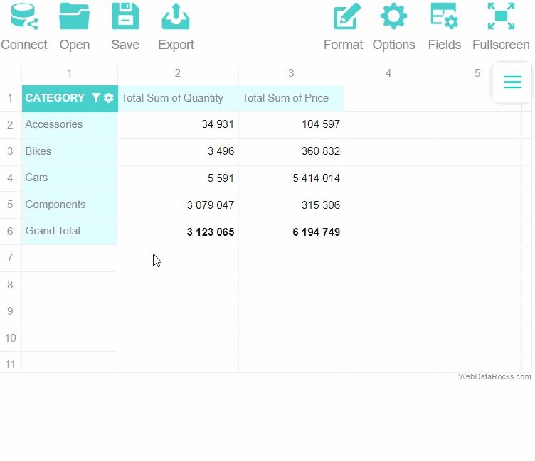
Compact form
The compact pivot table form is enabled by default. This layout helps keep your data in a neat and concise style.
Features:
- Compact form enhances the readability of the report.
- If the rows contain more than one field, the members of the inner field can be expanded and collapsed by clicking on the outer field’s member name.
- If the members of the field in the rows are expanded, they are placed one under the other, without being transferred to a separate column.
- If the members of the field in the columns are expanded, they are placed in a separate row.
- Subtotals are shown at the end of each row in a separate column.
- Grand totals are placed at the bottom in a separate row.
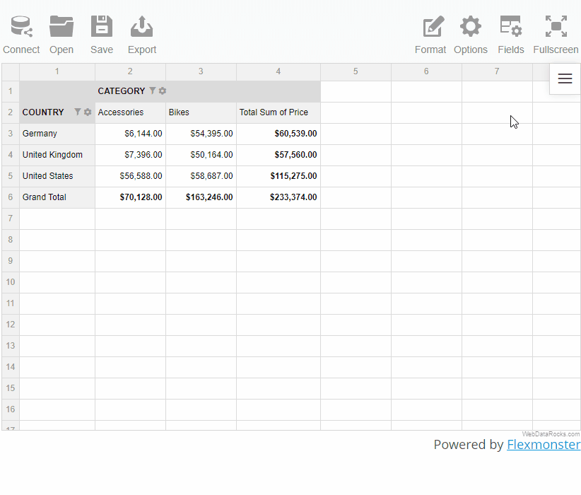
Classic form
The classic pivot table form suits perfectly those who would like to have an Excel-like user experience.
Features:
- If the rows contain more than one field, the members of the inner field can be expanded and collapsed by clicking on the outer field’s member name.
- If the members of the field in the rows are expanded, they are placed in a separate column. It is the main feature that distinguishes the classic layout from the compact one.
- If the members of the field in the columns are expanded, they are placed in a separate row.
- Subtotals are shown in a separate row after each hierarchy in the rows.
- Grand totals are placed at the bottom in a separate row.
Flat form
The flat table is a raw data view, which reflects the data’s original structure. It’s the simplest form among the others.
Features:
- The data is shown without aggregation.
- Each field is placed in a separate column.
- Grand totals are placed in the first row.
To change the grid form
Via UI
- Go to the Options tab () on the Toolbar.
- Select the form of your choice.
- Apply the changes.
Programmatically
Set a grid layout through the grid.type property of the Options Object:
report: {
  options: {
    grid: {
      type: "classic"
    }
  }
}
It is also possible to set the grid.type option for all reports.
To see the most relevant information first, apply sorting to the field members or values on the grid.
Sorting in the pivot table
In the pivot table, you can sort by values and by members.
Sorting by values
To sort by values in the pivot table:
- Hover over a member name or a total cell and click the arrow icon that appears to sort the records descending.
- Click again to sort ascending.
To remove sorting by values:
- Right-click the member name to open the context menu.
- Select the Clear sorting option.
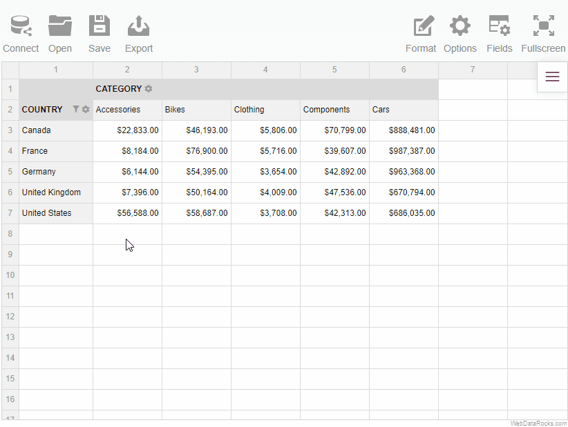
Sorting by members
To sort members on the grid:
- Open the field config pop-up window by clicking the gear icon () near the field caption.
- Choose the ascending or descending order using sorting controls. By default, members are sorted in ascending (AZ) order.
- Click the APPLY button to close the field config pop-up window and see the sorted members on the grid.
To remove sorting by members:
- Open the field config pop-up window by clicking the gear icon () near the field caption.
- Deselect an active sorting control to display the members unsorted (i.e., in the same order as they come inside the data source).
- Сlick the APPLY button to close the field config pop-up window and see the result.

Sorting in the flat view
In the flat view, you can sort by values:
- Hover over a field name and click the arrow icon that appears to sort the records descending.
- Click again to sort ascending.
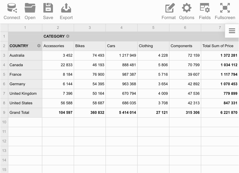
Use the filtering feature to focus on the important subsets of your data and display only those rows and columns that satisfy certain conditions.
WebDataRocks supports three types of filters:
- Filtering by member names. Use it to show the values of the specific members.
- Filtering by values, also known as the Top/Bottom X filter. Use it to keep records within a specified range (with values higher or lower than a specified number).
- A report filter. Use it to apply filtering to the entire report.
To apply a filter by member names
- Open the field config pop-up window by clicking the gear icon () near the field caption.
- Select the members to be displayed or deselect them to be hidden from the grid.
- To close the field config pop-up window and see the changes, click the APPLY button.
If you have a large list of hierarchy members, use the search option:
- Start typing the member’s caption in the search box.
- Select the check box of the member you are searching for.
- Click the APPLY button to see the filtered data.
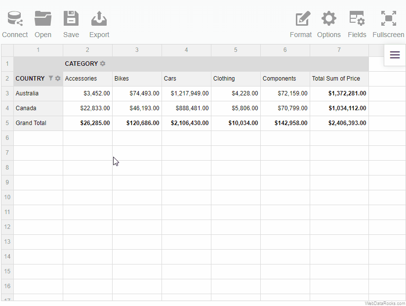
To apply a filter by value
- Open the field config pop-up window by clicking the gear icon () near the field caption.
- Select the Top 10 button.
- Select the Top or Bottom button to show the results with the lowest or the highest values, respectively.
- Enter the number of top or bottom results to show.
- Select the measure on which the filtering is based.
- Click the APPLY button to close the field config pop-up window and see the filtered data.
To apply a report filter
- Go to the Fields () tab.
- Drag the fields to the Report Filters area.
- Click APPLY to add report filters and close the Field List.
The separate tabs of the report filters appear above the grid. Click on them and choose the members based on which the data on the grid will be filtered. Then, click the APPLY button to apply the filters to the report.
The main idea of the calculated values lies in giving a more complete picture of your data by measuring your data in a custom way.
To create a calculated value, define an expression on which the values are calculated and apply it to your data. It serves as a new aggregation function that you can change or delete at any moment.
Moreover, multiple calculated values can be created within one report.
To add a calculated value
- Go to the Fields tab () on the Toolbar.
- Click the Add calculated value button.
- Type in the name of a formula in the input field.
- Choose the fields to include in the formula, the aggregation functions to apply to these fields, and add the necessary operators.
- Apply the changes.
NOTE: the Count and Unique Count functions can be applied only to the string fields.
Example
Let’s define a new Revenue measure. It is composed of Price and Quantity fields (Price * Quantity).
- Type in a name of a new calculated value.
- Drag the fields to the Formula area and add a multiplication operator to compose a product of two values.
- Apply the changes. Now the new calculated value is placed at the bottom of the list. Drop it to the Values area to add it to the report.
All calculated values are saved in the measures of the report’s slice.
To edit a calculated value
- Go to the Fields tab () on the Toolbar.
- Find the calculated value in the All fields box.
- Click the Sigma editing button (
 ) next to the value’s name.
 - Edit the calculated value.
- Apply the changes.
To remove a calculated value
- Go to the Fields tab () on the Toolbar.
- Find the calculated value in the All fields box.
- Click the Sigma editing button () next to the value’s name.
- Click the Remove button (✕).
- Confirm the action.
Individual values
Note that there is the Calculate individual values checkbox. If it is checked, the formula is calculated based on the raw values. Otherwise, it is calculated using the aggregated values.
Find out the difference between the calculated and calculated individual values in the demo.
Aggregation functions group together values from multiple fields to form a single compound value. To choose an aggregation function for a value, use the Field List.
WebDataRocks Pivot Table offers 17 aggregation functions, which you can apply to the measures in your report:
| Name | Value | Description |
|---|---|---|
| Sum | "sum" | Adds all values in the row/column |
| Count | "count" | Counts the number of the rows/columns that contain values |
| Distinct Count | "distinctcount" | Counts the number of the rows/columns that contain unique values |
| Average | "average" | Returns the average (arithmetic mean) of the values in the row/column |
| Median | "median" | Returns the median of the values in the row/column |
| Product | "product" | Multiplies the values in the row/column |
| Min | "min" | Returns the smallest number in the row/column |
| Max | "max" | Returns the largest value in the row/column |
| % of Grand Total | "percent" | Calculates the values distribution across grand totals in the report |
| % of Column | "percentofcolumn" | Calculates the percent distribution across the columns |
| % of Row | "percentofrow" | Calculates the percent distribution across the rows |
| Index | "index" | Calculates the aggregated weighted average to reveal the impact of each value within the context of a dataset |
| Difference | "difference" | Calculates the difference between two values in the row/column |
| % Difference | "%difference" | Calculates the difference between two values in the row/column expressed in percentages |
| Population Standard Deviation | "stdevp" | Calculates population standard deviation of the values in the row/column |
| Sample Standard Deviation | "stdevs" | Calculates sample standard deviation of the values in the row/column |
| Running Totals | "runningtotals" | Calculates running totals (cumulative sum) |
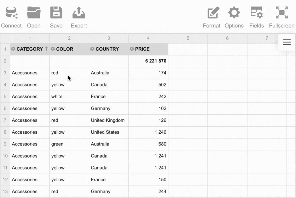
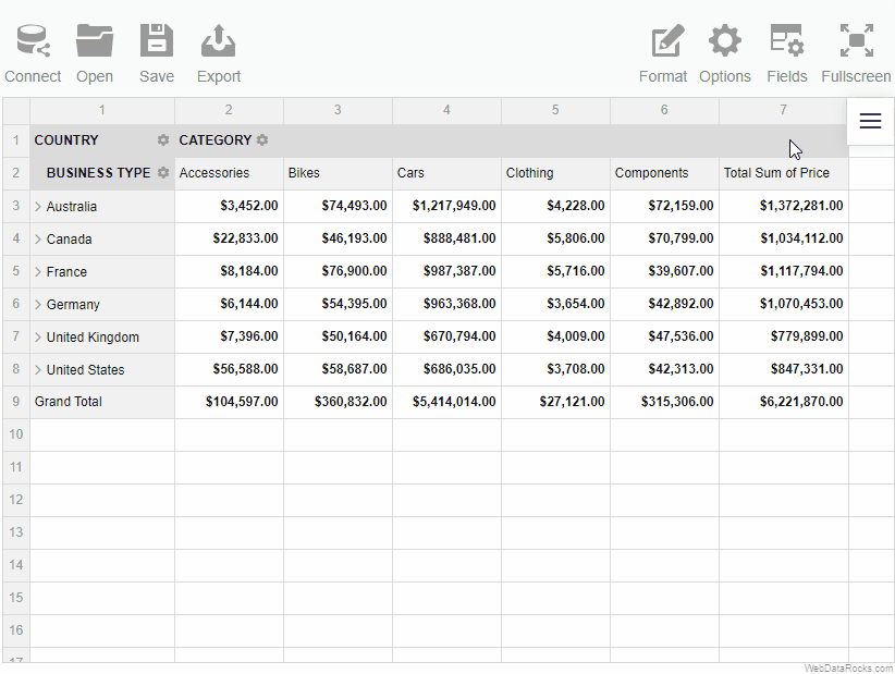
This article explains how to define which data is shown on the grid using the Field List. Each field can be selected to rows, columns, values, or report filters.
To select the fields in the Field List
- Go to the Fields tab () on the Toolbar.
- Pay attention to the All Fields section on the left. It contains all fields from your data source.
- Drag and drop the fields to the Rows, Columns, Values, and Report Filters areas.
- To change the aggregation for a field in the Values box, press the Edit button () next to its name.
- Use the Add calculated value button to compose new values based on your data source.
- Click the APPLY button to close the Field List and see the changes on the grid.
Try it yourself:
To show certain fields when loading data
- Configure your fields using the Field List.
- Save your current configuration and apply it when loading a new report. For more details, see Loading the report.
Want to check how is the field configuration defined in the report? Find the slice section in our online demo.
See also
This tutorial shows how to integrate the WebDataRocks reporting tool with the React framework. You can also run our sample project from GitHub.
Prerequisites
Step 1. Create a project (optional)
If you don’t have a React application yet, create one. In this guide, we’re using Vite to create a project:
React + ES6
Commands for npm 7+:
npm create vite@latest my-app -- --template react
cd my-app
npm install
Commands for npm 6:
npm create vite@latest my-app --template react
cd my-app
npm install
React + TypeScript
Commands for npm 7+:
npm create vite@latest my-app -- --template react-ts
cd my-app
npm install
Commands for npm 6:
npm create vite@latest my-app --template react-ts
cd my-app
npm install
Step 2. Get WebDataRocks
Install the WebDataRocks React wrapper from npm:
npm install @webdatarocks/react-webdatarocks
Step 3. Include WebDataRocks
Step 3.1. Add WebDataRocks styles to the src/index.css file:
@import "@webdatarocks/webdatarocks/webdatarocks.css";
Step 3.2. Import WebDataRocksReact to the src/App.jsx file (src/App.tsx for React + TypeScript):
import * as WebDataRocksReact from "@webdatarocks/react-webdatarocks";
Step 3.3. In src/App.jsx (src/App.tsx for React + TypeScript), add WebDataRocks using the WebDataRocksReact.Pivot component:
function App() {
  return (
    <div>
      <WebDataRocksReact.Pivot
         toolbar={true}
      />
    </div>
  );
}

export default App
Step 4. See the result
Run your application:
npm run dev
Open http://localhost:5173/ in the browser — WebDataRocks is embedded into your React project.
You can shut down the app with Ctrl + C.
Important WebDataRocks.Pivot is not compatible with <StrictMode>. If needed, disable <StrictMode> for the parts of the project where WebDataRocks is used.
Integrate WebDataRocks in a React/JSX project
This sample shows how to integrate WebDataRocks Pivot Table with the React/JSX application.
Troubleshooting
If you run into any issues during the integration, please create an issue on our GitHub.
See also
After reading how to apply predefined themes to the component, the next step is to create a custom theme:
Create a theme using the custom theme builder
Our custom theme builder is a tool to help you create themes for WebDataRocks. Here is how to use it:
Step 1. Download or clone the custom theme builder from GitHub:
git clone https://github.com/WebDataRocks/custom-theme-builder
cd custom-theme-builder
Step 2. Install npm packages with the npm install command.
Step 3. Go to the theme builder’s folder and open webdatarocks.less — a file with WebDataRocks’ styles. Customize them by setting your colors and fonts as variables’ values.
Step 4. Run the theme builder to get CSS files with your theme:
npm start
After the files are generated, you can find them in the custom‑theme‑builder/generated‑theme/ folder.
Step 5. Include your newly created theme to a file where you embed WebDataRocks:
<link rel="stylesheet" type="text/css"
 href="custom-theme-builder\generated-theme\webdatarocks.min.css"
/>
Now open WebDataRocks in the browser — the component is styled with your custom theme.
Create a theme manually
Step 1. Open the webdatarocks/theme/ folder, create a new folder inside, and name it respectively to the name of your theme, e.g., original‑theme/.
Step 2. Copy the contents of any predefined theme folder (e.g., lightblue/) to the original‑theme/ folder.
Step 3. Now you need to replace theme colors with your custom ones. There are two possible approaches:
Approach #1 We recommend using Less – it’s a language extension for CSS. Less allows quick setting the values to several variables which later are compiled into CSS code. WebDataRocks provides Less source code available in the webdatarocks.less file of each theme.
Choose colors that you want to apply and set them inside the webdatarocks.less file from the original‑theme/ folder. Having replaced the necessary colors, you need to compile webdatarocks.less into webdatarocks.css and webdatarocks.min.css. Read how to do it in Less documentation. You need to install an npm package manager previously.
Approach #2 Of course, you can also edit colors right inside webdatarocks.css from your theme’s folder. However, we don’t recommend this approach – it complicates the updating of your own theme when the updates are made in the component’s CSS.
Step 4. Now include the reference to CSS or minified CSS. Then your new theme will be applied to the pivot table.
<link rel="stylesheet" type="text/css" href="theme/original-theme/webdatarocks.css" />
Example
Let’s make a custom turquoise theme. Our main color will be #48D1CC. It’s a medium turquoise color. For light and dark shades we choose #AFEEEE and #00CED1 respectively. We suppose you’ve already created a new folder with theme files. Name it turquoise/. Find the next lines of code in theme/turquoise/webdatarocks.less:
/* ===== theme colors ===== */
@theme-color: #03A9F4;
@theme-color-dark: #039BE5;
@theme-color-superdark: #039BE5;
@theme-color-midlight: #03A9F4; //not used
@theme-color-light: #03A9F4; //not used
@theme-color-superlight: #E1F5FE;
@theme-color-supersuperlight: #F3FAFD;
And change them to:
@theme-color: #48D1CC;
@theme-color-dark: #00CED1;
@theme-color-superdark: #00CED1;
@theme-color-midlight: #03A9F4;
@theme-color-light: #edfffe;
@theme-color-superlight:   #AFEEEE;
@theme-color-supersuperlight: #e0ffff;
Then find where the grid colors are:
/* ===== grid ===== */
and change
@grid-selection-canvas-color: rgba(121, 204, 255, 0.2);
to
@grid-selection-canvas-color: rgba(175, 238, 238, 0.2);
Now compile Less file to CSS and minified CSS.
Update and enjoy the new theme!
WebDataRocks offers customization of the pivot table.
It’s useful if you want to enhance the Look & Feel of your web reporting tool and make the visitors’ interaction with your website a more pleasant experience.
WebDataRocks goes with a set of eight predefined themes:
- Dark
- Default
- Light blue
- Orange
- Teal
- Green
- Striped-Blue
- Striped-Teal
How to change the theme
Step 1. Include the CSS file
All files with themes are located in webdatarocks/theme/ folder. If you don’t specify a theme, a component will use the default one.
Firstly, open the code of a page where the component is placed. Include to a <head> section the <link> element with a reference to a minified CSS file of the theme you like.
In our sample, we’ve chosen the Light blue theme:
<link rel="stylesheet" type="text/css"
href="https://cdn.webdatarocks.com/latest/theme/lightblue/webdatarocks.css" />
In case you want to create a custom theme, turn to the detailed tutorial on custom report themes.
Step 2. Update the webpage
Save the applied results and reload the page to see how your pivot table looks now.
Example
Applying the Light blue theme to the pivot table:
See also
This tutorial shows how to integrate the WebDataRocks reporting tool with the Angular framework. WebDataRocks wrapper is Ivy-compatible and works with Angular 5 or later.
You can also run our sample project from GitHub.
Prerequisites
Step 1. Create a project (optional)
If you don’t have an Angular application yet, create one by running the following commands in the console:
ng new PROJECT-NAME --ssr=false
cd PROJECT-NAME
Step 2. Get WebDataRocks
Install the WebDataRocks Angular wrapper from npm:
npm install @webdatarocks/ngx-webdatarocks
This wrapper is Ivy-compatible and works only for Angular 14 and later. To integrate WebDataRocks with Angular 5 through 15, install the @webdatarocks/ng-webdatarocks wrapper.
Step 3. Include WebDataRocks
Step 3.1. Import the WebDataRocksPivotModule into the component where you need the pivot table (e.g., src/app/app.component.ts):
import { Component } from "@angular/core";
import { WebdatarocksPivotModule } from "@webdatarocks/ngx-webdatarocks";

@Component({
  selector: "app-root",
  standalone: true,
  imports: [WebdatarocksPivotModule],
  templateUrl: "./app.component.html",
  styleUrl: "./app.component.css"
})
export class AppComponent {
  // ...
}
If you are using NgModules, import the WebdatarocksPivotModule into your NgModule (e.g., src/app/app.module.ts):
import { NgModule } from "@angular/core";
import { BrowserModule } from "@angular/platform-browser";
import { WebdatarocksPivotModule } from "@webdatarocks/ngx-webdatarocks";

import { AppRoutingModule } from "./app-routing.module";
import { AppComponent } from "./app.component";

@NgModule({
  declarations: [
    AppComponent
  ],
  imports: [
    BrowserModule,
    AppRoutingModule,
    WebdatarocksPivotModule
  ],
  providers: [],
  bootstrap: [AppComponent]
})
export class AppModule { }
Step 3.2. Add WebDataRocks styles to the src/styles.css file:
@import "@webdatarocks/webdatarocks/webdatarocks.min.css";
Step 3.3. Open src/app/app.component.html and add WebDataRocks there using the app-wbr-pivot tag:
<app-wbr-pivot
 [toolbar]="true">
</app-wbr-pivot>
Step 4. See the result
Run your application:
ng serve --open
Open http://localhost:4200/ in the browser — WebDataRocks is embedded into your Angular project.
You can shut down the app with Ctrl + C.
Troubleshooting
If you run into any issues during the integration, please create an issue on our GitHub.