Integration with Google Charts
Read this tutorial to learn how to integrate the WebDataRocks reporting tool with Google Charts.
Supported chart types
WebDataRocks supports the following chart types:
If you need a chart that is not on the list, you can implement a custom logic of data processing in the options.prepareDataFunction parameter of googlecharts.getData().
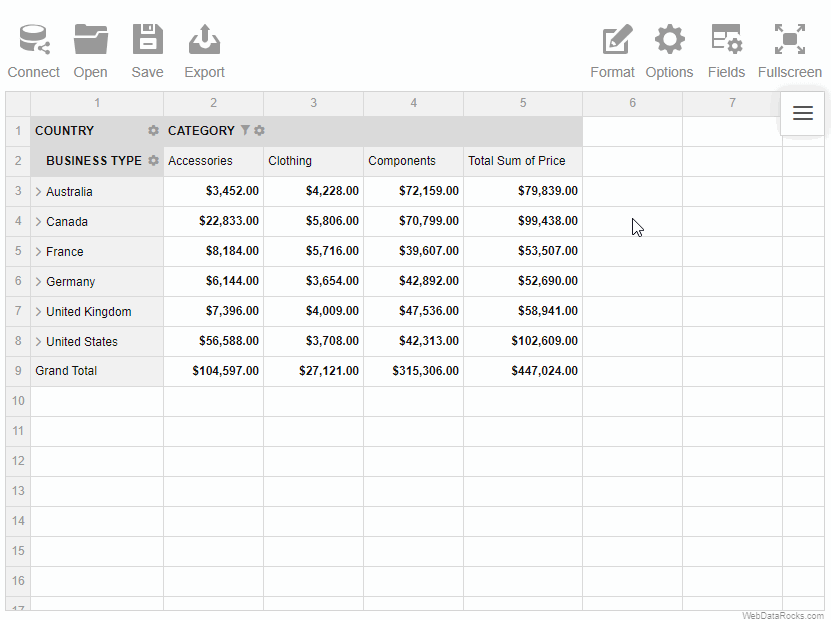
To start a new visualization project with WebDataRocks Pivot Table and Google Charts, follow the steps below.
Step 1. Add WebDataRocks to your project
Step 1.1. Complete the integration guide. Your code of the web page with WebDatarocks should look similar to the following:
<html>
  <head>
    <script src="https://cdn.webdatarocks.com/latest/webdatarocks.js"></script>
    <script src="https://cdn.webdatarocks.com/latest/webdatarocks.toolbar.min.js"></script>
    <link href="https://cdn.webdatarocks.com/latest/webdatarocks.min.css" rel="stylesheet"/>
  </head>

  <body>
    <div id="pivotContainer"></div>
    <script>
      const pivot = new WebDataRocks({
        container: "#pivotContainer",
        toolbar: true,
      });
    </script>
  </body>
</html>
Step 1.2. Create a report for WebDataRocks — connect to the data source and define which fields should be displayed in rows, columns, and measures:
const pivot = new WebDataRocks({
  container: "#pivotContainer",
  toolbar: true,
  report: {
    dataSource: {
      filename: "https://cdn.webdatarocks.com/data/data.csv",
    },
    slice: {
      rows: [
        {
          uniqueName: "Country",
        },
      ],
      columns: [
        {
          uniqueName: "Measures",
        },
      ],
      measures: [
        {
          uniqueName: "Price",
          aggregation: "sum",
        },
      ],
    },
  },
});
The fields you’ve specified in the report will be shown on the chart.
Step 2. Add Google Charts
Step 2.1. Include the script for Google Charts into your web page:
<script src="https://www.gstatic.com/charts/loader.js"></script>
Step 2.2. Create a flag variable to know when the Google Charts library is ready to be used:
let googleChartsLoaded = false;
Step 2.3. Load the Google Visualization API and the corechart package:
google.charts.load('current', {'packages':['corechart']});
Step 2.4. Set a callback to run when the Google Visualization API is loaded. In the callback handler, set the googleChartsLoaded flag to true:
google.charts.setOnLoadCallback(onGoogleChartsLoaded);

function onGoogleChartsLoaded() {
  googleChartsLoaded = true;
}
Step 2.5. Create a <div> container for Google Charts with an id (e.g., googlechartContainer):
<div id="googlechartContainer"></div>
Step 3. Show the data from the pivot table on the chart
Step 3.1. Include the WebDataRocks Connector for Google Charts:
<script src="https://cdn.webdatarocks.com/latest/webdatarocks.googlecharts.js"></script>
The Connector provides the googlecharts.getData() method, which gets data from WebDataRocks and converts it to the format required for a specific chart type.
Step 3.2. If we call the googlecharts.getData() method before WebDataRocks is fully loaded, it will return an empty result. To know when WebDataRocks is ready to provide data for the chart, handle the reportcomplete event:
const pivot = new WebDataRocks({
  container: "#pivotContainer",
  toolbar: true,
  report: {
    // ...
  },
  reportcomplete: onReportComplete,
});

let googleChartsLoaded = false;
// Add a flag variable to keep the state of the report
let pivotTableReportComplete = false;

// ...

function onReportComplete() {
  // Unsubscribing from reportcomplete
  // We need it only to track the initialization of WebDataRocks
  pivot.off("reportcomplete");
  pivotTableReportComplete = true;
}
Now we know when the data is loaded and the report is ready.
Step 3.3. Let’s start creating a chart. A function to create a chart should be called only when the following conditions are met:
- The Google Charts library is loaded (the
googleChartsLoadedflag istrue). - The WebDataRocks report is ready (the
pivotTableReportCompleteflag istrue).
Since we don’t know which will happen first, we have to handle both cases. Modify onGoogleChartsLoaded() and onReportComplete() functions as follows:
function onGoogleChartsLoaded() {
  googleChartsLoaded = true;
  // Handle the case when the report is complete before Google Charts is loaded
  if (pivotTableReportComplete) {
    createChart();
  }
}

function onReportComplete() {
  // Unsubscribing from reportcomplete
  // We need it only to track the initialization of WebDataRocks
  pivot.off("reportComplete");
  pivotTableReportComplete = true;
  // Handle the case when Google Charts is loaded before the report is complete
  if (googleChartsLoaded) {
    createChart();
  }
}
Step 3.4. Now it’s time to implement the createChart() function. It will use the googlecharts.getData() method from the Connector:
function createChart() {
  pivot.googlecharts.getData(
    {
      type: "column",
    },
    // Function called when data for the chart is ready
    drawColumnChart,
    // Function called on report changes (filtering, sorting, etc.)
    drawColumnChart,
  );
}
Step 3.5. Finally, implement the drawColumnChart() function:
function drawColumnChart(chartConfig) {
  let data = google.visualization.arrayToDataTable(chartConfig.data);
  const columnChartContainer = document.getElementById("googlechartContainer");
  const chart = new google.visualization.ColumnChart(columnChartContainer);
  chart.draw(data);
}
Notice the id of the columnChartContainer — it must match the id of a <div> created in step 2.5 (in our case, it is googlechartContainer).
Step 4. See the result
Open your web page in the browser to see how the pivot table looks in combination with Google Charts.
To see what a real-time interaction is, try experimenting: filter the data, change the measures and the aggregation functions — the results are reflected on the chart at once.
To learn more about chart customization, please refer to the Google Charts Documentation.
Check out the full code
After completing this tutorial, the full code of the web page should look as follows:
<html>
  <head>
    <script src="https://cdn.webdatarocks.com/latest/webdatarocks.js"></script>
    <script src="https://cdn.webdatarocks.com/latest/webdatarocks.toolbar.min.js"></script>
    <link href="https://cdn.webdatarocks.com/latest/webdatarocks.min.css" rel="stylesheet" />

    <script src="https://www.gstatic.com/charts/loader.js"></script>
    <script src="https://cdn.webdatarocks.com/latest/webdatarocks.googlecharts.js"></script>
  </head>

  <body>
    <div id="pivotContainer"></div>
    <div id="googlechartContainer"></div>
    <script>
      const pivot = new WebDataRocks({
        container: "#pivotContainer",
        toolbar: true,
        report: {
          dataSource: {
            filename: "https://cdn.webdatarocks.com/data/data.csv",
          },
          slice: {
            rows: [
              {
                uniqueName: "Country",
              },
            ],
            columns: [
              {
                uniqueName: "Measures",
              },
            ],
            measures: [
              {
                uniqueName: "Price",
                aggregation: "sum",
              },
            ],
          },
        },
        reportcomplete: onReportComplete,
      });

      let googleChartsLoaded = false;
      // Add a flag variable to keep the state of the report
      let pivotTableReportComplete = false;

      google.charts.load("current", { packages: ["corechart"] });
      google.charts.setOnLoadCallback(onGoogleChartsLoaded);

      function onGoogleChartsLoaded() {
        googleChartsLoaded = true;
        // Handle the case when the report is complete before Google Charts is loaded
        if (pivotTableReportComplete) {
          createChart();
        }
      }

      function onReportComplete() {
        // Unsubscribing from reportcomplete
        // We need it only to track the initialization of WebDataRocks
        pivot.off("reportComplete");
        pivotTableReportComplete = true;
        // Handle the case when Google Charts is loaded before the report is complete
        if (googleChartsLoaded) {
          createChart();
        }
      }

      function createChart() {
        pivot.googlecharts.getData(
          {
            type: "column",
          },
          // Function called when data for the chart is ready
          drawColumnChart,
          // Function called on report changes (filtering, sorting, etc.)
          drawColumnChart,
        );
      }

      function drawColumnChart(chartConfig) {
        let data = google.visualization.arrayToDataTable(chartConfig.data);
        const columnChartContainer = document.getElementById("googlechartContainer");
        const chart = new google.visualization.ColumnChart(columnChartContainer);
        chart.draw(data);
      }
    </script>
  </body>
</html>
Live example
Interact with the following sample where WebDataRocks Pivot Table is integrated with Google Charts to see how they work together:
See also
WebDataRocks Toolbar is designed to make your web reporting experience easier and more convenient. You can customize the Toolbar in the following ways:
- Add new custom tabs.
- Remove the tabs you don’t need.
- Reorder/change the existing tabs.
- Set your custom icons for tabs.
Important Before customizing the Toolbar, ensure it is enabled.
Let’s see how to customize the Toolbar in practice.
All customization can be made using the beforetoolbarcreated event which is triggered before the Toolbar is created. The event’s handler will be responsible for changing the Toolbar.
How to remove tabs
Step 1. Assign a handler (e.g., customizeToolbar) to the beforetoolbarcreated event. The handler function has the toolbar as a parameter that contains information about the Toolbar.
Step 2. Inside the handler (e.g., customizeToolbar), retrieve all the tabs using the toolbar.getTabs() method. It returns an array of objects that describe tabs’ properties.
Step 3. To remove a tab, delete a corresponding object from the array of tabs.
Your code should look similar to the following example:
const pivot = new WebDataRocks({
  container: "#pivotContainer",
  beforetoolbarcreated: customizeToolbar,
  report: "https://cdn.webdatarocks.com/reports/report.json",
  toolbar: true
});

function customizeToolbar(toolbar) {
  // Get all tabs from the Toolbar
  let tabs = toolbar.getTabs();
  toolbar.getTabs = function() {
    // Delete the Connect tab
    tabs = tabs.filter(tab => tab.id !== "wdr-tab-connect");
    return tabs;
  }
}
See the full code in our Codepen example.
How to add new tabs
Step 1. Assign a handler (e.g., customizeToolbar) to the beforetoolbarcreated event. The handler function has the toolbar as a parameter that contains information about the Toolbar.
Step 2. Inside the handler (e.g., customizeToolbar), retrieve all the tabs using the toolbar.getTabs() method. It returns an array of objects that describe tabs’ properties.
Step 3. Add a new tab to the array of tabs.
The example below implements the functionality that changes the theme of the component.
const pivot = new WebDataRocks({
  container: "#pivotContainer",
  beforetoolbarcreated: customizeToolbar,
  report: "https://cdn.webdatarocks.com/reports/report.json",
  toolbar: true
});

function customizeToolbar(toolbar) {
  // Get all tabs from the Toolbar
  const tabs = toolbar.getTabs();
  toolbar.getTabs = function() {
    // There will be two new tabs at the beginning of the Toolbar
    tabs.unshift({
      id: "wdr-tab-lightblue",
      title: "LightBlue",
      handler: newtabHandlerBlue,
      // You can replace icons with custom ones
      icon: this.icons.format
    }, {
      id: "wdr-tab-default",
      title: "Default",
      handler: newtabHandlerDefault,
      // You can replace icons with custom ones
      icon: this.icons.format
    });
    return tabs;
  }

  const newtabHandlerBlue = function() {
    setLightBlueTheme();
  };

  const newtabHandlerDefault = function() {
    setDefaultTheme();
  };
}
The full code with setLightBlueTheme() and setDefaultTheme() functions is available in our Codepen example.
How to add a tab with a drop-down
Step 1. Add a new tab.
Step 2. Define the menu property of this tab. This property should contain an array of drop-down menu items, each with a Tab Object structure.
In the example below, we add a new tab with a drop-down menu to change themes:
function customizeToolbar(toolbar) {
  // There will be one drop-down tab in the Toolbar
  tabs = toolbar.getTabs = function () {
    let tabs = [];
    tabs.unshift({
      id: "custom-select-view",
      title: "Theme",
      menu: [
        {
          id: "select-tab-one",
          title: "Default",
          handler: () => {
            setTheme("/");
          },
        },
        {
          id: "select-tab-two",
          title: "Dark",
          handler: () => {
            setTheme("/theme/dark/");
          },
        },
        {
          id: "select-tab-three",
          title: "Light Blue",
          handler: () => {
            setTheme("/theme/lightblue/");
          },
        },
      ],
      icon: toolbar.icons.options,
    });
    return tabs;
  };

  function setTheme(theme) {
    // ...
  }
}
The full code is available in our Codepen example.
Even more advanced customization
In this guide, we mentioned how to remove the Toolbar tabs and how to add a new one. For further customization, you can reorder the tabs, set the custom icons for the tabs, or implement new functionality. We recommend investigating the existing code to understand how the Toolbar works:
- Open the source code of the Toolbar –
webdatarocks.toolbar.jsfile. - Find a prototype of the
toolbar.getTabs()method. - Investigate how this method works.
You can also change the appearance of the Toolbar by changing the component theme.
See also
Export all the contents, layout, and a structure of a pivot table to a file in which format is the most convenient for you – PDF, Excel or HTML. Besides, you can print it as well.
To export a pivot table
- Go to the Export tab () on the Toolbar.
- Choose the format and export the report to the local file system of your device.
To print a pivot table
- Go to the Export tab () on the Toolbar.
- Select Print.
If you want to pick up where you left while working with the previous report, you can load it into the pivot table:
Loading the report via the Toolbar
To load a local report
- Go to the Open tab () on the Toolbar.
- Select Local report.
To load a remote report
- Go to the Open tab () on the Toolbar.
- Select Remote report.
- Enter the URL of the remote report.

Loading the report programmatically
Load your report while embedding WebDataRocks by specifying a path to your report file:
let pivot = new WebDataRocks({
  container: "#pivotContainer",
  toolbar: true,
  // Replace this URL with your report file
  report: "https://cdn.webdatarocks.com/reports/report.json"
});
You can save your current report and load it later with all your settings: slice, formats, filters, sorting, conditions, and options.
To save the report via UI
- Click the Save button () on the Toolbar.
The report will be saved to your local file system in JSON format. Later you can open this report in WebDataRocks and see your previous configurations on the grid.
Here’s a demo showing how to save a report via the Toolbar:
To save the report programmatically
Use the save() method:
webdatarocks.save();
The saved report will contain only the configurations you’ve explicitly defined. To save the report with default or global configurations, see the next section.
Saving the report with default and global configurations
The save() method has parameters that allow you to save the report:
- With global configs
- With default configs
- With global and default configs
Now let’s have a look at each of these approaches in detail. For simplicity, we’ll focus on how options are saved, but data source and slice configs are saved similarly.
With default configs
How to save. Run the save() method with the withDefaults option:
webdatarocks.save({
  withDefaults: true
});
How it works. Let’s define the following report:
const pivot = new WebDataRocks({
  container: "#pivotContainer",
  report: {
    dataSource: {
      filename: "https://cdn.flexmonster.com/data/data.json"
    },
    options: {
      grid: {
        type: "flat",
        showHeaders: false
      },
      configuratorActive: true
    }
  },
});
As you can see, we’ve defined only a few options in the report. Now if we save this report with default configs, we’ll see more options in the saved file:
{
 "dataSource": {
   // Data source configs
 },
 "slice": {
   // Slice configs
 },
 "options": {
   "grid": {
     "type": "flat",
     "title": "",
     "showFilter": true,
     "showHeaders": false,
     "showTotals": "on",
     "showGrandTotals": "on",
     // Other grid options
   },
   "configuratorActive": true,
   "configuratorButton": true,
   "showAggregations": true,
   "showCalculatedValuesButton": true,
   "drillThrough": true,
   "showDrillThroughConfigurator": true,
   // Other general options
 }
}
Notice that the options.grid.type, options.grid.showHeaders, and options.configuratorActive properties have values that we’ve set manually, whereas their default values are different — check them in the Options Object.
You can also check default values for the Slice Object and Data Source Object.
With global configs
How to save. Run the save() method with the withGlobals option:
webdatarocks.save({
  withGlobals: true
});
How it works. Let’s configure the component as follows:
const pivot = new WebDataRocks({
  container: "#pivotContainer",
  report: {
    dataSource: {
      filename: "https://cdn.flexmonster.com/data/data.json"
    },
    options: {
      grid: {
        type: "classic"
      },
      configuratorActive: false
    }
  },
  global: {
    options: {
      grid: {
        type: "flat",
        showHeaders: false
      },
      configuratorActive: true
    }
  }
});
We have defined global options, and some of them are overwritten in the report.
Now if we save this report with global configs, we’ll see the following options section in the saved file:
{
  "dataSource": {
    // Data source configs
  },
  "slice": {
    // Slice configs
  },
  "options": {
    "grid": {
      "type": "classic",
      "showHeaders": false
    }
  }
}
If we compare the initial configurations and the saved report, we’ll learn the following:
- If a configuration is defined globally and not defined in the report, the global value will be saved to the report (see the
grid.showHeadersoption in the example). - If a configuration is defined both globally and in the report, the global value is ignored (see the
grid.typeoption in the example). - If a global configuration is overwritten in the report, but its new value matches its default value, the configuration is not included in the saved report (see the
configuratorActiveoption in the example).
With default and global configs
How to save. Run the save() method with the withDefaults and withGlobals options:
webdatarocks.save({
  withDefaults: true,
  withGlobals: true
});
How it works. This approach is a combination of the previous approaches. For example, let’s save the following report with defaults and globals:
const pivot = new WebDataRocks({
  container: "#pivotContainer",
  report: {
    dataSource: {
      filename: "https://cdn.flexmonster.com/data/data.json"
    },
    options: {
      grid: {
        type: "classic"
      },
      configuratorActive: false
    }
  },
  global: {
    options: {
      grid: {
        type: "flat",
        showHeaders: false
      },
      configuratorActive: true
    }
  }
});
The saved file will look similar to the following:
{
  "dataSource": {
    // Data source configs
  },
  "slice": {
    // Slice configs
  },
  "options": {
    "grid": {
      "type": "classic",
      "title": "",
      "showFilter": true,
      "showHeaders": false,
      "showTotals": "on",
      "showGrandTotals": "on",
      // Other grid options
    },
    "configuratorActive": false,
    "configuratorButton": true,
    "showAggregations": true,
    "showCalculatedValuesButton": true,
    "drillThrough": true,
    "showDrillThroughConfigurator": true,
    // Other general options
  }
}
As you can see from the saved report:
- The
grid.showHeadersoption is not overwritten in the report, so it has its global value (false). - The
grid.typeoption is overwritten in the report, so its global value is ignored (grid.typeis"classic", not"flat"). - All other options have their default values, thanks to the
withDefaults: true.
See also
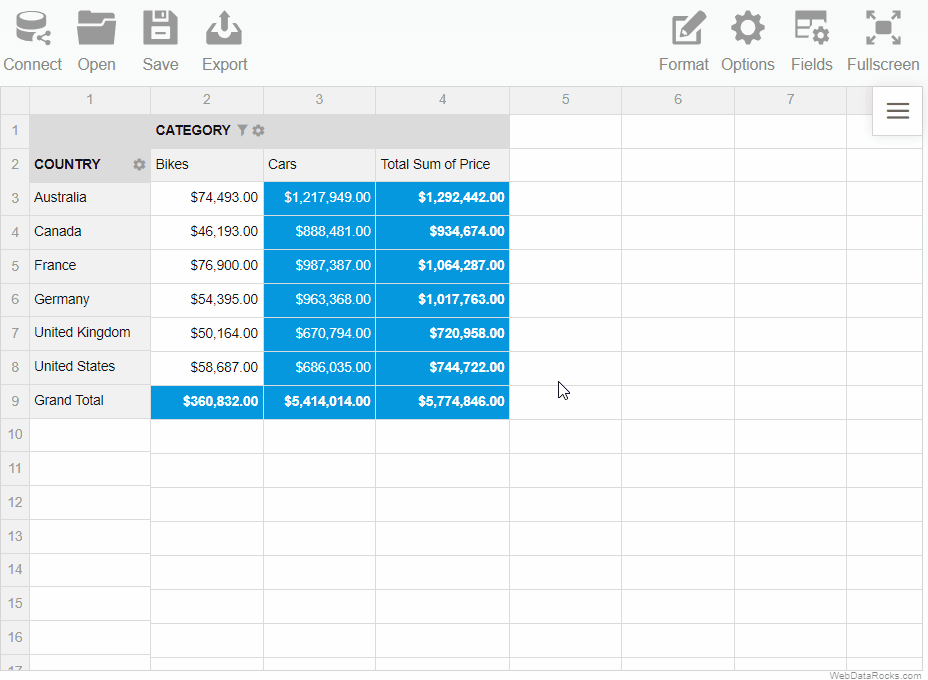
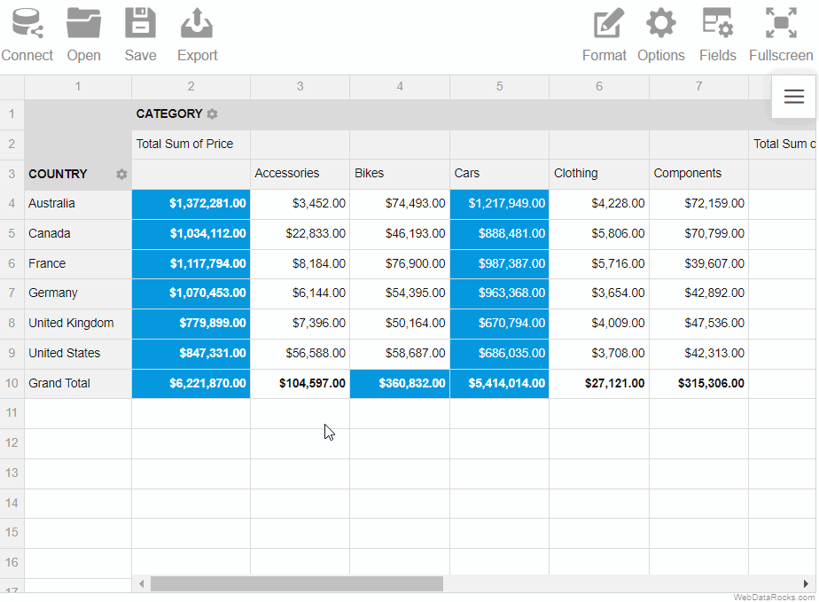
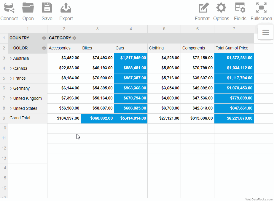
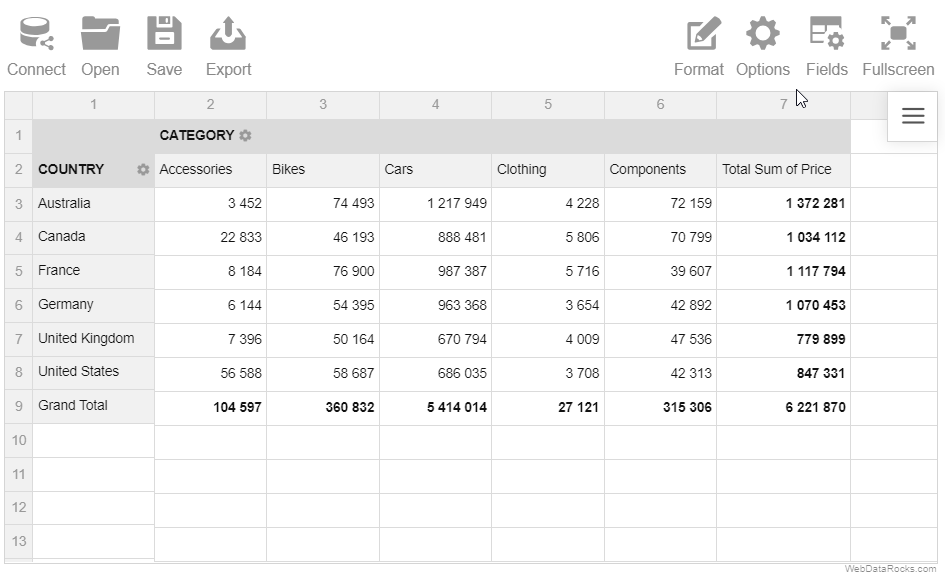
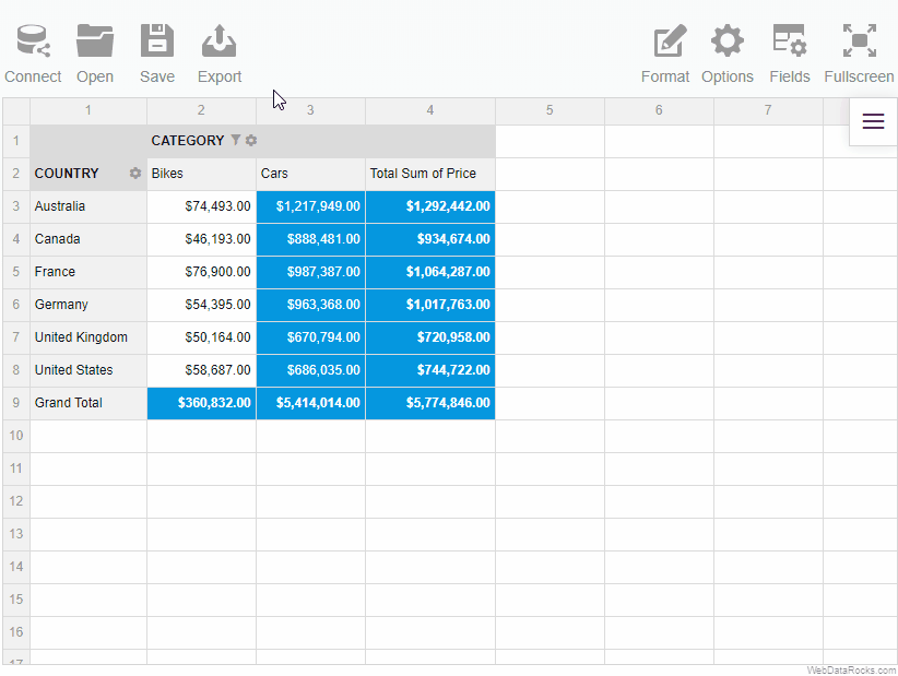
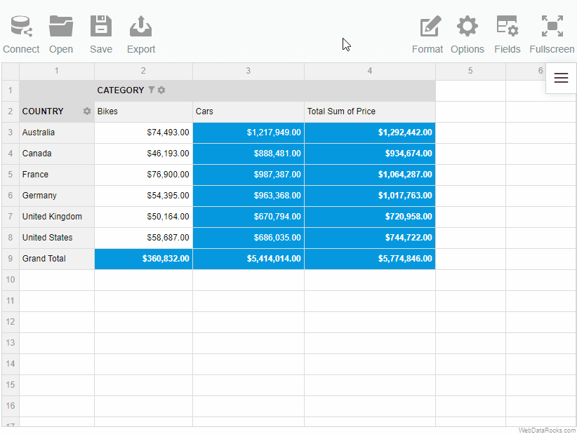
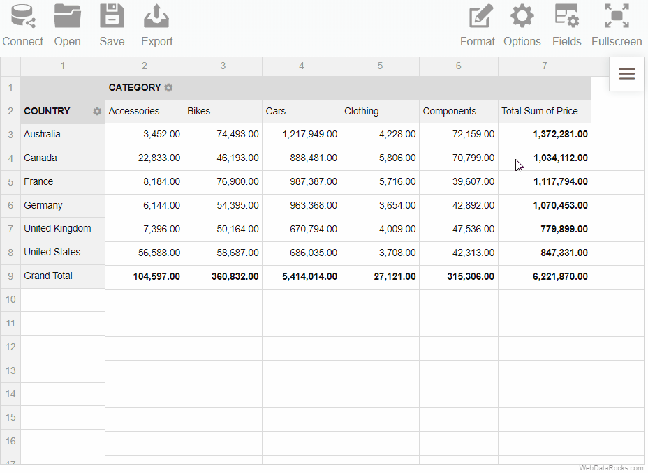
A grand total is a value that is composed by adding together other total amounts (subtotals) of the row/column.
When creating a report, you can change the default way grand totals and subtotals are displayed on the grid. The available options are:
- Show and hide grand totals for the entire report
- Show and hide subtotals for the entire report
- Show grand totals only for the rows or columns
- Show subtotals only for the rows or columns
To show or hide grand totals and subtotals
Via UI
- Go to the Options () tab on the Toolbar.
- Choose how to display grand totals and subtotals.
- Apply the changes.
Programmatically
Configure totals through the grid.showTotals property of the Options Object:
report: {
  options: {
    grid: {
      showTotals: "off"
    }
  }
}
Configure grand totals through the grid.showGrandTotals property of the Options Object:
report: {
  options: {
    grid: {
      showGrandTotals: "rows"
    }
  }
}
It is also possible to set grid.showTotals and grid.showGrandTotals options for all reports.
Example
Hide grand totals from the entire report:
Hide grand totals from the rows:

The layout of subtotals is changed similarly.
You can change the default size of the cells with a few clicks.
To resize the rows and columns
- Drag the header border of the row/column to resize its height/width.
- Drag the header border of the row to resize its height.
Example
Resize the columns widths:
To return the cells to the initial size, click twice on the header of the row or column:
You can change the default number formatting of the report. WebDataRocks offers many options for formatting your numerical data such as:
- Align of the text
- Thousand and decimal separators
- Quantity of decimal places
- Currency symbols
- Currency align
- Null (default) value
- Percent formatting
To format numbers
- Go to the Format tab () on the Toolbar.
- Select Format cells.
- Select the value which formatting should be changed.
- Set the properties of formatting.
- Apply the changes.
Use the conditional formatting feature to highlight important values and make your report look more personalized.
To apply conditional formatting
To implement your own logic of highlighting the data, follow the steps below:
- On the Toolbar, choose the Format tab () > Conditional formatting.
- Select the plus-sign icon.
- Choose a value that you want to format (e.g., Sum of Price). If necessary, you can format all values at once.
- Add a rule; for example, “Less than 100” will apply the changes to all the cells with a value less than 100.
- Select colors for the text and background, and change the font if necessary.
- Press the Apply button to see the changes on the grid.
You can add multiple conditions of formatting to the same measure. Each condition is described by the Conditional Format Object and is saved in the report.conditions property.
Use the drill-through feature to see from which non-aggregated records the value in the cell is composed.
To drill through the cell
- Double-click the cell.
- Look through all the information about the cell in the drill-through pop-up window.
To specify what information to show in the drill-through view, open the Field List ( ).
).
Note that if you change the values in the drill-through pop-up window, the changes are not applied to the values from the initial grid. They are “view-only”.