How to visualize geographic data with charts and a pivot table
In this article
This tutorial guides you through creating a choropleth map, a powerful tool for visualizing how a variable changes across regions.
We continue our blog series on discovering awesome data visualization types. This tutorial suits everyone who wants to understand their geographic data better.
Today we’ll focus on using one of the most popular visualization techniques for geospatial data – a choropleth map. And not only you’ll learn how to use this chart to represent the geodata but also how to efficiently combine it with a pivot table on a dashboard.
Here’s what you’ll get as a result:
See the Pen WebDataRocks Pivot Table with Google Charts Map by WebDataRocks (@webdatarocks) on CodePen.
But first things first: what is a choropleth map?
Choropleth map
Choropleth map is a data visualization technique that allows representing the data using different colors or shades of one color for different regions. Most often, it’s used to visualize how the variable varies across a certain geographic area. You can use this technique to communicate the correlation between the variable and a geographic location.
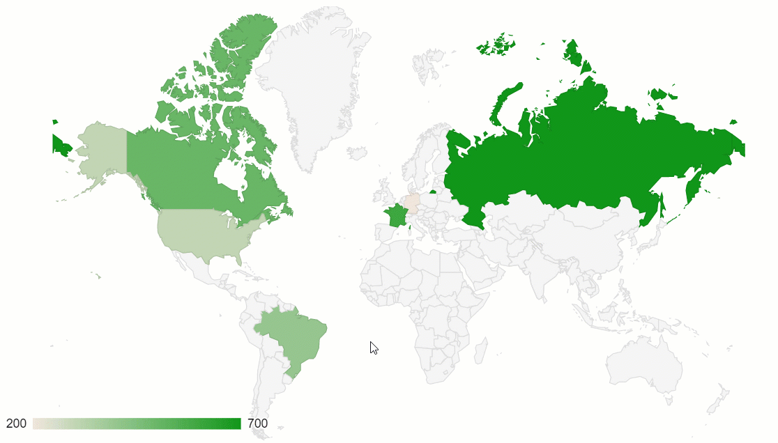
One of the best implementations of this data visualization method is a geo chart by Google Charts. Plus, it can be perfectly combined with another data visualization type – a pivot table.
Now let’s figure out how to create a dashboard in five simple steps.
Step 1: Add a web reporting tool
The first step is to include the pivot table on the page. For this, we should follow the straightforward steps from the Quickstart guide.
Step 2: Connect your data
Choose the data format you prefer and load the file into the pivot table by specifying its URL or the name of the function that returns it.
Here’s how you can specify the data source in the report object:
filename: "URL-to-your-CSV-or-JSON-file"
or
data: getData()
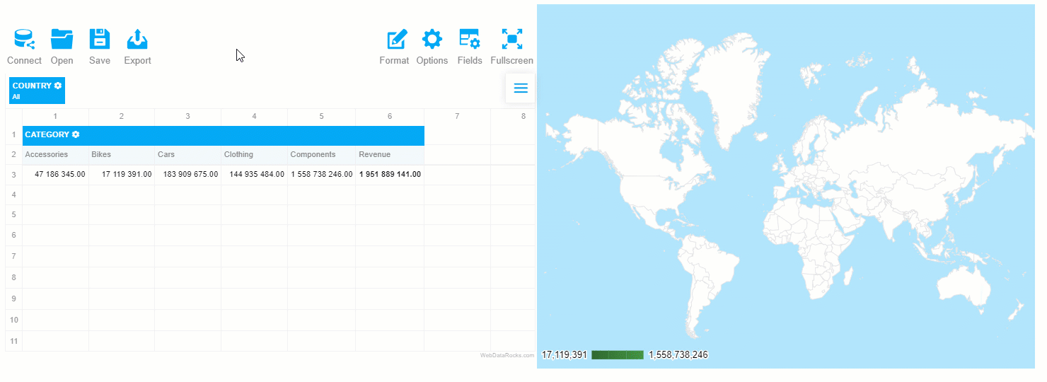
Step 3: Create a tabular report
Now it’s time to select the fields to be displayed on the grid. Let’s put the “Country” hierarchy to the rows, “Category” to the columns and aggregate this data by “Revenue” – a calculated value built using “Price” and “Quantity” measures:
"slice": {
    "rows": [{
        "uniqueName": "Country",
        "sort": "asc"
    }],
    "columns": [{
        "uniqueName": "Category",
        "sort": "asc"
    }, {
        "uniqueName": "Measures"
    }],
    "measures": [{
        "uniqueName": "Revenue",
        "formula": "sum(\"Price\") * sum(\"Quantity\") ",
        "individual": true,
        "caption": "Revenue"
    }]
}
Step 4: Integrate with Google Charts
Add the Google Charts loader to the <head> section of your web page:
<script src="https://www.gstatic.com/charts/loader.js"></script>
To have access to the data preprocessing methods of WebDataRocks, include its connector for Google Charts:
<script src="https://cdn.webdatarocks.com/latest/webdatarocks.googlecharts.js"></script>
Create a <div> container to hold the chart:
<div id="googlechart-container"></div>
Step 5: Connect the chart to the pivot table
Now that we’ve set up the web reporting tool and charts, let’s synchronize them.
For this, we need a reportcomplete event. It’s triggered once the report has completed loading into the pivot tool.
Here’s how we can attach an event handler to it:
reportcomplete: function() {
    pivot.off("reportcomplete");
}
Additionally, we need two flag variables to track when both charts loader and the report are ready to be used:
var pivotTableReportComplete = false;
var googleChartsLoaded = false;
For loading the charts, we need to specify the mapsApiKey parameter:
google.charts.load('current', {
    'packages': ['geochart'],
    'mapsApiKey': 'AIzaSyD-9tSrke72PouQMnMX-a7eZSW0jkFMBWY'
});
We also need to set the callback function for the google.charts module to track if it’s finished loading:
google.charts.setOnLoadCallback(onGoogleChartsLoaded);
Once we’ve configured everything, let’s move on to a more creative part of the tutorial – drawing charts.
Create the functions that are responsible for handling the drawing logic:
function createGoogleChart() {
    if (googleChartsLoaded) {
        pivot.googlecharts.getData({
                type: "bar"
            },
            drawChart,
            drawChart
        );
    }
}
function onGoogleChartsLoaded() {
    googleChartsLoaded = true;
    if (pivotTableReportComplete) {
        createGoogleChart();
    }
}
function drawChart(data) {
    var data = google.visualization.arrayToDataTable(_data.data);
    var options = {
        colorAxis: {
            colors: ['#449544', '#4ca64c', '#7fbf7f', '#b2d8b2']
        },
        backgroundColor: '#b3e5fc',
        datalessRegionColor: '#ffffff',
        defaultColor: '#f5f5f5',
    };
    var chart = new google.visualization.GeoChart(document.getElementById('googlechart-container'));
    chart.draw(data, options);
Since for mapping data, we’ll use a single-hue progression, in the colorsproperty, we should specify the palette – all the shades of the chosen color, from the lightest to the darkest. The darkest hue represents the largest values of the data, the lightest – the smallest values.
So, after we’ve defined all the needed functions, here’s how our event handler for reportcomplete looks like:
reportcomplete: function() {
    pivot.off("reportcomplete");
    pivotTableReportComplete = true;
    createGoogleChart();
}
Results
Hooray! Now your dashboard is rendered on the web page and we can use it for deriving insights from the geographic data.
The greatest thing about such a data visualization approach is that the elements on the dashboards are connected – the chart reacts to the changes applied to the report. Try filtering the data or moving the hierarchies between rows and columns to see the synchronization in action.
What’s next?
Eager to discover more features of WebDataRocks Pivot? Check out our tutorials on integration and the UI guide.
Want to customize the charts further? The editable examples from the Google Charts documentation will help you to find out how to do it.