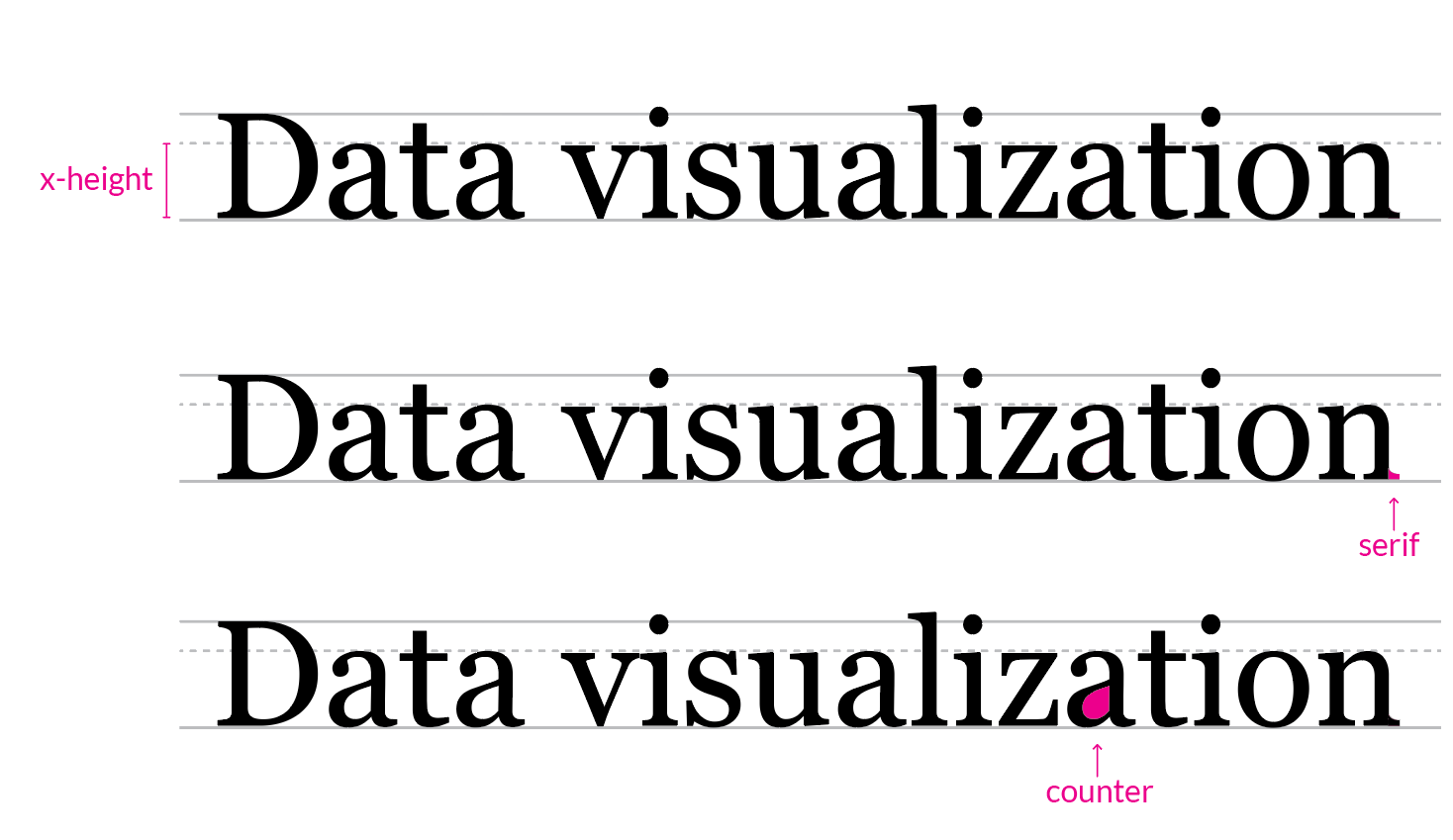
Data visualization for marketers: how to present data visually
In this article
Learn how to choose the right visualization methods, create impactful visuals, and avoid common pitfalls to make your data more engaging and understandable for your target audience.
Data forms a vital part of marketing. However, just having data is not sufficient. The way you represent the available data has a lot to do with how well you can engage your target customers. Here, data visualization comes into the picture.
Data visualization is nothing but converting data into graphs, charts, and other visual forms. As a marketer, you’d be aware that a single picture is worth more than a thousand words. Using graphs, tables, and other visual communication tools make your data easily understandable for your target audience.
Whether you want to present certain data to your customers or internal stakeholders, use more visuals for greater effectiveness. As per studies, the human brain can process visuals about 60,000 times faster as compared to texts. It shows the importance of data visualization for successful marketing.
Marketers can leverage data visualization for crafting content like reports, presentations, and blogs, reinforcing opinions, identifying market patterns, and making well-informed decisions.
Now let’s have a look at the 6 simple steps that will help you in presenting your data visually.
Know your Objective
Before visualizing your data, the first thing you need to do is to find out your core objective. Having clarity on why you should opt for data visualization will help you avoid any confusion later and stay focused.
You can start by collecting information about who your target audiences are, what type of data you want to represent in visual form, and what you aim at achieving through data visualization.
Establishing your objectives at the very beginning enables you to stay on track throughout the process. It gives you an idea of the path to follow in order to achieve the set objectives.
Determine the Best Data Visualization Method
When you opt for data visualization, you will surely find many options to choose from. Charts, graphs, diagrams, maps, and infographics are some of the most popular types of data visualizations.
Each of these methods has a unique purpose. For instance, charts are mostly used to represent a change or make comparisons, while infographics are used for a better understanding of a topic.
Depending on your purpose, choose the best data visualization method that can yield the desired outcomes. The selection of an inappropriate method can result in confusing and misleading your readers. So, in case you are confused, try a few data visualization methods and determine what works best for your data.
Create Visual Representation and Add Context
The next step is to actually visualize your data by creating graphs, charts, and other visual forms. For this, you would require using some tools. There are a number of tools available for data visualization. The right tool will depend on your data visualization method.
For instance, if you want to create simple graphs and charts, the best tool to use is Google Sheets or Microsoft Excel. Another analogy would be Flexmonster Pivot Table & Charts for desktop. Fast, simple and highly functional app. However if you want to integrate visualization into your own project, then WebDataRocks Pivot Table may become your best choice. If you want more appealing and design-oriented graphs and charts, you can make use of Canva.

Besides, you can also leverage data visualization platforms like Tableau in order to create different types of effective visuals. By using Tableau, you can also share as well as analyze data with your team members.
Once you are done with the creation of data visualization, you need to contextualize it. Adding context will help in giving meaning and clarity to the readers and enhances the understandability of the data.
Some of the popular ways to add context are giving an appropriate title, labeling the axes, using different annotations to highlight main points, and giving color keys. A simple addition like inserting legends can also give a clear picture to your audiences.
Use Bold Fonts and Appealing Colors
Fonts and colors are a vital part of designing your data visualization. Make sure to use the right colors wisely and strategically. While representing data, colors are mainly used to illustrate certain progression, highlight important points, distinguish various data points, and categorize information.
Different variants of colors can be used for different purposes. For instance, when you want to represent continuous data, try using a single color throughout. On the other hand, make sure to use contrasting colors while making comparisons.
If you want to emphasize a particular data, consider using bold colors. Bold colors can also be used to make the texts easy to read for your target audience. However, make sure to avoid using more than three fonts in single data visualization. This is so because it may distract your readers and might look unappealing.
Declutter
The next step is to declutter your chart, graph, and other visual forms. When you are done with data visualization, it’s time to remove all the data clutter. Eliminating unnecessary elements can help in improving the quality and ensuring the greater impact of the data visualization on your audience. Cleaner charts and graphs are easy to read and will enable customers to focus on the main points directly.
While you may always be tempted to add more design elements to beautify the data visualization and make it fancier, try avoiding it. Make sure whatever you add gives some kind of value to the data. Keeping your data visualization easy to read and simple can have the best impact.
Some of the components you can consider removing are unnecessary grid lines, decimals, axis, and various color effects. Irrelevant icons and decorative fonts also need to be removed. Also, consider eliminating the 3D effects from your graphs and charts always as it makes them more difficult to understand.
Avoid Distortion of Data
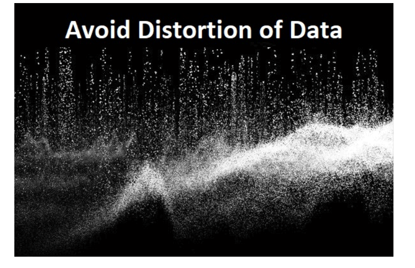
The final step is to avoid any kind of data distortion. While designing your data visualization, there are high chances that you may distort some data. Be careful about it. Make sure to look closely at aspects like chart type, size, color, and shape to ensure accurate representation of data.
There are a number of ways in which you can avoid data distortion. Some of the prominent ways are starting the vertical axis at zero, adding appropriate labels, cleaning all unnecessary data, avoiding the manipulation of the x and y-axis, and keeping data visualization simple.
Also, make sure to follow the conventions of visualization in order to avoid data distortion. Using a chart maker to select the right data visualization type can even be helpful.
Winding Up
Data visualization is vital for marketers in order to reach their target audience better. Data visualization helps in enhancing communication and boosting your marketing efforts. Visuals have much more impact on your customers in comparison to simple data represented in textual form.
Besides, leveraging data visualization can enable your sales and marketing team to reach their goals in much less time.
So, now that you know the benefits of data visualization and the steps to visualize your data, it’s time to put them into practice. Visualize your data and enhance your brand awareness and grow the sales of your business.
Thank you to our guest author Bhavik Soni, a Creative Writer at Auto Monkey. The companyprovide an original analysis of the latest happenings in the social media industry
What else to read?
- How data visualization transforms the way you do business
- Best online JavaScript data visualization courses
- The ways to create informative reports with Canva & WebDataRocks
- Top 11 splendid data visualization blogs to follow in 2020