Exporting and printing
Export all the contents, layout, and a structure of a pivot table to a file in which format is the most convenient for you – PDF, Excel or HTML. Besides, you can print it as well.
To export a pivot table
- Go to the Export tab () on the Toolbar.
- Choose the format and export the report to the local file system of your device.
To print a pivot table
- Go to the Export tab () on the Toolbar.
- Select Print.
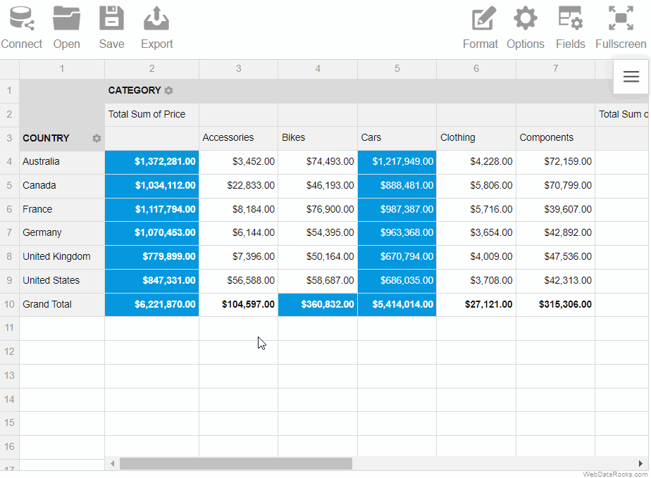
You can change the default size of the cells with a few clicks.
To resize the rows and columns
- Drag the header border of the row/column to resize its height/width.
- Drag the header border of the row to resize its height.
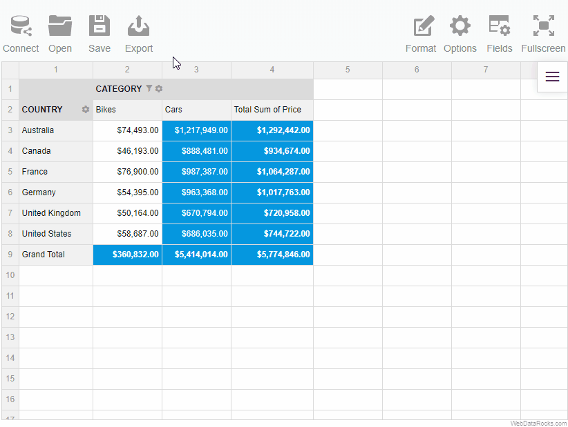
Example
Resize the columns widths:
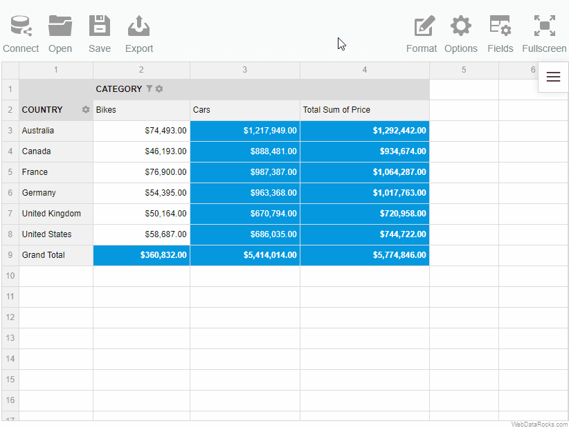
To return the cells to the initial size, click twice on the header of the row or column:
You can change the default size of the cells with a few clicks.
To resize the rows and columns
- Drag the header border of the row/column to resize its height/width.
- Drag the header border of the row to resize its height.
Example
Resize the columns widths:
To return the cells to the initial size, click twice on the header of the row or column:
Use the conditional formatting feature to highlight important values and make your report look more personalized.
To apply conditional formatting
To implement your own logic of highlighting the data, follow the steps below:
- On the Toolbar, choose the Format tab () > Conditional formatting.
- Select the plus-sign icon.
- Choose a value that you want to format (e.g., Sum of Price). If necessary, you can format all values at once.
- Add a rule; for example, “Less than 100” will apply the changes to all the cells with a value less than 100.
- Select colors for the text and background, and change the font if necessary.
- Press the Apply button to see the changes on the grid.
You can add multiple conditions of formatting to the same measure. Each condition is described by the Conditional Format Object and is saved in the report.conditions property.
Our pivot table can easily be translated into different languages. This article describes the process of language localization for WebDataRocks reporting component.
Available localizations
- English (default)
- French
- German
- Spanish
- Italian (partial)
- Dutch
- Brazilian Portuguese
- Chinese
- Turkish
- Polish
- Urdu
Localization files for new languages can be added by creating a new pull request on GitHub. Our team highly appreciates any help.
Create a custom localization file
Follow the steps below to create your own localization file based on our template:
Step 1. Download template JSON file. It contains all labels that are used in WebDataRocks and English values for them.
Step 2. Translate values into the language you want.
For example, you want a Spanish localization. You start from replacing the first label-value pair from the template ("flatHierarchyBox": "Select and arrange columns") with its Spanish equivalent ("flatHierarchyBox": "Seleccionar y organizar columnas") and keep on the same way with the whole file (e.g., check Spanish translated sample).
Localize a specific report
To set a specific language for a report, add a report.localization property with the necessary localization:
Set the localization as a URL to the file
const report = {
  dataSource: {
    filename: "https://cdn.webdatarocks.com/data/data.csv"
  },
  // Replace this file with your own localization file
  localization: "https://cdn.webdatarocks.com/loc/es.json"
};
Set the localization as an inline JSON object
const report = {
  dataSource: {
    filename: "https://cdn.webdatarocks.com/data/data.csv"
  },
  // Replace the translation below with your own labels
  localization: {
    toolbar: {
      connect: "Conectar",
      open: "Abierto",
      save: "Salvar",
      export: "Exportar",
      // Other labels
    }
  }
};
Set localization for all reports
If you want to set one language for all reports, add a global object with localization when initializing WebDataRocks:
Set the localization as a URL to the file
<script setup>
  import { Pivot } from "@webdatarocks/vue-webdatarocks";
  import "@webdatarocks/webdatarocks/webdatarocks.css";

  const report = {
    // Your report
  };

  const globalReport = {
    // Replace this file with your own localization file
    localization: "https://cdn.webdatarocks.com/loc/es.json"
  };
</script>

<template>
  <div>
    <Pivot
      v-bind:report="report"
      v-bind:global="globalReport"
      toolbar
    />
  </div>
</template>
Set the localization as an inline JSON object
<script setup>
  import {Pivot} from "@webdatarocks/vue-webdatarocks";
  import "@webdatarocks/webdatarocks/webdatarocks.css";

  const report = {
    // Your report
  };

  const globalReport = {
    // Replace the translation below with your own labels
    localization: {
      toolbar: {
        connect: "Conectar",
        open: "Abierto",
        save: "Salvar",
        export: "Exportar",
        // Other labels
      }
    }
  };
</script>

<template>
  <div>
    <Pivot
      v-bind:report="report"
      v-bind:global="globalReport"
      toolbar
    />
  </div>
</template>
Learn more about the Global Object.