Metadata object for JSON
The metadata object is used for setting data types, creating multilevel hierarchies, and changing captions. This object is specified as the first element of the JSON array.
Properties
| Name | Type | Description |
|---|---|---|
type | String | optional The field’s data type. Possible values:
|
caption | String | optional The field’s caption. |
hierarchy | String | optional The name of the hierarchy. Used for multilevel hierarchies. Set this property to make the field a level of the specified hierarchy. In this case, the type must be set to "level". |
parent | String | optional The caption of the parent hierarchy level. Used for multilevel hierarchies. In this case, the type must be set to "level". |
level | String | optional The caption of the hierarchy level. Used for multilevel hierarchies. In this case, the type must be set to "level". |
Examples
1) Setting the metadata object in a JSON array of objects:
[
  {
    "Product": {
      "type": "string"
    },
    "Price": {
      "type": "number"
    }
  },
  {
    "Product": "Apple",
    "Price": 2.50
  },
  {
    "Product": "Cherry",
    "Price": 5.25
  }
]
See the full example on CodePen.
2) Setting the metadata object in a JSON array of arrays:
[
  {
    "Product": {
      "type": "string"
    },
    "Price": {
      "type": "number"
    },
  },
  ["Apple", 2.50],
  ["Cherry", 5.25]
]
Try a live demo on CodePen.
See also
- Supported JSON formats
- Setting data types
- Connecting to JSON
- Creating multilevel hierarchies in JSON
Use the drill-down feature to drill into the different levels of a hierarchy. This operation helps to reveal more details of your data and get a more specific view of the hierarchies. Drill back up when you need to get a general view of the data.
Example
Starting from a country level, drill down to a city level that can be further drilled down to an address level. Drill up the levels to return to the previous view of the hierarchy.
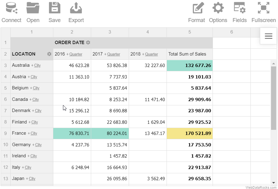
Note. This feature can be used only with the multilevel hierarchies. Refer to the Data types guide for details on how to define levels in the data types.
Use the drill-down feature to drill into the different levels of a hierarchy. This operation helps to reveal more details of your data and get a more specific view of the hierarchies. Drill back up when you need to get a general view of the data.
Example
Starting from a country level, drill down to a city level that can be further drilled down to an address level. Drill up the levels to return to the previous view of the hierarchy.
Note. This feature can be used only with the multilevel hierarchies. Refer to the Data types guide for details on how to define levels in the data types.
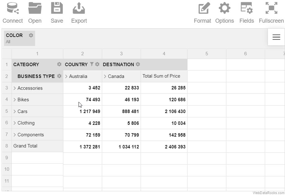
Use the drag-and-drop feature to organize and restructure your report in real time.
Example
Drag and drop the hierarchies between the rows, columns and report filters right on the grid.
Use the drag-and-drop feature to organize and restructure your report in real time.
Example
Drag and drop the hierarchies between the rows, columns and report filters right on the grid.
Use the drag-and-drop feature to organize and restructure your report in real time.
Example
Drag and drop the hierarchies between the rows, columns and report filters right on the grid.
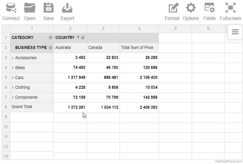
Use the expand and collapse operations to analyze the data on different levels of detail.
Example
Expand the Category hierarchy to display the members of the next (Business Type) hierarchy.
In a classic form:
In a compact form: